")
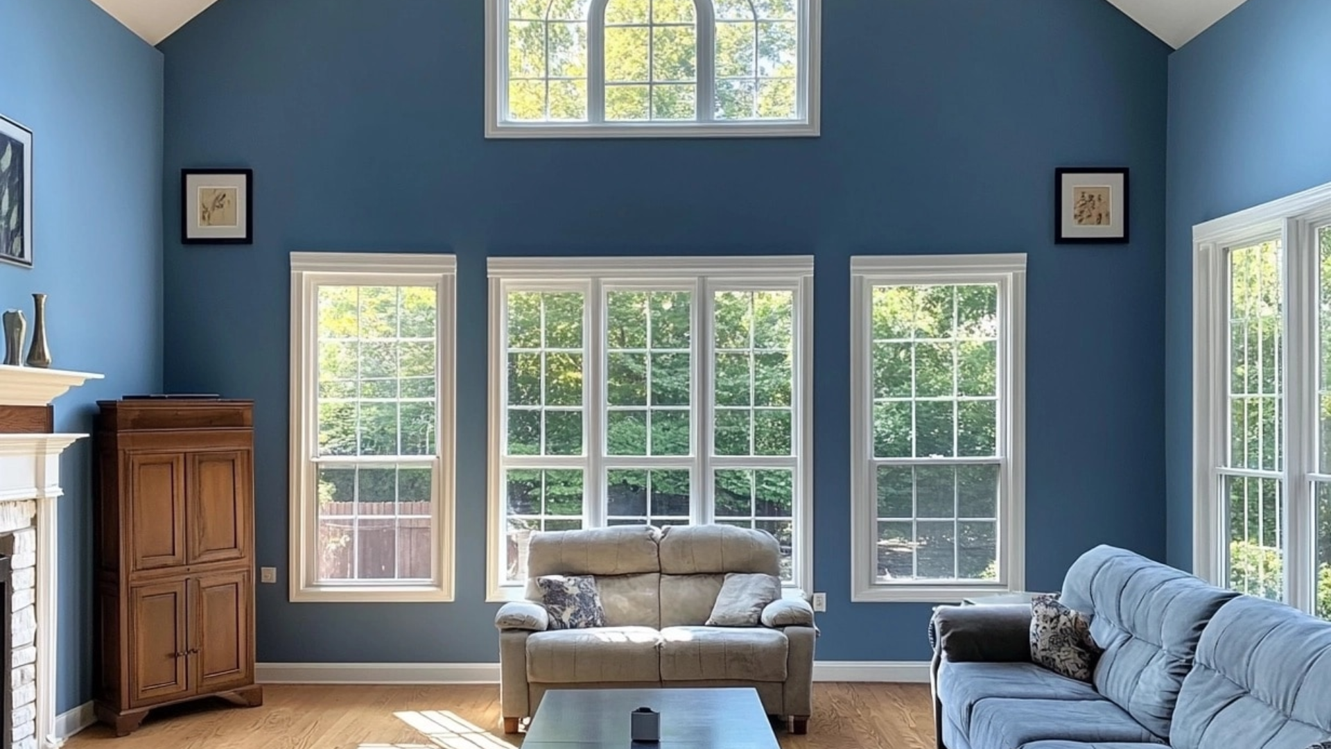
Are you looking for a blue paint color that feels both classic and fresh? Providence Blue (LRV 19.23) by Benjamin Moore could be the perfect fit. This shade blends calming and energizing tones to create a balanced, beautiful color.
In this guide, I’ll share everything you need to know about Providence Blue. You’ll learn what makes it special, how to pair it with other colors, and where it works best in your home. I know how hard it can be to choose the right paint. That’s why I put together this easy guide.
With over years of experience as an interior designer, I’ve used Providence Blue in many different homes. It’s one of my favorite go-to choices.
This color has a timeless quality that works in both modern and traditional spaces. If you’re painting one room or your whole home, this guide will help you decide if Providence Blue is the right pick for your space.
Why Providence Blue Is the Perfect Choice for Your Space?

Providence Blue is a medium-toned blue with soft gray undertones that make it calm, flexible, and easy to use in many rooms throughout the home. It adds a nice amount of color and depth without feeling too bold or overwhelming.
One of the best things about this shade is how it shifts throughout the day depending on the light in the room. In the morning, it appears brighter and fresher, while in the evening, it takes on a deeper and cozier feel.
I’ve used Providence Blue in both modern and traditional homes, and it always looks great, which shows how versatile it really is. It also pairs beautifully with many materials and finishes, including warm woods, cool metals, and a wide range of accent colors.
If you’re searching for a paint color that has personality but still feels timeless and easy to live with, Providence Blue is definitely one to consider.
Best Color Pairings with Providence Blue
1. White Dove (OC-17)

White Dove (LRV-83.16) is a soft white that pairs beautifully with Providence Blue. It has a hint of warmth, which helps balance the coolness of the blue without clashing. When used on trim, doors, or ceilings, it creates a fresh contrast that makes the space feel open and clean.
The light tone helps brighten rooms with darker walls and brings a peaceful, airy feeling. This pairing works well in bedrooms, living rooms, or any space where you want calm and comfort. Together, White Dove and Providence Blue feel timeless and easy to live with.
2. Edgecomb Gray (HC-173)

Edgecomb Gray (LRV-63.09) is a warm greige that softens the boldness of Providence Blue. It has just enough warmth and color to stand on its own, but doesn’t overpower. This neutral is great for nearby rooms or furniture pieces, helping everything feel connected.
The combination brings a gentle balance between cool and warm tones. Use Edgecomb Gray in hallways or open spaces to create a smooth color flow. It allows Providence Blue to shine while keeping the overall design simple and stylish. This mix feels cozy, natural, and perfect for everyday living.
3. Hale Navy (HC-154)

Hale Navy (LRV-8.36) is a bold navy blue that looks striking next to Providence Blue. Even though both are blues, they create a beautiful tone-on-tone effect. Hale Navy adds depth and richness, while Providence Blue keeps things lighter and calmer.
Use Hale Navy on a built-in bookshelf, an accent wall, or even lower cabinets. The mix adds drama without being too heavy. It’s a great choice for dining rooms, offices, or any space where you want strong style without loud color. Together, they feel smart, classy, and well put together.
4. Revere Pewter (HC-172)

Revere Pewter (LRV-55.05) is a soft, warm gray that pairs nicely with Providence Blue. The warm tone helps balance the cool blue and creates a relaxed, grounded look. This color works well in both modern and traditional spaces, giving flexibility in your design.
You can use Revere Pewter on lower walls or in nearby rooms for smooth color transitions. Try using it on wainscoting with Providence Blue above for a fresh, updated twist. This pairing feels calm, clean, and easy to match with wood tones or simple decor, making it a great everyday choice.
5. Simply White (OC-117)

Simply White (LRV-89.52) is a clean, bright white that makes Providence Blue stand out. It has a crisp look that brings energy to a room while keeping the overall style light and modern. Simply White is perfect for trim, ceilings, or even kitchen cabinets. It adds contrast without being too sharp or cold.
This pairing works well in spaces where you want a clean, fresh vibe, like bathrooms, kitchens, or small rooms that need more light. It gives a sense of openness and helps the color feel brighter and more lively throughout the day.
Providence Blue vs. Other Warm Neutrals
Providence Blue offers a refined shift from the standard warm neutrals often found in modern homes. Though it’s technically blue, its subtle gray base gives it a neutral feel that sets it apart.
Unlike beiges or taupes that can appear flat, Providence Blue brings depth and quiet character to a room, shifting gently with the light throughout the day.
| Comparison | Providence Blue |
|---|---|
| Base Tone | Blue with soft gray undertones |
| Feels Like | Calm, stylish, and slightly cool |
| Compared to Greiges | More personality and visual interest than Agreeable Gray or Revere Pewter |
| Lighting Behavior | Shifts gently throughout the day, adding a dynamic quality |
| Design Compatibility | Works in modern and traditional spaces; pairs well with both warm and cool tones |
| Staying Power | Timeless; less likely to feel dated than trend-based neutrals |
| Photographic Effect | Reflects light well, highlights room features, and looks polished in photos |
| Color Function | Acts like a neutral but adds the richness of real color |
Providence Blue is a great choice if you’re ready to move beyond beige but aren’t quite sure about bold color. It delivers the flexibility of a neutral with just enough color to make a space feel more alive. If you’re looking for a wall color that stays fresh and stylish over time, this one’s worth considering.
How to Incorporate Providence Blue Into Your Home Decor?
Providence Blue is a great way to add color without painting an entire room. A feature wall behind a bed or sofa adds depth and style without feeling too bold. In kitchens, try it on lower cabinets or an island. Pair it with light uppers and brass or black hardware for a fresh look.
A bathroom vanity in Providence Blue becomes a standout piece. It works well with marble or white countertops and keeps the space feeling clean and modern.
Painting interior doors in this shade adds a pop of color without too much effort. It stands out nicely against neutral walls. Built-in shelves look stylish in Providence Blue. It helps decor and books pop while adding depth to the room.
Outside, this color works well on front doors, shutters, or porch ceilings. It adds beauty without overwhelming your home’s look. If you’re not ready to paint walls, try it on furniture. A dresser or small table in Providence Blue adds personality in a simple, easy way.
Conclusion
Providence Blue truly stands out as a timeless and flexible color that works well in today’s homes. Throughout this guide, we’ve looked at what makes this blue-gray shade so special and why many designers choose it again and again.
What sets Providence Blue apart is its ability to work in different lighting and with many design styles. If your space is bright or dim, or if your home leans modern or traditional, this color fits right in. It adds just enough color to feel fresh, but never feels too bold or too dull.
You can use it on walls, kitchen cabinets, furniture, or even small accents. No matter where it goes, it adds calm and character without taking over the whole room.
I hope this guide helped you see what makes this color such a smart choice. The best color is one that feels right in your space and suits your personal style. Providence Blue offers that perfect mix of personality and balance. If you give it a try, it may surprise you in the best way.
Frequently Asked Questions
Is Providence Blue Considered a Cool or Warm Color?
Providence Blue falls between cool and warm. Its soft gray undertones make it flexible enough to work with a wide range of color palettes. In north-facing rooms, it can appear a bit warmer. This balance allows it to feel calm and neutral without leaning too far either way.
Does Providence Blue Work in Small Spaces?
Yes, Providence Blue works well in smaller rooms. Even though it’s a medium tone, it doesn’t overwhelm the space. Instead, it adds warmth and depth, creating a cozy feel. With good lighting and light-colored accents, it helps small rooms feel polished and inviting rather than closed in.
What Lighting Works Best with Providence Blue?
Natural daylight shows Providence Blue at its best, revealing its true blue-gray balance. In warm artificial light, it may lean slightly green. For the most accurate look, use LED bulbs around 3000K. This lighting keeps the color balanced and helps maintain its fresh, sophisticated tone throughout the day.
Can Providence Blue Work in Modern Interiors?
Absolutely. Providence Blue complements modern interiors with its soft, muted tone. It pairs well with clean lines, white trim, and simple furniture. Its subtle elegance allows it to blend into contemporary styles while still adding color and character. Keep styling minimal for the best modern look.
How Does Providence Blue Compare to Benjamin Moore’s Van Deusen Blue?
Van Deusen Blue is darker and has more green in its base. Providence Blue is lighter, with a softer gray tone that makes it more flexible. While Van Deusen is better for bold accents, Providence Blue works well across entire rooms, offering color without overwhelming the space.