

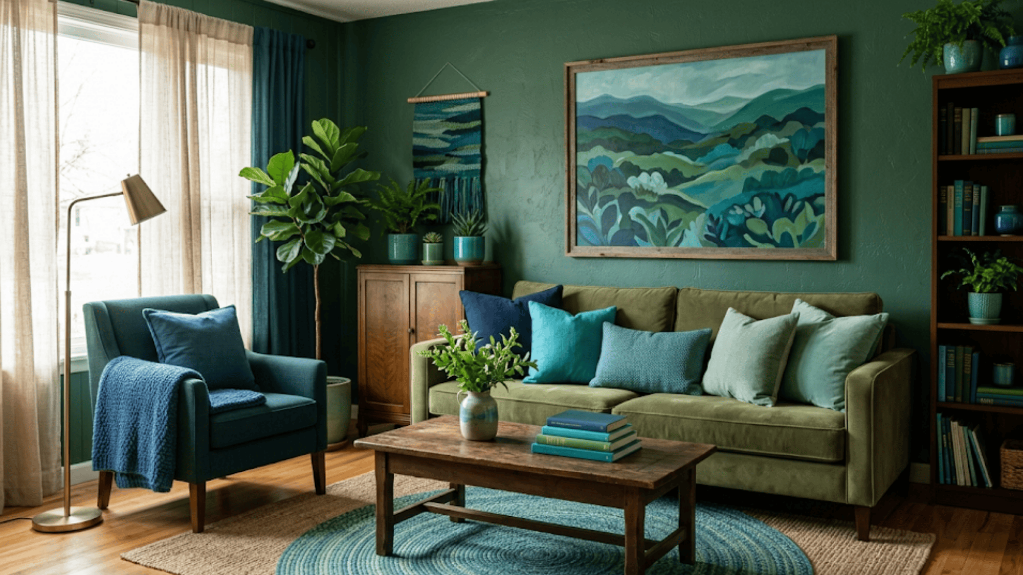
When I first started helping people pick colors for their homes, the question I heard most often was: “How do I know these colors will actually look good together?”
The answer, almost every time, came back to one simple principle: use colors that are already neighbors on the color wheel.
An analogous color scheme uses 2–5 colors that sit next to each other on the color wheel, like blue, teal, and green. Because these colors share similar undertones, they naturally match and don’t clash, creating a smooth, relaxing feel that’s hard to get wrong.
How Analogous Colors Work in Interior Design
The reason analogous colors feel so easy to work with comes down to how they’re built. They share underlying tones, so they blend instead of fight. That shared base is what color theory calls color harmony, and it’s what makes this scheme forgiving even for first-timers.
In practice, the approach is simple. Start with one main color on your largest surfaces; walls or big furniture. Then pull in 2–3 nearby colors through decor and fabrics to support it.
The 60-30-10 rule is how most designers structure the balance: 60% of the room in your main color, 30% in a supporting color, and 10% in a small accent.
A touch of black or white keeps the whole thing from feeling too soft or undefined.
One thing to watch: keep all your colors on the same side of the wheel, either warm or cool. Warm colors like red, orange, and yellow feel bright and cozy. Cool colors like blue, green, and purple feel calm and fresh. Mixing both sides tends to look off, even when the individual colors are nice on their own.
Analogous Colors 101 (Basics)
To use analogous colors well, it helps to know where they come from. Here’s a quick breakdown of how the color wheel is structured, and where analogous groups fit in.
All colors trace back to three primary colors: red, blue, and yellow. These are the base colors. You can’t make them by mixing anything else.
Mix two primary colors and you get a secondary color: orange, green, or purple.
Mix a primary with a nearby secondary and you get a tertiary color: red-orange, yellow-green, blue-green, and so on.
Analogous colors are simply neighbors within these groups, like blue, blue-green, and green. They sit close enough to share undertones, which is what makes them blend so naturally.
A standard analogous scheme uses 2–3 colors. An extended analogous scheme uses 4–5.
In large spaces, the wider range gives each zone of the room something slightly different to anchor it; a sitting area can lean toward one end of the palette while a reading corner leans toward the other. The space still feels cohesive, just not repetitive.
Pro variation — Accented Analogous: An accented analogous scheme uses similar colors plus one small opposite color for contrast. Green shades with a single red item, for example, adds a pop without breaking the calm. Use it when the room needs a focal point but you don’t want to lose the harmony.
Benefits of Using Analogous Colors in a Room
Analogous colors make it easier to design a room that feels calm and put together. They work well for both simple and detailed home styles.
| Benefit | What It Means |
|---|---|
| Creates a smooth and relaxing look | Colors blend well because they sit next to each other. The room feels calm and easy on the eyes. |
| Easy to match furniture and decor | Picking sofas, rugs, and curtains is simpler when the colors already work together. |
| Works in both small and large spaces | Can make small rooms feel more open and large rooms feel more connected. |
| Good for beginners in home design | The scheme is straightforward and forgiving; less room for color mistakes. |
| Works naturally with textures | Because the colors are similar, texture does the contrast work. Soft fabrics keep it calm; shiny surfaces make colors stand out. |
Best Analogous Color Combinations for Rooms
Choosing the right color mix can make a big difference in how a room feels. Here are the three main palette directions and how each one plays out in a real space:
1. Warm Color Combinations
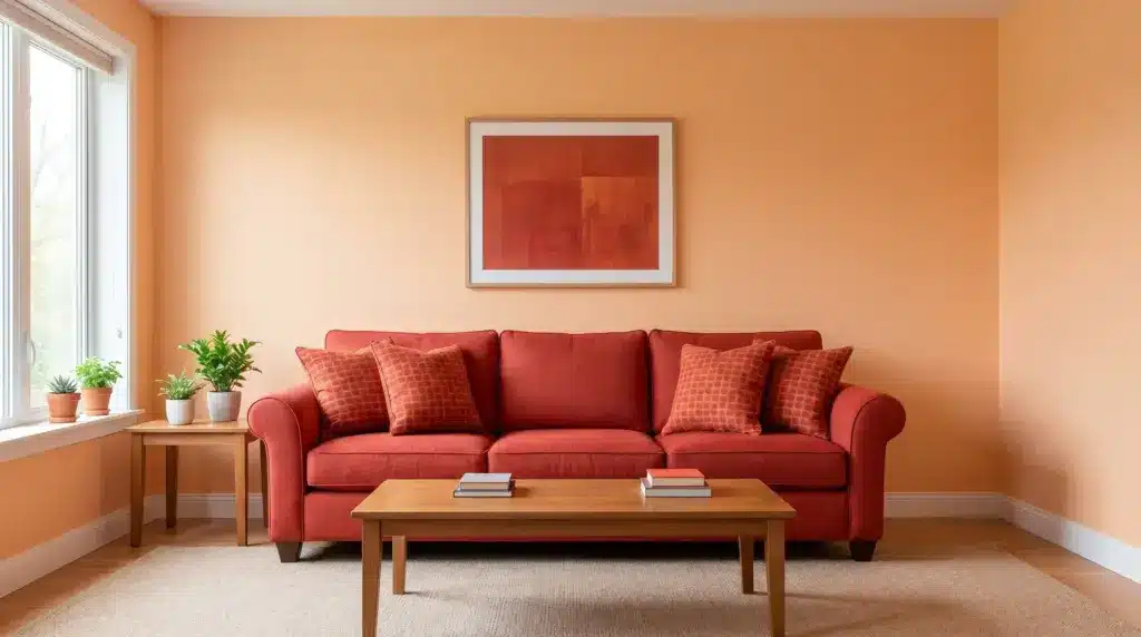
Warm colors make a room feel bright and full of life. A mix of red, red-orange, and orange gives a bold, cozy look that works well in living rooms and dining spaces.
For a softer version, try yellow, yellow-orange, and orange. The energy is still there, but it reads as happier and less intense.
Use your main warm color on the walls. Bring the others in through pillows, rugs, or art that way the room feels layered without being overwhelming.
Tone tip: Keep all shades at a similar depth, either all strong or all soft. Mixing very dark and very light warm shades in the same room tends to feel unbalanced rather than dynamic.
2. Cool Color Combinations
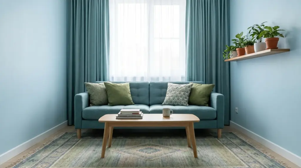
Cool colors help create a calm and fresh space. A mix like blue, blue-green, and green feels peaceful; these tones draw from nature and water, which is part of why they read as restful rather than stimulating.
You can also try green, teal, and blue for a clean, relaxed look. Use lighter shades on walls and bring in deeper tones through decor. That contrast in depth keeps the room from feeling washed out.
3. Neutral-Based Analogous Schemes
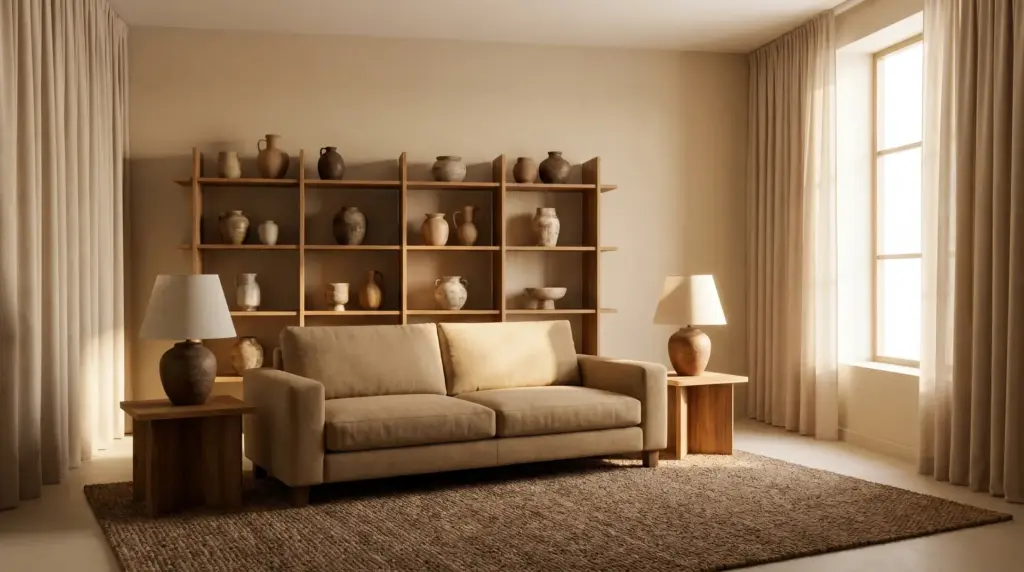
Neutral colors give a soft and simple look that fits almost any home. A mix like beige, tan, and warm brown makes the room feel warm and grounded.
For a cooler version, try gray, blue-gray, and soft blue. The feel is quiet and clean, works well in offices and bedrooms.
The key with neutrals: pick shades that share the same base tone, either all warm or all cool. Two neutrals that look similar on a chip can clash badly on a wall if one leans yellow and the other leans pink. Always check them side by side in your actual room light first.
How to Choose the Right Analogous Colors
The process doesn’t need to be complicated.
- Start with one base color: Pick a color you genuinely like and apply it to walls or large furniture. Everything else follows from this choice, so make it one you won’t tire of quickly.
- Use a color wheel for guidance: Find the colors sitting directly beside your base color. Those are your natural partners, they’ll match without effort.
- Pick shades across three values: Choose a light version for large surfaces, a medium tone for upholstery or big decor, and a darker shade for small accents. This range stops the room from looking washed out. When everything lands at the same lightness, the eye has nowhere to rest.
- Test with samples before committing: Try paint samples or fabric swatches in the actual room. A color that looks perfect in a store can shift significantly under different light.
- Find your palette from nature or art: Colors pulled from a photo, a rug, or a plant you already love tend to feel more personal than anything off a paint chart, and they’re already proven to work together.
- Check your light source: Warm bulbs (2700K–3000K) shift cool colors toward yellow and make warm ones glow. Cool bulbs do the opposite. Test your samples under the light the room actually uses.
Start with the base color and let the rest build from there. The more decisions you anchor to that first choice, the less overwhelming the whole process feels.
How to Use Analogous Colors in Different Rooms
The same palette logic applies across every room, but the way you weight the colors shifts depending on what the space needs to feel like. Here’s how it plays out room by room.
1. Living Rooms
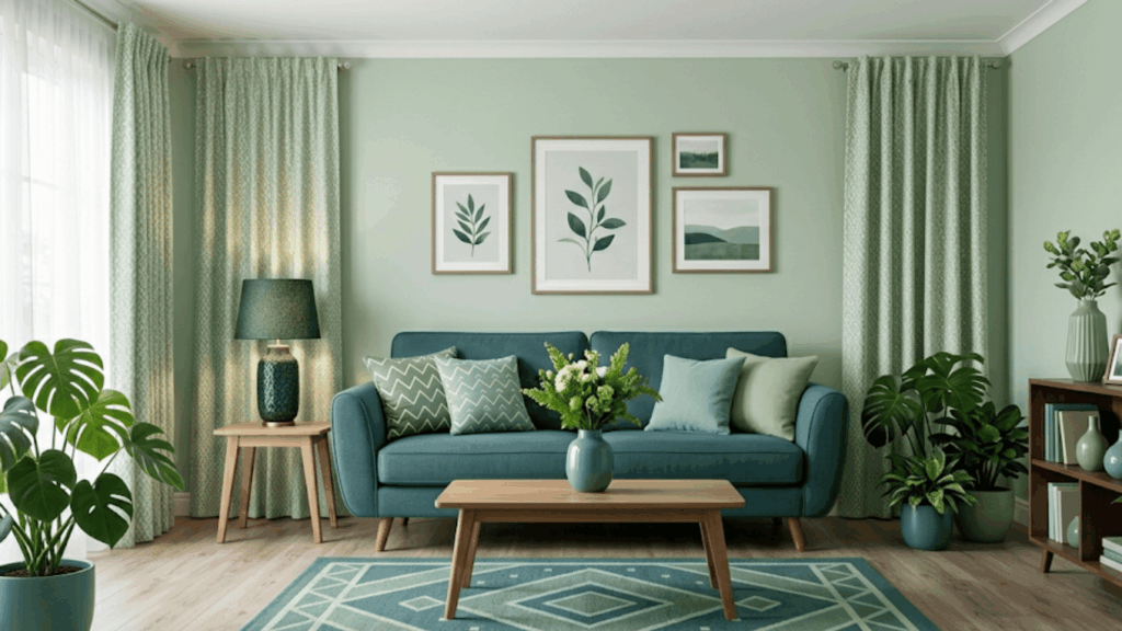
Use one main color on the walls to set the base. Then choose a sofa in a nearby color to keep things smooth. Add decor like lamps, frames, vases, and keep it in similar tones from the same group.
Cushions and rugs are where your third color comes in. Keep patterns simple so the space stays neat and the palette stays readable.
I once worked with a client who used sage walls, a teal sofa, and olive curtains, but the room felt off. When we made sage the main color, teal the support, and olive a small accent, the space looked balanced right away. The colors hadn’t changed. The proportions had.
2. Bedrooms
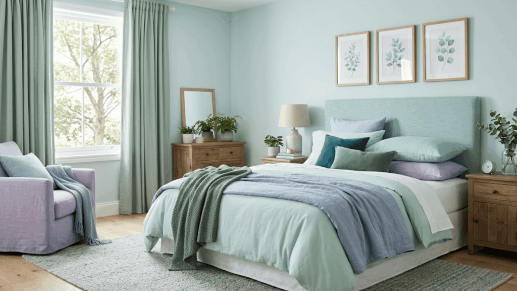
Soft tones work best here, light blue, sage green, or muted lavender on walls, bedding, and curtains. Keep everything within the same color group so the room reads as one cohesive space.
Bring in a slightly darker shade through pillows or a throw. That small shift in depth adds visual interest without making the room feel busy.
Avoid bright or saturated colors as your dominant choice in a bedroom. They tend to feel too active for rest. Keep the main color light and soft, then let the accent carry any stronger tone.
3. Kitchens
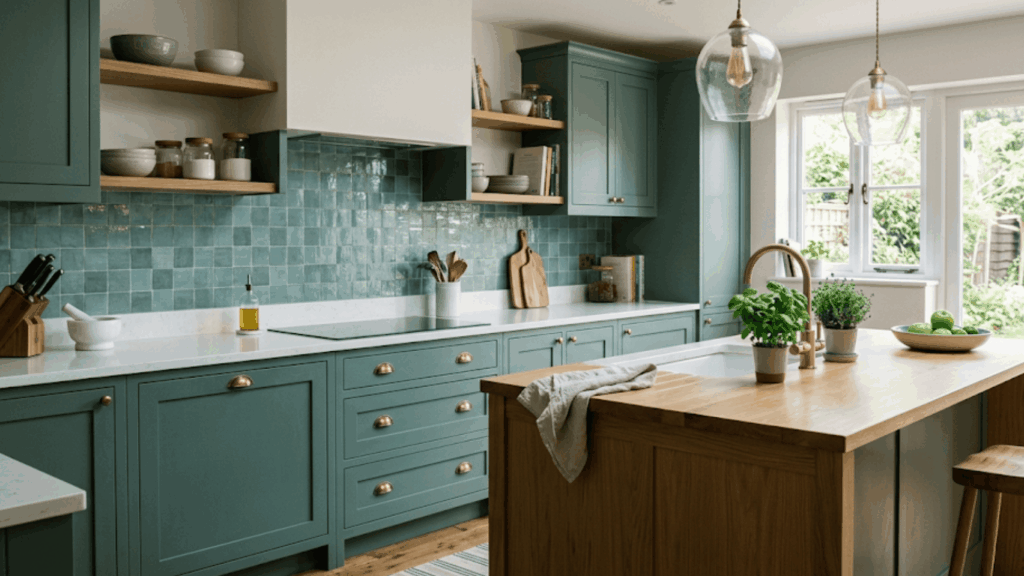
Kitchens work best with fresh, clean colors — nothing too warm or heavy. Green and teal are a popular choice because they feel natural without being cold.
Green cabinets with a blue-green backsplash is a combination that flows well and photographs cleanly. Add contrast through hardware, open shelving, or small decor pieces to keep the kitchen from feeling one-note.
One simple tip: Shiny surfaces make colors look stronger than they appear on flat samples. Always test a sample tile or cabinet door in the actual kitchen before making the final call.
4. Bathrooms
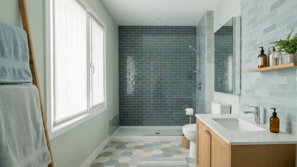
Light colors like soft blue, pale green, or warm gray make a bathroom feel fresh and open. Apply them across tiles, walls, towels, and mats to keep the look consistent.
Keep all shades close in value; avoid jumping from very light to very dark within the same small space. Since bathrooms are often compact and low on natural light, lighter tones do most of the work in making the room feel bigger.
One darker shade on a single wall or the floor adds depth without closing the space in.
Analogous Color Scheme Examples: Real Room Setups
Seeing real room setups makes it easier to understand how colors work together. Here are four common setups and how each one comes together in practice.
1. Cool Tone Room — Blue, Blue-Green, Green
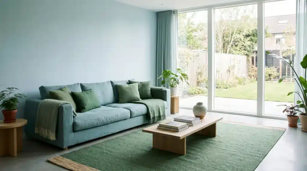
Walls in light blue, sofa in blue-green, cushions and rugs in green shades. These colors pull from nature and water, so the room feels calm without feeling cold. Good choice for bedrooms, reading nooks, or any space meant for rest.
2. Warm Tone Room — Red, Red-Orange, Orange
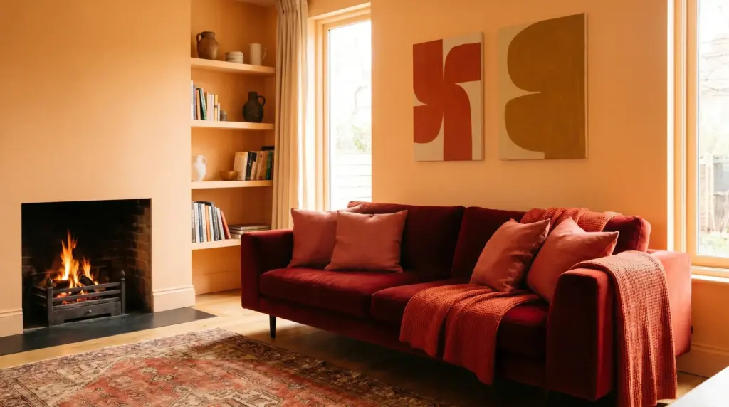
Walls in soft orange, sofa in red tones, decor in red-orange shades. Warm palettes like this bring energy and life into a space. They work best in social areas like living rooms and dining spaces where you want the room to feel alive.
3. Neutral Tone Room — Beige, Tan, Warm Brown
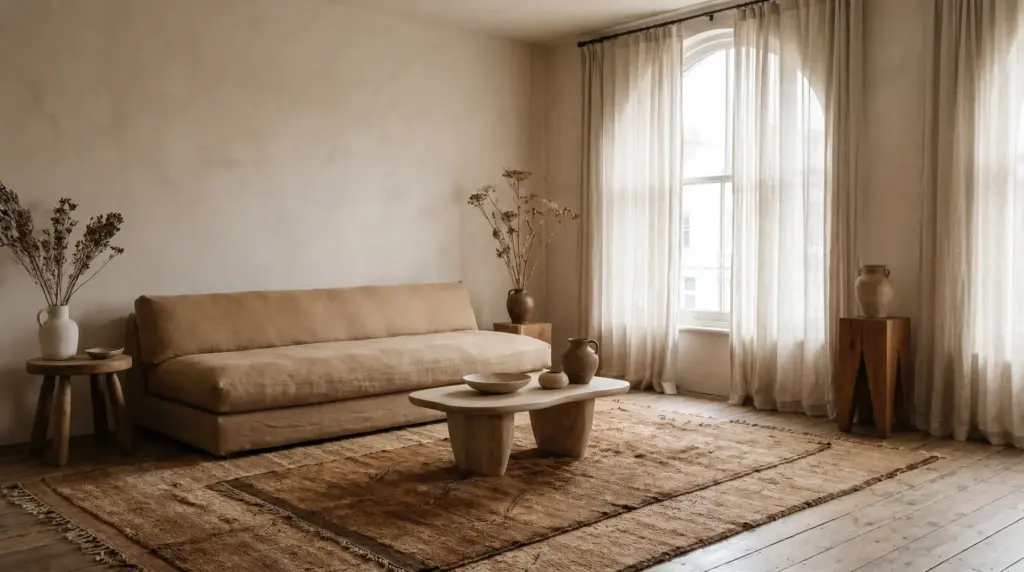
Walls in beige, furniture in tan, rugs and wood pieces in warm brown. Neutral analogous schemes are the easiest to live with long-term. The tones are close enough to feel cohesive but varied enough to keep the room from looking one-dimensional.
4. Accented Analogous Room — Blue-Green, Green, Yellow-Green + Red Accent
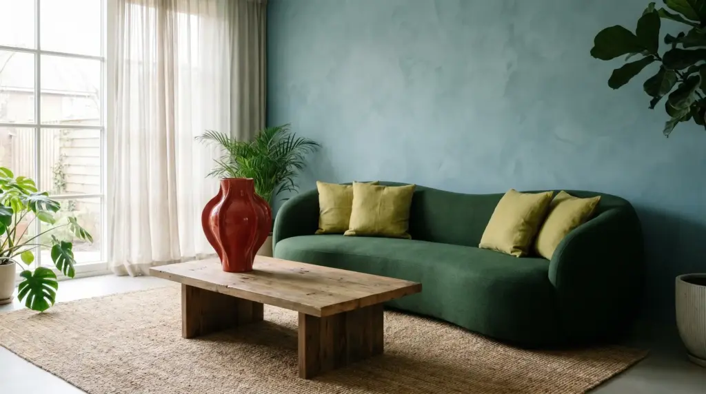
Soft blue-green walls, green furniture, one or two red items for focus. The analogous base keeps things calm, while the single red accent stops the room from feeling flat. Use it when the space needs a clear focal point without losing harmony.
Tips to Make Analogous Colors Look Better
The palette does most of the work, but a few small decisions determine whether the room looks intentional or just pleasant. These tips close the gap.
- Add texture (wood, fabric, metal): When all your colors are similar, texture does the work contrast usually does. A linen throw, a raw wood shelf, or a brushed metal lamp gives the eye somewhere to move without breaking the palette.
- Use white or black for contrast: A small area of white or black sharpens the edges of your palette. It makes the analogous colors read as intentional rather than accidental.
- Mix patterns carefully: Limit patterns to one or two within the same color group — stripes or a simple print work well. More than that and the patterns start competing instead of supporting each other.
- Use lighting to highlight colors: Natural light shows the truest version of your colors. Warm bulbs shift cool tones yellow; cool bulbs flatten warm ones. Check your palette under the light the room uses most before committing.
- Match undertones, not just colors: Two greens can look completely different if one is warm and one is cool. Check samples side by side in natural light; the undertone matters as much as the hue.
- Let nature guide your palette: Colors found in trees, sky, or sunsets already work together. If you’re stuck, start there, nature doesn’t clash.
None of these require extra budget or a design background. They’re small adjustments that make an already-good palette look deliberate.
Analogous vs. Other Color Schemes
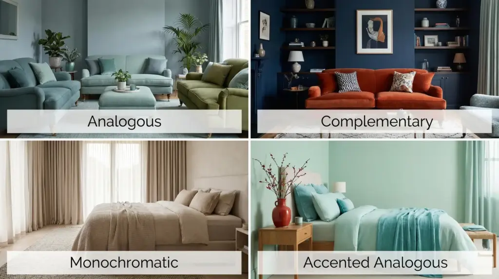
Analogous is one of several color schemes you’ll come across in home design. Understanding how it compares helps you confirm it’s the right fit or know when to reach for something else.
| Color Scheme | Analogous | Complementary | Monochromatic | Accented Analogous |
|---|---|---|---|---|
| Definition | Colors next to each other on the wheel, like blue & green | Opposite colors, like blue & orange, for strong contrast | One color in varying shades, like light & dark blue | Nearby colors with one small opposite color for contrast |
| Look & Feel | Calm, smooth, balanced | Bold, high contrast, energetic | Clean, uniform, minimal | Mostly calm with a subtle focal point |
| Number of Colors | 2–3 | 2 | 1 (shades) | 2–5 (plus accent) |
| Best For | Bedrooms, living rooms, relaxed spaces | Bold spaces needing visual tension | Simple, minimalist rooms | Rooms that need calm with a subtle highlight |
| When to Use | When you want a soft, harmonious look | When you want bold contrast & energy | When you want a uniform, streamlined feel | When you want calm with a single focal point |
Common Mistakes to Avoid
Small mistakes can make even good color choices look wrong. These are the ones that come up most often and the easiest to fix before they become a problem.
- Mixing warm and cool colors: Warm and cool colors together make the room feel unsettled. Keep all your colors on one side of the wheel, either warm or cool for the scheme to hold together.
- Ignoring the finish: The same color looks soft in matte and sharp in gloss. A glossy finish in a bathroom can make a pale blue feel electric rather than calm. Always factor in the finish alongside the color.
- Forgetting the floor color: Floors cover a lot of surface area. Wood tones, tile colors, and carpet all carry strong hues that will interact with your wall and decor choices. Start with the floor color as a fixed point, then build around it.
- Not testing colors in room light: Store lighting is almost never the same as home lighting. Paint a sample patch on your actual wall and check it at different times of day before deciding.
Most of these mistakes happen before a single drop of paint goes on the wall. Catching them at the planning stage saves a repaint.
Conclusion
An analogous color scheme is one of the easiest ways to make a space look calm and well put together. The colors sit close on the wheel, so they blend naturally, no guesswork needed.
If you’re just starting, keep it simple: one main color, two close neighbors, and the 60-30-10 rule to guide the balance. Build from there once you’re comfortable.
Start with a color you already love, find its two closest neighbors on the wheel, and test them together before committing. Most people find the hardest part is just picking a starting point, after that, the scheme tends to build itself.
Frequently Asked Questions
How Many Colors are in an Analogous Scheme?
An analogous scheme usually uses 3 to 5 colors that sit next to each other on the color wheel. This keeps the look smooth and easy to match.
Is an Analogous Color Scheme Good for Small Rooms?
Yes, it works well for small rooms because the colors blend smoothly. This can make the space feel more open, light, and less crowded.
Can Bold Colors Be Used in an Analogous Room?
Yes, you can use bold colors, but keep them balanced with softer shades. This helps the room look neat; neither too bright nor overwhelming.
Does Analogous Work with an Open-Plan Layout?
Yes, it works very well in open spaces. Using similar colors in each area keeps the whole space feeling connected and smooth, rather than broken up into mismatched zones.