")
Looking for a paint color that feels both grounded and rich? Cinnamon Slate by Benjamin Moore might be the perfect fit.
This deep, earthy shade blends warm cinnamon tones with a muted, slate-like softness, creating a balanced color that feels cozy without being overwhelming.
If you’re updating a living room, accent wall, or even kitchen cabinets, Cinnamon Slate brings a sense of warmth and style to any space.
I first came across it while searching for a bold yet livable color, and it instantly stood out. It pairs beautifully with creamy neutrals, dark woods, and even brass finishes, making it incredibly versatile.
If you’re drawn to nature-inspired hues with a modern edge, this one deserves a closer look. In this blog, I’ll walk you through its undertones, LRV, room ideas, and the best colors to pair with it.
Why Cinnamon Slate Is an Ideal Paint Color?

- Benjamin Moore Code: 2113-40
- HEX: #7F5C5A
- LRV: 12.35
This shade feels rich but not too dark. It adds color without being too bold. You won’t need to worry about it feeling flat or harsh. Cinnamon Slate works in many spaces. It’s flexible and easy to use.
Cinnamon Slate fits both modern and classic designs. It pairs well with clean lines and simple furniture, vintage pieces, wood tones, soft fabrics, and warm lights. It’s a color that supports the space, without taking over.
You don’t need bright furniture to make it work. Even simple, neutral pieces stand out against it. That’s part of what makes this color easy to live with.
Understanding the Subtle Undertones of Cinnamon Slate
Cinnamon Slate isn’t just one solid color. It has layers. A plum undertone gives it a soft hint of purple. At the same time, a warm, brown undertone keeps it grounded.
These two tones work together to create a rich color that feels luxurious without being too bold.
Lighting plays a significant role in determining how this color appears. In natural light, Cinnamon Slate can shift depending on the time of day.
Morning light may make it feel cooler and more muted, while late afternoon sun brings out its warmth.
Artificial light changes things, too. Cool bulbs may bring out more of the purple side. Warm bulbs accentuate the brown tone.
Because of this, it’s a good idea to test the color in your space before painting. Try it on different walls and check it at various times of day. That way, you’ll know exactly how it will look.
Best Places to Use Cinnamon Slate in Your Home
Cinnamon Slate creates a warm and inviting atmosphere, adding a touch of mood and style to your home. It works well in many rooms. It adds warmth without being too loud.
Bedrooms
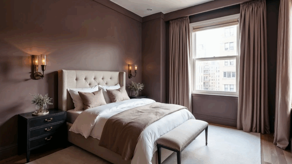
This color feels cozy, calming, and grounding – everything I want in a bedroom at the end of a long day. It creates a restful atmosphere that helps you relax, unwind, and clear your mind.
The warm, muted tones of Cinnamon Slate bring a sense of comfort without being too dark or heavy. When paired with soft bedding, neutral textiles, and warm, low lighting, it turns the room into a peaceful retreat.
It’s a great option if you’re aiming for a space that feels restful but still has a rich, stylish presence. Whether your decor is modern, traditional, or somewhere in between, this shade adapts beautifully and supports a soothing, uncluttered vibe.
Living Rooms

In living rooms, Cinnamon Slate creates a warm and inviting backdrop that feels both stylish and grounded. It pairs beautifully with soft, textured fabrics like cotton, wool, or velvet – materials that add comfort and depth.
This color brings a cozy richness to the space without feeling too dark, especially when balanced with lighter elements. I recommend adding warm lighting, like table lamps or wall sconces, to enhance the earthy undertones.
A light-colored rug can help soften the look and keep the room feeling open. Together, these touches create a welcoming, lived-in space that feels just right for relaxing or hosting friends.
Dining Rooms
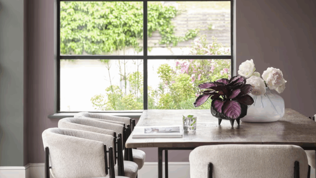
Cinnamon Slate adds a rich sense of depth to dining rooms, making the space feel more grounded and intimate. It’s a great color choice if you want your dining area to feel warm and focused without being too bold.
The earthy tone pairs beautifully with natural wood tables, enhancing the organic look and feel of the room. I’ve found that it also complements brass or matte black accents, whether it’s in light fixtures, curtain rods, or table settings.
These finishes bring a subtle contrast and elegance, helping the color shine while keeping the overall vibe relaxed and welcoming.
Powder Rooms
A small space is a perfect place to try a bolder color, and Cinnamon Slate really shines here. It adds instant style and makes the area feel thoughtful and complete. I love how it brings personality without overwhelming the room.
To keep the space feeling open, pair it with light-colored tile, pale flooring, or well-placed mirrors. These elements reflect light and balance out the deeper wall color.
Whether it’s a powder room, entryway, or reading nook, Cinnamon Slate brings warmth and richness that make even the smallest spaces feel special.
Flooring Options That Pair Well with Cinnamon Slate
The right floor can bring out the best in Cinnamon Slate. Because this color is deep and warm, it works with both light and dark floors.
- Light Oak or Maple: These woods add a contrasting tone. They help brighten the room and keep things feeling open. This combo works well in smaller spaces or rooms that receive limited sunlight.
- Rich Walnut or Espresso: For a more moody look, opt for a darker wood tone. Walnut or espresso adds depth, making the space feel cozy. Balance it with light-colored rugs or trim to prevent it from becoming too dark.
- Natural Stone or Beige Tile: Stone or tile floors in warm beige or tan look great next to Cinnamon Slate. They give the room a grounded, earthy feel. This works well in entryways, kitchens, or bathrooms.
- Soft, Warm Gray Carpet: A warm gray carpet adds comfort without clashing. It’s a good choice for bedrooms or living rooms. Look for grays with a brown or taupe tint to match the tone of the walls.
Trim and Ceiling Colors to Use with Cinnamon Slate
When I was choosing trim and ceiling colors to go with Cinnamon Slate, I realized how much they affect the final look of a room. The right white can either make the wall color pop or create a soft, seamless transition.
| Paint Name | Use | Tone | Why It Works with Cinnamon Slate |
|---|---|---|---|
| Chantilly Lace OC-65 | Trim & Ceiling | Bright, Crisp White | Offers strong contrast and a modern, clean frame around the color. |
| Simply White OC-117 | Trim | Soft, Warm White | Still fresh, but with a subtle warmth that complements Cinnamon Slate’s undertones. |
| White Dove OC-17 | Trim | Creamy Off-White | Gentle contrast; adds softness and warmth without looking yellow. |
| Cloud White OC-130 | Trim | Soft Off-White | A mellow, cozy option for a more traditional or muted look. |
| Flat Ceiling White | Ceiling | Neutral True White | Keeps the ceiling unobtrusive, helping the wall color stand out. |
These are the shades I found work best with Cinnamon Slate. I personally love Chantilly Lace for that crisp edge, but when I wanted something softer, White Dove really hit the mark.
I also stick with a flat ceiling white – it keeps the focus where I want it and helps the space feel more open. Picking the right whites made a big difference, and I hope this list helps you get it just right too.
Colors That Match Cinnamon Slate
Cinnamon Slate works well in multi-color palettes. You can use it as a main color or an accent. It blends seamlessly with both soft and bold tones, depending on the desired mood.
- Warm creams: soften the space and add brightness
- Dusty mauves: pull out the plum undertone in a quiet way
- Soft grays: keep things calm and cool
- Deep charcoals: add drama without clashing
Cinnamon Slate Compared to Other Warm Neutral Paints
Cinnamon Slate stands out because of its balance between plum and brown. But there are other colors in the same family.
| Paint Color | Tone | Undertones | How It Differs from Cinnamon Slate |
|---|---|---|---|
| Cinnamon Slate 2113-40 | Deep, muted, warm neutral | Plum + brown | Balanced mix of color and warmth; rich but not overpowering |
| Mauve Desert 2113-50 | Lighter, softer neutral | Pink + beige | Brighter and more delicate; less grounded, more airy |
| Sparrow AF-720 | Medium-dark earth tone | Brown + gray | Has no plum tone; feels more muted and rustic |
| Shadow 2117-30 | Deep, bold color | Purple | More dramatic and moody, lacks the brown warmth of Cinnamon Slate |
| Pashmina AF-100 | Soft greige | Beige + gray | Much lighter, more neutral, with little color depth |
Conclusion
Cinnamon Slate brings a lot to a room without being loud. It’s rich in color but still soft. The blend of plum and brown gives it a calm, earthy feel. It’s a color you can use every day without getting tired of it.
This shade works in many spaces. It’s great for bedrooms, living rooms, dining areas, and even powder rooms.
Whether your home is modern or more traditional, Cinnamon Slate fits right in. It can look clean and simple or warm and layered, depending on what you pair it with.
It also complements both light and dark finishes well. Light wood or white trim makes it feel fresh and inviting. Darker tones, such as walnut or charcoal, bring out its depth.
If you’re looking for a color that’s understated but full of depth, this is a strong option. It doesn’t overpower the room. Instead, it adds balance and warmth in a subtle, thoughtful way.