
I used to think terracotta tiles were old-fashioned. The first time I saw them in a friend’s kitchen, I imagined something out of a 1970s ranch.
But then I moved into a home with warm, sun-baked terracotta floors and fell in love. They’ve got this cozy, grounded vibe, like a hug from the earth.
At first, I had no clue what colors would work with them. I painted a wall gray and instantly regretted it. That’s when I went deep into figuring out what actually looks good with terracotta.
In this guide, I’ll walk you through everything I learned: color palettes that work, what to avoid, how to match by room, and even how lighting changes things.
If you’re wondering what goes with terracotta tiles and how to style your space around them, this will help.
Understanding the Character of Terracotta
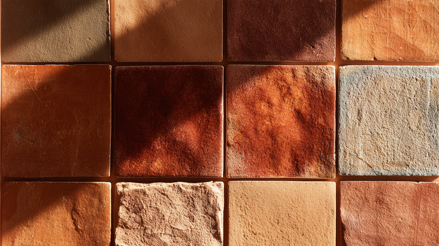
Terracotta is made from natural clay that’s been fired in a kiln. That’s where it gets those reddish-orange tones, from the iron in the clay. The look is warm and earthy.
You’ll usually see it in:
- Matte finishes (dull, rustic)
- Glazed options (shinier, more refined)
- Aged or handmade styles (with more texture and color variation)
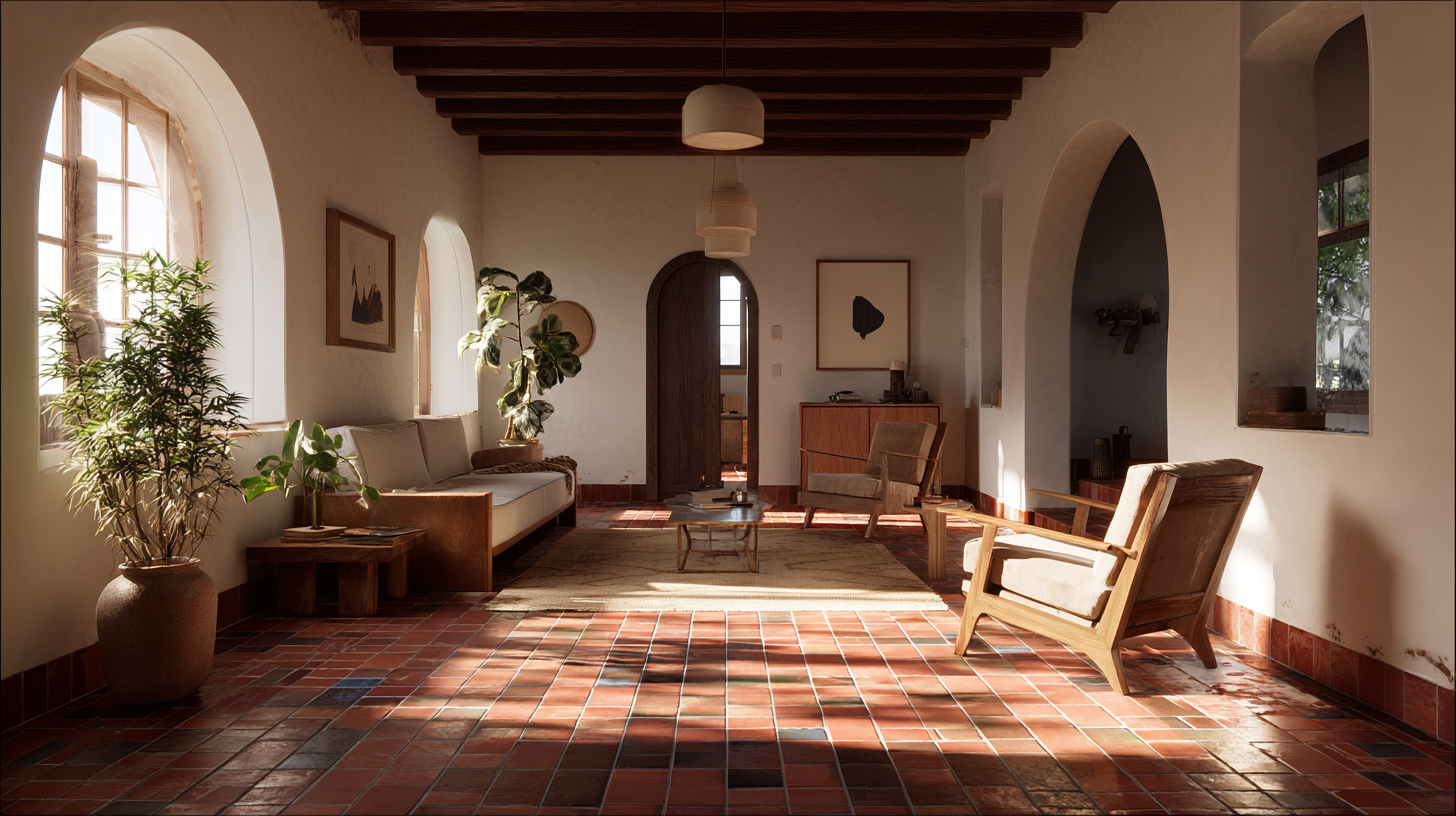
Terracotta pairs well with design styles like: Mediterranean, Spanish Colonial, Southwestern, Boho, and Rustic farmhouse
It brings warmth into the room, so the trick is to choose colors that either match that energy or cool it down without clashing.
Colors that Go Well with Terracotta Floor Tiles
Terracotta floor tiles bring warmth and rustic charm to any space, making them a timeless design choice. To enhance their natural beauty, pairing them with the right colors is essential.
1. Warm White
This white has a soft, creamy feel that works beautifully with the warmth of terracotta, creating a balanced, inviting atmosphere.
It keeps the space bright without looking too sharp or cold, making it perfect for spaces that need warmth and light.
This shade is ideal for walls, ceilings, and trim, offering a subtle elegance that complements a variety of color schemes and design styles.
2. Cream
Cream is cozy and incredibly versatile, making it easy to work with in any space. It blends seamlessly into the background, providing warmth and softness without overwhelming the room.’
This gentle hue creates a calming, inviting atmosphere that enhances other colors while maintaining a subtle presence.
Use it for curtains, paint, or bedding to add a touch of warmth and texture. Cream is perfect for creating a serene environment and can be paired with both bold and neutral tones to achieve a balanced, harmonious look.
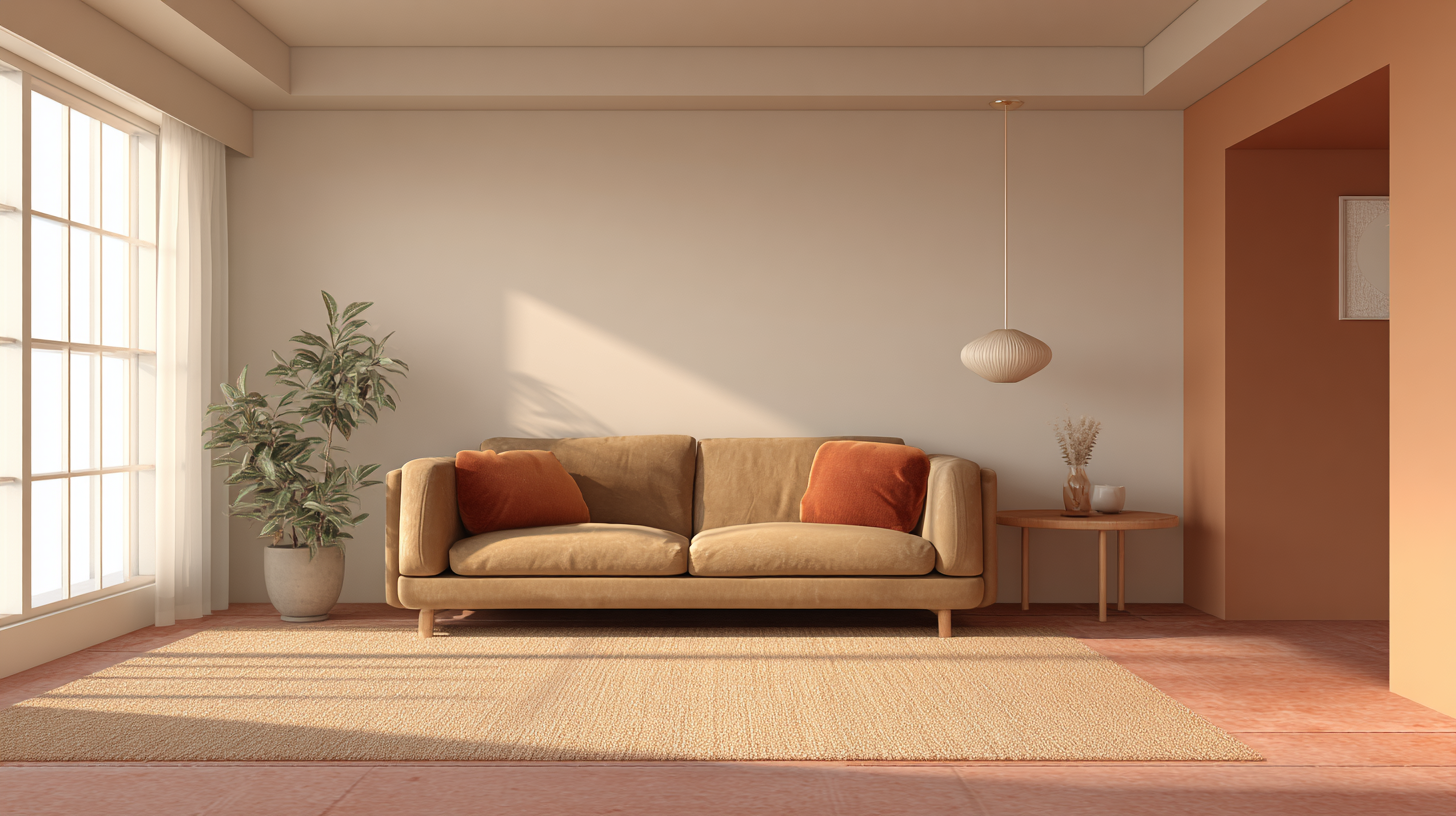
3. Beige
Beige feels calm and natural next to terracotta floors, providing a soothing balance without stealing the spotlight.
This versatile shade is perfect for creating a relaxed, inviting space. You’ll often see it used on sofas, walls, or large rugs, where it helps to ground the room and bring a sense of comfort.
Beige pairs beautifully with various colors, making it an excellent choice for those looking to enhance their space with subtle elegance.
4. Taupe
Taupe adds a bit more depth than beige, offering a subtle richness that complements its earthy feel. With just enough gray to cool things down slightly, it creates a balanced, neutral tone that works well in a variety of settings.
This color pairs well with both wood and metal finishes, enhancing the natural warmth of wood while providing a sleek contrast to cooler metal tones.
Taupe is perfect for creating a sophisticated yet grounded atmosphere in any room, making it an ideal choice for furniture, walls, or accessories.
5. Greige
Greige is a subtle fusion of gray and beige, offering a neutral base that effortlessly balances warmth and coolness. Ideal for larger surfaces like walls or furniture, greige adds an understated elegance to any space.
Its versatility allows it to seamlessly integrate with other colors, making it a perfect choice for creating a calm, welcoming environment with a modern touch.
Whether used in a living room or bedroom, greige provides a perfect backdrop for various design elements.
6. Olive Green
Olive introduces a muted, nature-inspired hue that adds a calming, grounded vibe to any space. Its earthy tone creates a peaceful atmosphere without overwhelming the room.
Olive pairs beautifully with other natural colors and textures, making it perfect for kitchen cabinets, planters, or throw pillows.
This shade works well in both modern and rustic settings, enhancing the overall warmth and inviting feel of the space.
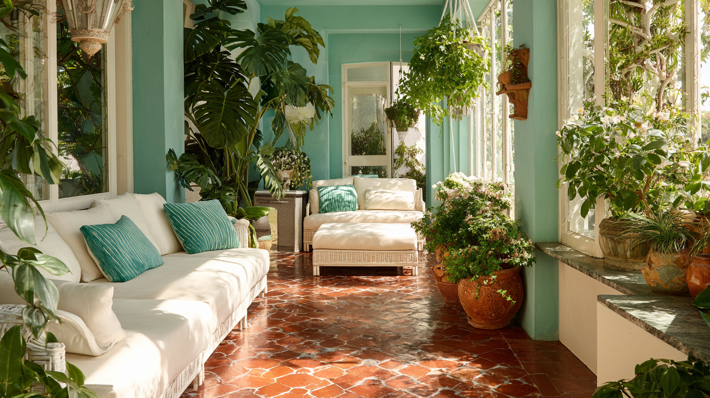
7. Sage Green
Sage offers a soft, slightly silvery tone that creates a gentle contrast with terracotta, adding freshness without feeling too cool.
Its subtle hue brings a light, airy quality to any space, making it perfect for walls, textiles, or decor. Sage pairs nicely with warm colors, enhancing the room’s natural charm while maintaining a serene atmosphere.
Whether used on large surfaces or smaller accents, sage brings a refreshing touch that balances well with earthy tones, creating a calm and inviting environment.
8. Forest Green
This deep green exudes a bold yet earthy vibe, adding drama without being overly flashy. It’s perfect for creating a striking presence in your space while maintaining a grounded, natural feel.
Use it in smaller areas like picture frames, vases, or dining chairs to introduce a rich pop of color that complements both rustic and modern elements.
This shade brings sophistication and depth to your decor, making it an ideal choice for accent pieces that stand out subtly, enhancing the overall ambiance without overwhelming the room.
9. Mustard Yellow
Mustard brings a warm, cheerful pop of color that’s lively without being too overpowering. It enhances the golden undertones of terracotta, creating a cozy and inviting atmosphere.
This rich hue works wonderfully in accents like pillows, rugs, or art, where it adds just the right amount of warmth and personality.
Mustard complements both bold and neutral tones, helping to tie together various elements in the room while maintaining a welcoming, relaxed vibe.
10. Ochre
Ochre, with its deeper golden hue, adds a rich, earthy tone that complements terracotta beautifully. It creates a layered, desert-inspired aesthetic, bringing warmth and depth to any room.
Ochre’s bold yet inviting presence works well in accents like throw pillows, rugs, or art, and can even be used on feature walls to make a striking statement.
Its warm undertones blend effortlessly with terracotta, enhancing the overall warmth of the space while adding a rustic touch.
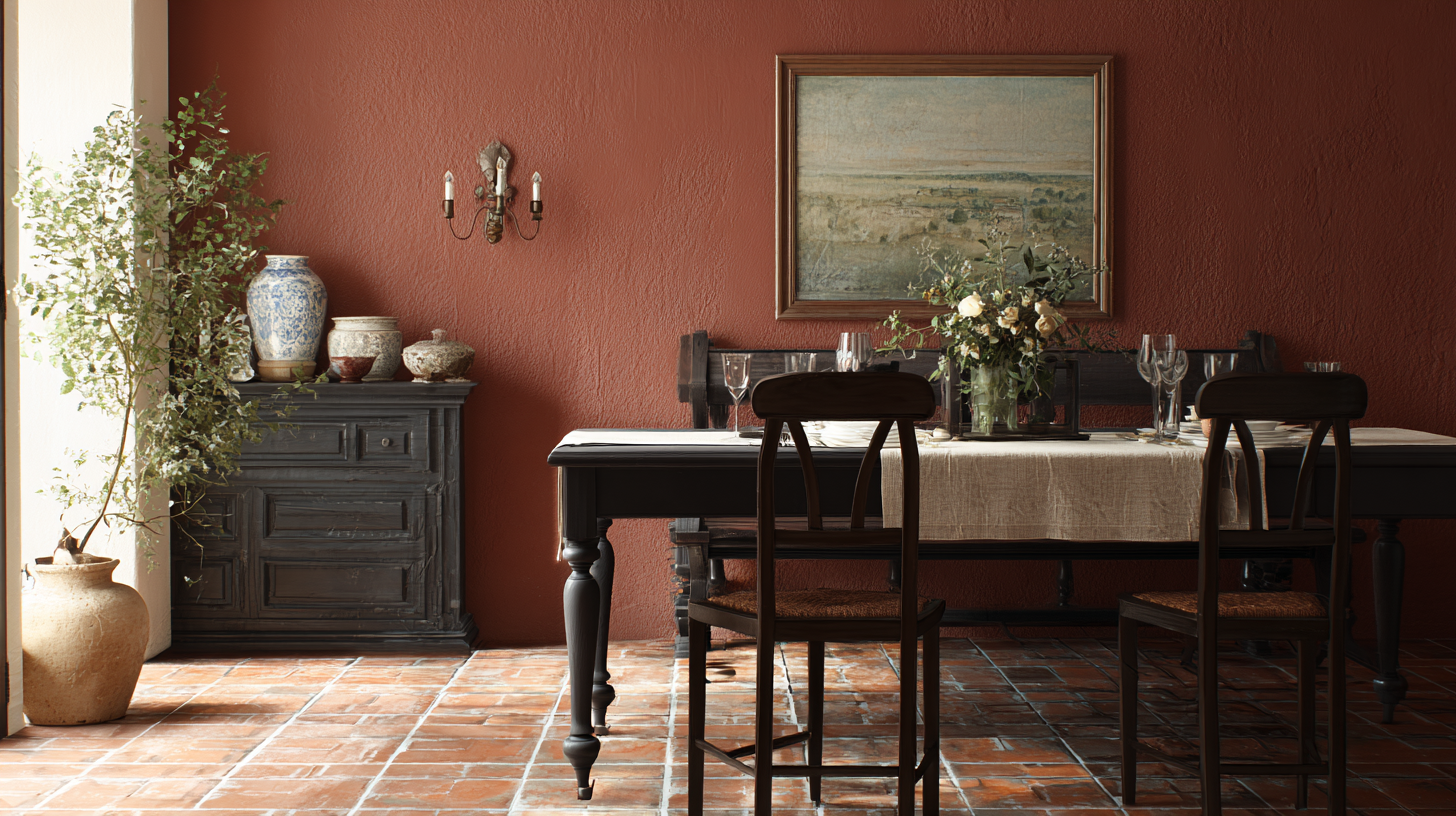
11. Burnt Sienna
Burnt sienna, a deeper and moodier shade than terracotta, brings a rich, earthy warmth to any space.
Layering this color with similar tones adds complexity and depth, creating a cozy, inviting atmosphere.
It’s a fantastic choice for textiles like throw blankets or cushions, as well as pottery or vases, where its boldness can shine without overwhelming the room.
12. Blush Pink
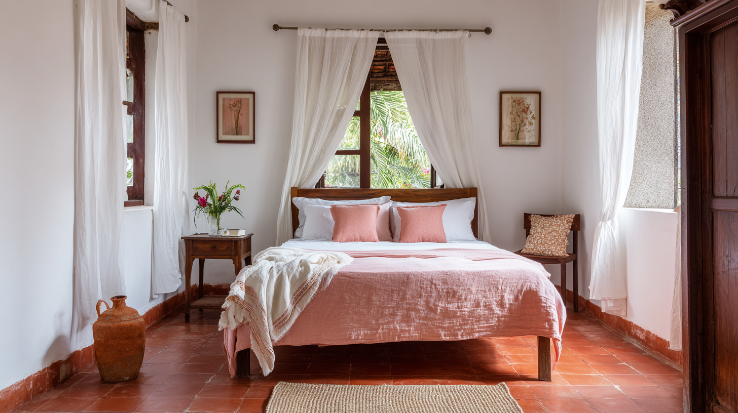
Blush adds a soft, light touch that effortlessly complements terracotta without overpowering it.
This delicate hue brings a gentle, modern feel to the space, enhancing the warmth of terracotta while keeping the atmosphere light and airy.
Blush works beautifully in accents like pillows, bedding, or artwork, where it can introduce a subtle pop of color that balances warmth with a refreshing, contemporary vibe.
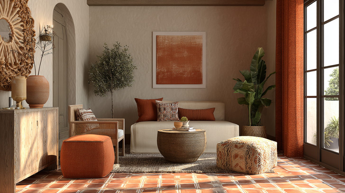
13. Coral
Coral offers a playful yet grounded touch when paired with terracotta, bringing energy to the space without overwhelming it.
It introduces just the right amount of color and character, creating a dynamic contrast while maintaining a balanced, earthy feel.
Coral works wonderfully if you’re looking to inject more energy into the room without veering into overly bright tones, making it an ideal choice for adding a lively yet harmonious touch to your decor.
14. Tan
Tan is a simple, neutral tone that effortlessly blends with other colors, keeping the space looking natural and cohesive.
It adds warmth and subtlety without drawing too much attention, making it a versatile choice for various design elements.
Whether used in furniture, rugs, or walls, tan provides a soft backdrop that complements both bold and muted hues.
15. Navy Blue
Navy creates a strong contrast that feels clean and sophisticated, adding depth and structure to the space without being overwhelming.
Use navy in cabinets, textiles, or framed art to introduce a refined touch that balances well with lighter tones like terracotta.
This deep, versatile hue brings both elegance and warmth, offering a striking contrast without feeling too harsh or stark. It’s perfect for adding visual interest and a polished look to your decor.
16. Teal
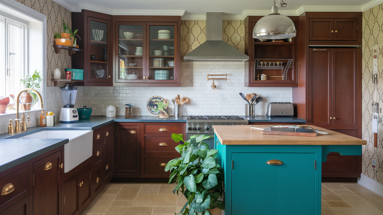
Teal blends blue and green tones to cool the space just enough while maintaining a balanced and rich feel. Its depth and vibrancy work harmoniously with terracotta, adding a refreshing touch without clashing.
Teal’s calming yet striking nature makes it ideal for use in small doses, such as accents or furniture pieces.
It enhances the earthy warmth of terracotta while introducing a cool contrast that keeps the space lively and inviting.
17. Turquoise
Turquoise brings a breezy, fresh feel to the room, offering a vibrant yet calming contrast to terracotta.
Its rich depth allows it to stand out without overpowering the warmth of terracotta, maintaining a light and inviting mood.
This color works beautifully in decor pieces like vases, cushions, or tiles, adding a touch of vitality and elegance.
18. Charcoal Gray
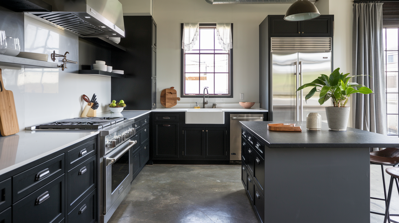
Charcoal provides a deeper, dramatic edge to the space without feeling cold or harsh.
Its muted intensity makes it perfect for adding depth, especially in small doses like metal finishes, mirrors, or furniture legs.
Charcoal offers a moody, sophisticated vibe that balances well with lighter tones, creating a striking contrast without overwhelming the room.
19. Chocolate Brown
This deep brown brings a solid, comforting presence to any room, complementing the earthy tones of terracotta while maintaining its distinct character.
Its rich depth adds warmth without blending too closely with terracotta, creating a balanced and grounded atmosphere.
Perfect for furniture, wood trim, or accent pieces, this color adds a sense of stability and timeless appeal.
20. Dusty Blue
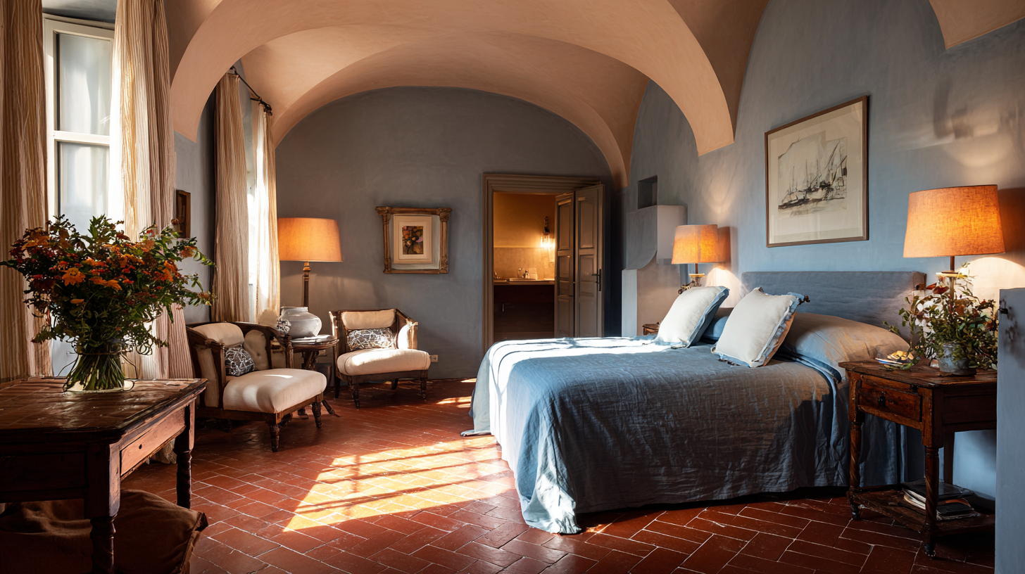
Dusty blue offers a soft, faded tone that complements terracotta without competing with its boldness.
It cools the space in a subtle, calming way, creating a gentle contrast that balances the warmth of terracotta.
This muted shade works wonderfully in textiles like throw pillows, curtains, or bedding, as well as in decorative pieces like vases or artwork.
21. Warm Gold
Gold introduces a touch of shine that enhances the warmth of your color palette without overpowering it.
Brushed or aged gold finishes offer a more refined, subtle look compared to bright yellow gold, creating a sophisticated atmosphere.
Gold pairs seamlessly with earthy tones like terracotta, providing a balanced, warm contrast that enhances your space’s overall style. It’s the perfect way to add depth and interest to your decor.
22. Rust
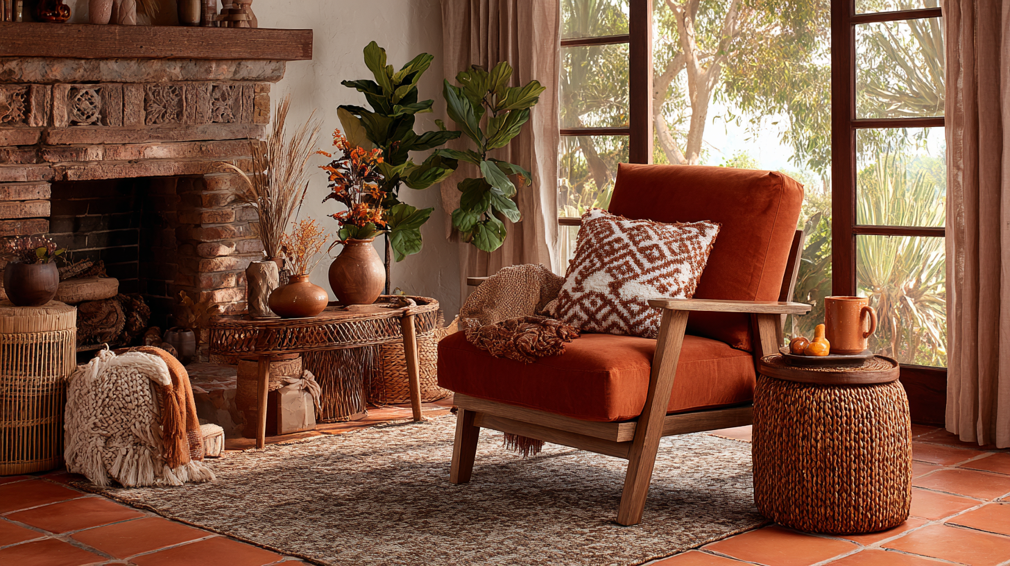
Rust is a deeper, more grounded version of terracotta, with added brown tones that create a warm, rich layer without being too overpowering.
It blends smoothly into the color scheme, enhancing the earthy feel of terracotta while offering a subtle contrast.
This color is perfect for throw blankets, cushions, or planters, where it adds depth and texture to the space.
23. Terracotta (Layered)
Using terracotta in layers can work beautifully. Combine lighter and darker shades of it through fabrics, tiles, or ceramics to create a warm, textured look.
It keeps things cohesive without feeling flat.
By choosing complementary shades, you can highlight the rich tones of terracotta while creating a harmonious ambiance. The right color palette will elevate your space and showcase the tiles beautifully.
Colors to Avoid with Terracotta Floor Tiles
Not every color works with terracotta. Some shades feel too sharp, cold, or out of place next to their warm, natural tone. These are a few you’ll want to use carefully or skip altogether.
- Cool grays: Too cold and make terracotta look flat
- Neons: Too bright and clash with the earthy tone
- Pure black: Feels harsh unless softened with warm textures
- Pure white: Too stark and creates a sharp contrast
- Silver: Looks too sleek and modern against rustic tiles
- Bright purple: Overpowers and feels out of place
- Bright red: Competes with terracotta instead of complementing it
If you really like any of these colors, keep them small and balance them with warmer elements. Terracotta does best when it stays the focus, not when it has to compete.
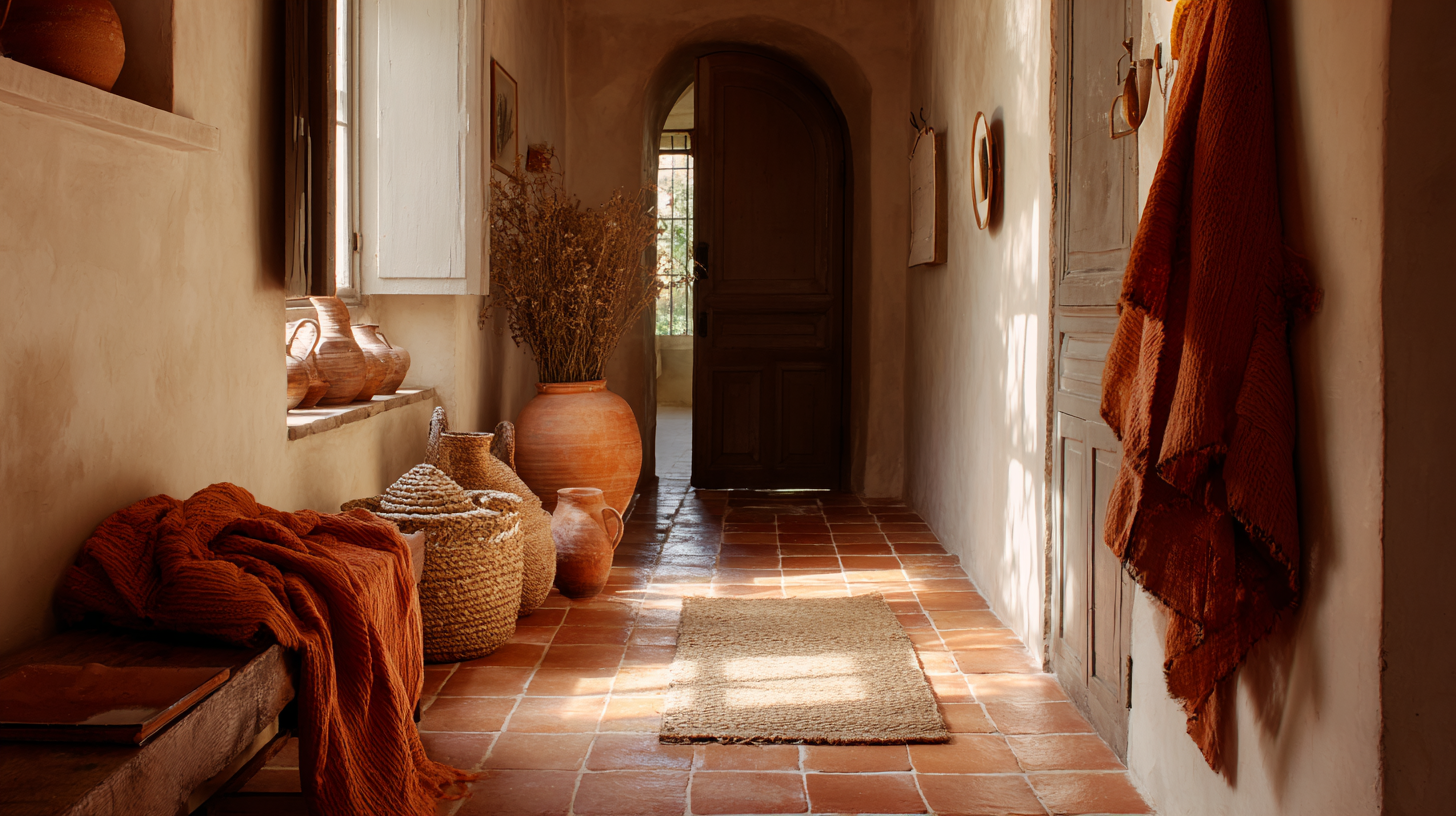
How to Style Terracotta Tiles in Every Room
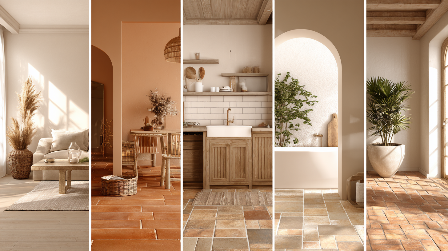
Each room has its own light, layout, and feel, so terracotta tiles won’t look the same everywhere. Match colors and materials to the space to help the tile feel connected and natural.
| Room | How to Use Color with Terracotta |
|---|---|
| Living Room |
Use warm white or cream walls with navy, olive, or mustard accents Add wood or rattan furniture with plants or textured throws |
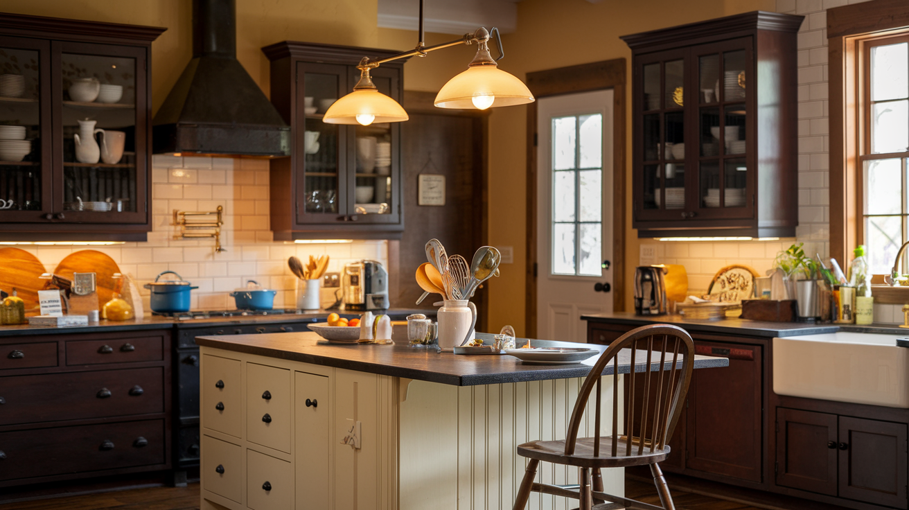
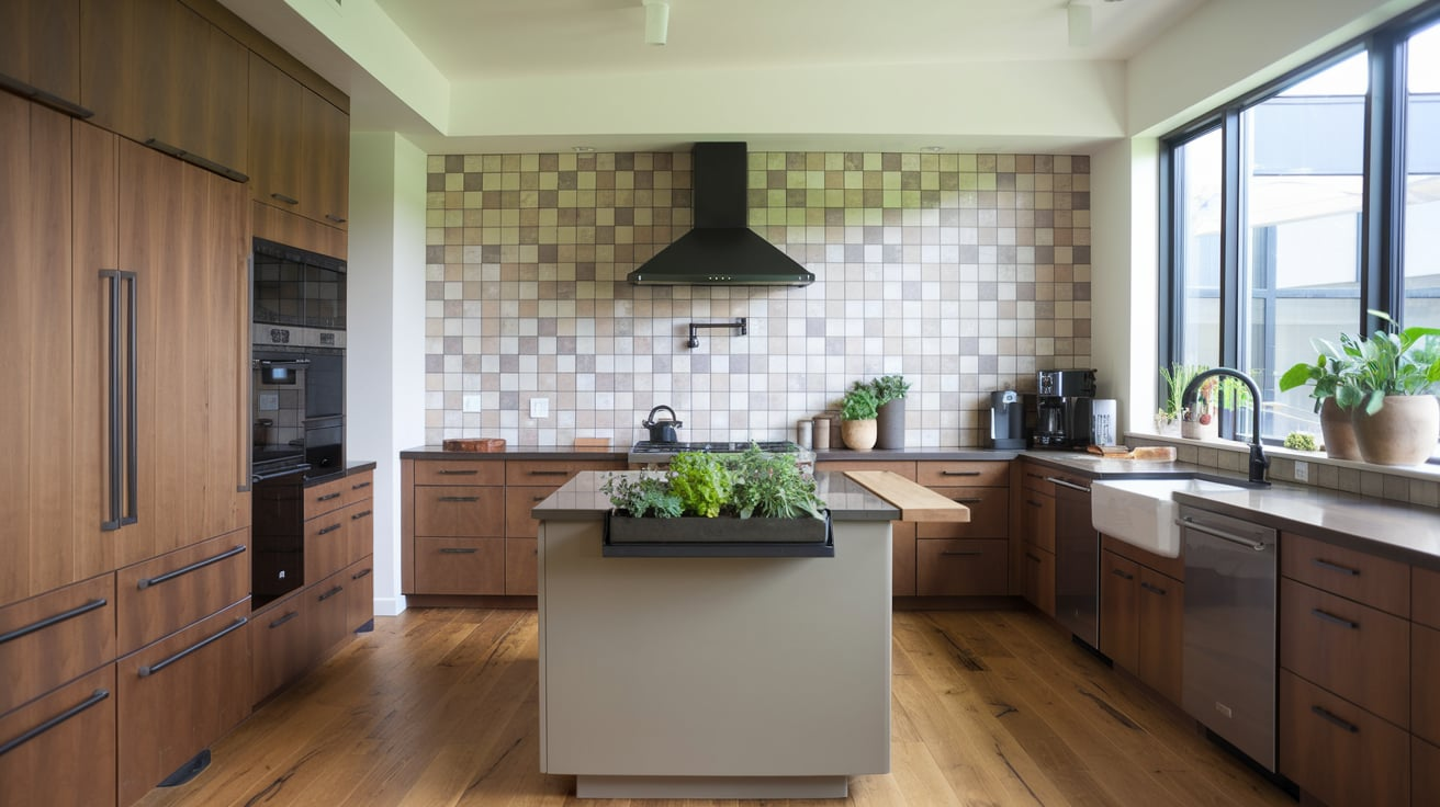
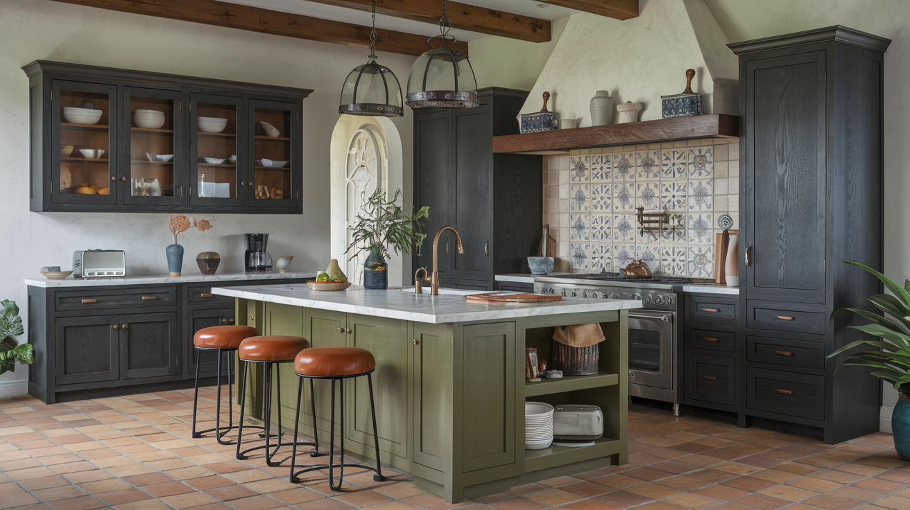
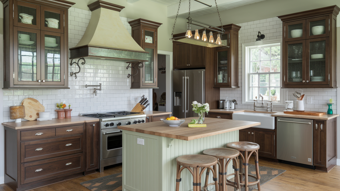
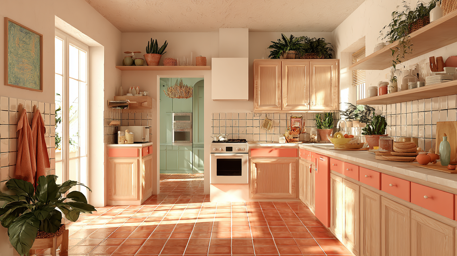
| Kitchen |
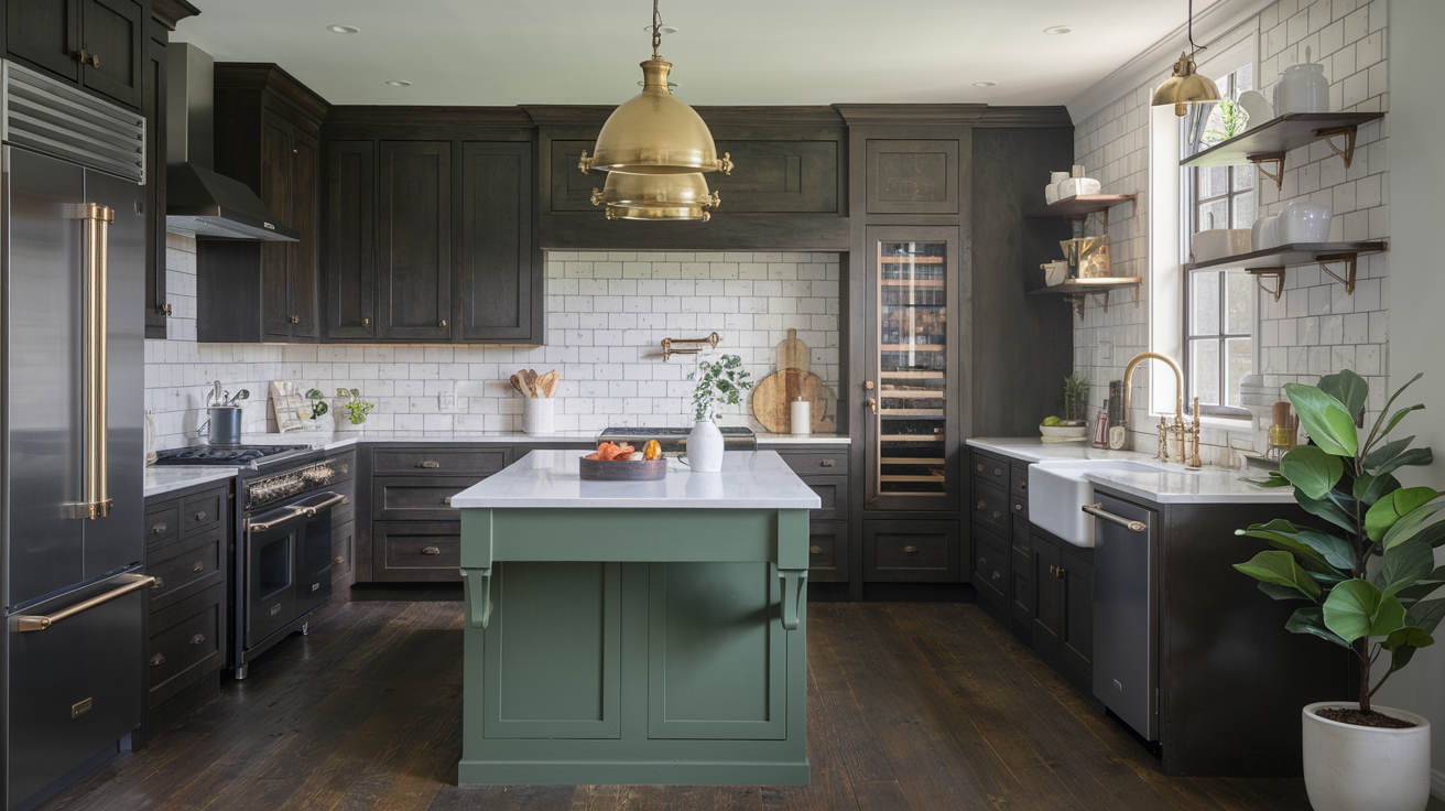
Try olive, sage, or tan cabinets with brass or matte black hardware Use warm backsplash and wood shelves to soften and unify the space |
| Bathroom |
Go with antique white or taupe walls and add clay or ceramic vases Use patterned curtains, soft towels, and a wooden stool or woven basket for texture |
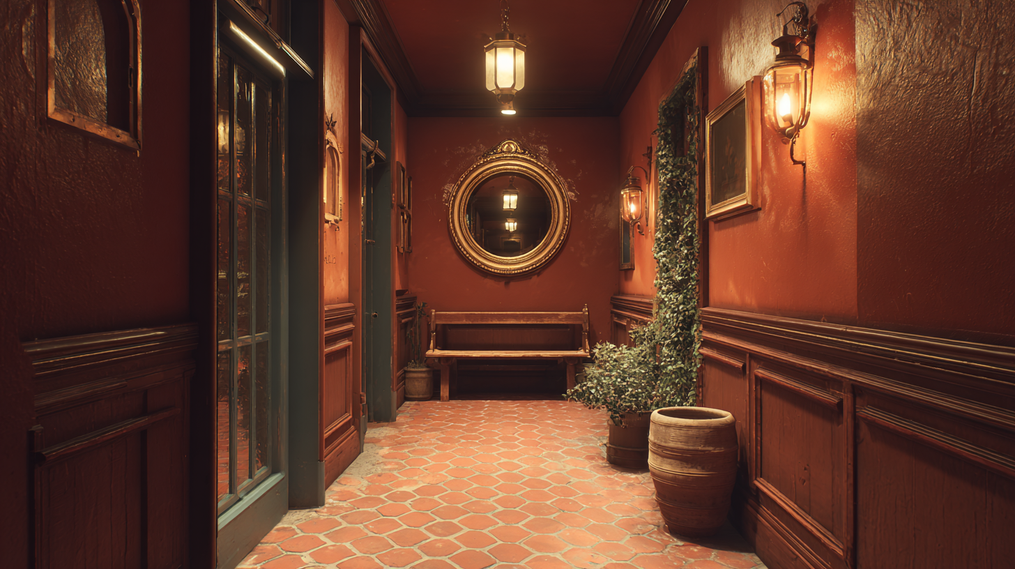
| Entryway |
Try a charcoal or navy statement wall with a wooden or black-framed mirror Keep rugs minimal and add a bench or plant stand for style and function |
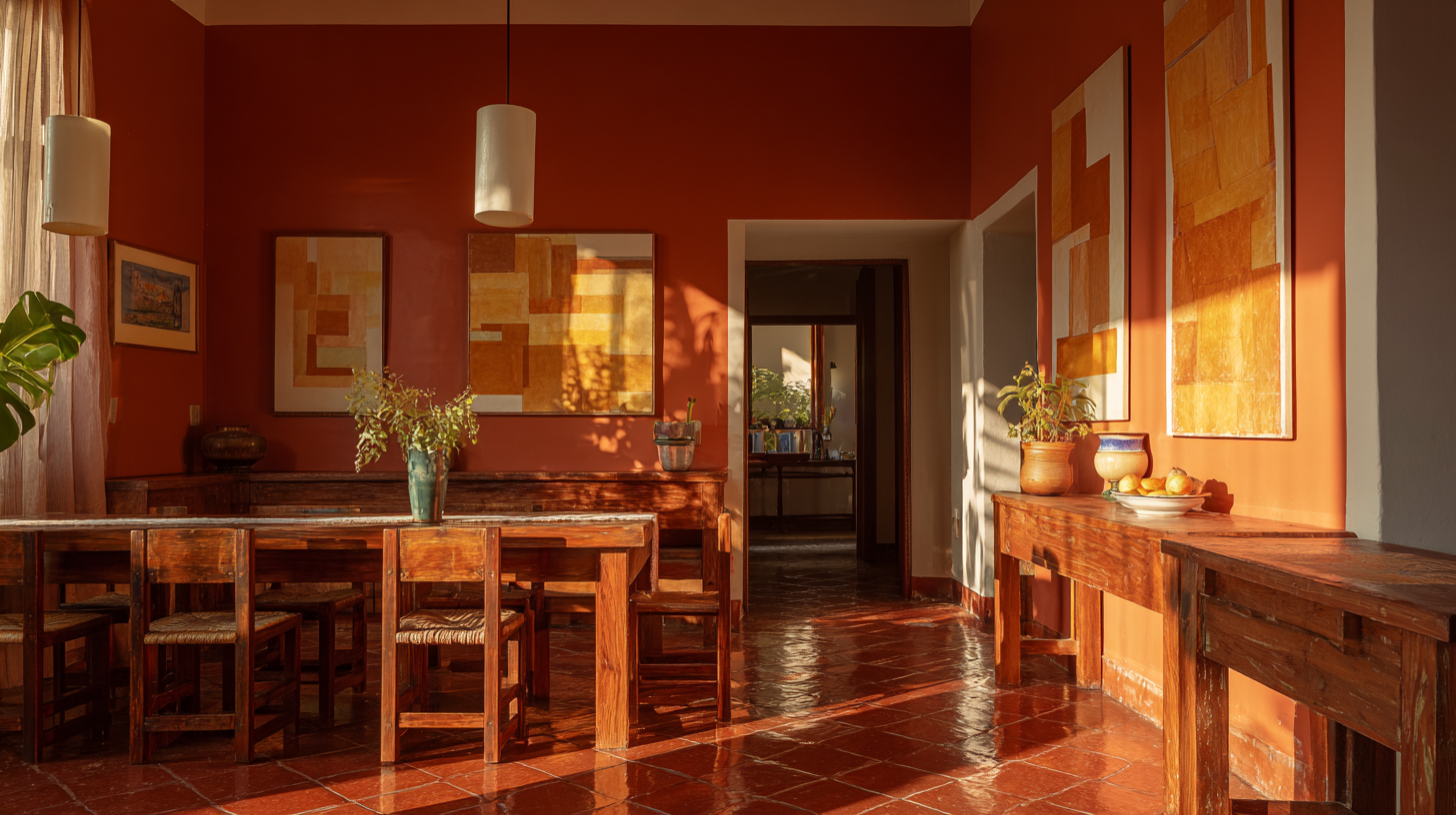
| Dining Room |
Use linen or natural fibers with warm lighting to highlight the floor Mix wood furniture with soft upholstery and accents in sage, cream, or ochre |
Let the floor guide your choices. When your colors work with terracotta’s warmth and texture, the whole room comes together with less effort.
Expert Styling Tips for Teracotta Tiles
Color choice matters, but the styling is what brings a space together. Once you’ve chosen the right palette, use materials, finishes, and accents that match terracotta’s warm, natural feel.
Try these:
- Layer natural textures: Linen curtains, wool rugs, or jute baskets add warmth
- Add greenery: Plants bring in softness and connect with the earthy tones
- Stick to matte finishes: Use matte paint, pottery, or furniture to keep things calm
- Use handmade items: Pottery, woven pieces, and artisanal tiles add depth and charm
- Don’t overdo patterns: Let the tile stand out and keep other details simple
Let the room breathe. A few natural touches go a long way with terracotta floors.
Conclusion
If you’ve been wondering what colors go with terracotta floor tiles, I hope this gave you real, workable answers.
Terracotta isn’t always easy to pair with, but it has character that’s worth the effort.
When you match it with the right colors like calming sage, rich navy, or cozy cream, it transforms your space.
Now that you’ve seen the palettes, room examples, and tips, you can confidently choose what fits your home.
You might be planning a full room makeover or just updating a few accents. Either way, you’ve got what you need to get started.
The colors you pick will either fight the floor or bring it to life, and now you know how to choose.
Use this guide as a base, then build around what feels natural in your space.