
Choosing colors for your home can feel harder than it should be. With so many options available, it’s easy to end up with a space that feels busy or disconnected.
I like monochromatic color schemes because they create a clean, balanced look with room for personal touches.
The good news is that monochromatic design is not limited to white, gray, or minimalist spaces. By using different shades, tones, and textures of the same color, you can create rooms that feel warm, stylish, and inviting.
In this article, I’ll share a monochromatic example for every room, along with practical decorating tips and trending palettes.
From small room updates to whole-home makeovers, you’ll find inspiration you can use with confidence.
What Is a Monochromatic Color Scheme?
A monochromatic color scheme uses different shades, tints, and tones of a single color throughout a space.
It creates a cohesive, balanced look while adding depth through variation rather than multiple colors. In interior design, a monochromatic palette starts with one base color, such as blue, green, or beige.
Designers then layer lighter and darker versions of that color to create contrast and visual interest.
A classic monochromatic example would be a living room in layered blues, from pale sky to deep navy.
This approach helps rooms feel organized, calming, and visually connected. It also makes decorating easier because all elements work within the same color family.
Mixing textures and finishes keeps the space from looking flat, making the design feel simple and refined.
How to Create a Successful Monochromatic Color Scheme?
A successful monochromatic design relies on balancing shades, textures, and finishes within the same color family.
- Choose a Strong Base Color: Select a color that matches the room’s purpose and desired atmosphere, since it influences every design decision.
- Layer Different Shades and Tones: Combine lighter and darker variations of the same color to create depth and prevent flatness.
- Incorporate a Variety of Textures: Use fabrics, wood, stone, and metals to add visual interest without introducing additional colors.
- Balance Light and Dark Elements: Mixing tonal contrasts helps define spaces, highlight features, and create a more dynamic appearance.
- Use Patterns Thoughtfully: Subtle patterns within the same color family add personality while maintaining a cohesive overall design.
- Pay Attention to Lighting: Natural and artificial lighting can change color perception, affecting how the monochromatic palette appears.
- Add Complementary Materials: Natural materials and varied finishes help the room feel richer, warmer, and more visually appealing.
Monochromatic Color Scheme Ideas
Different monochromatic color schemes can create unique moods, from cozy and relaxing to elegant and dramatic, depending on the shades you choose.
1. Soft Beige Monochromatic Color Scheme
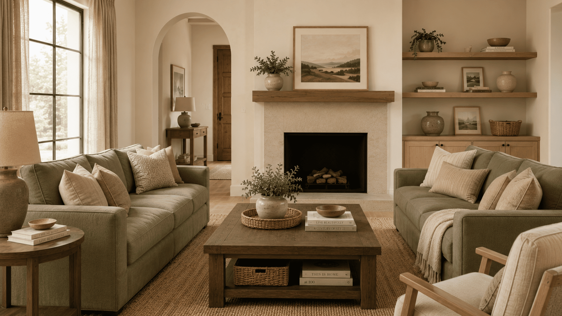
A beige monochromatic palette creates a warm and welcoming atmosphere that works well in living rooms. Layer soft cream walls with sandy beige furniture and deeper taupe accents to add dimension.
Natural materials such as linen curtains, woven baskets, and light wood furniture enhance the look.
This color scheme feels timeless and comfortable, making it ideal for family spaces where you want a relaxed yet polished appearance.
2. Sage Green Monochromatic Color Scheme
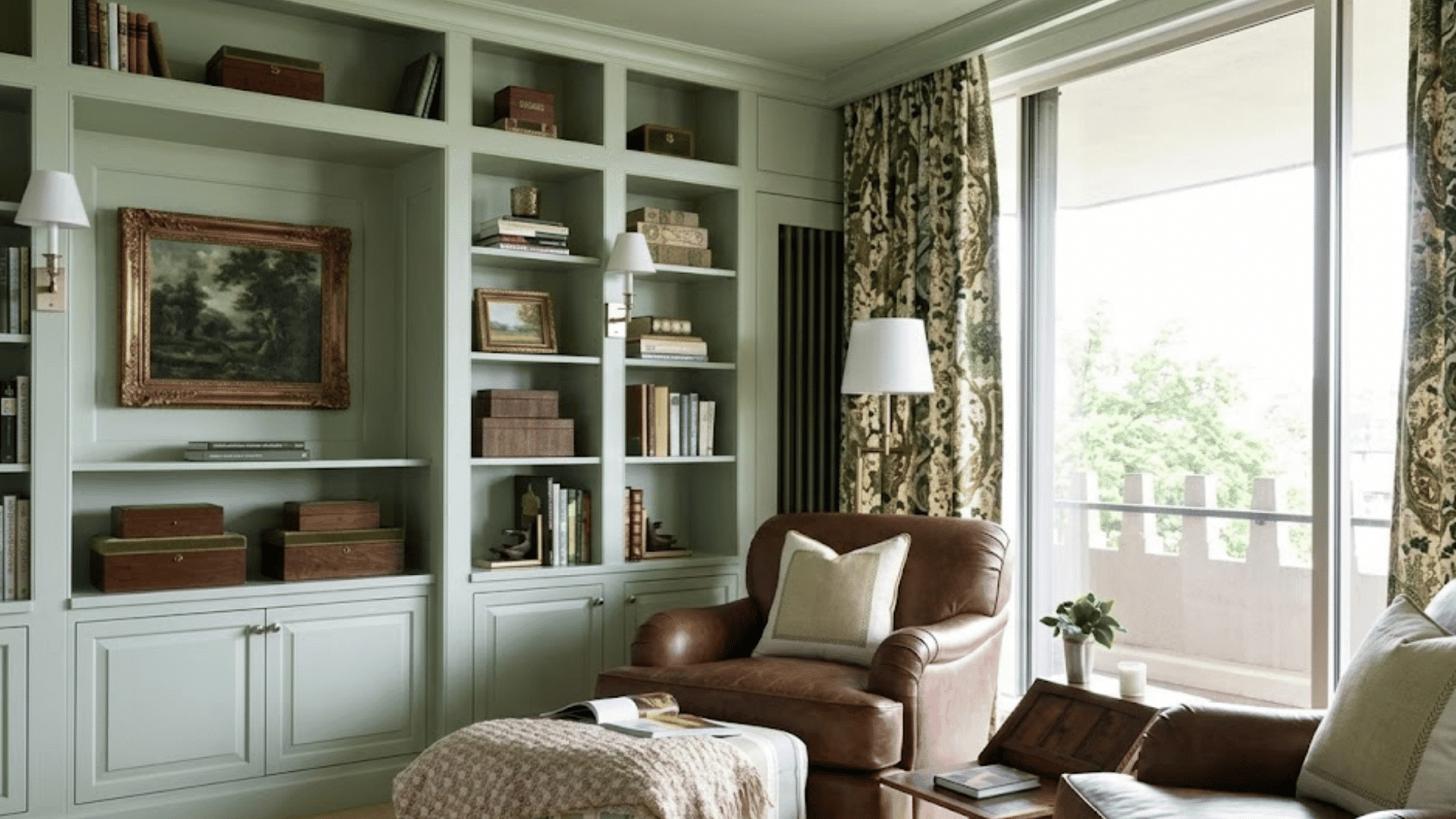
Sage green has become a favorite in home decor because of its connection to nature.
Combining pale sage walls with olive accents and deeper green furnishings creates a peaceful environment.
This palette works beautifully in bedrooms, reading nooks, and home offices. Natural materials such as rattan, wood, and stone complement the color family.
The result is a calming space that feels fresh, grounded, and effortlessly stylish.
3. All-White Monochromatic Colors
White remains one of the most popular monochromatic color choices because it makes rooms feel larger and brighter.
Use different shades of white and varied textures like boucle, cotton, and matte finishes to add depth.
I remember seeing a feature in an interior design magazine that used layered white tones and textures to make a small room feel surprisingly warm and inviting.
Different finishes and materials add interest, making the space feel simple and refined.
4. Warm Gray Monochromatic
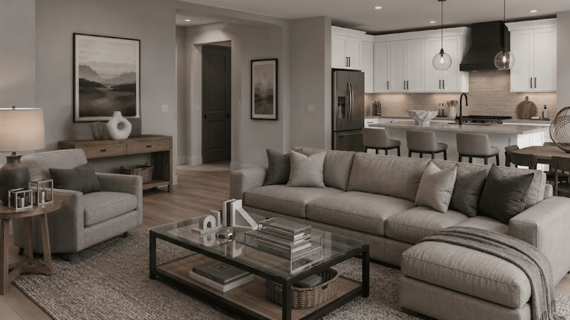
Gray offers a versatile foundation for contemporary interiors.
By mixing light gray walls, medium-gray upholstery, and charcoal accents, you can create depth without overwhelming the room.
Warm gray undertones help the space feel inviting rather than cold. Pairing gray with natural wood elements and soft textiles adds balance.
This monochromatic example is especially effective in open-concept living areas where a cohesive design is important.
5. Navy Blue Monochromatic Colors
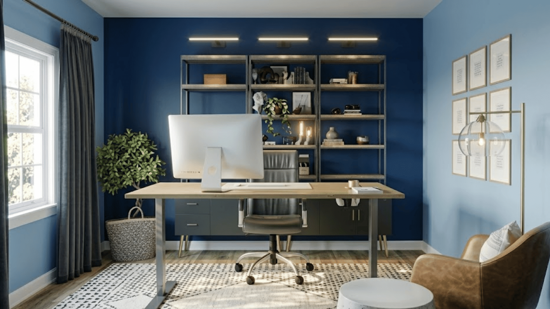
Navy blue adds richness and class to almost any room. A monochromatic design can include soft blue-gray walls, navy furniture, and darker blue decorative accents.
Metallic finishes, particularly brass or gold, enhance the luxurious feel.
Because blue is often associated with calmness and stability, this palette works well in dining rooms, offices, and bedrooms.
The layered shades create depth while maintaining a refined and cohesive appearance.
6. Blush Pink Monochromatic Colors
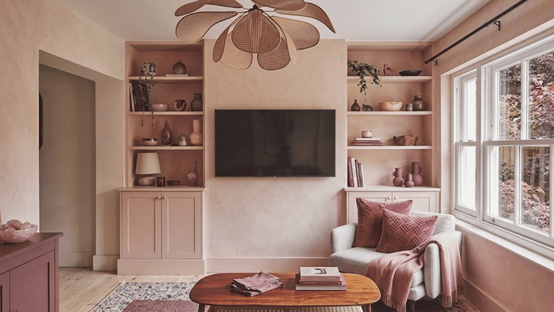
Modern blush pink interiors feel sophisticated rather than overly feminine. Combining pale blush walls with rose-toned textiles and deeper mauve accents creates a layered effect.
This color scheme works beautifully in bedrooms, dressing rooms, and sitting areas. Neutral materials such as light wood and stone help balance the palette.
The result is a soft, elegant space that feels inviting while maintaining a contemporary appearance.
7. Terracotta Monochromatic Color Scheme
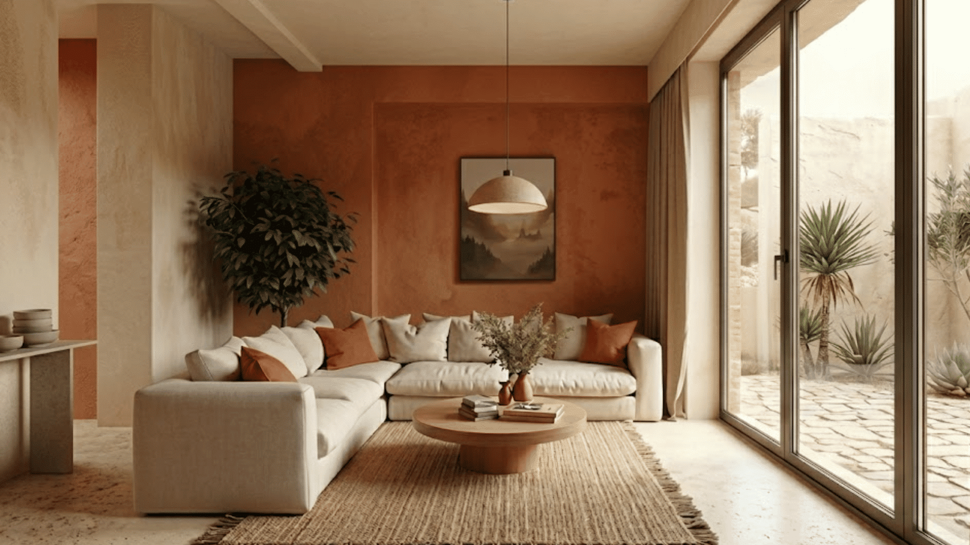
Terracotta shades bring warmth and character to a room. Using soft clay tones, burnt orange accents, and deeper rust hues creates a cozy, inviting look.
This palette is often associated with Mediterranean and Southwestern design styles. Terracotta works particularly well in living rooms and dining spaces where warmth is desired.
I once visited a café that used terracotta walls and rust-toned decor, and the space felt instantly warm and welcoming.
Pairing these shades with natural wood and textured fabrics helps create a balanced and welcoming interior.
8. Dusty Blue Color Scheme
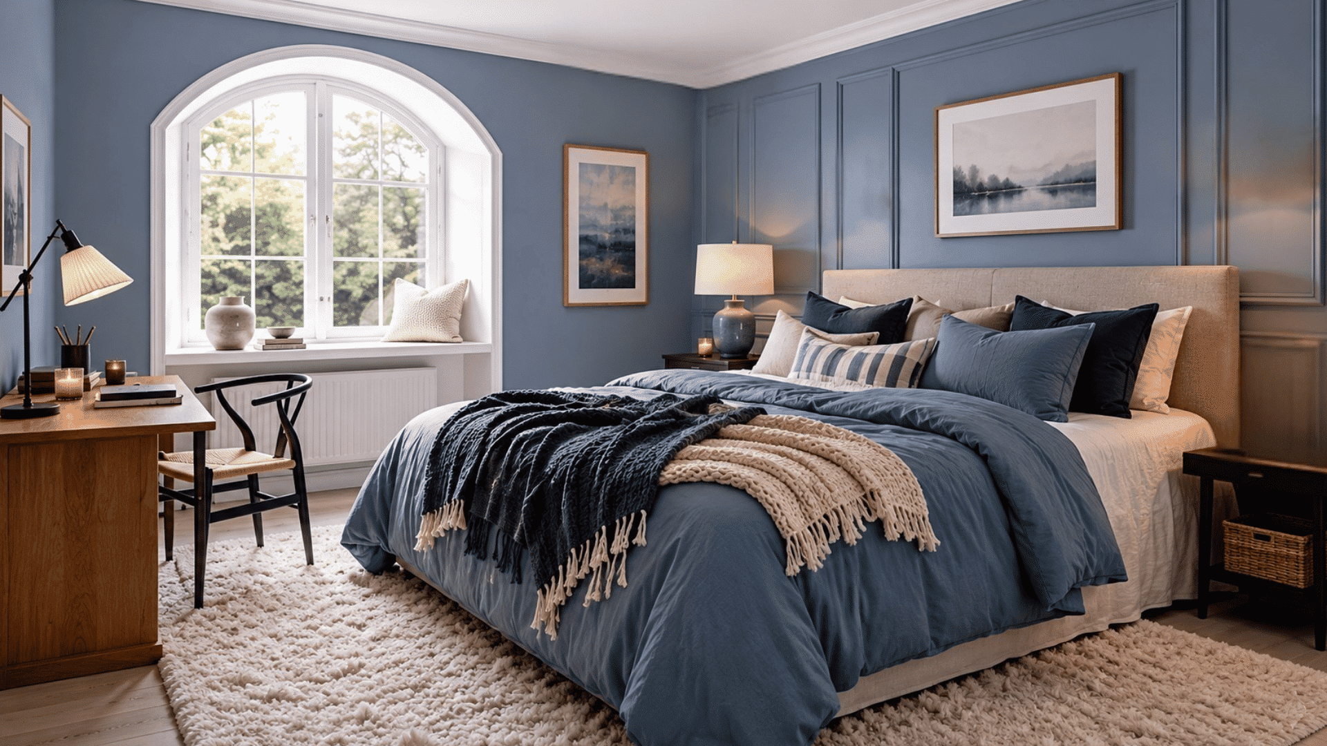
Dusty blue tones create a soft and soothing atmosphere that is perfect for restful spaces. Pair light-blue bedding with medium-blue walls and darker accent pillows to create visual interest.
The subtle variations help the room feel layered without becoming busy.
This monochromatic example works especially well in bedrooms because blue is known for promoting relaxation. Soft fabrics and warm lighting further enhance the peaceful environment.
9. Charcoal and Black
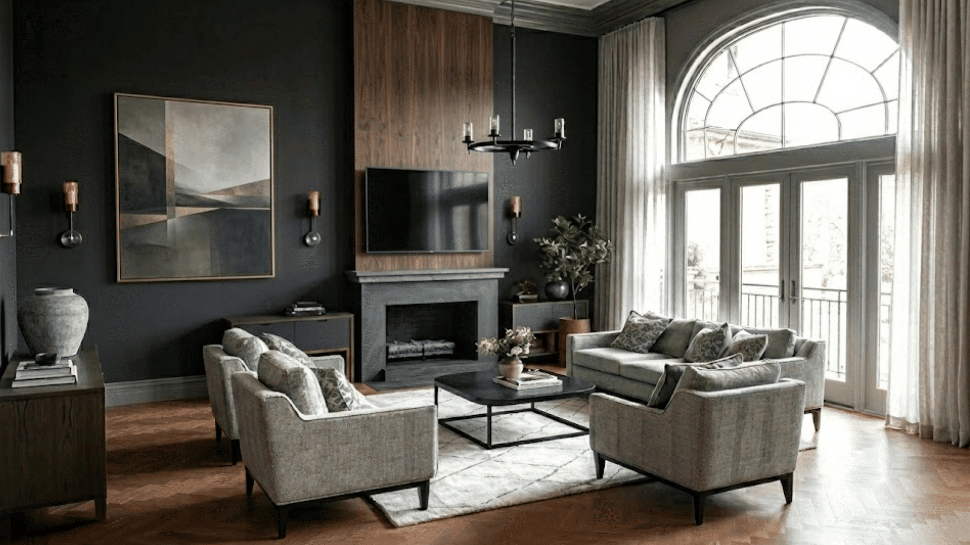
A charcoal-and-black palette creates a bold and striking visual impact. The key is balancing darker shades with adequate lighting and varied textures.
Matte-black walls, charcoal furnishings, and dark-gray accessories add depth while preventing the room from feeling one-dimensional.
This monochromatic example is often used in modern and industrial interiors.
Strategic lighting and reflective surfaces help maintain an open and sophisticated atmosphere.
10. Taupe Monochromatic Color Scheme
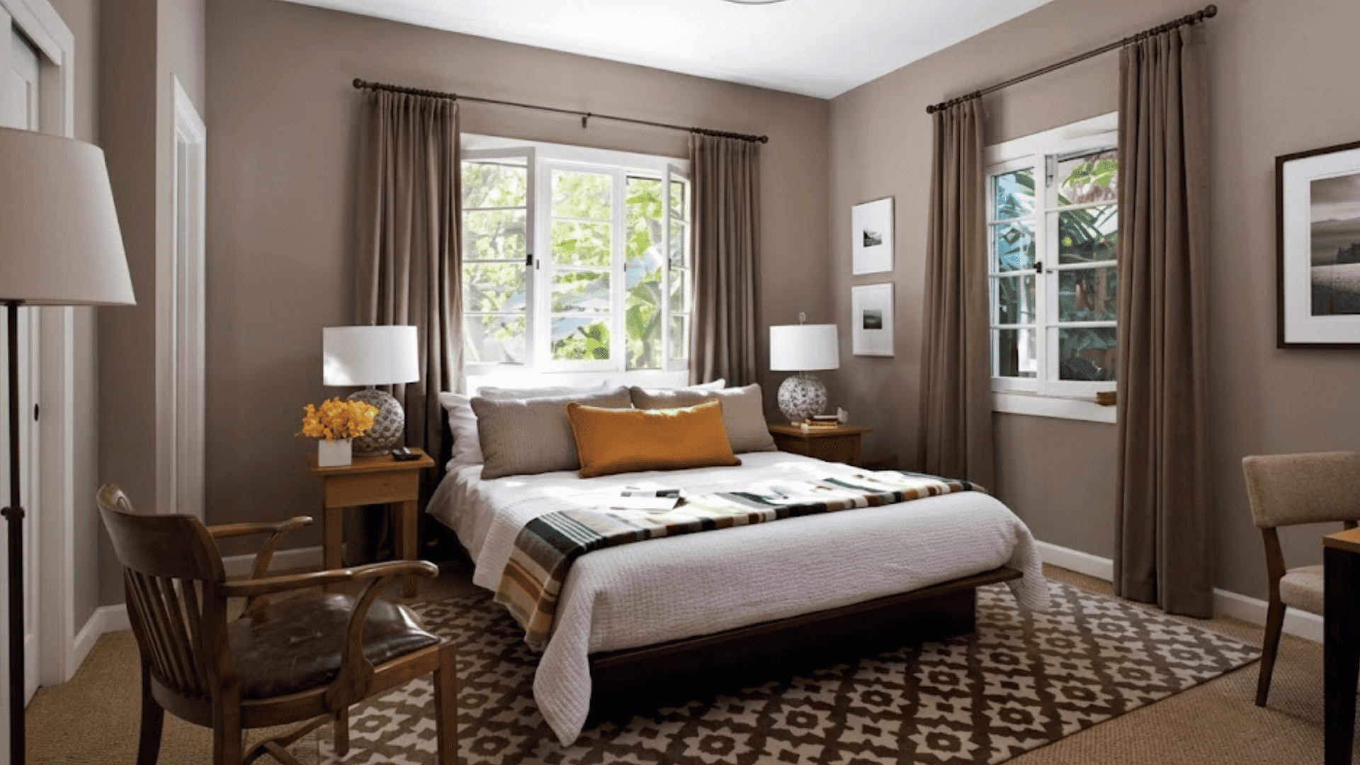
Taupe blends the warmth of beige with the sophistication of gray, making it highly adaptable.
Layering light taupe walls with deeper taupe furniture and accessories creates a seamless look.
This color scheme complements both traditional and contemporary decor styles. It also works well in nearly every room, from living areas to bedrooms.
The subtle variations provide enough contrast to keep the space visually engaging.
11. Forest Green Monochromatic Colors
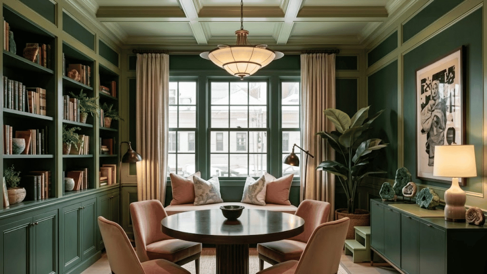
Forest green creates a rich and grounded atmosphere that feels connected to the outdoors.
Pair deep green walls with lighter green accents and natural materials to achieve balance.
This palette works exceptionally well in libraries, home offices, and dining rooms. Wood furniture, stone surfaces, and indoor plants enhance the organic feel.
The layered green tones create depth while making the room feel both luxurious and inviting.
Best Monochromatic Example by Color Family
Each color family creates a different mood, so the right choice depends on your room’s purpose and light.
- Red and Rust: A red monochromatic example adds bold warmth, layering soft brick tones with deeper rust accents and raw textured fabrics.
- Terracotta and Burnt Orange: This monochromatic example brings earthy richness, combining clay walls with warm orange accents and natural linen furnishings.
- Yellow and Amber: A yellow monochromatic example works well in kitchens, pairing soft butter tones with deeper amber accents and warm wood surfaces.
- Sage and Olive Green: This monochromatic example suits bedrooms and offices, combining pale sage walls with deeper olive furnishings and natural rattan.
- Dusty Blue and Navy: A blue monochromatic example adds calm and depth, pairing soft blue-gray walls with navy upholstery and darker accent pieces.
- Lavender and Plum: This monochromatic example feels creative and moody, layering light lavender walls with broader violet accents and soft linen textiles.
- Warm Gray and Charcoal: This monochromatic example works well in open-plan spaces, blending light gray walls with charcoal furniture and warm wood details.
- Beige and Cream: A beige monochromatic example works best in living rooms, layering cream walls with sandy furniture and taupe accents.
Mixing Monochromatic Colors for Variety
Different variations of the same color can add depth and interest while maintaining a cohesive monochromatic look.
| Technique | Description | Effect |
| Create Tints With White | Add white to your base color to produce lighter versions. | Makes spaces feel brighter, larger, and more open. |
| Create Tones With Gray | Mix gray into the original color to reduce its intensity. | Creates a softer, more muted, and sophisticated look. |
| Create Shades With Black | Add small amounts of black to create darker variations. | Adds richness, contrast, and visual weight. |
| Use Multiple Value Levels | Combine light, medium, and dark versions of the same color. | Creates depth and prevents a flat appearance. |
| Balance Saturation Throughout the Space | Mix highly saturated colors with softer versions. | Maintains visual interest while keeping the design cohesive. |
| Layer Tints, Tones, and Shades Together | Use all three variations throughout the room. | Creates a balanced and visually dynamic palette. |
| Enhance Variations With Texture | Pair color variations with wood, linen, stone, and metal. | Increases visual depth and adds character. |
Why Designers Love Monochromatic Color Schemes?
Designers love monochromatic color schemes because they create a cohesive, balanced look by using different shades, tones, and tints of a single color.
They create a balanced look that feels polished and well-planned. One of the biggest benefits of a monochromatic palette is its simplicity.
Since all design elements belong to the same color family, rooms naturally feel connected and easy on the eyes.
This approach also highlights textures, materials, and architectural details.
By layering lighter and darker variations of a single color, they can add depth without creating visual clutter.
In addition, monochromatic color schemes work well with almost any interior style, from modern and minimalist to traditional and luxurious.
This flexibility makes them a reliable choice for creating timeless spaces that remain stylish for years.
Tips for Making a Monochromatic Color Scheme Look Expensive
The difference between a basic monochromatic room and a luxurious one often comes down to thoughtful layering and detail.
- Layer Multiple Textures: Combine velvet, linen, wood, stone, and metal finishes to create richness, depth, and visual interest throughout.
- Use a Mix of Light and Dark Tones: Varying shades within one color family adds dimension and prevents the space from appearing flat.
- Invest in Statement Lighting: Elegant lighting fixtures draw attention, enhance ambiance, and elevate the overall design without disrupting color harmony.
- Incorporate High-Quality Materials: Natural materials like marble, solid wood, and premium fabrics instantly create a more refined appearance.
- Add Architectural Details: Features such as molding, paneling, and trim provide depth while making monochromatic spaces feel more sophisticated.
- Balance Matte and Gloss Finishes: Mixing different finishes reflects light differently, helping the room feel layered, polished, and professionally designed.
The Benefits of Monochromatic Schemes in Design
Monochromatic schemes offer several practical and visual advantages in both home decor and interior design.
| Benefit | How It Helps |
| Visual Harmony | Creates a cohesive and well-balanced look throughout the space. |
| Spacious Feel | Makes rooms appear larger by reducing visual interruptions. |
| Timeless Style | Maintains a classic appearance that stays relevant over time. |
| Enhanced Texture | Draws attention to materials, finishes, and architectural details. |
| Calming Atmosphere | Creates a peaceful environment through smooth color transitions. |
| Design Flexibility | Works well with modern, traditional, minimalist, and luxury styles. |
| Easier Decorating | Simplifies the process of choosing furniture and accessories. |
| Greater Depth | Uses shades and tones to add dimension without extra colors. |
How to Choose the Best Monochromatic Colors for Your Home?
The right monochromatic palette depends on your space, lighting conditions, and the atmosphere you want to create.
- Consider the Room’s Purpose: Choose calming colors for bedrooms, energizing tones for workspaces, and welcoming shades for living areas.
- Evaluate Natural Lighting: Rooms with abundant sunlight handle darker shades better, while low-light spaces often benefit from lighter tones.
- Think About Room Size: Lighter monochromatic colors can make small rooms feel larger, whereas darker palettes create intimacy and depth.
- Match the Desired Mood: Soft neutrals promote relaxation, while richer colors add drama, sophistication, and stronger visual impact.
- Pay Attention to Undertones: Consistent warm or cool undertones help maintain harmony and prevent colors from appearing mismatched together.
- Test Colors Before Committing: Paint samples on different walls and observe them throughout the day under changing lighting conditions.
Common Mistakes to Avoid when Using Monochromatic Colors
Even a well-chosen monochromatic palette can fall short if key design principles are overlooked.
| Mistake | Why It’s a Problem | Better Approach |
| Using Only One Shade | The room can feel flat and lack dimension. | Mix light, medium, and dark tones of the same color. |
| Ignoring Texture | The design may appear dull and one-dimensional. | Layer fabrics, wood, stone, and other materials. |
| Forgetting Contrast | Everything can blend together visually. | Add tonal variation through shades and finishes. |
| Overlooking Lighting | Colors may look different throughout the day. | Test paint and decor in natural and artificial light. |
| Choosing the Wrong Undertones | Colors can clash despite being in the same family. | Match warm undertones with warm tones and cool with cool. |
| Adding Too Many Accent Colors | The monochromatic effect becomes less cohesive. | Keep additional colors minimal and subtle. |
| Neglecting Focal Points | The room may lack visual interest. | Use statement furniture, artwork, or lighting features. |
Conclusion
A monochromatic color scheme proves that you do not need a wide range of colors to create a beautiful home.
By layering different shades, tones, and textures within the same color family, you can design spaces that feel balanced, stylish, and full of personality.
From soft neutrals to rich greens and blues, there’s a monochromatic palette for every room and style.
I believe the key is choosing colors that reflect the mood you want your home to have while adding enough variation to keep the space visually interesting. Small details can make a big difference.
Have you used monochromatic colors in your home? Share your favorite palette or decorating tips in the comments below.
Frequently Asked Questions
What Are the 5 Best Colors that Go Together?
Blue, white, gray, beige, and green work well together. This combination creates balance, versatility, and a timeless look in interiors.
What Is the 70-20-10 Rule for Colors?
The 70-20-10 rule uses 70% for the dominant color, 20% for the secondary color, and 10% for the accent color for visual balance.
What Color Calms Down Anxiety?
Soft blue is often considered the most calming color. It promotes relaxation, reduces stress, and creates a peaceful atmosphere.
What Is the Color for 70 Years Old?
Platinum is commonly associated with a 70th anniversary. It symbolizes strength, achievement, and lasting value.