I’ve seen countless paint colors come and go, but Sherwin-Williams Accessible Beige has proven itself time and time again.
As a paint expert, I often get asked about this specific shade, and it’s no surprise – it’s now among Sherwin-Williams’ top 50 colors.
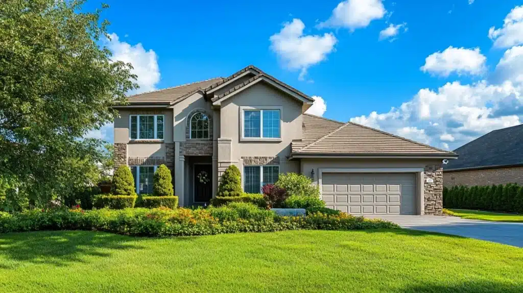
I especially love how it works on home exteriors. In my experience, it hits the sweet spot between warmth and subtlety that many homeowners look for. Not too light, not too dark – just right.
In this guide, I’ll walk you through everything you need to know about this versatile paint color.
From its unique traits to real-world applications, I’ll share my expert insights to help you decide.
What is SW Accessible Beige?
I’ve worked with many neutral paints, but Accessible Beige stands out for its special qualities.
I’ve seen that it’s a warm neutral that changes throughout the day. In the morning sun, it looks soft and creamy, while in the evening light, it takes on a deeper, cozier feel.
What I really like about this color is how well it works on different home styles.
Whether you have a modern house with clean lines or a traditional home with lots of details, this paint fits right in.
I’ve used it on farmhouses, city homes, and even beach houses – it works beautifully every time.
Color Characteristics
1. LRV of Accessible Beige
Let me explain Light Reflectance Value (LRV) in simple terms.
Think of it as how much light a color bounces back. The higher the number, the brighter the color.
Accessible Beige has an LRV of 58, which I find perfect for exteriors.
In my experience, this means it’s light enough to keep your house looking bright, but not so light that it looks washed out in strong sun.
I’ve noticed it keeps its warmth even in shady spots, which isn’t always true for lighter colors.
2. RGB of Accessible Beige
When I look at Accessible Beige’s RGB values (209/199/184), I can tell you exactly why it works so well.
These numbers show how the color blends red, green, and blue. In plain terms, it has a bit more red than the other colors, which gives it that welcoming warmth I love.
I find it helpful to think of these numbers as a recipe – they create the perfect mix that isn’t too warm or too cool.
When clients ask me why this color looks so balanced, I point to these values as proof of its well-thought-out formula.
4. Undertones of Accessible Beige
Let’s talk about what’s hiding beneath the surface of this color.
I’ve noticed that Accessible Beige has subtle green undertones, but don’t worry, your house won’t look green! This hint of green helps it blend with nature, like your trees and garden.
Sometimes, you might see a flash of taupe coming through, especially during sunrise or sunset.
I love this about the color because it means your house will look slightly different throughout the day, but always in a good way.
5. HEX
The HEX code for Accessible Beige (#D1C7B8) might seem like random letters and numbers, but it’s pretty useful.
I often share this code with clients who want to match their digital design plans to their actual house color.
If you’re working with a designer or planning to coordinate your home’s look online, this code ensures everyone’s talking about exactly the same shade.
It’s like a color’s fingerprint – totally unique to Accessible Beige.
Why is Accessible Beige a Top Choice for Exterior Painting?
1. Timeless and Elegant
I’ve seen paint trends come and go, but Accessible Beige stays strong.
What makes it special? It’s not trying too hard to be trendy. I’ve painted countless homes with this color, and it always looks clean and put-together.
Just last month, I worked with a client who wanted to update their 1990s home.
The change to Accessible Beige made their house look brand new but not out of place in their older neighborhood.
It’s this kind of success story I see over and over again with this paint.
2. Versatile
What I love most about this color is that it plays nicely with others.
It looks great next to white trim, wood doors, stone paths, and brick walls.
It’s like that friend who gets along with everyone!
In my years of painting homes, I’ve used it in busy city neighborhoods and quiet country settings.
It works everywhere because it’s not shouting for attention – it’s just quietly doing its job of making your home look good.
3. Brightens and Warms
I often tell my clients that Accessible Beige is like having good lighting for your house. In bright sun, it stays soft and welcoming without that harsh glare you get from pure whites.
The best part? Even when the sun hits it straight on, it keeps its warmth.
This makes your home’s edges look softer and more welcoming.
I’ve seen it make boxy modern homes feel cozier and older homes look fresh a
4. Low-maintenance and Durable
I always tell my clients that picking a color isn’t just about looks; it’s about being practical, too.
That’s why I love Accessible Beige for exteriors. It’s good at hiding dust and doesn’t fade quickly, which means less work for you.
I’ve checked on homes I painted years ago with this color, and they still look fresh.
It handles weather well, from hot sun to rain, and stays true to its color. Plus, since it’s from Sherwin-Williams, you know you’re getting paint that lasts.
Exterior Color Combinations With Accessible Beige
1. Neutral Color Pairings

Let me share my favorite combinations.
I often pair Accessible Beige with lighter shades like Alabaster for trim – it creates this soft, flowing look that’s easy on the eyes.
For a bit more depth, Tony Taupe on details like window frames works really well.
I like to think of these combinations as building blocks. Start with Accessible Beige as your main color, add a lighter neutral for trim, and watch how your home’s features start to pop in a subtle, classy way.
2. Bold Color Pairings

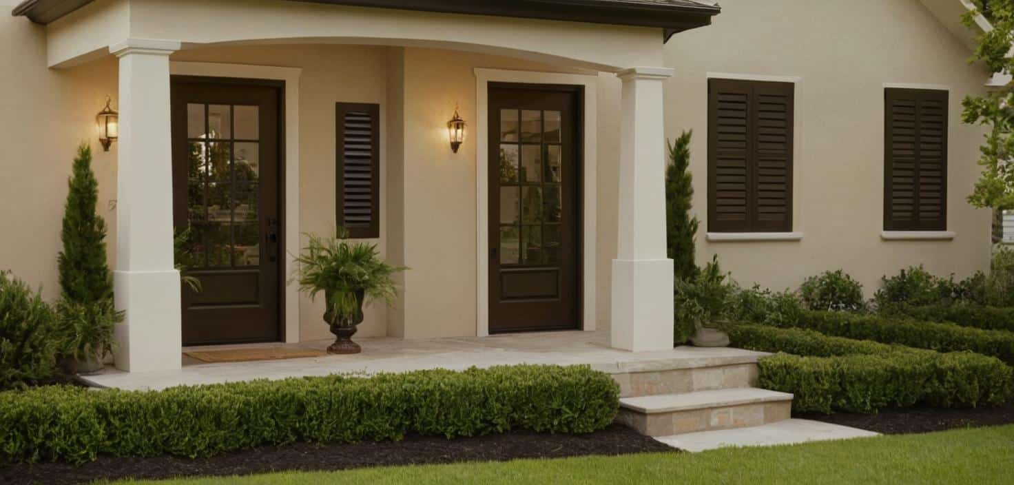
Want to add some drama? I love using darker colors like Urbane Bronze for front doors or window shutters with Accessible Beige.
It’s like adding the right piece of jewelry to a simple outfit – it just works!
In my experience, these bold touches work best on things like doors, shutters, or even garage doors. The contrast looks planned and purposeful, not harsh or random.
Comparing Accessible Beige With Similar Colors
| Comparison | Accessible Beige | Agreeable Gray | Shiitake | Edgecomb Gray | Natural Tan |
|---|---|---|---|---|---|
| Warmth | Warm, cozy feel with soft beige and gray undertones. | Cooler, modern feel with more gray undertones. | Warm, slightly deeper tone with richer beige. | Cooler and more neutral, like a cool morning. | Bright, warm, and slightly more vivid beige. |
| Mood/Effect | Creates a welcoming and comfortable atmosphere. | Adds a sleek and contemporary vibe. | Adds a rich and earthy depth to a space. | Feels fresh and cool, suitable for modern and understated designs. | Makes the home stand out more with a lively, sunny personality. |
| Best For | Homes that need warmth, balance, and harmony with nature. | Homes in bright, sunny spots looking for a cooler, modern aesthetic. | Accent areas or smaller surfaces due to their deeper tone. | Homes in hot climates for a cooling effect or where a neutral vibe is preferred. | Homes that want a vibrant, warm, and noticeable aesthetic. |
| Lighting Impact | Retains warmth in different lighting conditions. | It may look cooler or slightly gray in low light. | Shows hints of pink undertones under certain lighting conditions. | Works best in areas with consistent light but may feel flat in dim areas. | Reflects a cheerful brightness in sunlight but can feel intense in very bright light. |
| Surface Use | Works well for larger surfaces due to its lighter tone. | Best for spaces needing a more uniform, neutral gray palette. | It is ideal for trim or accents as it can overpower large surfaces. | Great for main walls or exteriors with stone/brick elements. | Suitable for main walls or siding where warmth and brightness are desired. |
| Unique Traits | Blends seamlessly with natural surroundings, especially greenery. | Adds a polished look and pairs well with modern design elements. | Richer and slightly darker, offering a deeper earthy feel. | Subtle, understated, and easy to pair with other colors. | Lively and cheerful, with a louder presence compared to Accessible Beige. |
| Recommendation | Ideal for homeowners seeking warmth and a cozy exterior. | Perfect for those who prefer a cooler, modern appearance. | Best for creating contrast or depth in neutral palettes. | Great choice for cooler climates or homes with minimal sunlight. | Ideal for making a house stand out with vibrant warmth |
Expert Tips For Using Accessible Beige
-
Test the Color: Always test Accessible Beige on your house. Paint a large sample board and observe it at different times of the day to see how the lighting affects its appearance.
-
Consider Roof and Driveway: Ensure the roof color and driveway complement Accessible Beige, as they act like your home’s “shoes and hat” and need to harmonize with the paint.
-
Evaluate Landscaping: Check how Accessible Beige interacts with your specific plants and greenery. Its earthy tones usually pair beautifully with natural surroundings.
-
Choose the Right Finish: For stucco or textured walls, choose a flat finish to hide surface imperfections and achieve a clean, modern look.
-
Prepare for Brick or Stone: Use the appropriate primer to ensure smooth application and durability when painting brick or stone.
-
Take Your Time: Deciding on a house color is a long-term commitment. Take your time and test thoroughly to avoid regrets.
-
Trusted Choice: Accessible Beige has proven popular and satisfying for most homeowners due to its versatility and timeless appeal.
Conclusion
I’ve walked you through everything I know about Accessible Beige, and here’s what it comes down to: it’s a reliable, adaptable color that works on almost any home style.
From what I’ve seen in my years of color consulting, it’s one of those rare paints that keeps looking good season after season.
But don’t just take my word for it – get some samples and try them at home. See how it looks next to your brick, stone, or wood trim.
Have questions about using Accessible Beige on your home? Drop a comment below or send me a message.
Remember, picking the right color is personal – it’s about finding what makes you smile every time you pull into your driveway.
Frequently Asked Questions
Is Accessible Beige outdated?
No, Accessible Beige isn’t outdated. Its blend of warm beige and soft gray keeps it modern and fresh. Unlike older beiges from the 2000s, it creates a clean, current look that works well on today’s homes.
Can Accessible Beige be used on all exterior materials?
From my experience, Accessible Beige works well on most exterior surfaces – siding, stucco, wood, and brick. For best results on stucco, use a flat finish. On wood, make sure to use proper primer first.
Is Accessible Beige a warm or cool color?
Accessible Beige is a warm color. While it has gray in it, which some might think makes it cool, the beige base gives it warmth. In sunlight, it shows its warm side even more clearly.


1 Comment
Would Accessible Beige (or the Natural Tan mentioned in the table) work as an exterior trim color with Quiver Tan base and Universal Khaki gables? Thank you.