Looking for a paint color that makes your heart skip a beat? I still remember the first time I saw Benjamin Moore’s Britannia Blue 1623 on a wall.
This isn’t just another blue paint color. It’s a rich blend where deep blue meets subtle gray, with gentle green hints peeking through – creating depth that ordinary blues simply can’t match.
I’ve seen how this shade turns plain walls into stunning focal points.
Let me show you exactly how Britannia Blue can give your space the character you’ve been searching for. I’ll share all my tips to help you use this captivating color successfully.
Benjamin Moore’s Britannia Blue: Color Profile
I want to tell you what makes Britannia Blue 1623 truly special.
This paint color has remarkable depth – it’s a moody blue that carries a sophisticated touch of gray within its layers. When you look closely, you’ll notice how the color shifts between deep blue and gray tones.
The Light Reflectance Value (LRV) of 18.06 tells us something important: this is a color that absorbs more light than it reflects.
In practical terms, this means it will create a more intimate feeling in your space.
I often explain to my clients that an LRV of 18.06 puts this color in the darker range, making it perfect for creating bold statements without overwhelming a room.
Undertones and Lighting
The magic of Britannia Blue lies in its soft green undertones. These aren’t obvious at first glance, but they add complexity to the color that keeps it interesting throughout the day.
Let me share what I’ve noticed about how lighting affects this shade:
- Morning light: The blue appears clearer and brighter
- Afternoon sun: The gray notes become more noticeable
- Evening light: The green undertones often become more visible
- Artificial lighting: Warm bulbs bring out the gray, while cool LEDs enhance the blue tones
In north-facing rooms, the color tends to show its deeper, moodier side.
South-facing spaces bring out its brighter qualities.
In east or west-facing rooms, you’ll see the most dramatic shifts throughout the day.
Room-by-Room Visual Guide
1. Bedroom Transformation
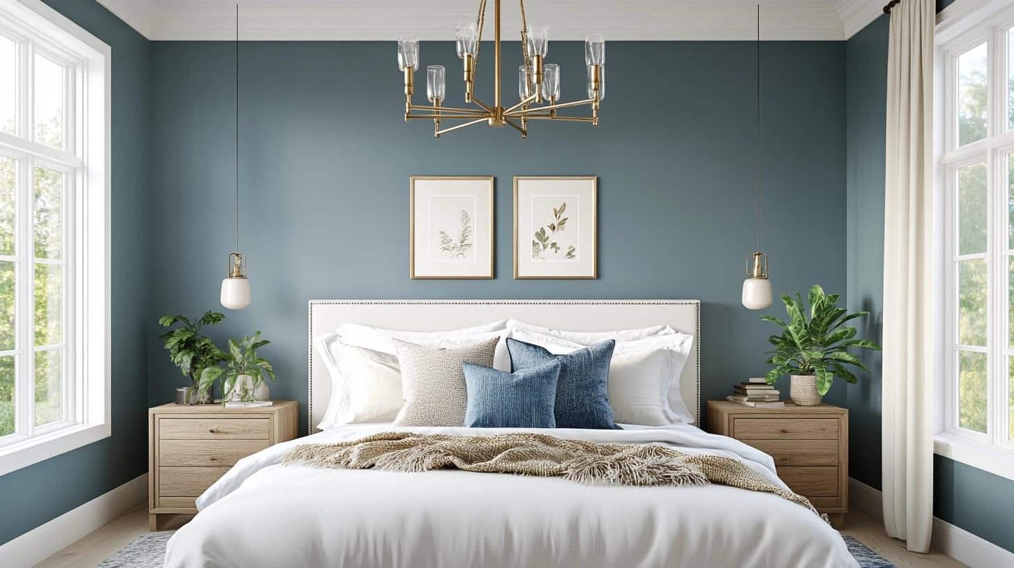
I transformed my guest bedroom with Britannia Blue, and it’s become my favorite space to showcase. The color performs wonderfully in bedrooms because it promotes rest while adding character.
From my experience, it creates a perfect sleeping environment.
Here’s my detailed approach:
- Paint all four walls for a full cocoon effect – this makes the room feel like a retreat
- Keep the ceiling bright white to maintain visual height
- Use white trim at least 4 inches wide to create striking contrast
- Add brass or gold light fixtures – I installed a vintage chandelier that glows beautifully
- Choose cream or ivory bedding to brighten the space
- Layer in textured throws and pillows in varying shades of blue and gray
- Include natural wood furniture to warm up the space
2. Britannia Blue in Living Room (my favourite)
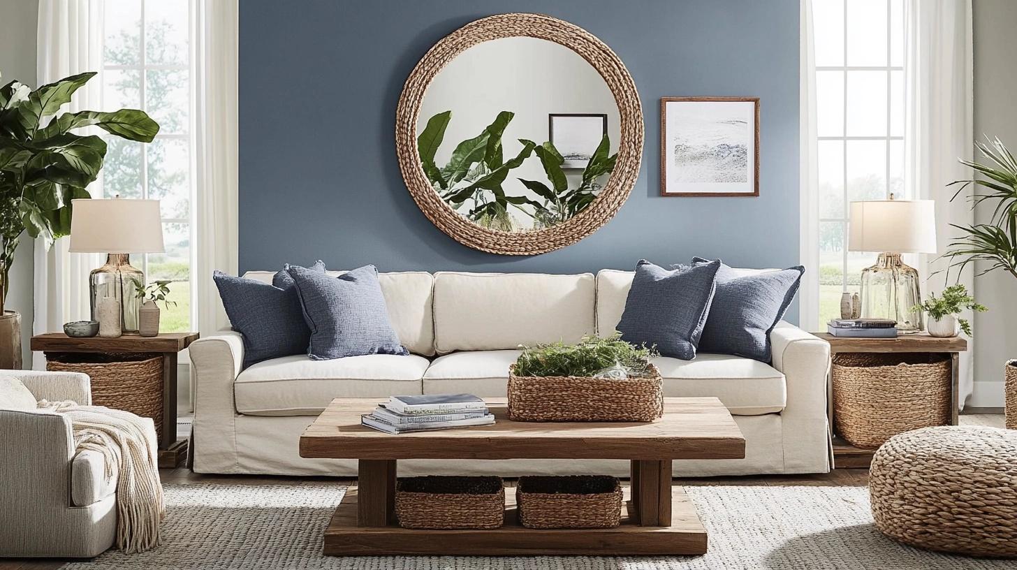
My living room’s transformation with Britannia Blue taught me valuable lessons about using this color in larger spaces.
I noticed it changes personality throughout the day, making the room feel different yet always welcoming.
Essential elements for success:
- Create a striking focal wall behind the main seating area
- Balance the color with neutral furniture pieces
- Add natural elements through houseplants and wooden accessories
- Include plenty of table lamps for evening lighting
- Use mirrors strategically to reflect light and expand the space
- Mix in lighter blue accent pieces to create depth
- Keep window treatments simple and light-colored
- Add textural elements like woven baskets or natural fiber rugs
3. Beautiful Blue Bathroom
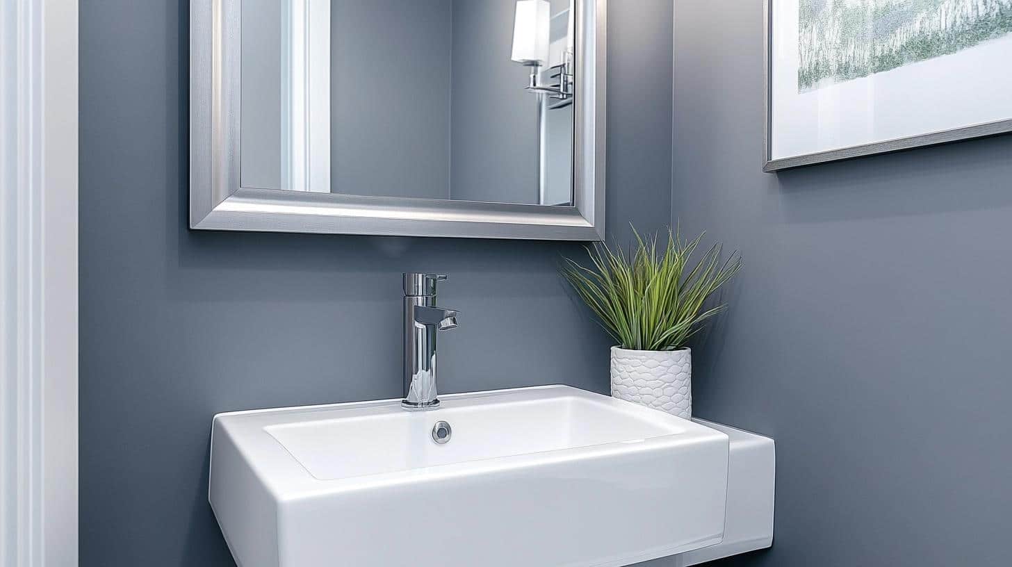
This color transformed my small powder room into a jewel box. In bathrooms, Britannia Blue works best with:
- White porcelain fixtures
- Chrome or nickel fittings
- Light-colored floor tiles
- Plenty of mirrors to reflect light
4. Kitchen Upgrade with Benjamin Moore’s Britannia Blue
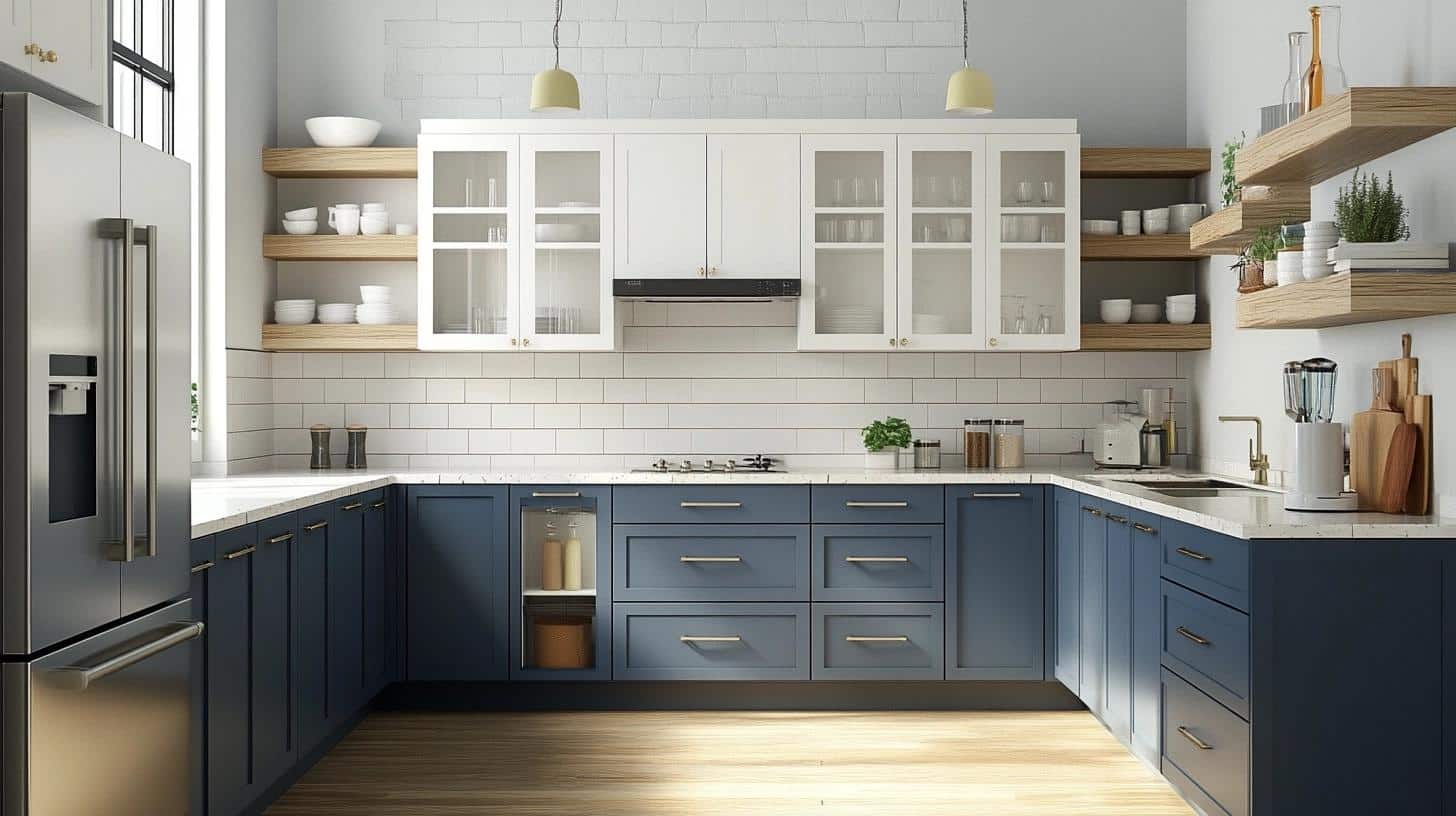
My sister’s kitchen renovation showed me how versatile Britannia Blue can be in cooking spaces. The key is strategic placement.
Essential tips for kitchen success:
- Paint lower cabinets Britannia Blue while keeping uppers white
- Choose quartz or marble countertops in white or light gray
- Install under-cabinet lighting to enhance the color’s depth
- Select brushed nickel or chrome hardware for contrast
- Keep backsplash light – we used white subway tiles
- Add natural wood elements through open shelving
- Include glass cabinet doors to break up solid color blocks
- Consider painting an accent wall in eating areas
5. A Stunning Entryway
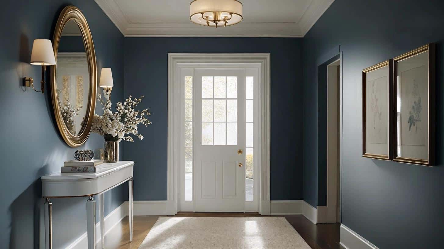
Through my friend’s colonial home project, I learned how Britannia Blue can set the perfect tone for a home’s entrance.
The color makes a statement while remaining sophisticated.
Entryway implementation tips:
- Paint all walls for maximum impact
- Install substantial white crown molding
- Add a large mirror with a metallic frame
- Use a light-colored runner or area rug
- Install warm LED lighting to enhance the color
- Keep furniture minimal and light-colored
- Add artwork with gold frames
- Include a white console table for contrast
- Consider painting interior door in matching color
Paint the Front Door with Britannia Blue!
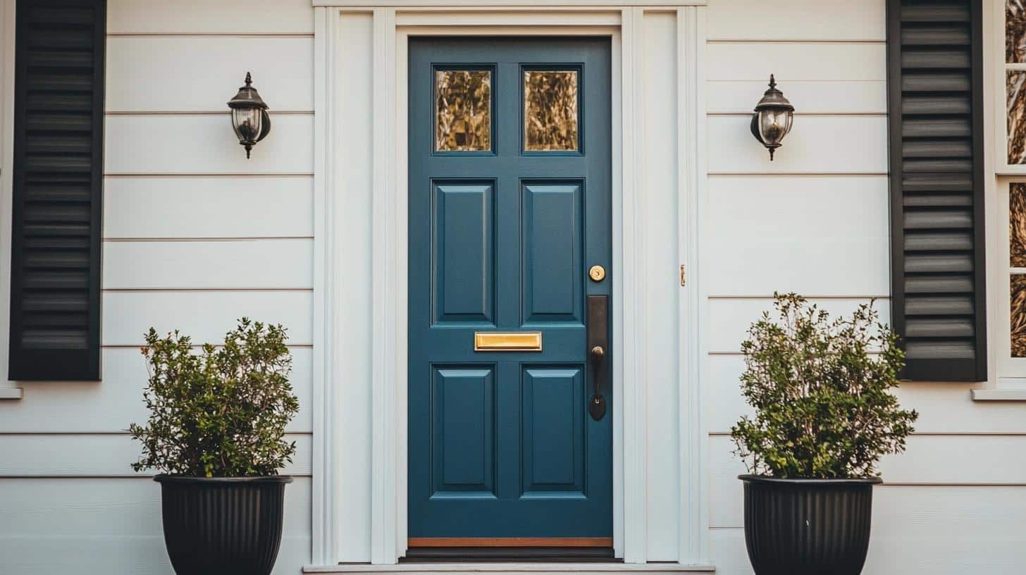
I love how Britannia Blue works on front doors – it creates such a strong first impression without being flashy.
Here’s what I’ve learned about using this shade on front doors:
Prep work matters extra:
- Clean the door thoroughly with TSP cleaner
- Sand any rough spots smooth
- Use a quality exterior primer
- Plan for 2-3 coats of paint
Best pairings I’ve tested:
- White or cream house siding
- Gray stone facades
- Red brick exteriors
- Natural wood trim
Pro tips from my projects:
- Paint during mild weather (60-80°F) for best results
- Use exterior-grade paint for durability
- Consider painting both sides for consistency
- Add new black hardware for extra pop
- Include a door knocker in brushed nickel
The best part? A Britannia Blue front door looks good in any light. I’ve noticed it appears richer in morning sun and develops a soft glow in evening light.
This makes it welcoming at all hours!
Choosing the Right Finish of Britannia Blue
After working with Britannia Blue in countless spaces, I’ve learned that the finish you choose can make or break your project.
Let me share my hard-earned knowledge about which finishes work best in different situations.
Interior Finishes
For interior walls, I often recommend a flat or matte finish, especially in bedrooms and formal living rooms.
I used this in my guest room, and it perfectly showcases the color’s depth while hiding minor wall imperfections. The flat finish helps create a soft, peaceful feeling that’s perfect for relaxation spaces.
Eggshell finish has become my go-to for most living spaces.
When I painted my own living room, this finish struck the perfect balance – it’s not too shiny, yet it’s still easy to clean.
For high-traffic and moisture-prone areas, pearl or satin finish proves its worth.
I learned this in my kitchen makeover project – these finishes make cleaning a breeze while adding a gentle glow to the walls.
They’re particularly good for:
- Bathrooms and laundry rooms
- Kitchen walls
- Children’s play areas
Exterior Applications
For exterior projects, particularly front doors, semi-gloss is your best friend.
When I painted my neighbor’s front door, the semi-gloss finish made Britannia Blue look like fine velvet while providing excellent protection against weather.
The paint still looks fresh after two years of sun, rain, and seasonal changes.
Special Considerations
From my experience with cabinet projects, pearl or satin finish offers the sweet spot between durability and beauty.
The finish should protect your surface while letting the true character of Britannia Blue shine through. For trim work, I stick with semi-gloss – it creates beautiful contrast against matte or eggshell walls.
Interior Designers on Benjamin Moore’s Britannia Blue
Let me share both my experience and what I learned from talking with talented designers who work with Britannia Blue.
Sarah, who has worked on homes for 15 years, told me: “I often suggest Britannia Blue for clients who want something more interesting than navy.”
I tried this advice in my own living room, and she was right – visitors always ask about the unique color shift.
Michael Chen showed me something I’d never considered. “In small spaces, I paint just the ceiling Britannia Blue.”
After seeing his work, I tried this in my home office. Now my workspace feels like a cozy retreat, and I find myself looking up to admire the color during long work days.
These conversations with designers, combined with using the color in my own home, have shown me how versatile Britannia Blue can be.
It’s become my go-to recommendation for friends who want a color with personality.
Summing It Up
After exploring Benjamin Moore’s Britannia Blue 1623, I hope you see why this color captured my heart.
This rich shade offers more than just beautiful walls – it creates spaces that feel alive and personal.
From my bedroom makeover to countless client projects, I’ve seen how this color brings rooms to life. Whether you’re planning to paint a statement wall, refresh your kitchen cabinets, or give your front door new life, Britannia Blue offers endless possibilities.
Ready to start your painting project? Remember to test your lighting, choose the right finish, and take time to watch how the color changes throughout the day.
And if you’d like more painting tips or color advice, leave a comment below – I’d love to hear about your plans and help you create a space you’ll love.

