
When I walk into a room, the walls are usually the first thing I notice. Plain single-color walls can look neat, but they can sometimes feel a bit flat.
If you want a space to look more lively without a full renovation, two-tone wall colors can make a big difference. I’ve seen how using two paint colors can quickly change the mood of a room.
The right mix can make a small space look larger, add contrast, or simply give the room more character. And the best part is that you don’t always need fancy tools or complex design skills to try it.
In this blog, I’ll share practical ideas you can use in living rooms, bedrooms, kitchens, and other spaces. You’ll also see simple ways to pair colors and apply them to your walls so your walls look balanced and stylish.
How Two-Tone Wall Colors Work
Before you start picking colors, it helps to understand how two-tone walls are used in a space. A simple layout can make your walls look balanced and well-planned.
One of the easiest ways to use two-tone colors is to split the wall horizontally, which gives a clean, classic look. Many people prefer placing a darker shade at the bottom and a lighter shade at the top, as this keeps the room feeling open and airy.
Adding a trim or border between the two colors can make the design look more polished and neat.
You can also try vertical panels to make your ceilings appear higher. Choosing colors from the same family creates a soft and blended feel, while a bit of contrast can add interest without making the space feel too busy.
Modern Two-Tone Wall Color Ideas to Refresh Your Home
These combinations work well in many spaces and blend easily with different furniture and décor styles. Below are a few two-tone wall ideas that add gentle contrast while keeping the room warm and balanced.
1. Beige and White Walls
Beige and white are classic two-tone wall color combinations that create a calm, welcoming atmosphere. Beige adds warmth and softness, while white keeps the space bright and open.
A common layout places beige on the lower half of the wall and white above to maintain balance and light. These two-tone wall color examples work well with wood furniture, woven baskets, and soft fabrics.
This pairing is often used in living rooms, dining areas, and hallways, where a simple, relaxed look is preferred.
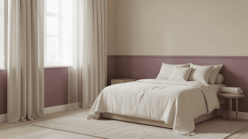
2. Cream and Taupe Walls
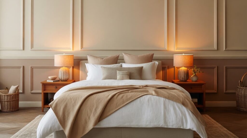
Cream and taupe are two-tone wall color options that help create a cozy, balanced interior. Cream reflects light and keeps the space feeling soft and bright, while taupe adds a deeper neutral tone that grounds the design.
Taupe is commonly used on the lower part of the wall with cream above for contrast.
These two-tone wall color examples blend beautifully with neutral furniture, soft rugs, and warm lighting, making them suitable for bedrooms and comfortable living spaces.
3. Light Gray and White Walls
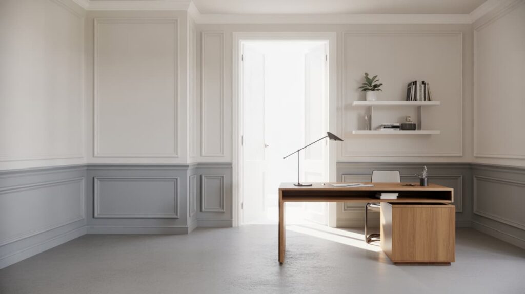
Light gray and white are modern two-tone wall color options that bring a clean, fresh look to a room. Light gray adds gentle contrast without making the space feel heavy, while white keeps the interior open and bright.
A typical design places gray on the lower half of the wall and white on the upper portion, often separated by trim.
These two-tone wall color examples work well in bedrooms, home offices, and living rooms, and pair nicely with metal accents and simple furniture.
4. Ivory and Pale Sage Walls
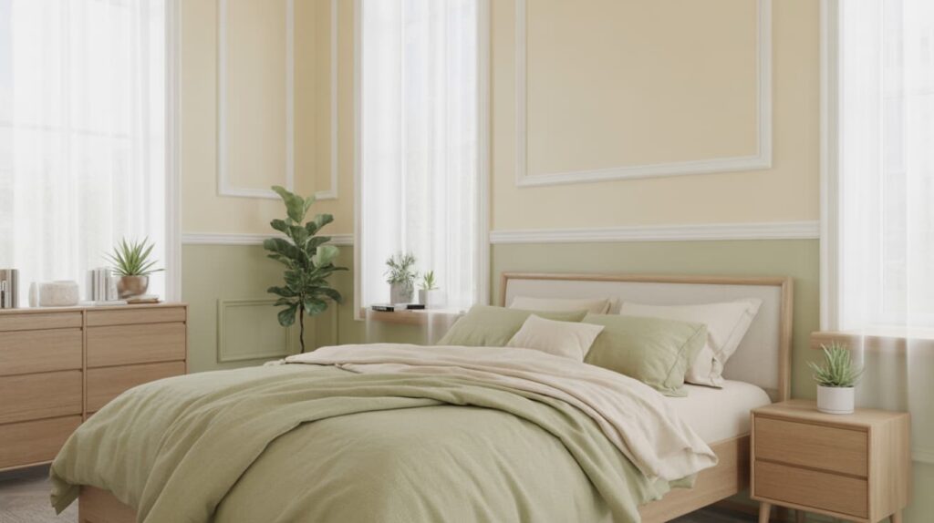
Ivory and pale sage are soft two-tone wall colors that create a peaceful, natural atmosphere. Ivory keeps the wall bright and warm, while pale sage introduces a gentle hint of color that feels calm and refreshing.
Pale sage is often used on the lower half of the wall with ivory above to keep the space balanced and airy.
These two-tone wall color examples work especially well in bedrooms and quiet spaces, paired with plants, light wood furniture, and soft fabrics.
Soft & Relaxing Color Combos
These gentle tones work well in bedrooms, reading spaces, and areas where you want a quiet, relaxing mood. Below are a few two-tone wall combinations that use light shades to create a soft and soothing atmosphere.
5. Blush Pink and White Walls
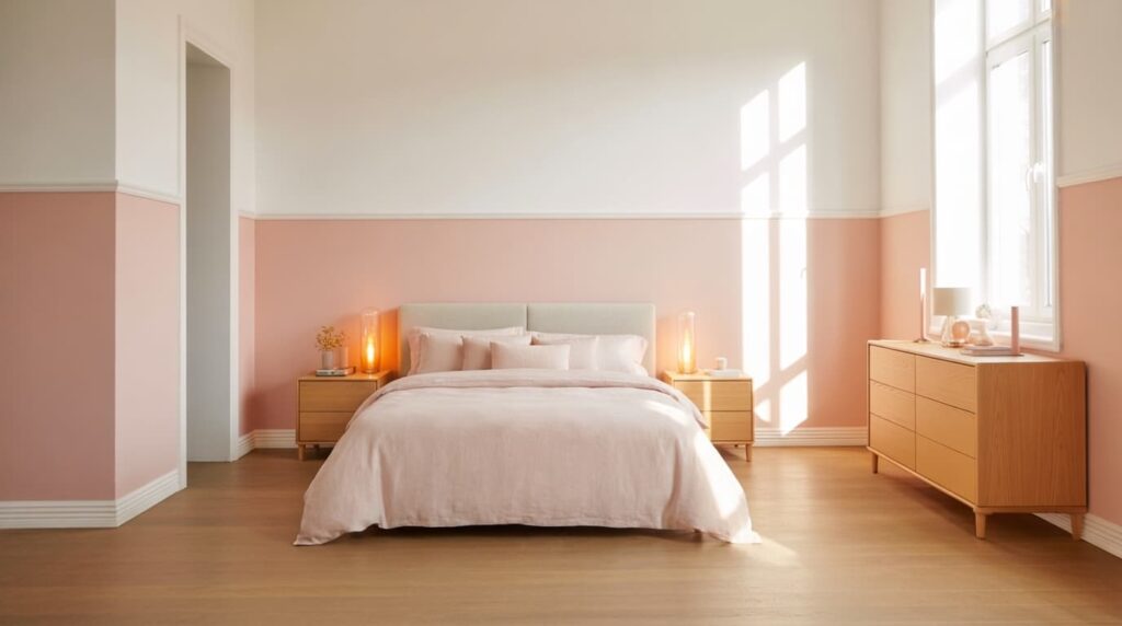
Blush pink and white are soft two-tone wall colors that create a warm and peaceful atmosphere. Blush pink adds a gentle touch of color, while white keeps the room bright and open.
A common layout places blush pink on the lower part of the wall and white above to maintain balance and light. These two-tone wall color examples work beautifully with light wood furniture, soft bedding, and warm lighting.
This pairing is often used in bedrooms to create a calm, simple, and comfortable space for everyday living.
6. Light Blue and White Walls
Light blue and white are refreshing two-tone wall color options that give a room a bright, breezy feel. Light blue brings a calm and airy tone, while white keeps the space looking open and clean.
Light blue is often placed on the lower half of the wall with white above to maintain brightness. These two-tone wall color examples work well in bedrooms, bathrooms, and small living areas.
When paired with woven décor, natural textures, and light fabrics, the room feels relaxed and welcoming.
7. Lavender and Soft Gray Walls
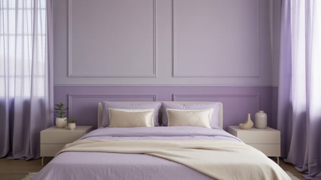
Lavender and soft gray are balanced two-tone wall color options that create a calm, gentle interior style. Lavender introduces a soft pastel shade, while gray provides a neutral tone that keeps the design grounded.
Lavender is often used on the lower section of the wall with soft gray above for contrast. These two-tone wall color examples work well in bedrooms, guest rooms, and quiet study spaces.
Light curtains, simple furniture, and soft fabrics help maintain the peaceful and comfortable atmosphere.
8. Mint Green and Cream Walls
Mint green and cream are bright two-tone wall color examples that create a fresh and welcoming environment. Mint green adds a soft touch of color, while cream keeps the room warm and light.
Mint green is commonly used on the lower part of the wall, with cream above, to reflect light and maintain balance. These two-tone wall color examples work well in kitchens, bedrooms, and smaller living spaces.
Plants, light furniture, and simple décor help enhance the clean and refreshing look.
Bold Contrast Designs
These bold color combinations use strong contrast to make interiors feel striking and full of personality. Each pairing balances dark and light tones to create depth, visual interest, and a memorable style.
9. Black and White Interior Contrast
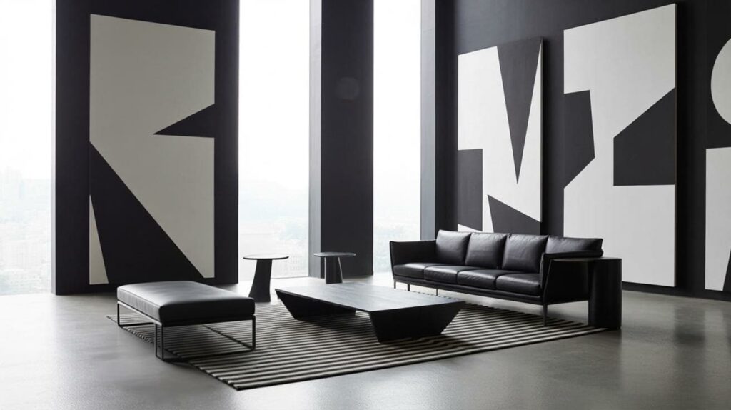
Black and white is one of the most striking color combinations used in modern interiors. The strong contrast between deep black and crisp white instantly creates a clean, graphic look that feels both timeless and contemporary.
White walls can keep the room bright and open, while black furniture, lighting, or window frames add sharp definition. Patterns such as striped rugs, geometric tiles, or bold artwork can further enhance the contrast.
This pairing works well in living rooms, kitchens, and bedrooms, where a sleek, confident style is desired.
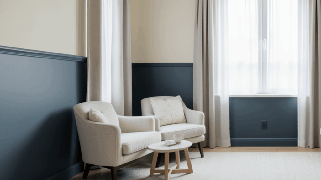
10. Navy Blue and White Walls
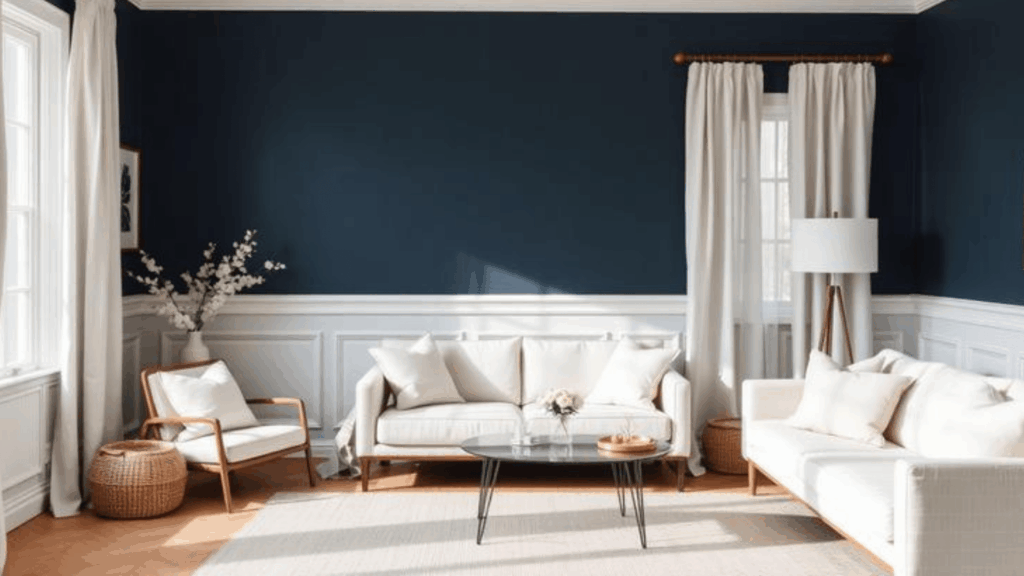
Navy blue paired with crisp white creates a balanced and elegant interior that feels classic yet fresh. Navy walls or a navy accent wall can add richness and depth without making the room feel too dark.
When combined with white trim, ceilings, or furniture, the space instantly looks polished and structured. This combination works particularly well in bedrooms, dining rooms, and home offices.
Adding natural textures such as light wood furniture, woven baskets, or linen curtains can soften the bold contrast and give the space a welcoming, comfortable feel.
11. Charcoal and Mustard Interior Style
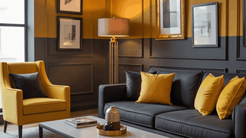
Charcoal gray and mustard yellow form a modern color pairing that brings energy and sophistication to an interior. Charcoal serves as a strong, grounding base, giving the room a refined, contemporary feel.
Mustard accents, such as cushions, chairs, artwork, or a feature wall, introduce warmth and vibrancy without overpowering the space.
This contrast works beautifully in living rooms or creative spaces that call for a modern look. Metallic details, such as brass lamps or gold frames, pair nicely with mustard tones and enhance the overall stylish atmosphere.
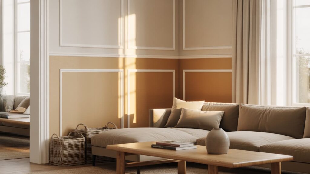
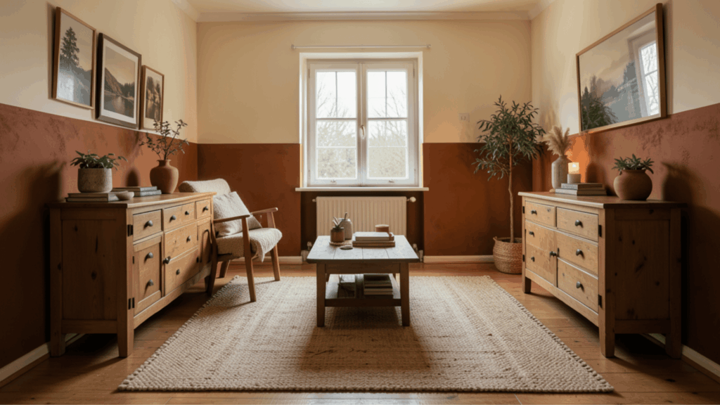
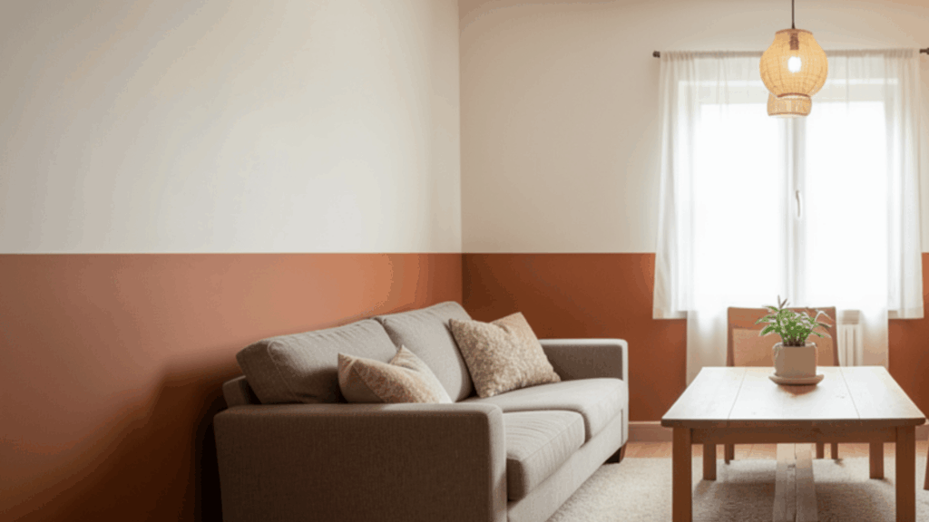
12. Terracotta and Cream Walls
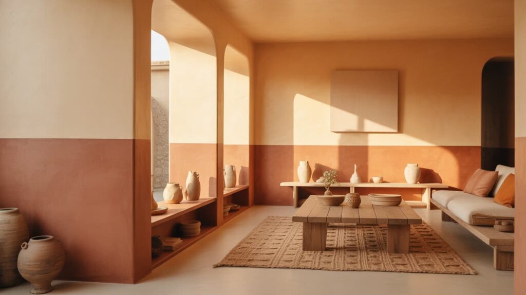
Terracotta and cream create a warm, earthy palette that makes a room feel calm and inviting. Terracotta, with its rich clay-inspired tone, adds depth and a natural character to walls, tiles, or decorative accents.
Cream balances the warmth by softening the overall look and keeping the room light and comfortable. This color pairing works well in living rooms, kitchens, or dining areas, aiming for a relaxed, grounded atmosphere.
Natural materials such as wood furniture, woven rugs, and ceramic decor can further enhance the cozy and organic feel.
Nature-Inspired Color Combinations
These color pairings are inspired by landscapes, plants, and coastal scenery. They bring calm, freshness, and a natural balance into interior spaces while keeping the room comfortable and visually pleasing.
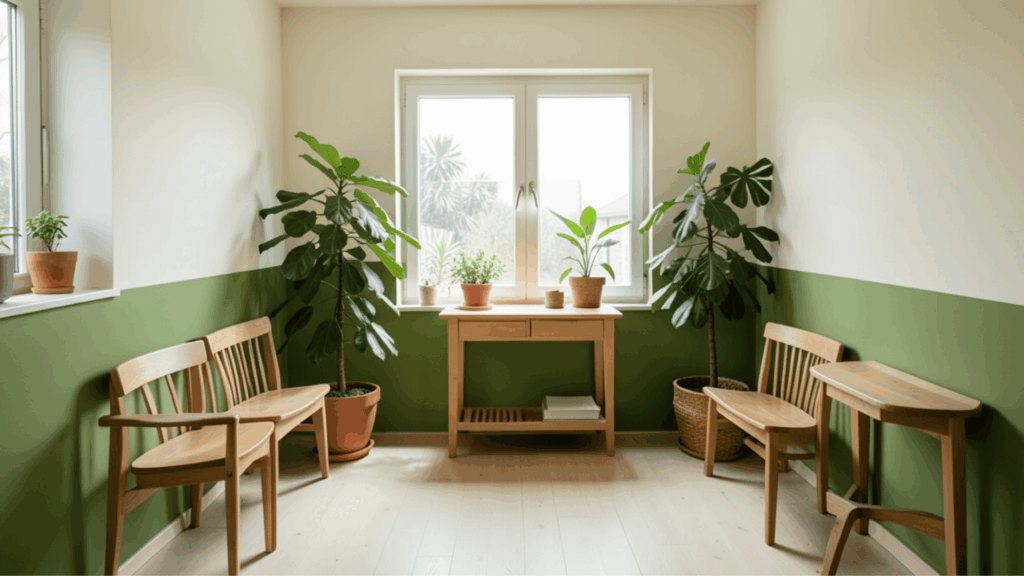
13. Olive Green and Beige Walls
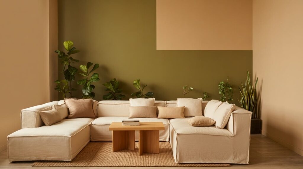
Olive green and beige create a calm and grounded interior inspired by nature. Olive green adds depth and a subtle earthy tone that works beautifully on walls, cabinets, or accent furniture.
Beige balances the look by bringing warmth and softness, keeping the room light and comfortable. This combination works well in living rooms, bedrooms, and reading corners where relaxation is important.
Natural textures such as linen curtains, wooden tables, and woven rugs blend perfectly with these tones, creating a space that feels peaceful and closely connected to nature.
14. Pistachio Green and White Walls
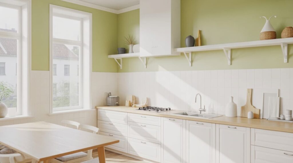
Pistachio green and white form a fresh and uplifting interior palette that feels light and cheerful. Pistachio green brings a soft botanical tone that adds personality without overpowering the room.
White walls, trims, or furniture help reflect light and keep the space open and airy. This pairing works especially well in kitchens, bathrooms, or sunlit living areas where brightness is welcome.
Adding indoor plants, light wood furniture, and simple decor pieces can enhance the botanical feel, making the room appear fresh, lively, and naturally inviting.
15. Forest Green and Soft Gray Walls
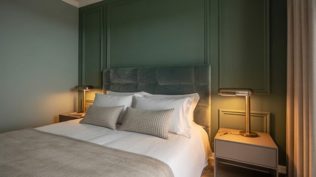
Forest green combined with soft gray creates a calm interior atmosphere. Forest green introduces a rich, nature-inspired depth that can make walls or statement furniture feel luxurious and bold.
Soft gray balances the intensity by adding a neutral tone, keeping the room refined and modern. This pairing works particularly well in bedrooms, offices, or formal living rooms where a relaxed yet elegant mood is desired.
Velvet fabrics, brushed metal accents, and subtle lighting can enhance the layered look and make the space feel rich and comfortable.
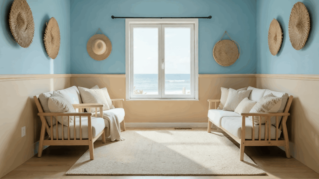
16. Sand and Ocean Blue Walls
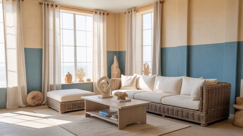
Sand and ocean blue create a relaxing palette inspired by beach landscapes. Sand tones bring warmth and softness, evoking coastal dunes, while ocean blue adds freshness and depth, evoking the feel of seawater.
Together, they create a calm and breezy interior atmosphere. This pairing works well in living rooms, bedrooms, and vacation-style homes that aim for a coastal feel.
Natural textures like rattan furniture, light wood finishes, and airy cotton fabrics complement these colors beautifully, helping the space feel bright, peaceful, and reminiscent of seaside living.
17. Dusty Blue And Beige Walls
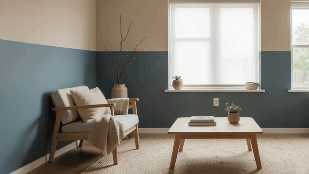
Dusty blue and beige create a soft and grounded look that feels calm and comfortable. Dusty blue adds a muted touch of color without feeling too strong, while beige keeps the space warm and neutral.
Placing blue on the lower half and beige above helps keep the room balanced and easy on the eyes. This pairing works well with wooden furniture, woven rugs, and soft lighting.
The result is a peaceful space that feels cozy, simple, and well-put-together.
18. Peach And White Walls
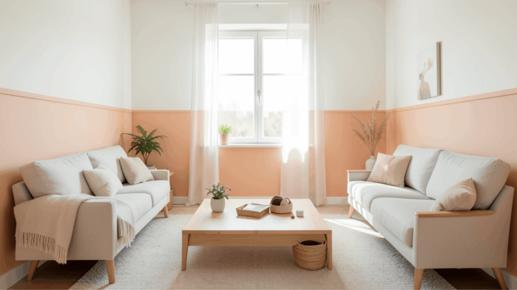
Peach and white bring warmth and brightness together in a simple and clean way. Peach adds a soft glow that feels warm and welcoming, while white keeps the space fresh and open.
A peach-colored wall with white above helps reflect light and keeps the room airy. This combination suits bedrooms, kids’ rooms, and small living areas.
Light furniture, soft fabrics, and simple décor help create a cheerful space that feels relaxed and easy to enjoy every day.
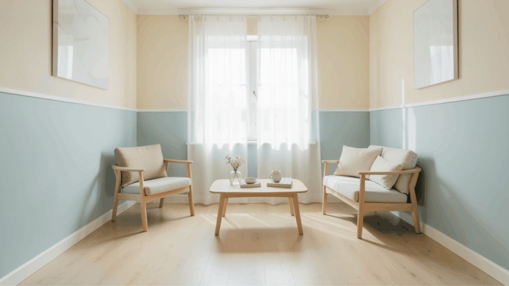
19. Steel Gray And Soft Blue Walls
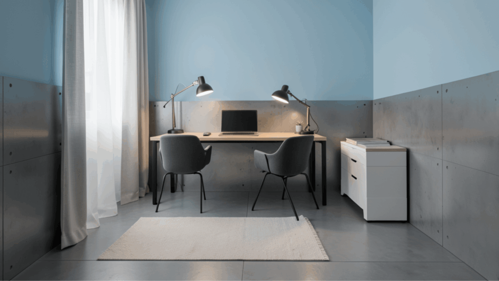
Steel gray and soft blue offer a calm and slightly modern look that feels clean and balanced. Steel gray adds depth and structure, while soft blue keeps the space light and gentle.
Using gray on the lower half and blue above creates a smooth and steady flow. This pairing works well with simple furniture, metal accents, and light curtains.
The overall look feels neat, quiet, and comfortable, making it a great choice for bedrooms and workspaces.
20. Warm White And Clay Walls
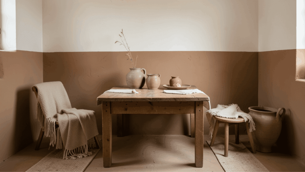
Warm white and clay tones create a cozy and earthy interior that feels welcoming and natural. Clay adds a rich tone that brings depth, while warm white keeps the space bright and open.
Using clay on the lower part of the wall helps ground the room, while white above keeps it light. This pairing works well with wooden tables, ceramic décor, and soft fabrics.
The space feels calm, warm, and easy to relax in throughout the day.
21. Butter Yellow And Cream Walls
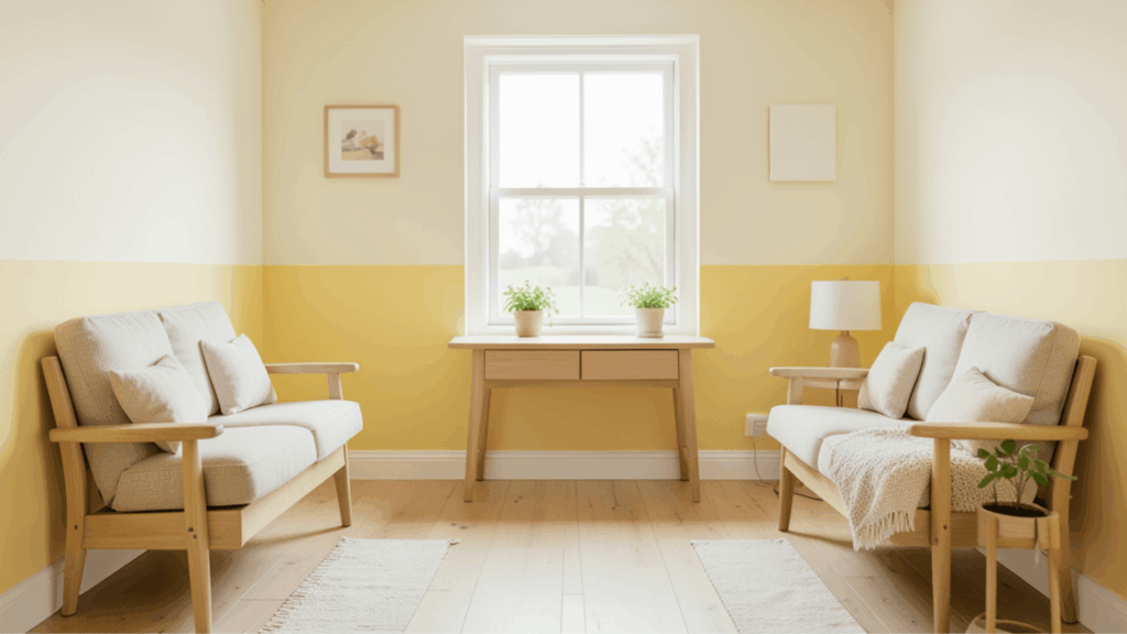
Butter yellow and cream create a soft, cheerful setting that feels warm and inviting. Butter yellow adds gentle brightness without being too strong, while cream keeps the room calm and smooth.
Yellow on the lower half with cream above helps reflect light and keeps the space balanced. This combination works well with light wood furniture, simple décor, and natural textures.
The room feels bright, fresh, and comfortable, making it ideal for everyday use.
22. Teal And Light Gray Walls
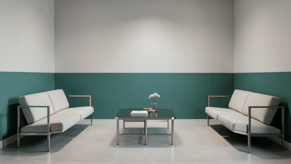
Teal and light gray create a modern, fresh contrast that feels stylish and balanced. Teal adds a rich tone that stands out, while light gray softens the overall look.
Placing teal on the lower half and gray above helps maintain harmony. This pairing works well with simple furniture, metal finishes, and soft lighting.
The result is a clean and updated space that feels calm, neat, and visually appealing without looking too busy.
23. Coral And White Walls
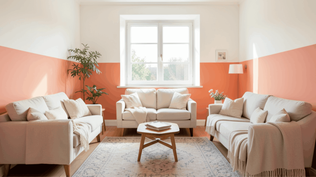
Coral and white create a lively yet soft interior style that feels warm and bright. Coral adds a gentle pop of color, while white keeps the room open and airy.
Using coral on the lower half helps anchor the space without making it feel heavy. This pairing works well with light furniture, soft fabrics, and simple décor.
The overall look feels cheerful and relaxed, making the space inviting and easy to enjoy throughout the day.
24. Sky Blue And Sand Walls
Sky blue and sand tones create a relaxed and airy feel inspired by coastal spaces. Sky blue adds freshness and lightness, while sand tones bring warmth and comfort.
Placing sand below and blue above keeps the room balanced and bright. This pairing works well with woven décor, light wood furniture, and soft fabrics.
The space feels calm, open, and peaceful, making it a great choice for bedrooms and living areas.
25. Mauve And Beige Walls
Mauve and beige create a soft and slightly elegant look that feels calm and balanced. Mauve adds a gentle color tone, while beige keeps the space warm and neutral.
Using mauve on the lower section with beige above creates a subtle contrast without being too bold. This pairing works well with soft fabrics, light curtains, and simple décor.
The result is a peaceful space that feels cozy, neat, and comfortable for daily living.
26. Olive And Cream Walls With Trim Divider
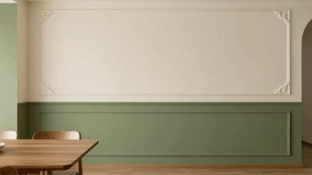
Olive and cream with a trim divider create a clean and structured wall design. Olive adds depth and an earthy tone, while cream keeps the room bright and soft.
A trim line between the two colors gives a neat and finished look. This pairing works well in dining areas and hallways with wooden furniture and simple décor.
The space feels organized, balanced, and visually pleasing without feeling too busy.
27. Charcoal And Blush Walls
Charcoal and blush create a balanced mix of deep and soft tones that feel warm and modern. Charcoal adds strength and depth, while blush softens the overall look.
Using charcoal on the lower half and blush above keeps the room grounded and light at the same time. This pairing works well with soft fabrics, warm lighting, and simple furniture.
The space feels cozy, stylish, and comfortable for everyday use.
28. Powder Blue And Ivory Walls
Powder blue and ivory create a gentle and airy atmosphere that feels calm and welcoming. Powder blue adds a soft touch of color without making the space feel heavy, while ivory keeps the room warm and bright.
Using blue on the lower half and ivory above helps maintain balance and light. This pairing works well with light wood furniture, soft curtains, and simple décor.
The space feels peaceful, clean, and comfortable for rest and quiet daily use.
29. Rust And Cream Walls
Rust and cream offer a warm and inviting color pairing that feels cozy and grounded. Rust brings depth and richness, while cream softens the overall look and keeps the room light.
Using rust on the lower section creates a strong base, while cream above adds brightness. This pairing works well with wooden furniture, woven rugs, and natural décor.
The result is a space that feels warm, relaxed, and easy to enjoy during everyday living.
30. Pale Yellow And Light Gray Walls
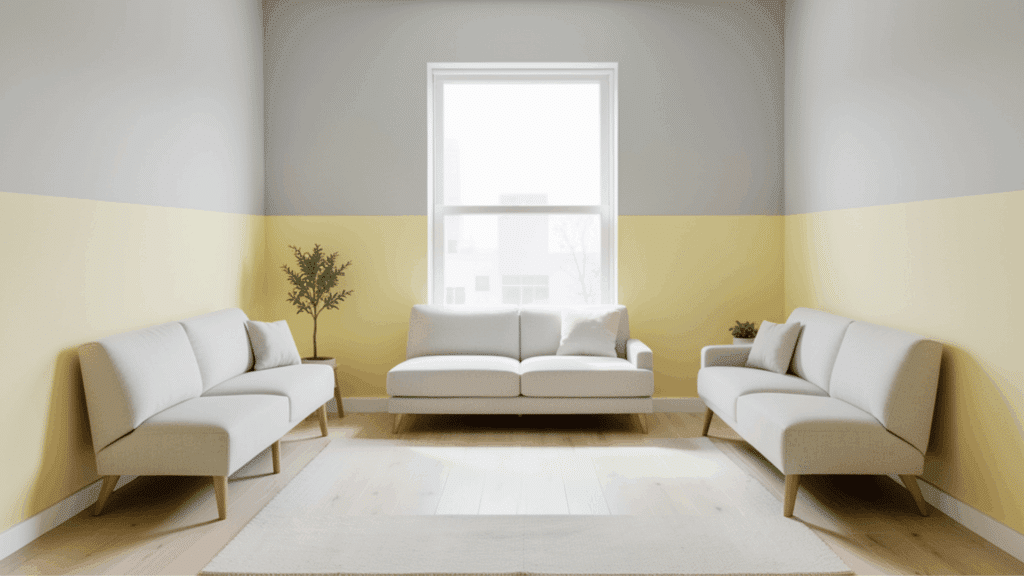
Pale yellow and light gray create a soft and balanced interior that feels fresh and calm. Pale yellow adds a gentle hint of brightness, while light gray keeps the space neutral and steady.
Placing yellow on the lower half and gray above creates a smooth contrast without being too bold. This pairing works well with simple furniture, light fabrics, and clean décor.
The room feels bright, neat, and comfortable for both work and relaxation.
31. Deep Green And Beige Walls
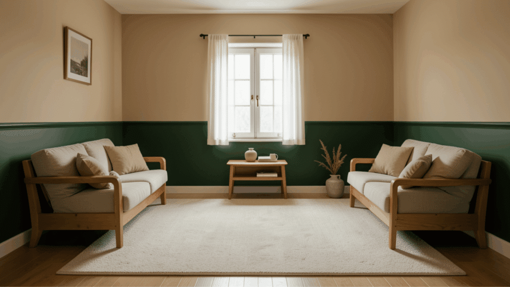
Deep green and beige create a rich yet comfortable look that feels natural and balanced. Deep green adds a strong, earthy tone that brings depth, while beige keeps the room warm and light.
Using green on the lower half helps anchor the space, while beige above maintains openness. This pairing works well with wooden furniture, soft rugs, and neutral décor.
The space feels calm, grounded, and well-suited to quiet, relaxing areas.
32. Aqua And White Walls
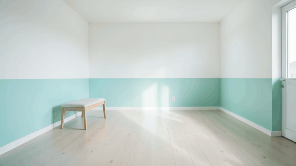
Aqua and white create a fresh and lively interior that feels clean and bright. Aqua adds a light and energetic tone, while white keeps the room open and airy.
Using aqua on the lower section with white above helps reflect light and maintain balance. This pairing works well with simple furniture, light fabrics, and minimal décor.
The overall space feels refreshing, neat, and comfortable, making it suitable for everyday living and small areas.
33. Cinnamon And Soft White Walls
Cinnamon and soft white create a warm and cozy setting that feels inviting and comfortable. Cinnamon adds depth and a rich tone, while soft white keeps the space bright and balanced.
Using cinnamon on the lower half and white above helps maintain a clean look. This pairing works well with wooden furniture, warm lighting, and soft fabrics.
The space feels relaxed, simple, and well-suited for living rooms and dining areas.
34. Slate Blue And Cream Walls
Slate blue and cream create a calm and slightly refined look that feels balanced and smooth. Slate blue adds depth without making the space feel dark, while cream keeps the room warm and open.
Using blue on the lower half and cream above helps maintain harmony. This pairing works well with light furniture, soft curtains, and simple décor.
The room feels neat, peaceful, and comfortable for both rest and daily use.
35. Moss Green And Off-White Walls
Moss green and off-white bring a soft, natural feel that feels calm and refreshing. Moss green adds an earthy tone that complements nature, while off-white keeps the space light and open.
Using green on the lower portion and off-white above creates a balanced look.
This pairing works well with plants, wooden furniture, and simple décor. The space feels peaceful, clean, and comfortable for everyday living.
Most Popular Two-Tone Wall Painting Styles
These painting styles are simple to achieve and work well in living rooms, bedrooms, hallways, and even small spaces.
Horizontal Split Walls
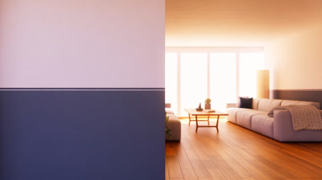
Horizontal split walls divide the wall into two sections with one color on the top and another on the bottom. This classic two-tone method gives the room a balanced and organized appearance.
Many homeowners choose a darker shade below and a lighter shade above to keep the space feeling open. When the top color is lighter, ceilings often appear taller, which helps small rooms feel less cramped.
This style works well in dining rooms, living rooms, and bedrooms where subtle contrast can add interest without making the design feel too busy.
Vertical Split Walls
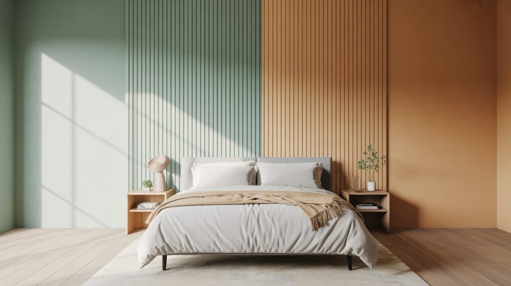
Vertical split walls use two colors placed side by side across the wall. Instead of dividing the wall horizontally, the color line runs from floor to ceiling.
This approach creates a bold and modern look that can highlight a specific section of a room. Designers often use this style for accent walls or narrow areas that need a visual lift.
Vertical color division can also guide the eye upward, making the room feel taller. Choosing two shades from the same color family helps maintain harmony while still adding contrast to the space.
Ombre Gradient Walls
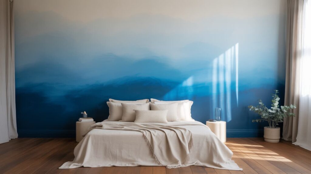
Ombre gradient walls blend two or more shades, with the colors gradually fading into each other. Instead of a sharp line separating colors, the transition appears smooth and soft.
This painting style adds a calm and artistic atmosphere to bedrooms, nurseries, and creative spaces. The gradient effect often begins with a darker tone near the floor and gradually becomes lighter toward the top of the wall.
Soft blues, pinks, and neutral shades work especially well for this design. The gentle color shift creates depth while keeping the overall wall design relaxed and visually pleasing.
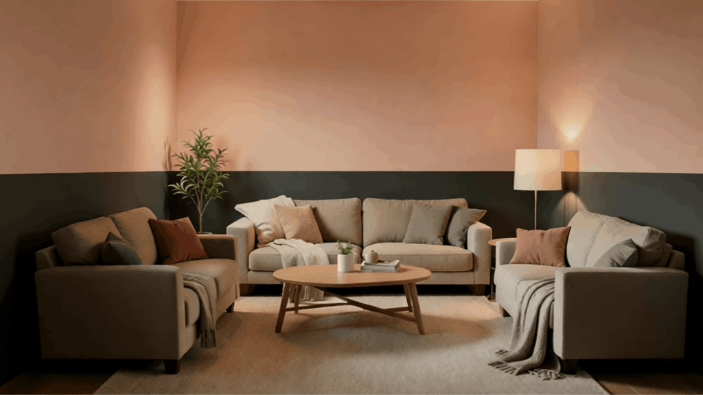
Half-Wall Paint
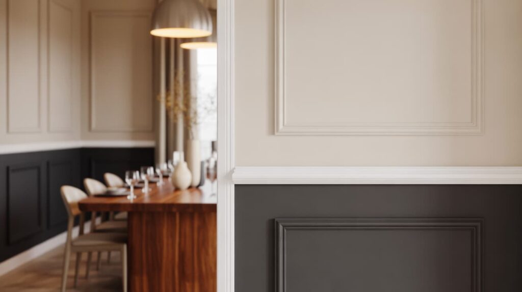
Half-wall paint, often called color blocking, divides the wall evenly with two contrasting shades. The bottom half usually features a deeper or richer color, while the upper half stays light and airy.
This technique is commonly paired with chair rails, wooden trims, or decorative moldings to highlight the separation line.
It is a practical option for hallways, dining rooms, and children’s rooms because darker paint on the lower section can help hide marks or scuffs. The result is a structured and stylish wall design that feels both traditional and modern.
Geometric Two-Tone Walls
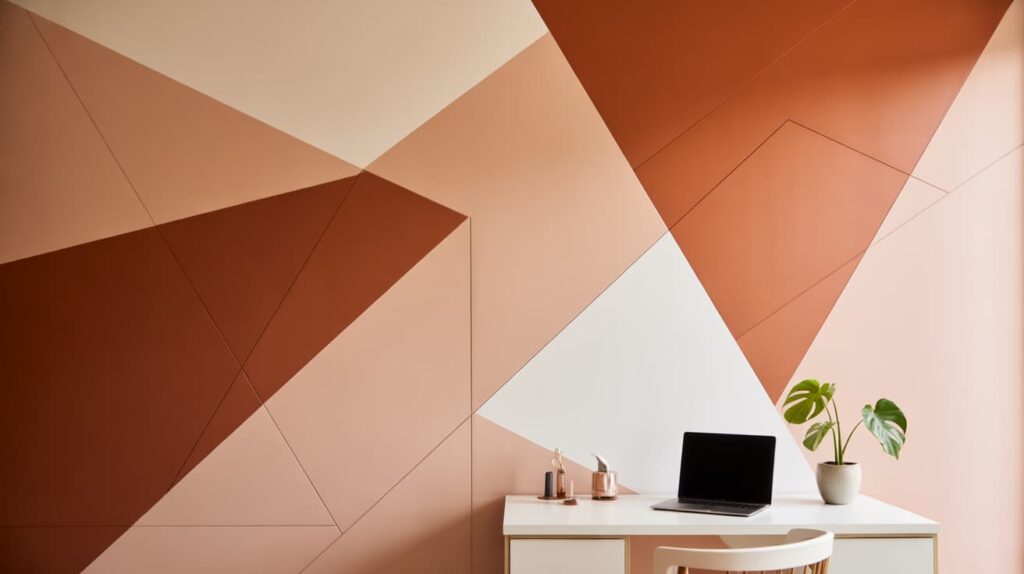
Geometric two-tone walls use shapes and lines to create eye-catching patterns with two different paint colors. Painter’s tape helps outline triangles, diamonds, or angled blocks before painting begins.
This technique allows homeowners to add personality and creativity to plain walls without using wallpaper or large decorations. The patterns can be subtle with soft neutrals or bold with strong contrasting colors.
Geometric designs work especially well in modern living rooms, home offices, and children’s bedrooms, where playful and artistic wall details can make the space feel more dynamic.
Mistakes That Can Ruin a Two-Tone Wall Design
Two-tone walls can look stylish and balanced when done right. However, a few common mistakes can make the space feel awkward or overwhelming instead of polished.
-
Choosing colors with clashing undertones:
Even if two colors look nice individually, mismatched undertones can create a harsh visual effect. For example, pairing a warm beige with a cool gray may feel off. Always check whether the colors share similar warm or cool undertones before painting. -
Using overly dark combinations in small rooms:
Dark shades on both sections of a two-tone wall can make a small room feel cramped. Instead, balance a darker color with a lighter shade to keep the space feeling open and comfortable. -
Ignoring lighting conditions:
Natural and artificial light can change how paint colors appear on the wall. A shade that looks perfect in the store may appear dull or overly bold in your room. Test paint samples under your room’s lighting before committing. -
Painting uneven dividing lines:
A messy or uneven line between the two colors can quickly ruin the clean look of a two-tone design. Use painter’s tape, a level, and careful measurements to keep the dividing line crisp and professional.
Final Thoughts
After going through all these ideas, I feel two-tone walls are one of the easiest ways to change how a room feels without doing too much work.
I’ve noticed that even small color changes can make a space look more put-together and comfortable. The key is to keep things simple, pick colors that feel right to you, test them in your lighting, and take your time with the layout.
You don’t need perfect skills to try this. Even a basic horizontal split or soft color pairing can give your walls a fresh look. I always believe that your home should reflect your style, not just trends.
If you’re thinking about updating your walls, this is a great place to start. Try one idea, see how it feels, and build from there.
Tell me in the comments, what color combo are you planning to try first?