
Proportion in interior design shapes how spaces feel by controlling how objects relate in terms of size, balance, and placement across a room, without relying solely on individual measurements. It connects furniture, color, and layout into one readable system where nothing feels random, even when each piece is technically the right size for the space. Once these relationships start to shift your attention inside a room, you begin noticing why some spaces feel right instantly while others feel slightly off without reason.
What Proportion in Interior Design Really Means?
Proportion is the size relationship between objects in a room, such as how a coffee table relates to a sofa or a lamp relates to its table. Scale in interior design is different, though, which focuses on whether a single object fits a space, while proportion evaluates how pieces relate to each other visually. A sofa can pass the scale test in interior design, yet still fail proportion if the relationships among surrounding furniture feel off, creating an imbalance despite individually correct sizing throughout the room. Visual weight changes how things feel in size, referring to the perceived mass based on color, material, and density, with darker or solid pieces appearing heavier than lighter, transparent ones. Understanding size, scale, and visual weight together makes design rules clearer, showing why some correctly sized furniture still feels visually wrong in placement.
The Golden Ratio: Why Uneven Proportions Feel More Natural than Even Ones?
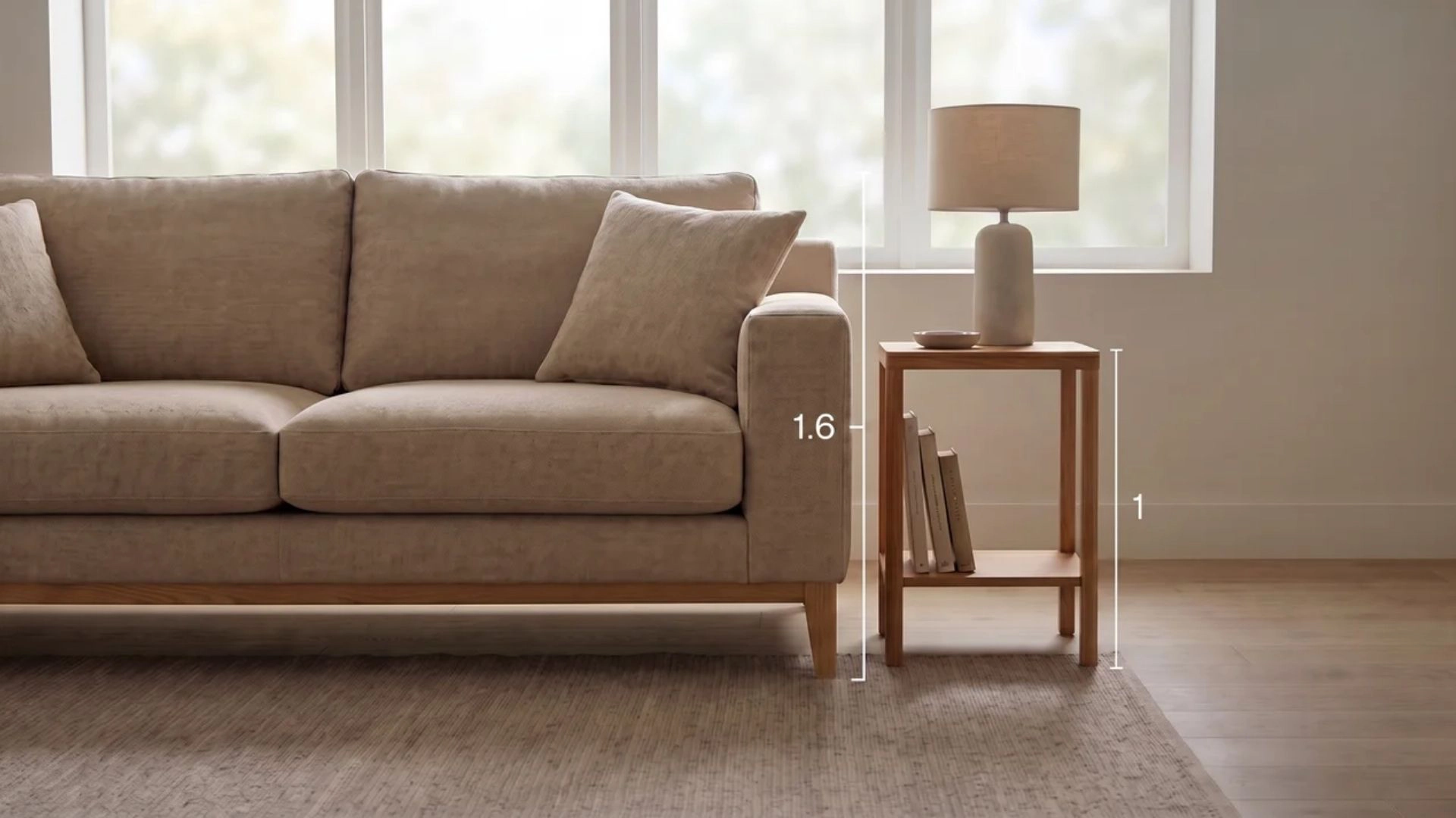 The Golden Ratio sounds like math, but it’s really about how the eye reads. When two objects are nearly equal in size, such as pairs of furniture, the eye struggles to assign importance, creating visual competition and subtle perceptual discomfort.
- Equal-sizing conflict: When objects are similar in size, neither reads as the anchor, so attention shifts repeatedly between them without resolution, producing visual tension.
- Uneven ratios: Ratios like 2:3 or 3:5 create a clear hierarchy, where one element anchors the space and the other visually supports it.
- Core principle: The idea is not the exact 1.618 value but the consistent separation of dominance and support in any paired visual arrangement.
- Design applications: This logic applies to furniture, lighting, and layout decisions, helping establish clarity even when adapting rules beyond standard ratios.
Once hierarchy becomes clear, the eye settles quickly, and compositions feel resolved, even when objects differ in style, scale, or placement across a space.
12 Golden Rules of Proportion that Always Work
Theory is useful, but a tape measure is better. These twelve rules are the shortcuts designers lean on, and each one takes the guesswork out of sizing a room.
Rule 1: Fill 60% of the Room, Leave 40% Open
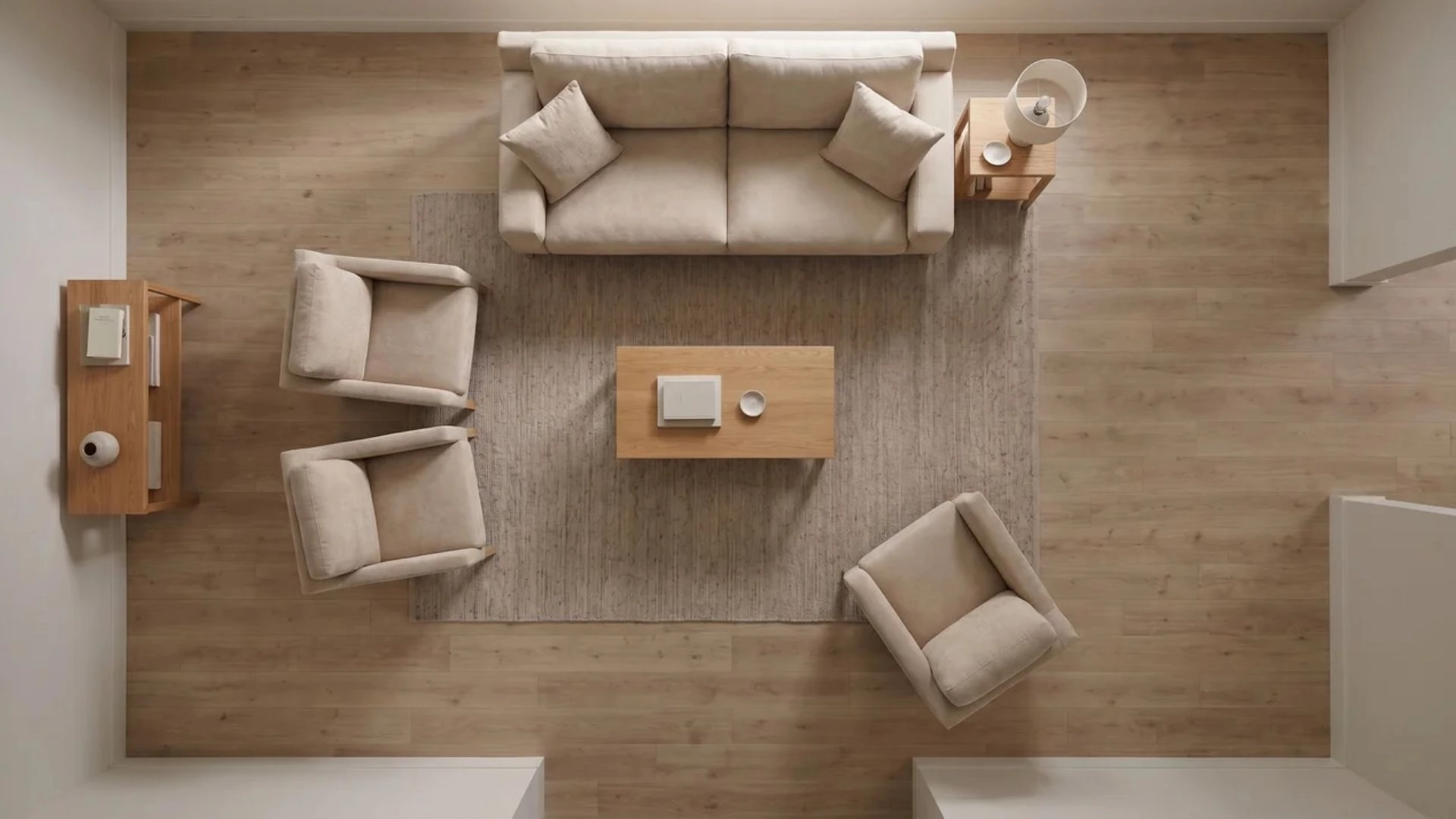 Furniture should occupy about sixty percent of your usable floor space. That remaining space is what keeps movement easy and prevents a cramped feel. Step back and check walking paths first. If you cannot move freely between key areas, remove one piece until the layout feels open again.
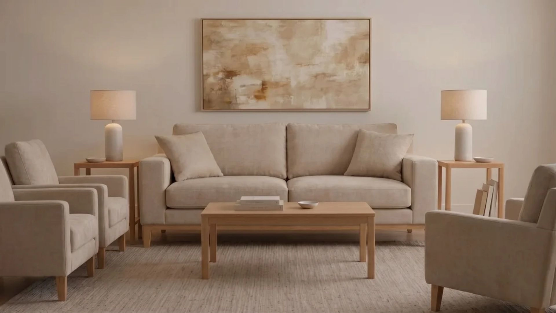
Rule 2: Size the Sofa to its Wall
 A sofa should cover roughly two-thirds of the wall it sits against. This creates visual balance without making the wall feel empty or overcrowded. Start by checking the wall size first, then choose a sofa that fills most of that span without touching the edges. Avoid small sofas on long walls since they instantly feel disconnected.
Rule 3: Match the Coffee Table to the Sofa
 A coffee table works best at about two-thirds the length of your sofa. This keeps reach distance practical while maintaining visual balance. Pick a table that sits within arm’s reach of every seat. Leave enough space around it so you can walk through without turning sideways.
Rule 4: Always Go Bigger on the Rug
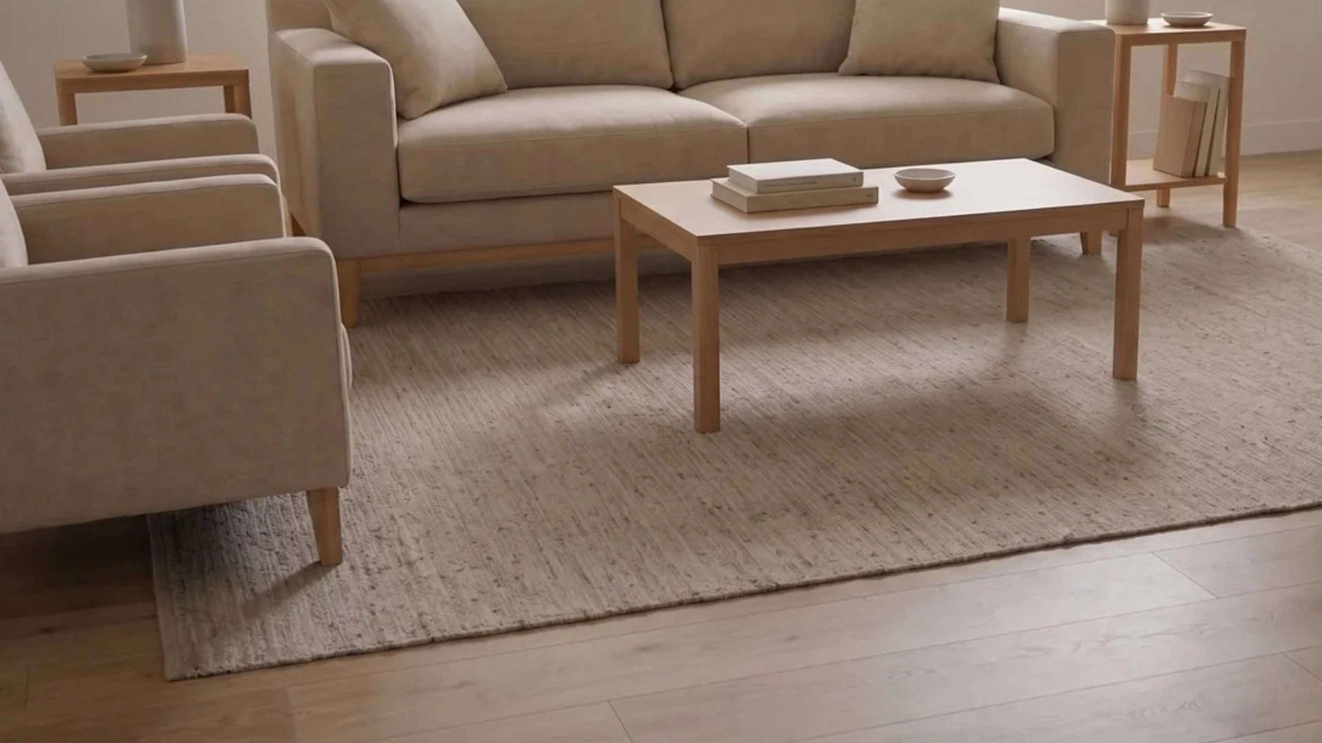 Small rugs break up a room visually and make everything feel disconnected. A proper rug should anchor at least the front legs of all seating. Place your rug first, then arrange furniture around it. If the rug does not touch the main seating pieces, size up immediately.
Rule 5: Hang Art at Two-Thirds Width
 Art should span about two-thirds of the furniture or wall beneath it. This ratio keeps the composition visually stable and intentional. Measure the furniture below before hanging anything. Center the artwork and ensure it visually fills most of the available width above it.
Rule 6: Get the Chandelier Width Right
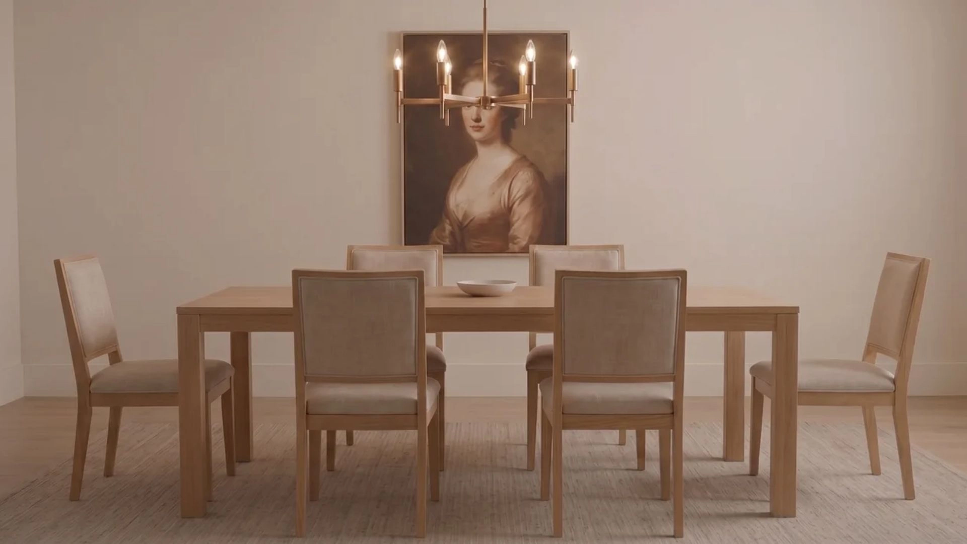 A chandelier over a dining table should be about half the table’s width. This keeps the fixture proportionate without overpowering the surface below. Stand under the fixture spot and check coverage. If it feels too narrow or lost, increase the diameter before installation.
Rule 7: Use the Room-Size Light Formula
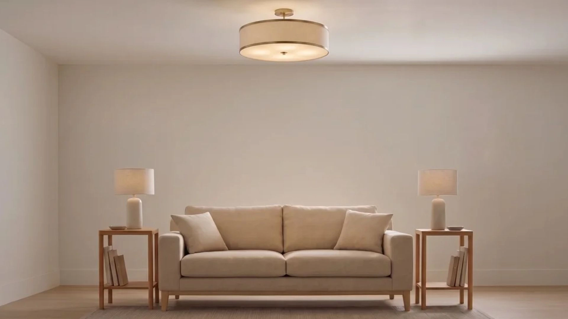 Add the room length and width in feet, then convert the total to inches for the fixture diameter. A 12-by-14 room calls for roughly a 26-inch light. Measure your room first, then apply the formula before shopping. Avoid guessing since most lighting ends up undersized when chosen visually.
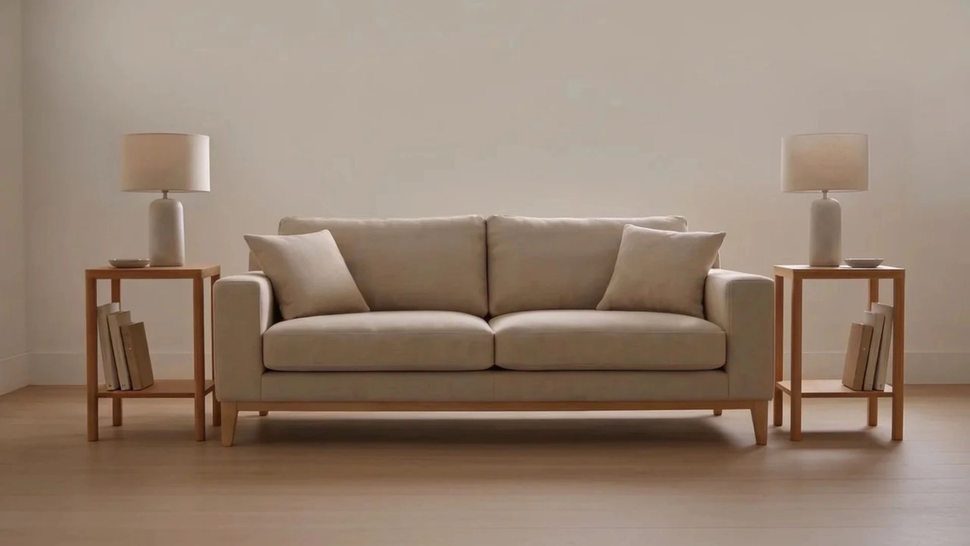
Rule 8: Vary Heights for Visual Rhythm
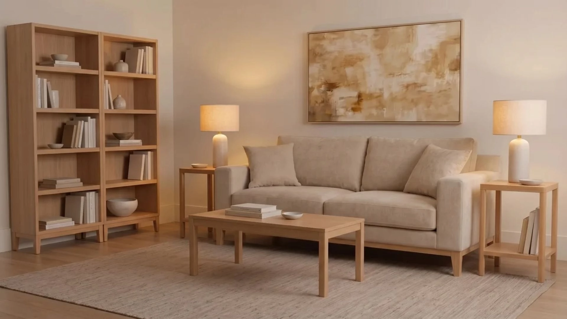 Rooms feel flat when everything sits at the same height. Mixing tall, medium, and low pieces creates natural movement for the eye. Place tall items first, then fill in lower layers around them. Avoid lining everything at the same level since it flattens the entire setup.
Rule 9: Keep Decor to the One-Third Rule
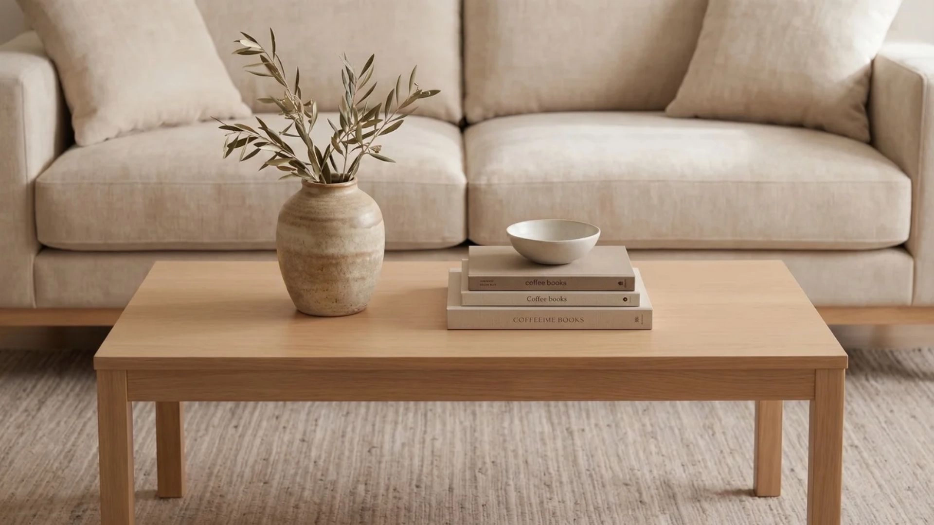 Decor pieces should stay within one-third of the size of the surface they sit on. This keeps tables and consoles from feeling overloaded. Check each surface individually and remove anything that dominates more than one-third of its base. Keep only accents that support the main furniture.
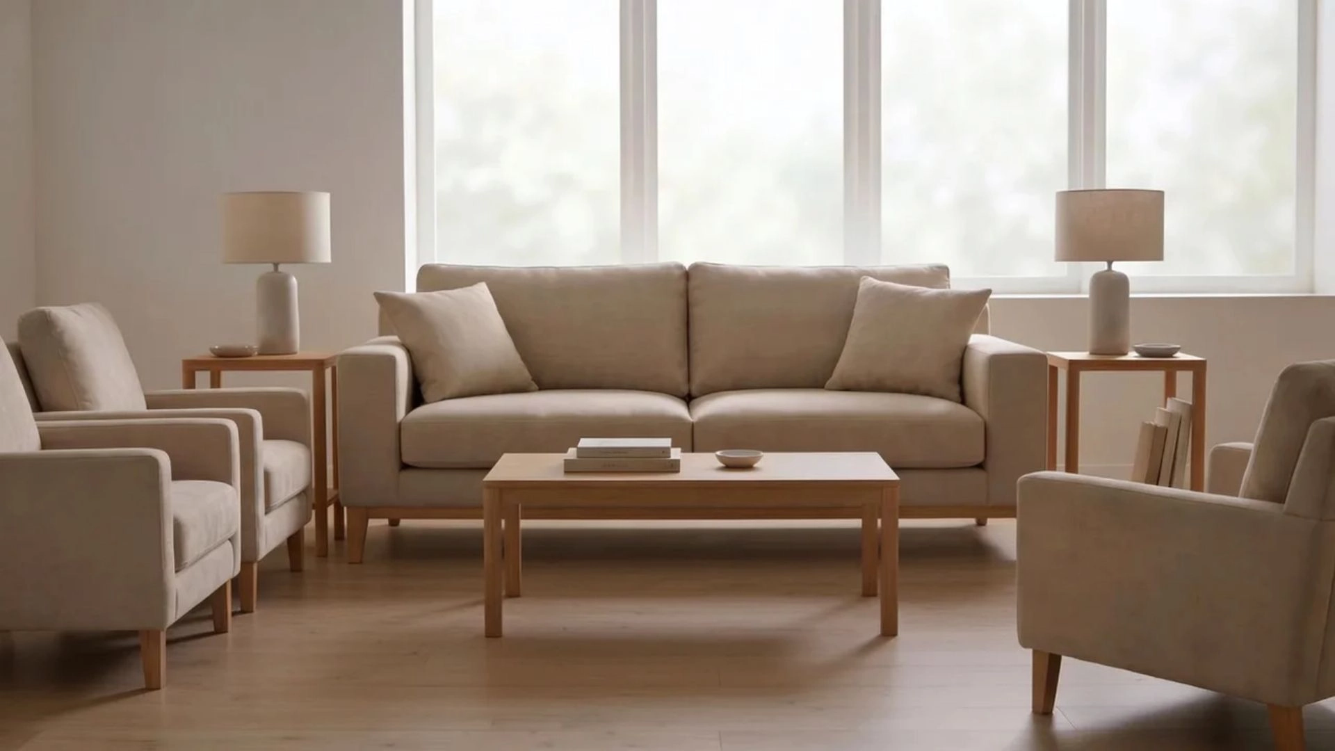
Rule 10: Balance Visual Weight Across the Room
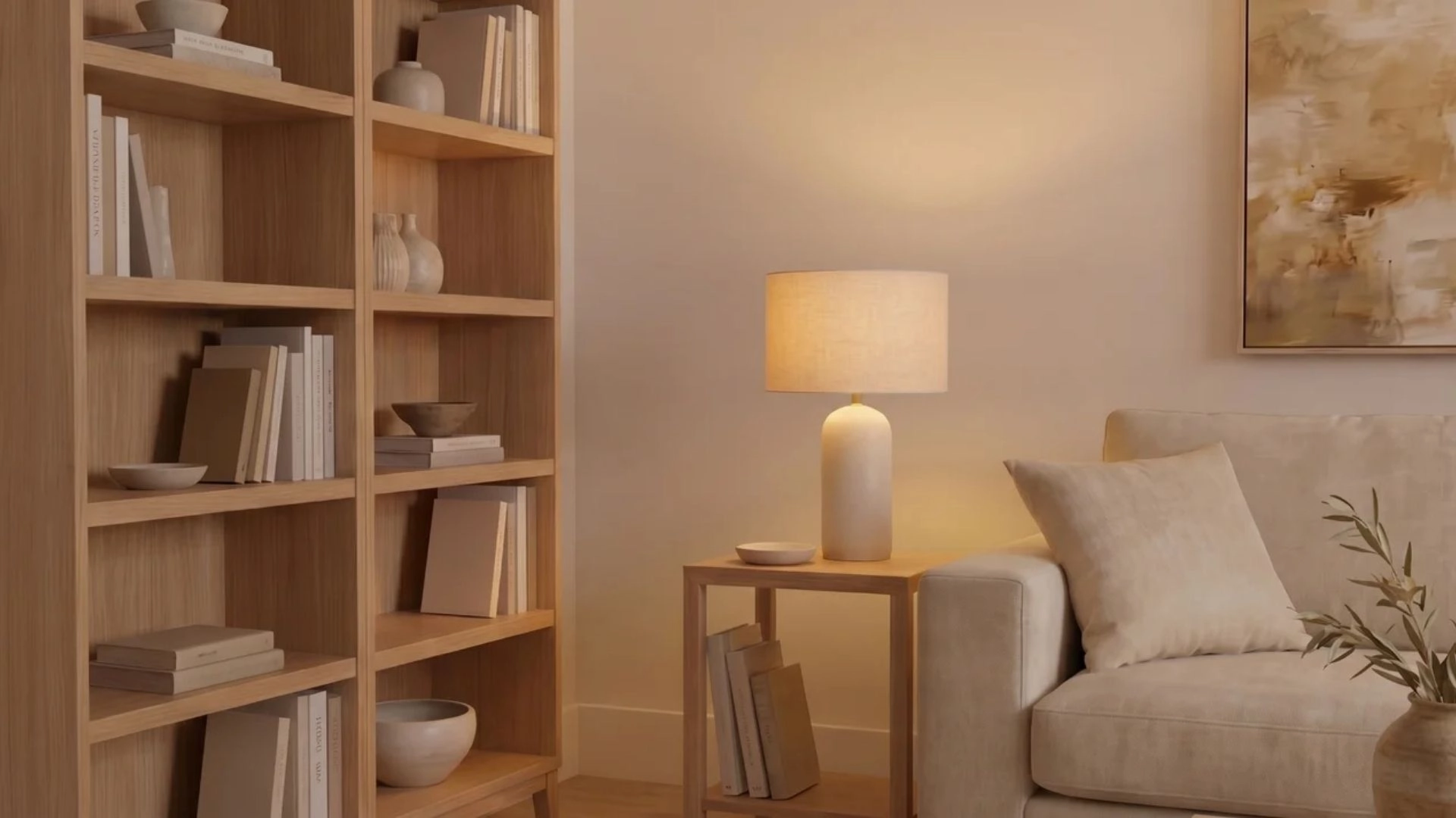 Every object carries visual weight based on size, color, and density. That weight needs to be distributed evenly across the room. Scan the room from left to right and shift heavier pieces until both sides feel equally grounded. Avoid clustering all large items in one corner.
Rule 11: Respect Human Scale
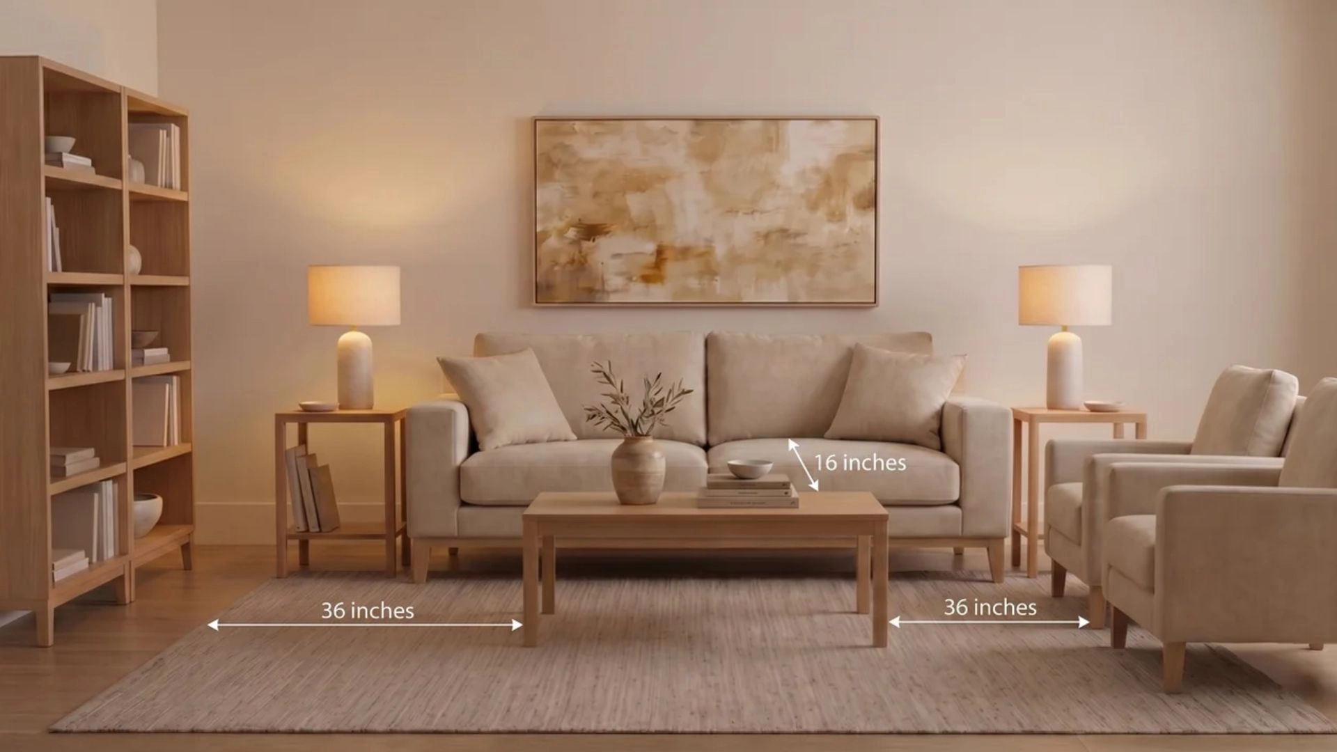 Furniture must work with real human movement, not just aesthetics. Walkways should stay around three feet wide for comfortable passage. Measure walking paths in your layout and adjust spacing until movement feels natural. Keep seating close enough for conversation but not tight.
Rule 12: Do the Painter’s Tape Test
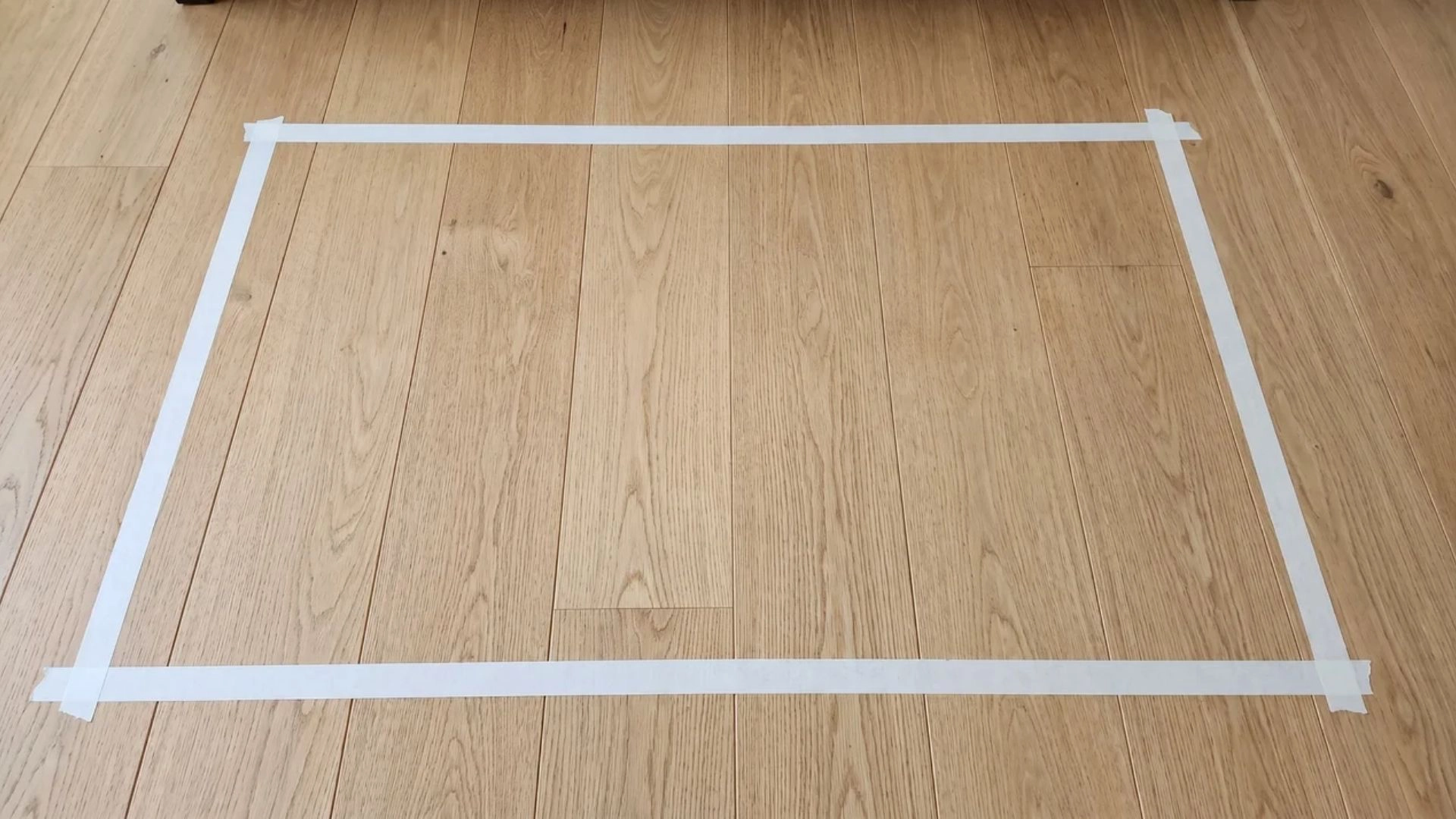 Before buying anything large, map its footprint on the floor using painter’s tape. This shows how much space it actually occupies. Tape the exact dimensions where the furniture will go. Walk around it and adjust it before purchase to avoid sizing mistakes. Master these twelve rules, and you’ll have covered the vast majority of proportion decisions for your sweet home.
How Does Proportion Work with Color? The 60-30-10 Rule
The 60-30-10 rule doesn’t just apply to furniture. It also controls how color sits in a room, using the same idea of one dominant, one supporting, and one accent. Sixty percent is your base. It’s the walls, floors, and big surfaces that set the mood the moment you walk in. This is what everything else builds on. Thirty percent is your secondary layer. Sofas, curtains, rugs, cabinets. It doesn’t lead the room, but it gives structure and keeps things from feeling empty. Ten percent is the small population. Cushions, art details, lamps, decor pieces. It’s there to break monotony and guide the eye in small hits.
- Clear structure: One color takes charge, another backs it up, and a third adds contrast.
- Easy reading: The eye doesn’t get confused because each layer has a job.
- Controlled energy: Accent color stays limited, so it stands out without taking over.
The whole rule works because it stops colors from fighting for attention. Everything has a place, so the room feels calmer and more intentional. It all comes down to one thing: hierarchy. One leads, one supports, one punctuates. When that’s clear, the space just feels right. Where it gets interesting is visual weight. Color isn’t just about how much space it covers; it’s also about how heavy it feels. A 30 percent sofa in deep navy velvet can easily feel larger than its percentage would suggest. Dark tones, rich textures, and glossy finishes pull more attention.
- Visual weight matters: Dark or saturated colors feel larger than light ones.
- Material changes perception: Velvet, gloss, and texture all increase impact.
- Fix the feel, not the math: Often it’s better to adjust tone than change ratios.
So if something feels “off,” it’s usually not the rule-breaking. It’s the material or shade overpowering its role. In open-plan spaces, don’t treat everything as one big 60-30-10 system. It works better when each zone has its own balance. That way, the kitchen, dining, and living areas each feel complete on their own, rather than competing with one another throughout the layout.
How Does Scale Work Alongside Proportion?
Scale and proportion sound similar, but they’re doing two different jobs. Proportion is about how objects relate to each other; scale is about the room itself. In larger rooms, small furniture loses impact fast. It doesn’t just look tiny; it fails to ground the space, leaving everything feeling scattered. In smaller rooms, oversized pieces do the opposite. They overwhelm the layout and reduce usable space, making the room feel tighter than it actually is.
- Large spaces need weight: Bigger furniture creates a visual center that holds the room together.
- Small spaces need restraint: Slim profiles keep flow open and prevent visual clutter.
Scale also helps you create a focal point. One slightly oversized element gives the eye a place to land and instantly establishes the hierarchy. A focal piece, such as art, lighting, or furniture, establishes visual hierarchy. It anchors the room, so everything else relates to it rather than competing with it. Scale extends dominance across the entire space, not just between objects. It ensures one element leads while others visually support or recede naturally within the layout. If nothing stands out at entry, the scale is missing. When multiple elements compete equally, the room feels unsettled. One clear leader creates balance.
Common Proportion Mistakes and Easy Fixes
Even with the rules in hand, a few mistakes can trip up almost everyone. Here are the most common ones and how to fix them fast:
- Tiny Art on a Big Wall: A small frame stranded on a large wall looks lost. Size up to one big piece, or group several frames so they read as a single unit.
- Matching Furniture Sets: When every piece looks the same, the room loses depth. Mix shapes, heights, and finishes so the eye has movement and natural focus points.
- Undersized Nightstands and Side Tables: A narrow table beside a tall bed or deep sofa feels out of place. Match height and visual weight so the setup feels grounded and intentional.
Small proportion fixes like these often shift the entire feel of a room without replacing anything.
Wrapping Up
Proportion in interior design brings everything together by linking scale, visual weight, and placement so that rooms feel naturally balanced rather than visually scattered or disconnected. It becomes easier to see why some layouts work even when nothing seems special on its own, as the relationships between objects carry the actual design impact. Start paying attention to how elements interact rather than how they look on their own, and adjust the balance where the eye feels tension rather than rest.
Frequently Asked Questions
What is the 60-30-10 rule in interior design?
The 60-30-10 rule distributes color across a room in a dominant-to-accent hierarchy: 60% to walls and floors, 30% to major furniture, 10% to accent pieces. The percentages encode a visual hierarchy that prevents any one color from competing with another for the eye’s attention.
What is the Golden Ratio and how does it apply to interior design?
The Golden Ratio (approximately 1.618:1) is a mathematical proportion that produces a visually stable dominant-to-subordinate relationship. In practice, it appears in furniture sizing ratios, such as the 2:3 rule for coffee tables relative to sofas. Uneven ratios establish a clear dominant-subordinate hierarchy. Even splits create visual tension because neither element reads as the anchor.
How do you fix a room that feels off but you cannot identify why?
Start with visual weight rather than measurements. Check whether any two objects of near-equal visual weight sit at the same eye level without a clear dominant-subordinate relationship. Dark, dense, or highly textured pieces carry more visual weight than their size suggests; adjusting placement or introducing a stronger anchor piece often resolves the feeling without replacing furniture.
What is the difference between scale and proportion in interior design?
Scale describes how a single object’s size relates to the surrounding room. Proportion describes how objects relate to each other. A sofa can be correctly scaled to a large room and still be out of proportion with a small coffee table beside it. Both must work independently for a space to feel balanced.