
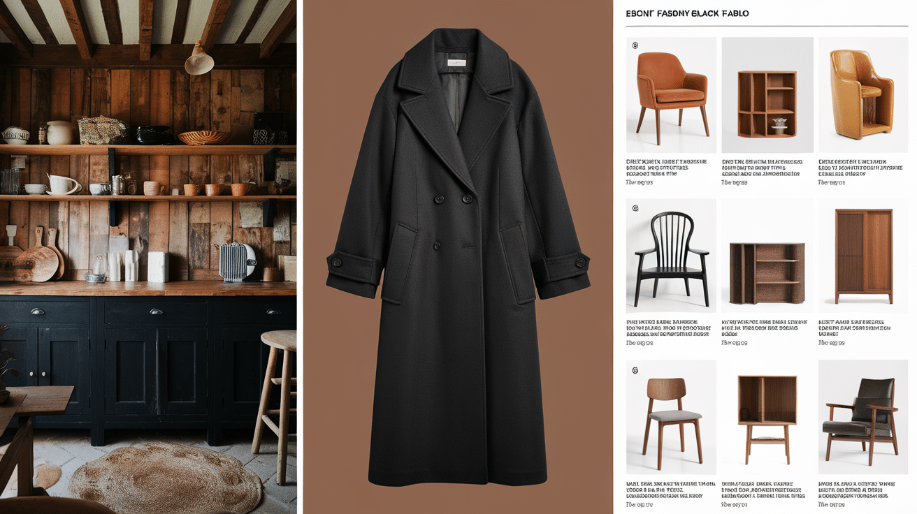
Black might seem like just one color, but did you know there are actually many different shades of black? From jet black to charcoal to raven, each shade has its own look and feel. Some are darker and bolder, while others have hints of gray, brown, or even blue.
Designers, artists, and fashion lovers often choose certain shades of black to create a specific mood or style. Whether it’s a sleek black dress, a cozy charcoal couch, or bold black lettering in a logo, the black you pick can really make a difference.
In this blog, we’re going to look at some of the most popular black colors, what makes each one special, and where you might see them used. If you thought black was boring, you’re about to change your mind.
Understanding Black and Its Variations
When most people think of black, they picture one solid, dark color. But black is actually more than that—it can come in many different shades. So, how is that possible?
It all comes down to how black is mixed with other colors or how light or dark it appears. Some blacks look warmer with a touch of brown or red. Others look cooler with hints of blue or gray. Even the tiniest change can give black a whole new look.
Designers and artists often experiment with these small changes to create the perfect shade for their needs. Understanding these small differences helps us see that black isn’t just one color—it’s a whole range of cool, dark tones.
How Black Colors Affect Mood and Style
Different shades of black can change how something feels just by looking at it. Designers and artists use black on purpose to send a message or create a certain mood.
-
Bold and Strong: Deep blacks, such as jet black or pitch black, can make something look powerful and confident. They are great for bold outfits or dramatic designs.
-
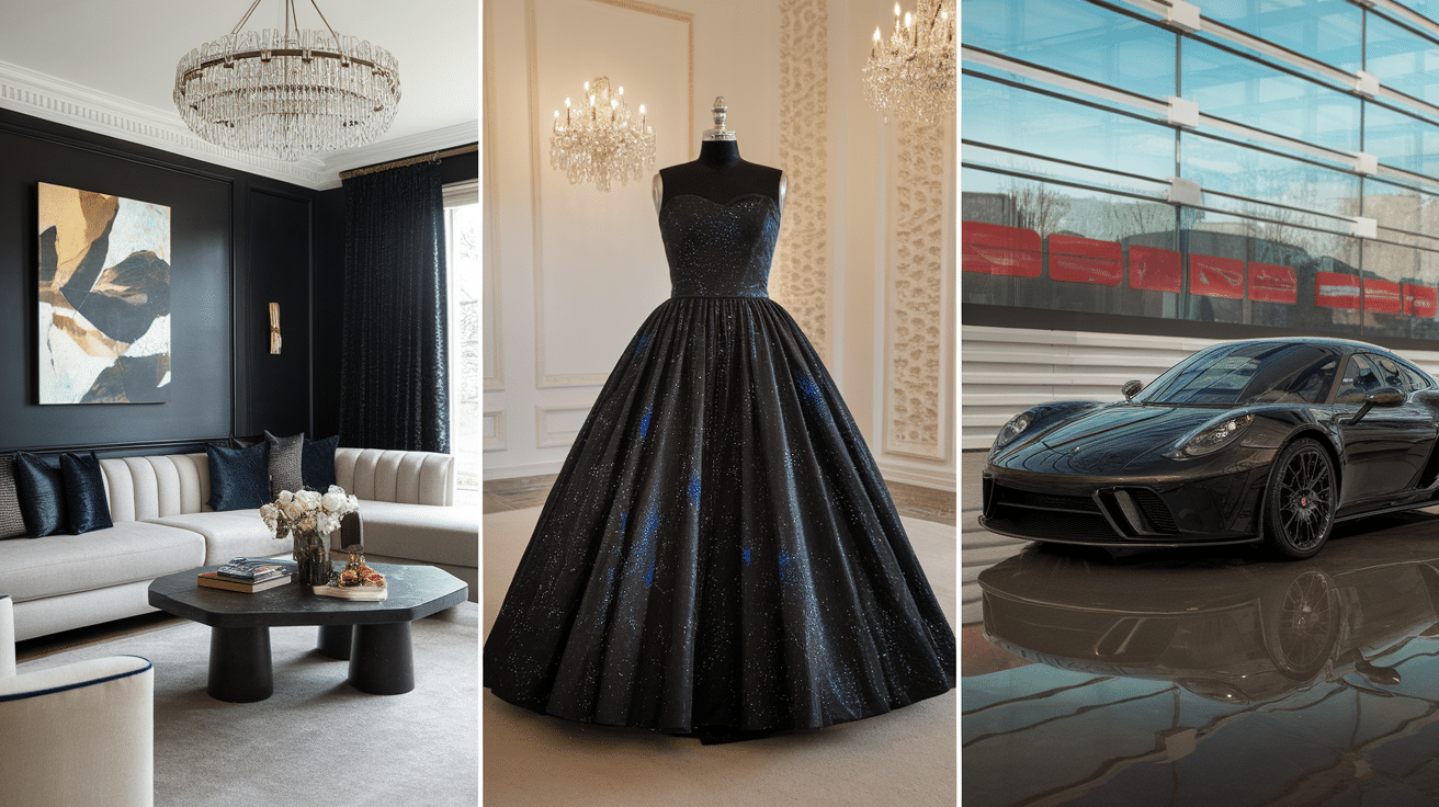
Fancy: Black is often used in fashion and events to add a touch of class. Think of a black tuxedo or a little black dress—it always looks fancy.
-
Cool and Mysterious: Shades like a raven or midnight black give off a calm, secretive vibe. They’re perfect for designs that want to feel cool or mysterious.
-
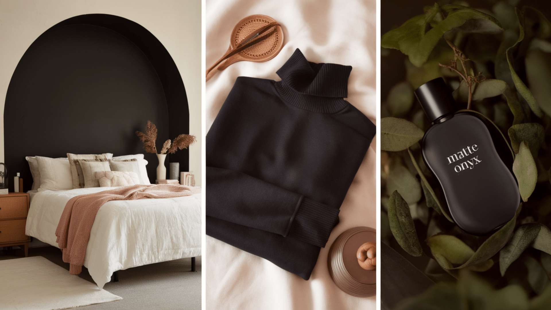
Warm and Cozy: Softer blacks like ebony or licorice have hints of brown or red. These shades make things feel warm and comfy—great for home décor or casual clothes.
-
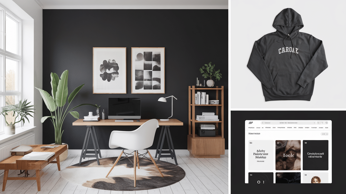
Modern and Clean: Colors like charcoal or coal black are popular in tech and web design. They make things look simple, neat, and contemporary.
-
Serious and Professional: Many businesses use black in their logos or websites because it makes them look serious and trustworthy. It shows that they mean business!
So, the next time you see black in a design or outfit, think about the feeling it gives you.
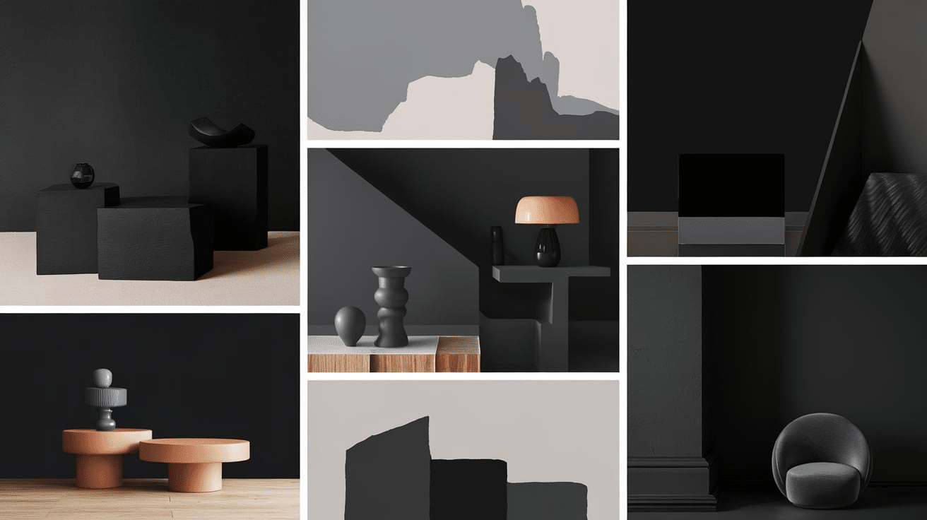
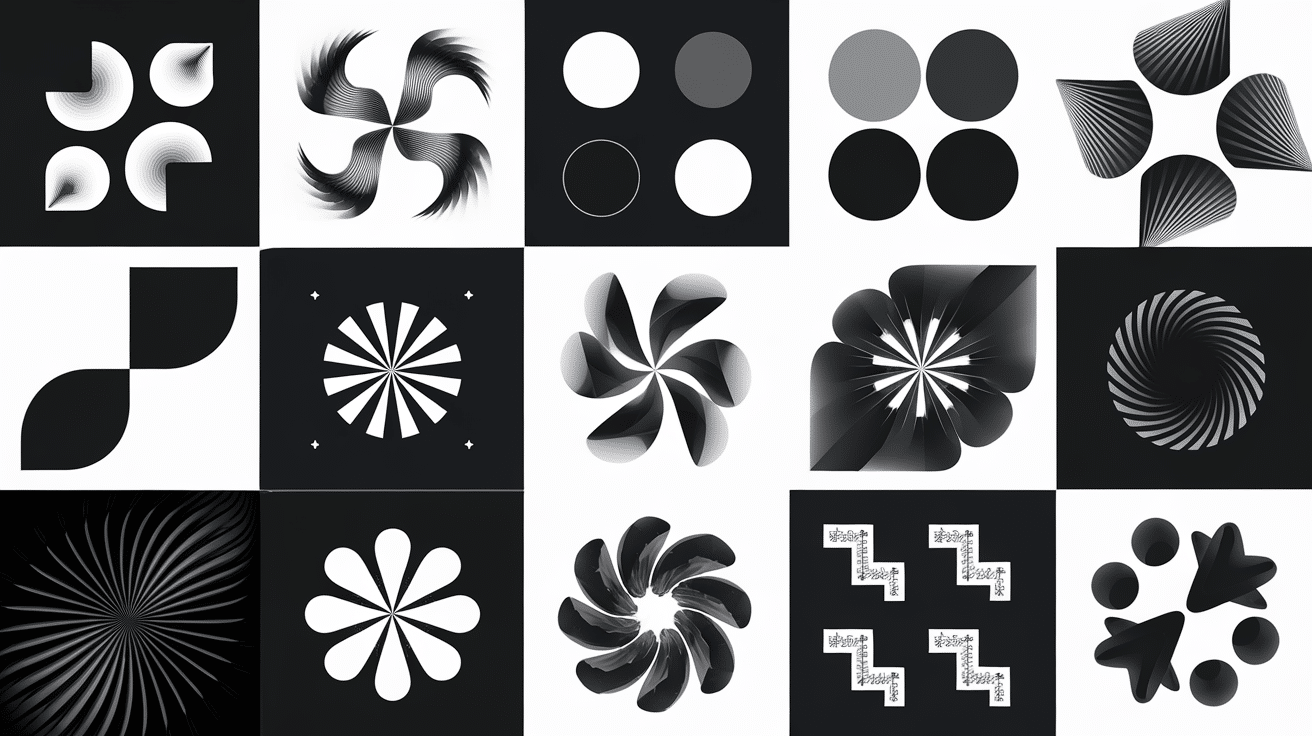
Popular Shades of Black
Black isn’t just one flat color—there are actually many different shades of black, and each one gives off a different vibe. Some are deep and bold, while others have tiny hints of gray, blue, or brown.
1. Jet Black (#343434)
Jet black is one of the darkest and boldest blacks out there. It’s rich, deep, and has no other colors mixed in. You’ll see jet black a lot in fashion, like in dresses, suits, or shoes. It’s also common in makeup and hair dye because it looks sleek and dramatic.
2. Onyx (#353839)
Onyx is a soft black with a touch of gray. It’s named after the shiny black stone called onyx. This shade feels rich and is often used in jewelry and home décor. It’s perfect when you want a dark color that isn’t too harsh. Onyx adds a sense of calm and balance, making it a great choice for modern, relaxing spaces.
3. Charcoal (#36454F)
Charcoal is a mix of black and gray, kind of like the color of burnt wood. It’s a little lighter than jet black and has a cool, modern feel. You’ll see charcoal a lot in interior design, clothing, and websites because it adds style without being too intense.
4. Ebony (#555D50)
Ebony has warm brown or green tones mixed into it, which gives it a rich, earthy feel. This color is named after the dark wood from the ebony tree and is often used in furniture, flooring, and instruments like guitars and pianos. Its natural warmth makes it a great choice for adding depth and comfort to both modern and classic designs.5.
5. Raven (#141414)
Raven black is dark with a soft, shiny look and a hint of blue—kind of like the feathers of a raven. It’s a sleek, cool-looking black that you’ll find in hair dye, clothing, and even cars. It gives off a stylish and mysterious vibe. This shade is perfect when you want a bold color that still feels a little magical.
6. Pitch Black (#0B0B0B)
Pitch black is super dark—almost like a black hole! It gets its name from pitch, a thick black tar-like material. This shade is perfect when you want something strong, dramatic, and bold. It’s often used when designers want full impact with no distractions.
7. Coal Black (#1C1C1C)
Coal black looks a lot like real coal: dark with a soft, dusty feel. It’s a popular shade in design and clothes because it’s solid and serious but not too harsh on the eyes. It brings a balanced and grounded feel to modern styles. This shade is great when you want something strong but still calm and easy to work with.
8. Licorice (#1A1110)

Licorice black is named after the candy, and it has warm reddish or brownish tones. It’s not as cold as some other blacks, which makes it feel friendlier. It’s great for fashion, makeup, and cozy design styles. This shade adds a touch of charm and comfort to any space or outfit.
9. Ink Black (#0F0F0F)
Ink black is the color of printer or pen ink—smooth, deep, and clean. It’s used a lot in graphic design, books, and anything that needs strong, readable black. It gives a crisp, polished look that feels smart and professional. This shade is perfect when clarity and sharp contrast are most important.
10. Midnight Black (#2C3539)
Midnight black has a soft blue undertone, like the sky late at night. It’s a calm and mysterious shade that’s often used in fashion, paint colors, and cars. It gives off a peaceful, dreamy feel. This black works great when you want something dark without it being too heavy.
11. Vantablack (Hex: #000000, but even darker!)
Vantablack is one of the darkest materials ever made—it’s so black it absorbs almost all light. It doesn’t reflect anything, so it looks super flat, like a shadow you can’t escape. You won’t see this used in regular products, but it’s popular in science and modern art.
Less Common Shades of Black
11. Obsidian (#0B0B0B): Named after the volcanic glass, obsidian is a deep, rich black with a glossy shine. It has a strong, sharp look and is often used in jewelry and dark-themed designs. It feels bold and a little mysterious.
12. Black Olive (#3B3C36): This is black with greenish or brown undertones, like a super dark olive color. It has an earthy, natural feel and works well in rustic or eco-friendly designs. It’s softer than jet black but still strong.
13. Outer Space (#414A4C): This is a dark blackish-gray that feels cool and calm, like the night sky. It’s perfect for space-themed designs or anything modern and sleek. It’s not too bold, which makes it easy to pair with other colors.
14. Taupe Black (#483C32): This black has warm brown and gray tones, giving it a vintage, cozy feel. It’s great for old-school designs or adding a soft, worn-in look to furniture. It’s less intense than pure black but very stylish.
15. Gunmetal (#2C3539): Gunmetal is black with hints of dark blue and gray, like the color of metal. It’s often used in tech, cars, and gadgets because it feels modern and cool. It adds a little shine without being too flashy.
16. Ash Black (#1C1C1C): Ash black has a soft, dusty look—like burned wood or soot. It’s often used in design when you want something dark but not too shiny. Perfect for cozy rooms or moody artwork.
As you can see, black isn’t just one color—it’s a whole collection of dark, beautiful shades. Each one has its own style and purpose, and choosing the right black can totally change the look of a design, outfit, or space. Pretty cool, right?
Black Shades in Design
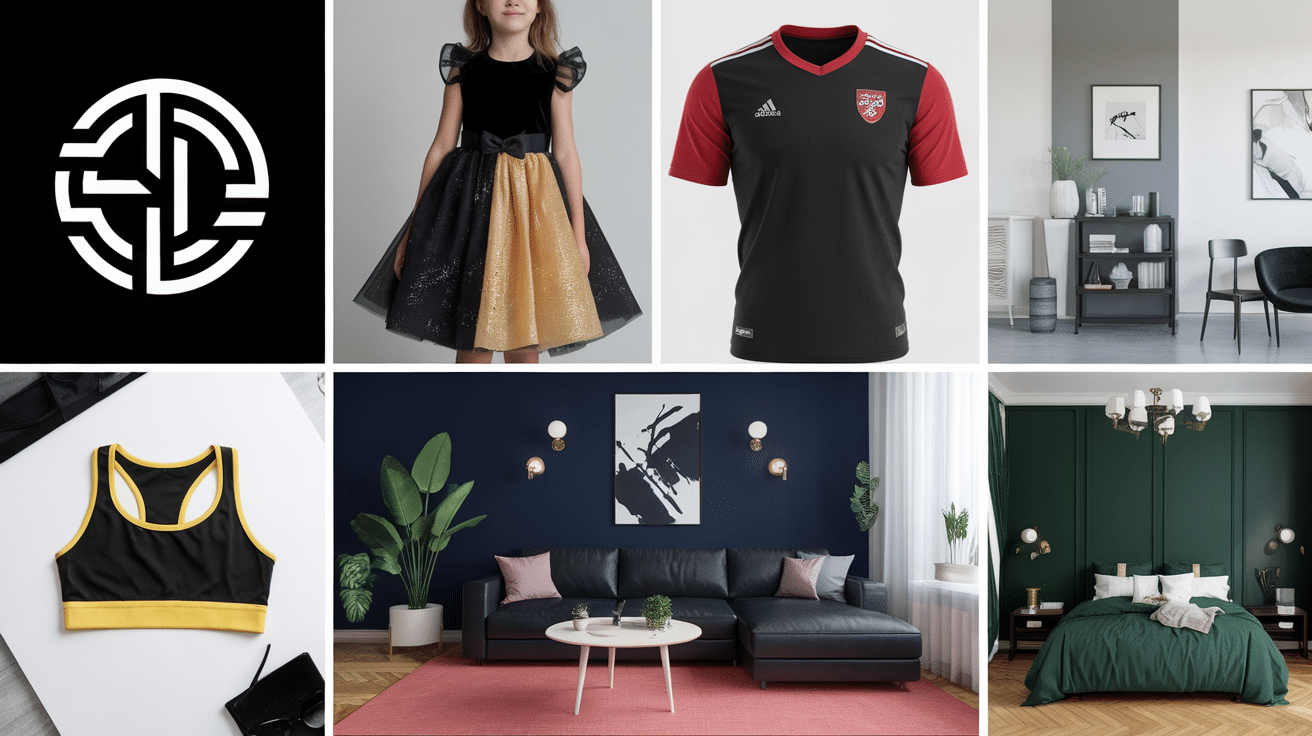
Black is a powerful color in the world of design. It can make things look bold, classy, cool, or even mysterious. But what many people don’t realize is that designers don’t just use one kind of black—they pick from different shades depending on what kind of mood or style they want to create. Let’s look at how black is used in design and why the shade you choose really matters.
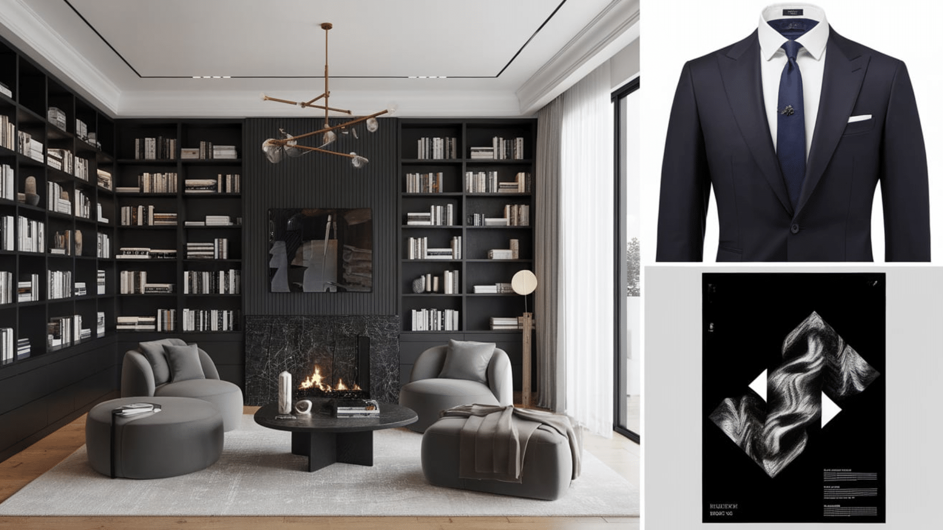
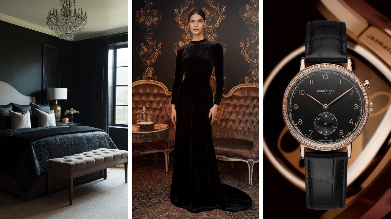
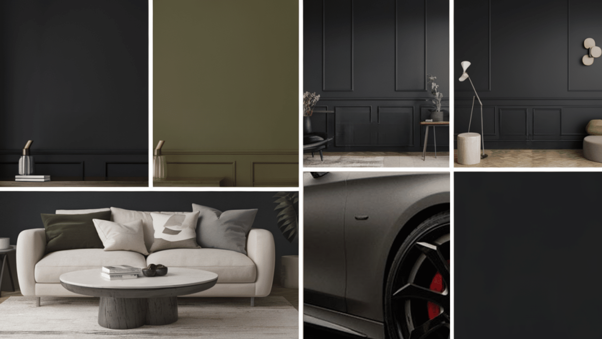
1. In Interior Design
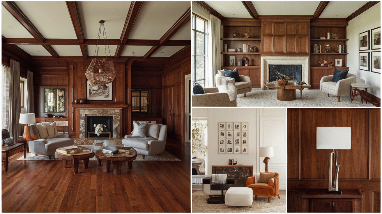
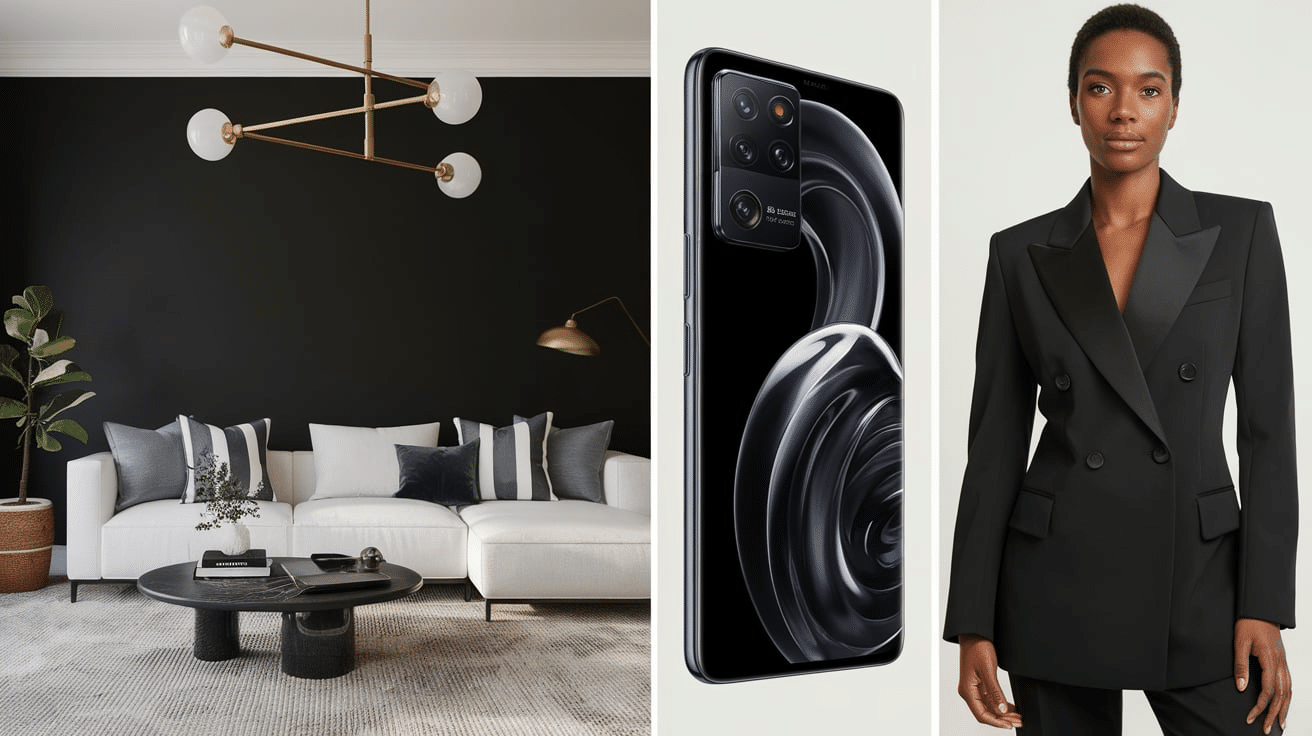
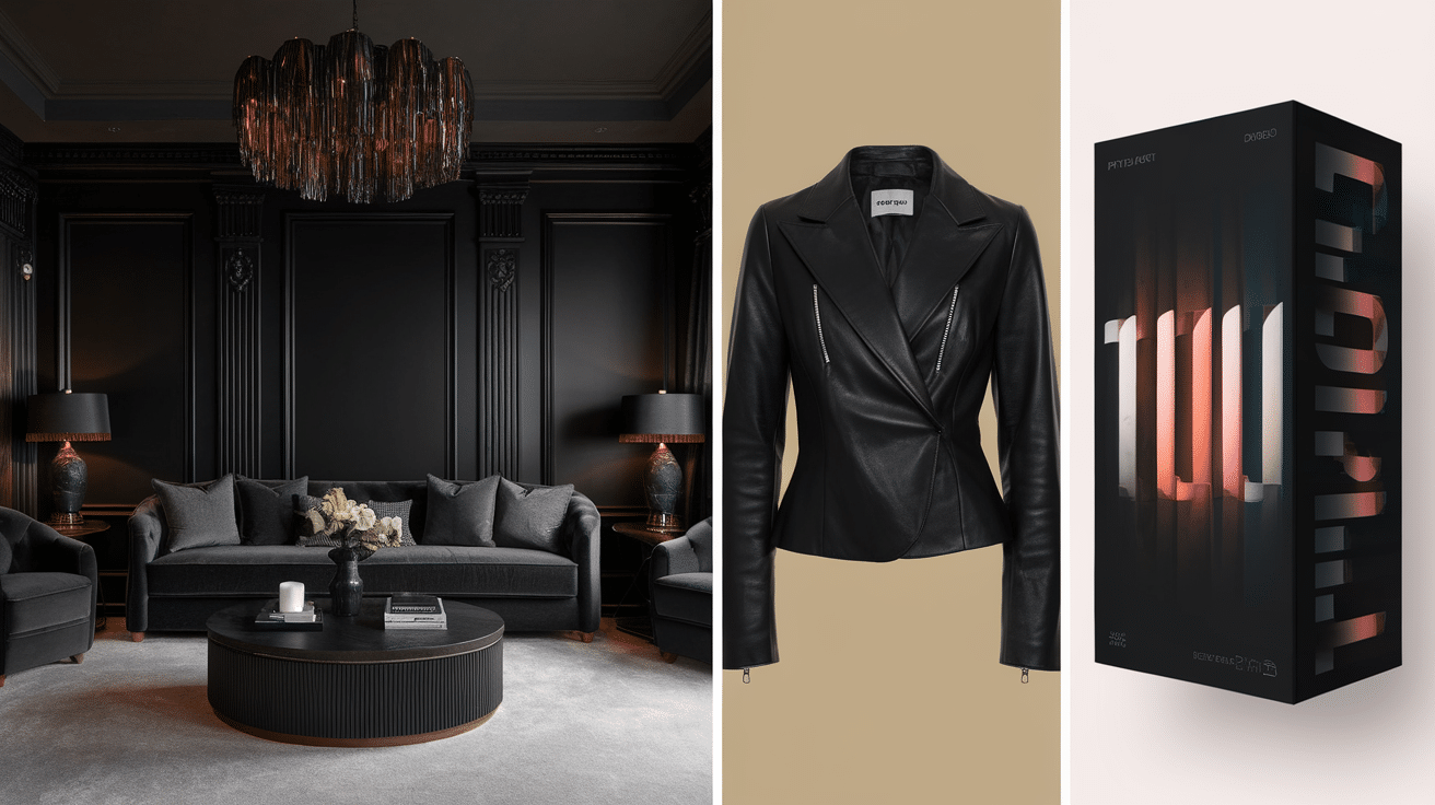
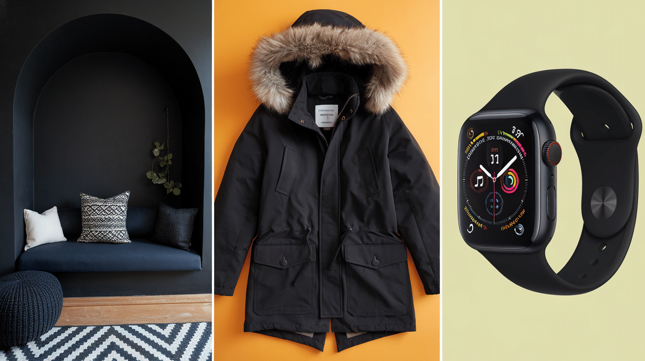
Black can add a lot of style to a room when decorating. Darker shades like charcoal or onyx are popular in modern homes. These blacks are soft but still strong, and they go great with whites, grays, or wood tones. People often use these shades on walls, furniture, or home décor pieces like lamps and picture frames.
2. In Graphic and Web Design
Black is super important in graphic design. It’s used for text, backgrounds, logos, and so much more. But not all blacks look the same on a screen. A very dark black like pitch black or ink black is perfect for clear, easy-to-read writing. Black also works really well with other colors. For example, black and gold look rich and fancy. Black and white looks clean and classic. No matter the mix, the shade of black can change how the whole design feels.
3. In Fashion
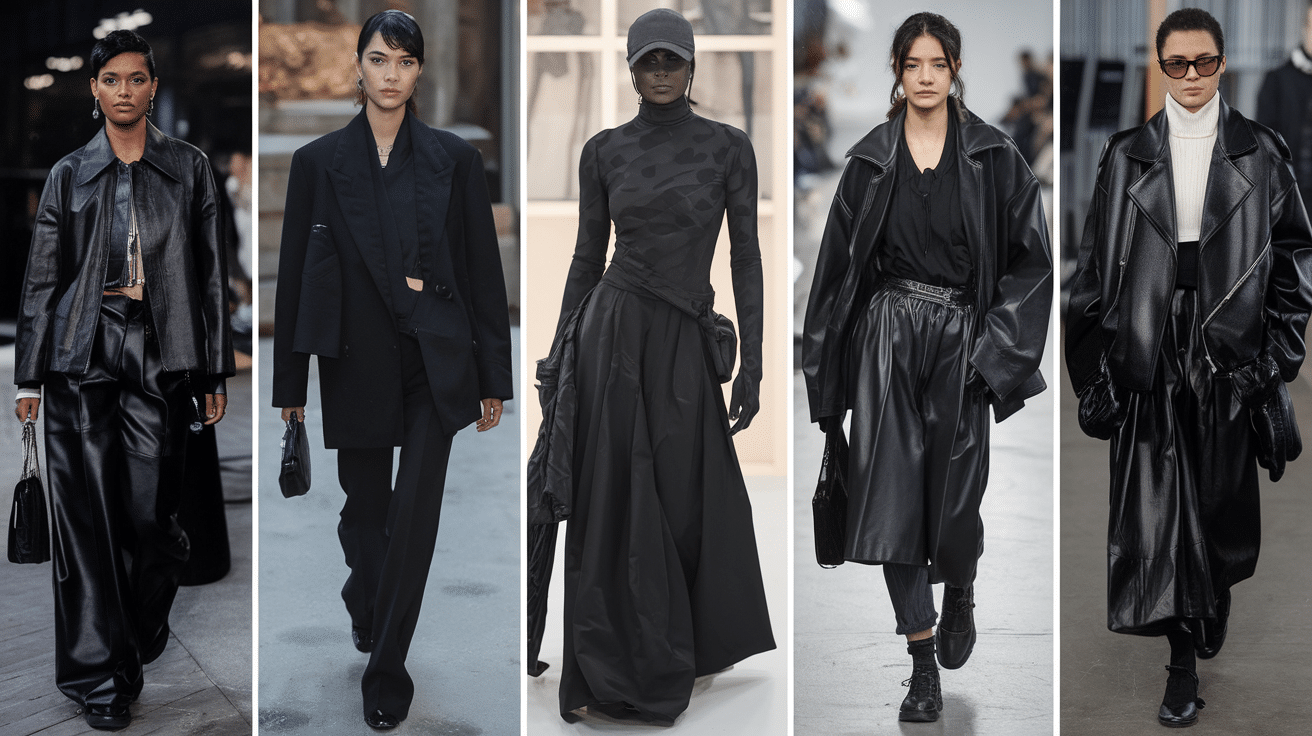
Black is always in fashion, but the type of black you wear can give off a totally different vibe. Jet black looks super sleek and formal, perfect for suits and dresses. Raven black, with its soft shine, can be great for evening wear or fancy events. Many fashion brands use different shades of black to make their clothes stand out, even when they’re all the same color at first glance.
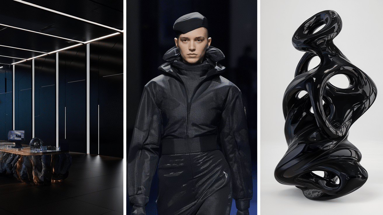
4. In Product and Industrial Design
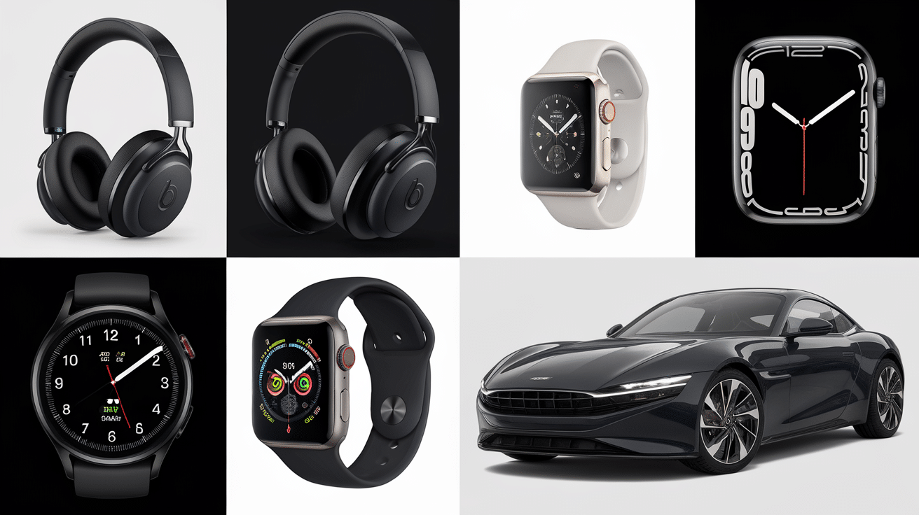
Black is often used in designing things like phones, headphones, cars, and furniture. Why? Because it looks clean, cool, and timeless. But again, it’s not always the same black. For example, cars might use midnight black for a fancy, mysterious look, or onyx for a smooth, modern style. Headphones or tech gadgets often use ink black or pitch black to make them look sharp and high-tech.
So, the next time you see something black—whether it’s a couch, a website, a shirt, or a phone—take a closer look. It might not be just “black.” It could be one of many shades that were picked on purpose to create a certain look or feeling. That’s the magic of design—every detail, even the color of black, makes a big difference.
How to Choose the Right Black for Your Project
Not all blacks are the same! Picking the right shade of black can make a big difference in how your project looks and feels.
-
Think About the Mood: Want something bold and serious? Try jet black or pitch black. Want something softer or more relaxed? Go with charcoal or ebony.
-
Match the Style: For a modern look, use coal black or charcoal. For something classic or fancy, try Raven or Onyx. These shades add style without being too bright.
-
Use the Right Contrast: If you’re using black next to light colors (like white or cream), go with a dark black, like ink black. For softer color combos, a warmer black, like licorice, works better.
-
Check the Lighting: In a dark room, super black colors can look too heavy. Lighter blacks, like ebony, can help balance things out and make the space feel less dark.
-
Think About the Material: Some blacks look different on fabric, walls, screens, or paper. Raven looks great when it shines, like on cars or hair. Charcoal is perfect for soft items like clothes or furniture.
Choosing the right black doesn’t have to be hard. Just think about the mood, style, and where you’ll use it. The right shade can totally level up your project!
Black and Other Colors: Best Color Combos
Black goes with almost everything, but some color combos just look better than others. Depending on the look or mood you want, pairing black with the right color can really make your design or outfit pop.
-
Black and White: Classic and clean. It’s great for modern designs, outfits, logos, and websites.
-
Black and Gold: This combo feels expensive and fancy. Perfect for parties, fashion, and others.
-
Black and Red: Red adds energy to black, making it an eye-catching mix. Great for posters, sports teams, or fashion.
-
Black and Gray: Cool and calm. A great mix for clean, modern styles—especially in home decor or tech designs.
-
Black and Pink: Fun and trendy. Light pink softens black and gives it a playful, stylish vibe.
-
Black and Blue: Deep and serious. Navy or royal blue with black creates a strong, grown-up look.
-
Black and Yellow: Yellow adds a pop of fun and stands out next to black. Often seen in sporty designs.
-
Black and Green: Fresh and modern. Dark green with black looks earthy and stylish.
Black is super flexible—it can be classy, fun, serious, or stylish depending on what you pair it with. Try mixing it with different colors to see what vibe you like best!
Common Mistakes When Using Black in Design
Black is a strong and stylish color, but it can be tricky if you’re not careful. Using the wrong shade or too much black can make your design feel heavy, messy, or just not right.
-
Using Just One Flat Black Everywhere: Not all black is the same! Using one flat black all over can make your design look boring or too harsh. Try mixing different black shades like charcoal, onyx, or ebony to add depth and interest.
-
Too Much Black: Covering everything in black can make things feel dark, heavy, or even a little depressing. Always balance black with lighter or brighter colors to keep it fresh.
-
Not Enough Contrast: Putting black text on a dark background—or vice versa—makes it hard to read. Always make sure there’s enough contrast so everything is clear and easy to see.
-
Using the Wrong Shade for the Mood: For example, using pitch black in a cozy space might feel too intense. Instead, go for a warmer shade like licorice or ebony if you want a softer feel.
-
Ignoring the Material or Screen: Some blacks look different depending on where they’re used—like on fabric, walls, paper, or screens. What looks good on your computer might look way too dark in real life.
-
Forgetting Texture and Shine: Black can be shiny, matte, rough, or smooth—and these textures totally change how it looks. Raven black, for example, has a shiny touch that adds style.
Black is powerful, but just like any color, it needs to be used the right way. Keep these tips in mind, and your designs will look clean, stylish, and balanced!
Conclusion
Black may seem like just one color, but as you’ve seen, it comes in many different shades—each with its own look, feel, and purpose. From bold jet black to soft charcoal and shiny raven, every black tells a different story.
If you’re designing a room, picking an outfit, creating a logo, or painting artwork, the right shade of black can make a big difference.
It’s not just about being dark—it’s about creating the right mood, the right style, and the right balance. Choosing black with care can make your project feel more modern,classy, cozy, or cool. And when you mix black with other colors or textures, the results can be even more powerful.
So next time you reach for “just black,” take a second look. You might find that the perfect shade is just a little different than you expected—and way more exciting!