")
I’ve been living with Benjamin Moore’s Bewitched on my walls for about a year now, and I’m excited to share what I’ve learned about this rich, moody color. This deep shade has changed my home in ways I didn’t expect.
In this blog, you’ll learn:
- What Bewitched actually looks like in real homes
- Which rooms work best with this color
- Colors that pair perfectly with it
- How to test it properly before buying
I’ve used this paint in several rooms with different light exposures and noticed how it shifts throughout the day. I’ve made the mistakes, so you don’t have to.
Let’s see if this rich, moody color is the perfect choice for your home.
What Kind of Color Is Bewitched?

Bewitched (Benjamin Moore CSP-450) is a deep, rich color with purple-gray undertones. It creates a strong background and gives rooms a cozy, intimate feel. To me, it looks like evening skies or deep shadows—moody, balanced, and full of depth.
I’ve seen it change throughout the day. Morning light brings out more purple. By afternoon, it looks more gray, and at night, it feels deeper and more private.
The color has a very low Light Reflectance Value of 6.37, making it quite dark. This means it absorbs more light than it reflects, adding drama to rooms. Because it’s so balanced, Bewitched works well for making spaces that feel both bold and cozy.
What’s special about Bewitched is how it creates both drama and comfort. In most rooms, it adds depth and richness that complements many settings and home styles.
What Rooms Work Best with Bewitched?
I’ve found that Bewitched works wonderfully in spaces where you want a bold, deep look that will last for years. Based on my experience, here are the spaces where Bewitched performs best:
Living Rooms
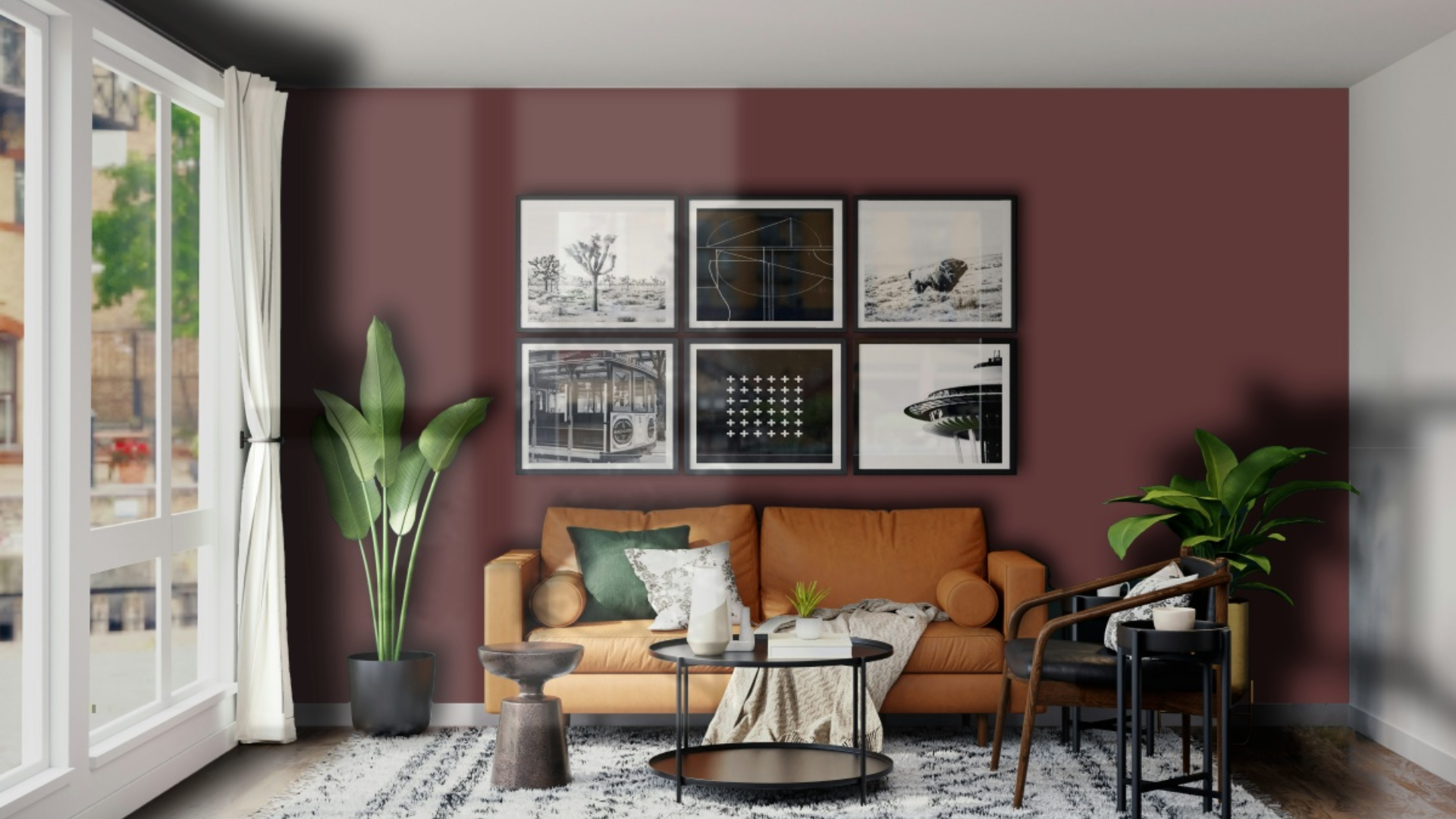
This color helps living spaces feel full and friendly. It makes a bold background that shows off furniture and art well. In my living room, walls with this shade make the space feel finished while making my cream couch and wood accent items stand out.
The color is very good for spaces that should feel snug. When used with warm lights, it makes a room that feels both eye-catching and soothing.
Dining Rooms
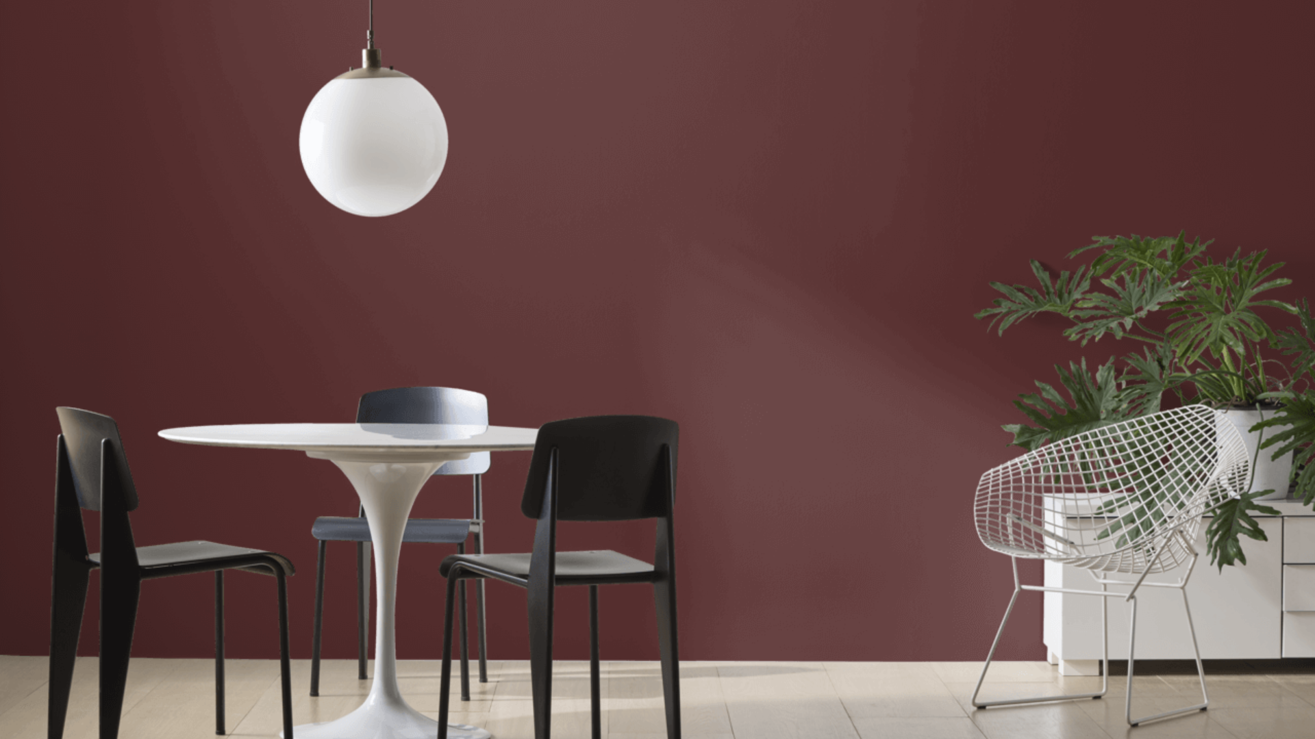
Bewitched can change dining spaces into warm, friendly areas that work well for get-togethers. I used it in my dining room, and it made meals and talks feel warm and close.
The deep colors help make a nice feeling while being more interesting than plain, basic colors. What I didn’t expect was how good it looks with different types of wood.
My oak table stands out nicely against the Bewitched walls, while brass lights add warmth that balances the cool walls. The room feels both special and comfortable.
Home Offices
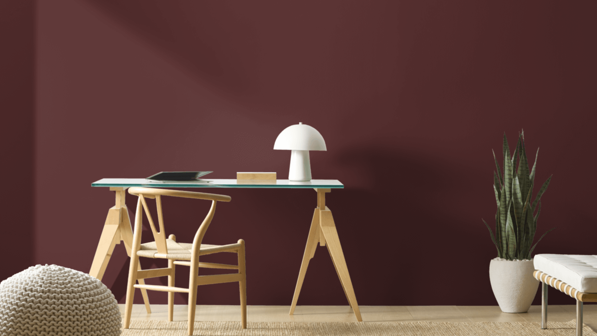
This deep color helps make work areas feel more focused. It’s bold but still feels good during long hours of work. I put it on one wall in my home office and find it makes a perfect background when I’m on video calls, while also helping me stay on task.
This shade works especially well for offices that need to look professional but still feel comfortable. The color seems to add depth and helps with staying focused.
I’ve noticed I get more done in my office with this color compared to when my walls were just plain white.
Bedrooms
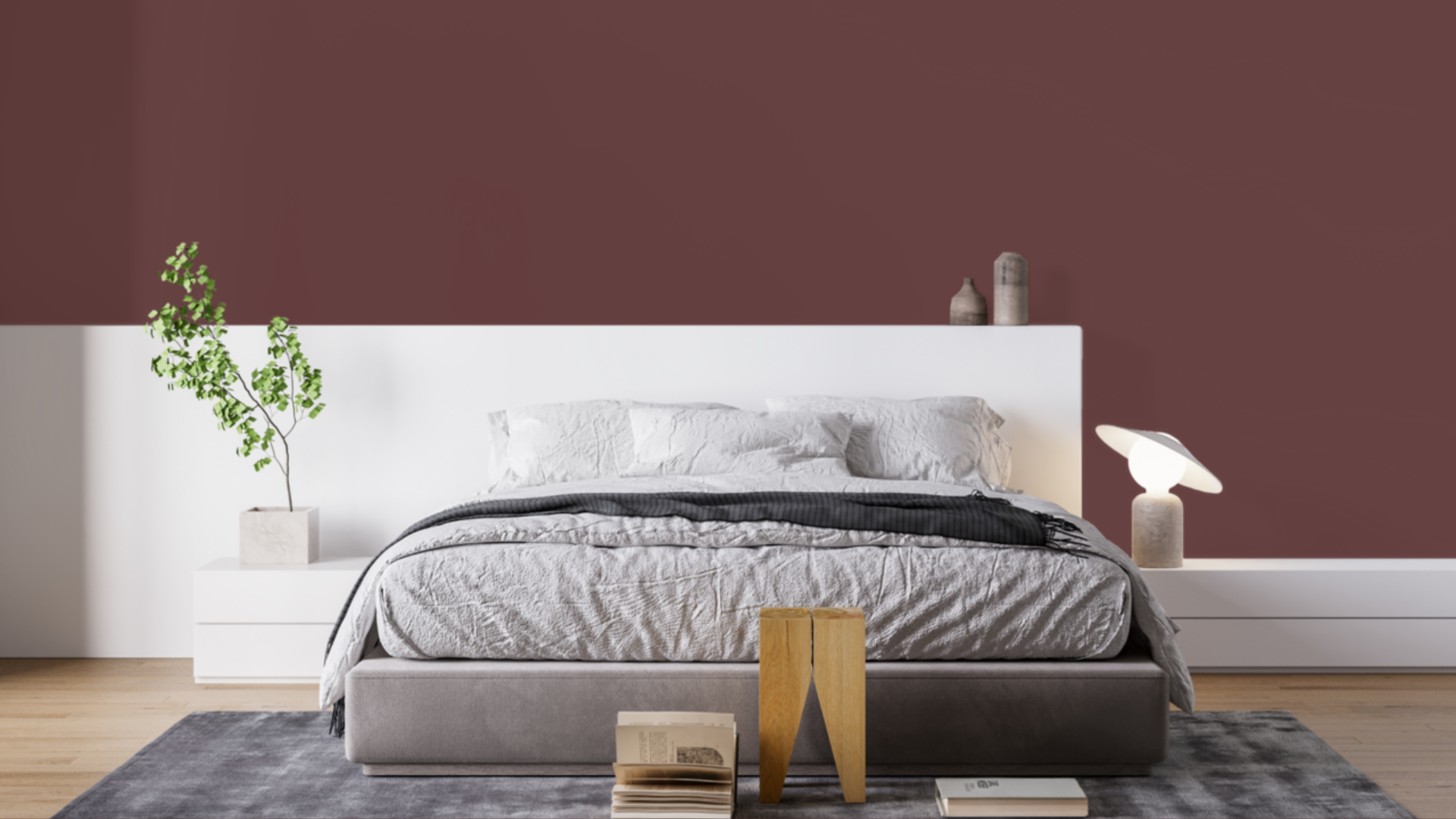
This deep color can make these private spaces feel more special. I used it in my main bedroom, and it feels both fancy and comfortable. It’s good for a room that should feel close and personal without being too plain.
The color looks great with white sheets and gold or brass lights and handles. It adds just enough drama without being too much, making it a good pick for a room where you want to relax.
Bathrooms
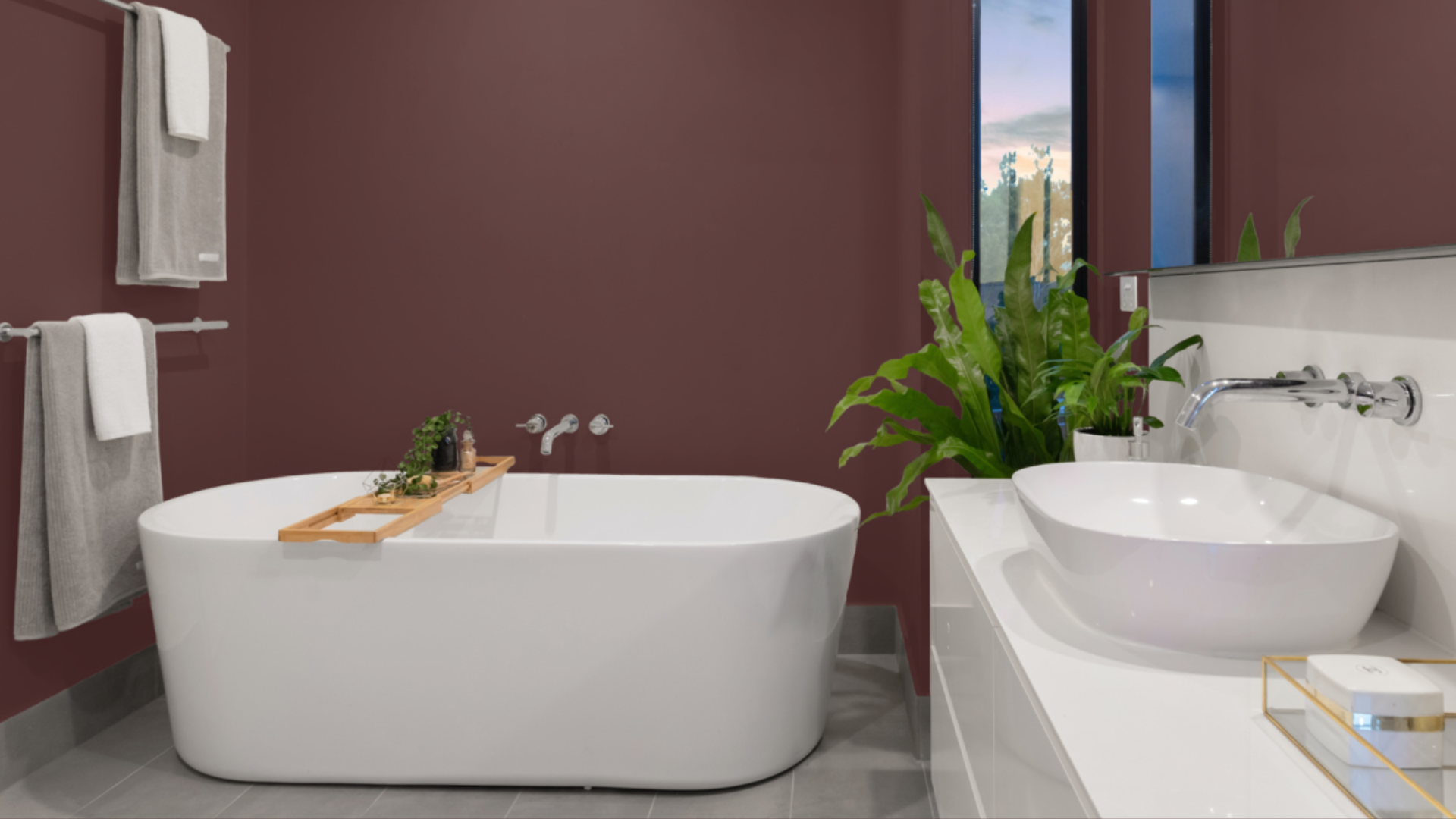
Bewitched can change bathrooms into fancy, spa-like spaces. I put it in my guest bathroom, and it made a bold, classy feel. The deep color brings drama, making even small bathrooms feel special.
What works well is how Bewitched complements white fixtures and marble surfaces. The difference is strong, but not excessive.
In my bathroom, with its chrome fixtures, the color creates a modern, clean look. Adding warm wood elements and soft fabrics helps balance the cool color, so the space feels both dramatic and cozy.
What Colors Complement Bewitched?
- Clean whites: They form a strong contrast that looks neat and eye-catching
- Gentle off-whites: Give a mild contrast that feels united and peaceful
- Mid to pale wood shades: Bring natural texture and matching warmth
- Black details: Make clear outlines that help the color stand out
- Gold and brass touches: Add warm spots that match well with the cooler tones
For my bedroom, I combined Bewitched walls with white trim and brass lighting fixtures. The combination feels both rich and balanced.
What Style Works Well With This Color?
Bewitched works with many design approaches. In modern homes, it adds a strong element that’s clean but not too plain.
For traditional spaces, it makes a great backdrop for older furniture and classic items. In dramatic settings, it provides a deep quality that feels right and stable.
What’s most impressive is how Bewitched helps in homes that combine different styles by adding a strong presence to rooms that mix various elements.
My house features both newer items and more traditional ones, and this color creates the perfect background for both types.
This ability to work with various materials makes it a good choice for those who enjoy updating their decorations or combining pieces from different styles.
Is It a Warm or Cool Color?

Bewitched has a mix of colors that work well together. Its purple-gray base gives it a cool, rich feel, but its depth also adds some warmth.
I think of it as “deeply balanced” – it makes rooms feel solid without being too cool or too warm. Since it’s fairly neutral, it doesn’t look too bright or colorful. This middle-ground quality enables it to work effectively in most homes throughout the year.
Even though it has a balanced base, when used right, it doesn’t make spaces feel cold. Its depth makes it good for rooms you use every day. In places with abundant natural light, you can observe how it changes in various ways throughout the day.
If you think a room might be too cool with this color, I’ve noticed that adding warm items like wood, soft fabrics, or brass light fixtures creates a good mix. In my bedroom, my Bewitched walls look great next to my wooden furniture and brass lamps.
Color Characteristics Table
| Characteristic | Bewitched | What This Means For Your Space |
|---|---|---|
| Temperature | Balanced with cool undertones | Creates a dramatic, grounded atmosphere |
| Undertones | Purple-gray notes | Adds depth and sophistication |
| Light Reflectance Value | 6.37 | Adds significant drama with its very dark depth |
| Seasonal Feel | Year-round | Works well in both summer and winter settings |
| North vs. South Rooms | Adaptable | Appears richer in south-facing rooms, deeper in north-facing rooms |
How to Test This Color in Your Space?
- Buy a sample: Get a small container of Bewitched
- Paint a board: Use a 2×2-foot piece of white poster board
- Move it around: See how it looks in different locations at different times of day
- Live with it for 3 days: Your first impression might change
When I tested Bewitched, I was surprised by the significant changes it underwent from morning to evening. In my north-facing bedroom, it appeared deeper and more moody. In my south-facing living room, it showed more of its clear, purple-gray aspects throughout the day.
What Paint Finish Should You Choose?
- Flat: This is good for ceilings and walls with texture issues
- Matte: My top choice for most walls – the deep color looks rich without glare
- Eggshell: This works in kitchens and bathrooms, where you need to clean walls
- Satin: Adds a slight sheen, could make the color look slightly brighter
- Semi-gloss: Too shiny for Bewitched walls, but works for trim and doors
I used a matte finish in my bedroom and an eggshell finish in my bathroom. The eggshell finish makes cleaning easier without adding too much shine that would alter the color’s appearance.
Real Home Ideas Using Bewitched
- Feature wall: Bewitched on a single wall forms a central focus that anchors the space
- Alongside white molding: Paired with white molding colors for a sharp, clean contrast
- Storage units: Kitchen center island or bathroom sink cabinet in this tone creates a high-end look
- Home items: A shelf unit or chest of drawers coated in this shade brings a strong visual element
- Outside use: Functions well as a highlight color for entryways or window coverings
My friend painted just one wall in her dining room, Bewitched with white trim, creating a balanced look that feels both fresh and grounded. It looks amazing and has inspired me to think about using it in more areas of my home.
Mistakes to Avoid
Not testing in your actual space first: Light affects this color dramatically. Don’t trust online photos alone—paint a sample board and move it around your room at different times of day to see how it truly looks in your specific lighting conditions.
Use in rooms with poor lighting: Bewitched needs adequate lighting to show its depth. In poorly lit spaces, it can appear flat and too dark, losing its rich character. Add extra light sources before committing to this color.
Pairing with cool white trim: This paint has subtle warm undertones that clash with bluish-white trim. Choose warmer whites for trim and ceilings to complement rather than fight with Bewitched’s undertones.
Applying without proper prep work: Dark colors show wall imperfections more than light ones. Take the time to thoroughly patch, sand thoroughly, and prime surfaces thoroughly. The extra prep makes a significant difference in the final result.
Using in small rooms without a plan: In small spaces, Bewitched can feel overwhelming if used on all walls. Consider using it on one accent wall or balancing with plenty of light-colored furniture and mirrors to prevent the room from feeling closed in.
Why Do People Choose Bewitched?
Bewitched has gained many fans among homeowners, and for good reason. This bold shade adds depth to rooms while maintaining a comfortable and livable atmosphere. Its appeal comes from having character without being difficult to work with.
Rooms painted with Bewitched feel dramatic yet warm and welcoming. The color complements various decorating styles and stands the test of time better than fleeting trends.
One of its best features is how it changes throughout the day as light shifts, giving spaces an ever-changing quality that keeps them fresh and interesting regardless of whether the light source is natural or artificial.
Conclusion
After living with Bewitched in multiple rooms for months, I’m still happy with my choice. This color creates spaces that feel both dramatic and cozy at the same time, adding bold character while working well with various furniture and decor styles.
This isn’t a color for those wanting light, airy walls. Instead, it forms a strong foundation that supports your items while making its statement. This balance explains its lasting popularity.
In today’s world of whites and grays, Bewitched stands out for those who want color with purpose. It works across various design styles, including modern, traditional, and dramatic.
What makes Bewitched special is how it creates rich, personal spaces that feel truly lived-in. For a home that reflects your personality while maintaining style and comfort, this color delivers beautifully.
Frequently Asked Questions
What Type of Lighting Works Best with Bewitched?
Natural light brings out its depth and subtle undertones. In rooms with limited windows, use warm white bulbs to highlight their rich qualities.
Will Bewitched Make My Ceiling Look Lower?
When used on walls, it can make ceilings feel lower. Keep ceilings white or very light to maintain a sense of height and balance the intensity of the colors.
How Does Bewitched Compare to Benjamin Moore’s Hale Navy?
Bewitched has more purple-gray undertones while Hale Navy leans blue. Bewitched feels more moody and mysterious, while Hale Navy offers a more classic, structured look.
Is Bewitched Suitable for Exterior Use?
Yes, it works well for front doors and shutters, creating a striking contrast. For larger exterior areas, test carefully, as they appear much darker outdoors.
Does Bewitched Require a Special Primer?
A gray-tinted primer helps achieve true color coverage with fewer coats. This darker base primer prevents the need for multiple coats of the more expensive topcoat.