")
I’ve been testing Saybrook Sage paint in my home for the past six months. Now, I want to share everything I’ve learned about this beautiful green shade.
In this article, you’ll learn:
- What Saybrook Sage actually looks like in real homes
- Which rooms work best with this color
- Colors that pair perfectly with it
- How to test it properly before buying
I’ve used this paint in both north and south-facing rooms and watched how it changes from morning to evening. I’ve made the mistakes so you don’t have to. My walls have been Saybrook Sage for over half a year now. I know how it holds up and how it feels to live with every day.
Let’s see if this soft, earthy green is right for your home.
What Kind of Color Is Saybrook Sage (HC-114)?
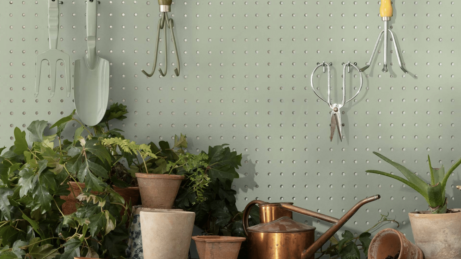
Saybrook Sage is a soft, muted green with gray and beige notes. It’s a gentle color that adds a calm, natural feeling without being too bold or intense. I think of it as the color of dried herbs with just a hint of coolness.
I’ve noticed it shifts throughout the day. In morning light, the green aspects become clearer and more noticeable. By afternoon, it takes on a more neutral quality that feels balanced and soothing.
The color has an LRV (Light Reflectance Value) of 45.46, placing it in the medium range. This means it absorbs some light while still adding depth to spaces. The balanced nature of Saybrook Sage makes it excellent for creating rooms that feel both grounded and comfortable.
What makes Saybrook Sage stand out is how it adapts to its surroundings. In some spaces, it appears more gray, while in others, the green aspects become more visible. This flexibility helps it work well in many settings and with various home styles.
What Rooms Work Best with Saybrook Sage?
I’ve found that Saybrook Sage truly shines in spaces where you want a natural, calming look that still has some character. It’s not just about which rooms – it’s also about the lighting, the style, and what feeling you want to create. Based on my experience, these are the spaces where Saybrook Sage performs best:
Living Rooms
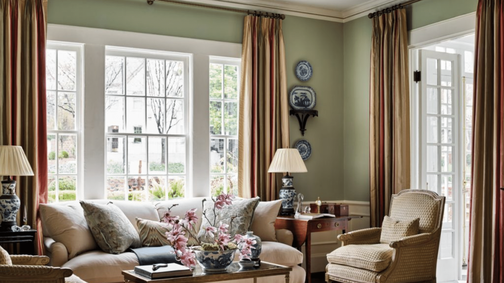
This color makes living areas feel grounded and welcoming without being too dark. It creates a soft background that allows furniture and art to stand out.
In my living room, Saybrook Sage walls make the space feel cozy while highlighting my cream sofa and wooden accent pieces. The color works especially well in both large and medium living spaces.
In larger rooms, it helps create a sense of warmth and flow. In medium rooms, it adds depth without feeling too closed in when paired with the right accessories.
Bedrooms
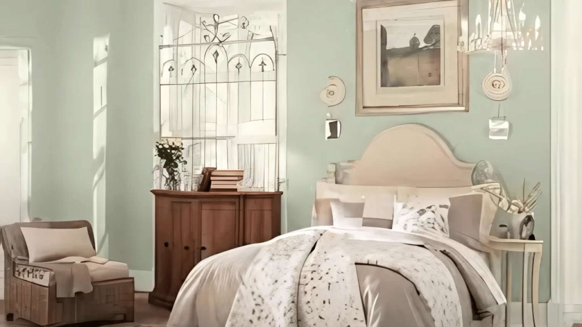
The soft, earthy tones make bedrooms feel calm and relaxing. This color creates a peaceful background that helps with rest and sleep.
In my main bedroom, I paired Saybrook Sage with white bedding and dark wood tones for a retreat that feels both natural and balanced. The color also tends to make bedrooms feel cozier and restful.
The subtle green undertones create a sense of nature that many people find helpful for sleep environments. Since painting my bedroom this shade, I’ve found that it feels more organized and peaceful.
Dining Rooms
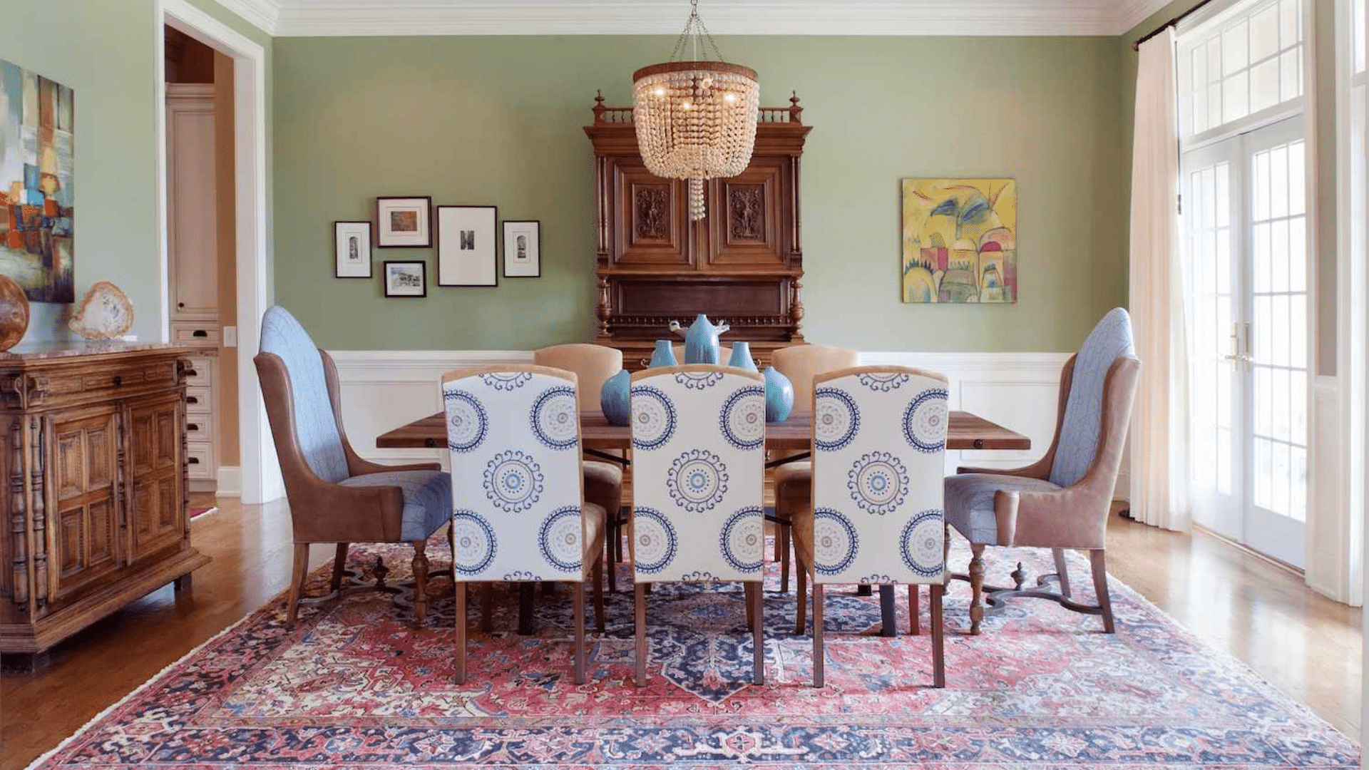
Saybrook Sage shines in dining rooms, where it creates a warm, intimate feel. The subtle undertones complement wooden tables perfectly while adding more interest than plain white walls.
My dining room in this shade feels much more custom and thoughtful than it did with basic, neutral walls. In dining rooms with natural light, the color takes on a beautiful glow that changes throughout the day. Even in dining rooms without windows, it helps create a cozy feeling when paired with good lighting.
Home Offices
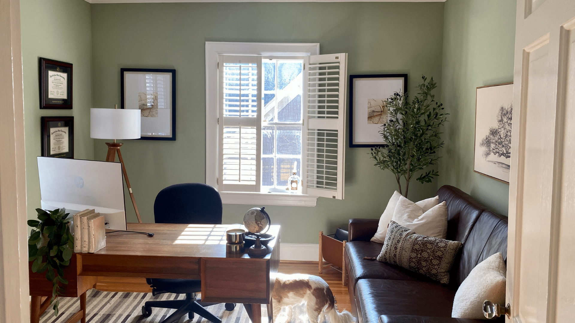
The color helps create focus without being distracting. The soft green feels professional yet calming during work hours.
I painted my home office in this shade and find it makes the perfect background for video calls while keeping me focused. Saybrook Sage is particularly effective in offices that need to feel balanced and organized.
The color seems to reduce visual stress and create a sense of calm. I’ve noticed I feel more productive in my Saybrook Sage office compared to my previous stark white workspace.
Kitchens
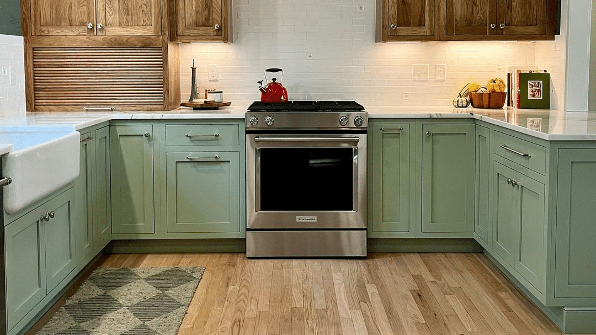
Saybrook Sage adds subtle depth to kitchens without competing with cabinets or backsplashes. It creates a natural feeling that still feels clean and bright. My friend painted her kitchen this color with white cabinets, creating a balanced look that still has character.
The color works well with both white and wood cabinets, making it very flexible for most kitchen styles. It adds just enough color to feel interesting without taking away from other kitchen elements.
What Colors Go Well with Saybrook Sage?
- Cream: It creates a soft, natural contrast
- Terracotta: Offers a warm companion that feels organic
- Crisp white: Complements the earthy tones beautifully
- Dark wood tones: Add depth and balance to the soft green
- Brass or copper: Metal finishes that enhance the natural undertones
For my living room, I combined Saybrook Sage walls with white trim and dark wood furniture. The combination feels fresh and grounded.
What Style Works Well With This Color?
Saybrook Sage adapts to many design styles. In modern homes, it brings in a subtle natural element that feels organic. For contemporary spaces, it creates a muted canvas that lets minimalist furniture stand out.
In transitional settings, it offers a fresh update while respecting classic elements. Most impressively, Saybrook Sage works well in traditional homes by adding warmth to formal furniture.
My own home mixes modern items with more traditional ones, and this color creates the perfect subtle background for both. This flexibility makes it a smart choice if you like to change your decor or mix elements from different styles.
Is It a Warm or Cool Color?

Saybrook Sage is a balanced neutral that leans slightly cool. The gray undertones give it that cool, calming feeling. I’d describe it as “softly cool” – not the kind that makes a room feel too cold or stark.
The subtle, warm aspects keep it from feeling too cool. This balance makes it work well year-round in most homes. Despite being slightly cool, it doesn’t feel too gray like some green-grays can.
The medium-light value softens the coolness, making it more livable for everyday spaces. In rooms with lots of natural light, especially south-facing rooms, the coolness helps balance the warmth of the light throughout the day.
If you’re worried about a space feeling too cool, I’ve found that adding warm elements like wooden furniture, cream textiles, or brass fixtures creates the perfect balance. In my living room, the Saybrook Sage walls look beautiful with my warm wood coffee table and cream accent pillows.
Color Characteristics Table
| Characteristic | Saybrook Sage | What This Means For Your Space |
|---|---|---|
| Temperature | Slightly Cool | Creates a calming, relaxing atmosphere |
| Undertones | Green with gray notes | Adds subtle depth without being too bold |
| Light Reflectance Value | 45.46 | Medium tone that balances light absorption and reflection |
| Seasonal Feel | Year-round | Works well in both winter and summer settings |
| North vs. South Rooms | Adaptable | Appears more gray in north-facing rooms, more green in south-facing rooms |
How to Test This Color in Your Space?
- Buy a sample: Get a small container of Saybrook Sage
- Paint a board: Use a 2×2 foot piece of white poster board
- Move it around: See how it looks in different locations at different times of day
- Live with it for 3 days: Your first impression might change
When I tested Saybrook Sage, I was surprised by how different it looked from morning to evening. In my south-facing living room, it appeared greener. In my north-facing bedroom, the gray aspects were more noticeable.
What Paint Finish Should You Choose?
- Flat: Good for ceilings or very smooth walls
- Matte: My top choice for most walls – the soft color looks clean without glare
- Eggshell: This works in kitchens and bathrooms where you need to clean walls
- Satin: Adds a slight sheen, which could make the color look brighter than expected
- Semi-gloss: Too shiny for Saybrook Sage walls, but works for trim and doors
I used matte in my bedroom and eggshell in my kitchen. The eggshell finish makes cleaning easier without adding too much shine that would change how the color looks.
Real Home Ideas Using Saybrook Sage
- Full room: Saybrook Sage on all walls creates a consistent, calming feeling
- Accent wall: Used on one wall with lighter walls for a hint of color
- Trim: Using it on trim with white walls creates a subtle, custom look
- Furniture: A bookcase or side table painted this shade adds a soft touch
- Cabinets: Works beautifully as a cabinet color with light countertops
My sister painted all her kitchen cabinets Saybrook Sage with white countertops, creating a custom look that feels both clean and fresh. It looks amazing and has inspired me to think about using it in more areas of my home.
Common Mistakes to Avoid
I’ve made some mistakes with this color. Learn from my experience:
- Using cool-toned lighting with Saybrook Sage – Cold bulbs can make this color look too gray. Stick with warm white bulbs (2700-3000K) to showcase its true balanced beauty.
- Not testing in your actual space – This color changes with lighting conditions. I was surprised how different it looked in my north-facing bedroom versus my south-facing living room. Always test a large sample in your own space.
- Using too many cool accessories – This can make the room feel disconnected. Mix in some warm woods, creams, or brass accents for balance.
- Expecting it to look exactly like online photos – Every screen shows colors differently, and professional images are often edited. The only way to know how it will look in your home is to test it yourself.
- Using it in very dark rooms without adding extra lighting – In rooms with minimal natural light, Saybrook Sage can look too flat without proper lighting support.
Why People Like Saybrook Sage?
Saybrook Sage has become popular among many homeowners, and I understand why. Its soft balance creates spaces with character while still feeling very livable.
People like it because it’s not a typical neutral—it has personality without being hard to use. The color creates spaces that feel connected to nature while still being clean.
It works with many decorating styles and doesn’t date quickly like bolder colors might. Whether in natural or artificial light, it maintains its character while shifting subtly throughout the day, keeping spaces interesting.
Is Saybrook Sage Right For Your Home?
Saybrook Sage creates spaces that feel both natural and balanced at the same time.
After using this color in multiple rooms over several months, I’m still happy with my choice. What makes it stand out is how it adds subtle depth while remaining very flexible with different furniture and decor styles.
It’s not a color that demands attention. Instead, it creates a backdrop that enhances your furniture and accessories. This balanced presence explains why it remains popular season after season.
In a world of stark whites and gray neutrals, Saybrook Sage offers gentle color and flexibility. It works with modern, traditional, contemporary, and everything in between.
Is it subtle? Definitely, but it creates beautiful, livable spaces that feel clean and personal—and that’s what truly matters in the end.
Frequently Asked Questions
How Does Saybrook Sage Change in Different Lighting?
Morning light brings out its green tones, creating a fresh, natural feel. Evening lighting tends to emphasize the gray undertones, making the color feel more muted and cozy.
Does Saybrook Sage Work With Black Accents?
Black creates a dramatic contrast against Saybrook Sage, adding modern punch to the space. I’ve found this pairing works best when balanced with some warm wood tones to soften the look.
Is Saybrook Sage Too Dark For Small Spaces?
In small rooms with decent natural light, it actually adds depth without feeling cramped. Just pair it with well-placed lighting and some lighter furniture to maintain balance.
How Does It Hold Up To Cleaning?
In eggshell finish, I’ve found it wipes clean easily without showing wear patterns. After six months of regular cleaning in high-traffic areas, the color remains consistent, with no noticeable fading.
Will Saybrook Sage Look Dated In Five Years?
This color has staying power because it’s neither trendy nor completely neutral. Its connection to natural elements gives it a timeless appeal that works across changing design trends.