")
Some colors feel too bright and shouty. Others just fall flat. But Seafoam by Benjamin Moore? It hits that perfect middle ground.
It’s soft, calming, and quietly beautiful – just the kind of tone I love bringing into a space. With its gentle blend of green and blue, it gives walls a fresh, breezy feel without being overwhelming.
That balance is why I keep coming back to it. Whether I’m working on a bedroom, bathroom, kitchen, or even a front entry, Seafoam always feels like the right choice.
It reflects natural light in the prettiest way and adds a steady, soothing base to build around.
In this blog, I’ll show you all the ways I like to use Seafoam – so you can see why it’s one of my go-to paint colors for creating calm, inviting spaces.
Why Seafoam Is the Perfect Choice for Your Space?
Seafoam is a soft color that brings a calm look to a room without being too plain. Its mix of green and blue helps it feel light and clean. It adds a quiet pop of color while keeping the space easy to enjoy.
People often pick Seafoam because it:
- Brings a soft, clean feel without being too bright
- Pairs well with light woods, white trim, and soft fabrics
- Works in sunny or shaded rooms
- Blends with both warm and cool accent colors
- Helps make smaller rooms feel more open
Seafoam provides a color that looks fresh without being loud. It’s a steady option for anyone looking to maintain a clear and peaceful space.
The Undertones of Seafoam
Seafoam is a soft green with a light touch of blue in its base. This blend creates a cool and calm color that works well in many spaces. The mix of green and blue keeps it feeling fresh without being too strong.
In bright rooms, the blue may appear more pronounced, especially during the middle of the day. In lower light or at night, the green becomes more visible. These shifts are soft and help the color feel steady throughout the day.
Due to its subtle undertones, Seafoam lends a serene ambiance to any space. It has just enough color to keep things interesting while staying calm and light.
Seafoam Lrv: Light Reflectance Value Explained
Seafoam has a high Light Reflectance Value (LRV) of 82.71. This means it reflects a lot of light, making it a helpful pick for brightening darker rooms or opening up smaller spaces. It works well on full walls, ceilings, or trim.
The high LRV helps bring in light without making the space feel flat. Seafoam still has a soft color base, so it avoids looking too white or washed out. The balance between brightness and color is what makes it easy to use.
With its strong reflectance, Seafoam helps make rooms feel clear and open. It supports both natural and indoor lighting and can brighten a space without feeling harsh.
The Psychology of Seafoam: How It Affects Your Mood
Seafoam evokes a calm, serene atmosphere. Its soft green base is known to support focus and rest, and the hint of blue adds a cool, clean finish. The color feels light and airy, which helps create a sense of peace in a room.
It doesn’t stand out too much, which is why it works well in places meant for relaxing. Seafoam is often used in bedrooms, bathrooms, or reading nooks. It brings a quiet background that feels steady throughout the day.
This color also works in rooms where you want a fresh look without too much color. It feels light and clean without being plain, and it helps people feel more at ease.
How Does Seafoam Look in Different Lighting?
Seafoam can shift a bit depending on the direction of light. In north-facing rooms, it may appear slightly cooler, with more of the blue hue visible. The green still stays soft and helps the color feel balanced.
In south-facing rooms, the natural light brings out more of the green, which adds warmth and depth. The color appears clearer and slightly brighter during the day, making the space feel airy and inviting.
East- and west-facing rooms change throughout the day. Morning light in east-facing rooms gives Seafoam a clean and soft look. In west-facing rooms, the afternoon sun adds depth, but the color still feels soft and quiet.
Where Is Seafoam Best Used in An Interior?
Seafoam is light enough for full walls but still strong enough for accents. It brings a gentle touch to almost any space. This makes it useful in both private and shared rooms.
Bedrooms
Seafoam works beautifully in bedrooms, especially if you’re after a peaceful and calming retreat. I’ve used it on walls behind the bed to create a soothing backdrop that helps the whole space feel restful.
It pairs well with crisp white bedding, natural wood tones, or even soft pastels for a cozy layered look.
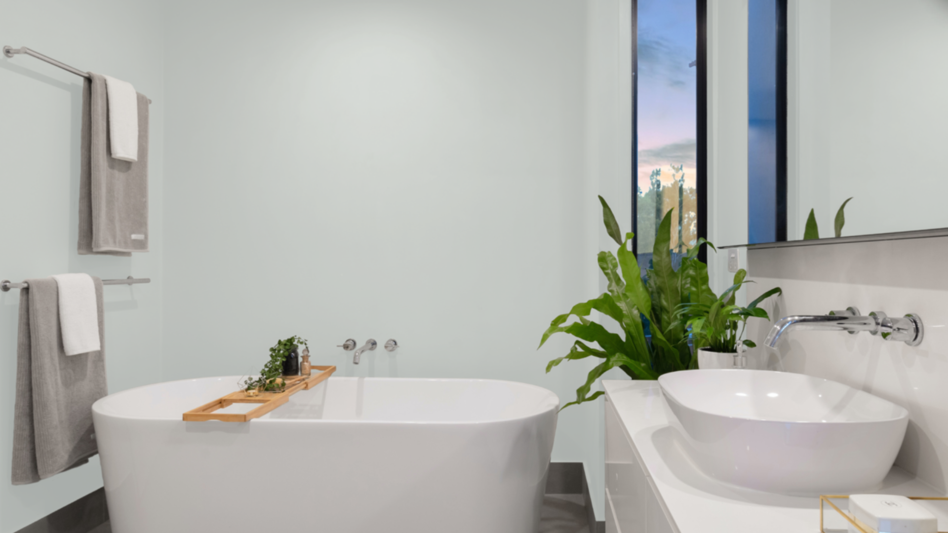
Bathrooms
In bathrooms, Seafoam brings a clean and refreshing vibe. It mimics the feeling of a gentle sea breeze, making even a small bathroom feel larger and more relaxing.
I love how it works with marble or light gray tile, and it looks especially nice with brushed nickel or matte black fixtures.
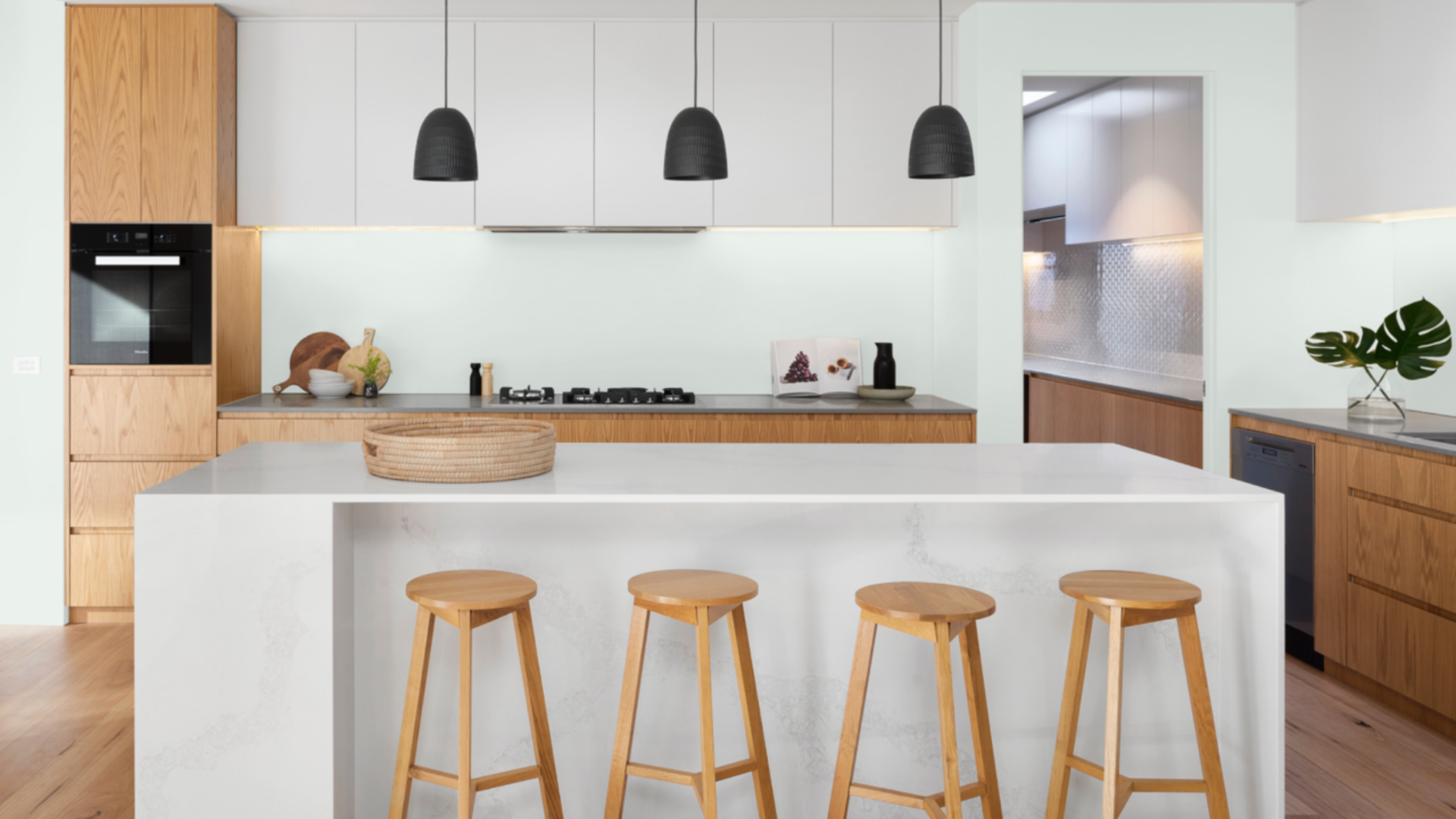
Kitchens
Seafoam can be a quiet hero in the kitchen. When paired with white cabinets or light stone backsplashes, it adds just enough color without overwhelming the space.
I’ve used it on kitchen walls to subtly break up all the white while still keeping things bright and airy.
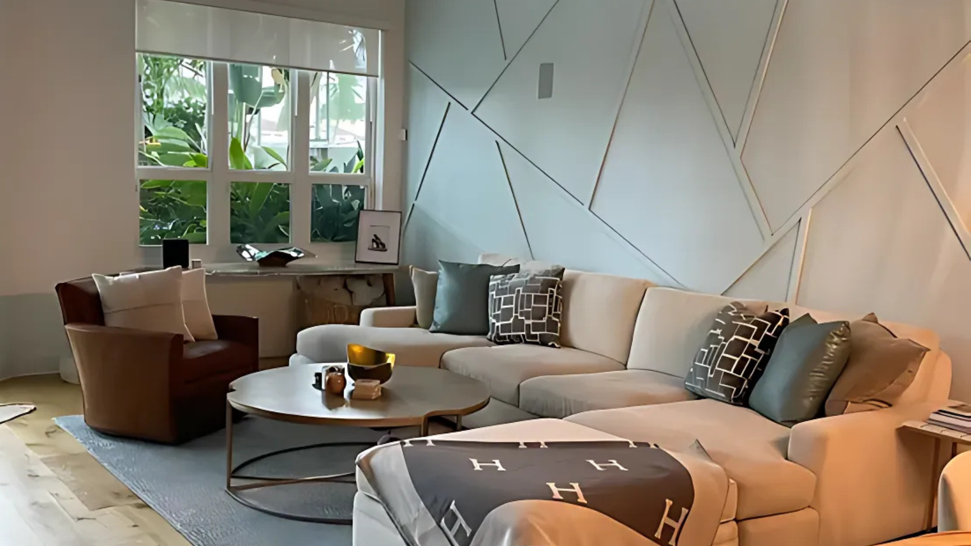
Living Rooms
If your living room needs a color that isn’t too bold but still adds personality, Seafoam is a great option. It can help soften harsh angles and bring in a sense of ease.
I’ve seen it used alongside light grays, beiges, and even pale blues for a soft coastal or cottage-inspired palette.
Ceilings
Painting ceilings in Seafoam is a trick I’ve used when I want to make a room feel taller or fresher. It adds a subtle hint of color that draws the eye upward without feeling heavy.
It’s especially lovely in sunrooms, bathrooms, or bedrooms with white or very light walls.
Trim, Doors, or Built-ins to Add a Soft Contrast
Instead of using bright white or standard neutrals, Seafoam can make a lovely trim or built-in color. I’ve painted bookshelves, window frames, and even closet doors in Seafoam to add just a whisper of color.
It’s a gentle way to bring life to architectural details without making them shout.
Seafoam helps rooms feel clear and open. You can use it as a main color or mix it in with other light shades.
What Kind of Floors Would Look Best with Seafoam?
Picking the right floor can help Seafoam look even better. Since it has a cool, light tone, you’ll want floors that add balance. Warmth or texture in the flooring helps keep the room from feeling too cold.
Floor options that go well with Seafoam include:
- Light oak or maple wood for a soft and fresh look
- Warm brown hardwoods to add contrast
- Whitewashed floors for a clean, beach-like feel
- Beige or light gray tile to keep the space even
- Natural stone with soft tan or sand tones
- Neutral carpet in cream, taupe, or soft gray
With the right flooring, Seafoam brings a clean and settled feel to any space. It helps tie the room together without feeling too strong or too soft.
How to Incorporate Seafoam Into Your Home Decor?
Seafoam is a soft green that works well in both small details and large spaces. It adds a light touch of color without taking over the room. This makes it easy to use in many home styles.
Try pairing Seafoam with white or light-colored wood furniture to keep the space feeling open.
You can also use soft fabrics, such as linen or cotton, in shades of cream, gray, or soft blue to create a relaxed look. These choices help the color stand out just enough.
For accents, consider adding warm metal finishes, such as brushed gold or soft black, for contrast. Natural textures, such as rattan, stone, or jute, also complement Seafoam well.
Wall art, rugs, or throw pillows in soft, patterned designs can help tie everything together.
Seafoam vs. Other Light Greens
Seafoam is often compared to other soft, green-blues, such as Palladian Blue and Woodlawn Blue. While all three have a gentle feel, each brings a slightly different tone to a room.
The differences come down to how much green or blue shows and how light affects the color.
| Feature | Seafoam (2123-60) | Palladian Blue (HC-144) | Woodlawn Blue (HC-147) |
|---|---|---|---|
| Undertone | Light green with soft blue | Blue with a green touch | Balanced green-blue with gray |
| Depth | Very light and airy | Slightly deeper and richer | Medium-light with soft depth |
| Best For | Calm, open rooms | Bright bedrooms or baths | Subtle color in main spaces |
| Light Behavior | Reflects a lot of light | Warms up in the sunlight | Can shift slightly cooler |
Seafoam is the lightest of the three and offers the most brightness. It works well when you want just a hint of color and a clean, soft feel. It’s a strong choice if you want something fresh that remains calm in various lighting conditions.
Conclusion
Seafoam by Benjamin Moore is a gentle green with a soft, blue-based hue. It brings a light, calm feel that works in many rooms. The color offers enough personality without being too bright or too soft.
One of the things I appreciate most about Seafoam is how well it works with natural light. It complements a range of floor types, materials, and accents.
Its tone helps create a steady mood and brings a clean finish to the space. Seafoam adds a light touch to your home without feeling too plain.
From walls to ceilings and even cabinets, this color stays balanced. It supports both warm and cool accents, making it easy to build a room around. Its fresh feel and soft presence make it a helpful choice for daily living.
Seafoam offers a look that’s gentle, steady, and simple. For homeowners seeking a color that makes rooms feel light without appearing washed out, this is a smart choice.