
Looking for a paint color that can work almost anywhere in your home?
I get it – picking the perfect shade that fits both inside and outside spaces feels like searching for a needle in a haystack.
As a color consultant working with hundreds of homeowners, I’ve found Sherwin-Williams Urbane Bronze to be remarkably adaptable.
This rich, deep neutral brings a sense of calm to interior walls, adds character to kitchen cabinets, and creates striking curb appeal on exterior features.
In this guide, I’ll share everything you need to know about Urbane Bronze – from its unique undertones and light reflectance value to real examples of how it works in different spaces.
Plus, I’ll provide tested color combinations so you can use this versatile shade with confidence in your home.
What Makes Urbane Bronze Special?
As a color consultant, I’ve seen countless paint colors come and go, but Sherwin-Williams Urbane Bronze stands out for a special reason. When it earned its spot as the 2021 Color of the Year, it wasn’t just about following trends – this shade brought something unique to the table.
What catches my eye about Urbane Bronze is its rich depth.
It’s not quite brown, not quite gray, and definitely not black. Instead, it offers a perfect mix of all three, with subtle green notes that shine through in natural light. Think of it as that perfect pair of worn-in leather boots – familiar, comfortable, yet oddly sophisticated.
I often tell my clients that Urbane Bronze is like a chameleon. Inside your home, it can make a room feel snug and intimate. Outside, it adds a touch of refinement whether it’s on window frames, doors, or entire walls.
This adaptability makes it a reliable choice for almost any spot in your home.
Why Choose Urbane Bronze For Your Home?
Let me tell you what makes this color special from my years of helping homeowners select paint. The magic of Urbane Bronze lies in its warm undertones.
On walls or cabinets, it creates a feeling similar to sitting by a fire with a cozy blanket – it just makes you want to settle in and stay awhile.
What I love most about this color is how it plays well with different home styles. In a modern space, it adds depth without feeling heavy. In traditional settings, it brings a fresh twist while respecting classic design rules.
I’ve seen it work beautifully in farmhouse-style kitchens and equally well in sleek, contemporary living rooms.
Here’s something interesting I’ve noticed: Urbane Bronze has this unique ability to make other colors in your room look better.It’s like that perfect backup singer who makes the lead vocalist sound amazing – it supports without stealing the show.
Quick Tips For Using Urbane Bronze:
Smart Places to Use It:
- Make a statement with one wall in your living room or home office
- Paint kitchen base cabinets while keeping the upper ones light
- Update exterior trim, window frames, or your front door
- Add character to built-in bookcases or fireplace walls
Lighting Matters: Here’s something important I tell all my clients: test this color in different lights. In bright, sunny rooms, Urbane Bronze shows off its subtle green notes. In spaces with less light, it leans more toward its gray side.
Pro Tip: If you’re planning to use it in a room, check how it looks at three different times: morning, afternoon, and evening. The color shifts throughout the day, and you’ll want to love it in all its moods.
How To Use Urbane Bronze Indoors
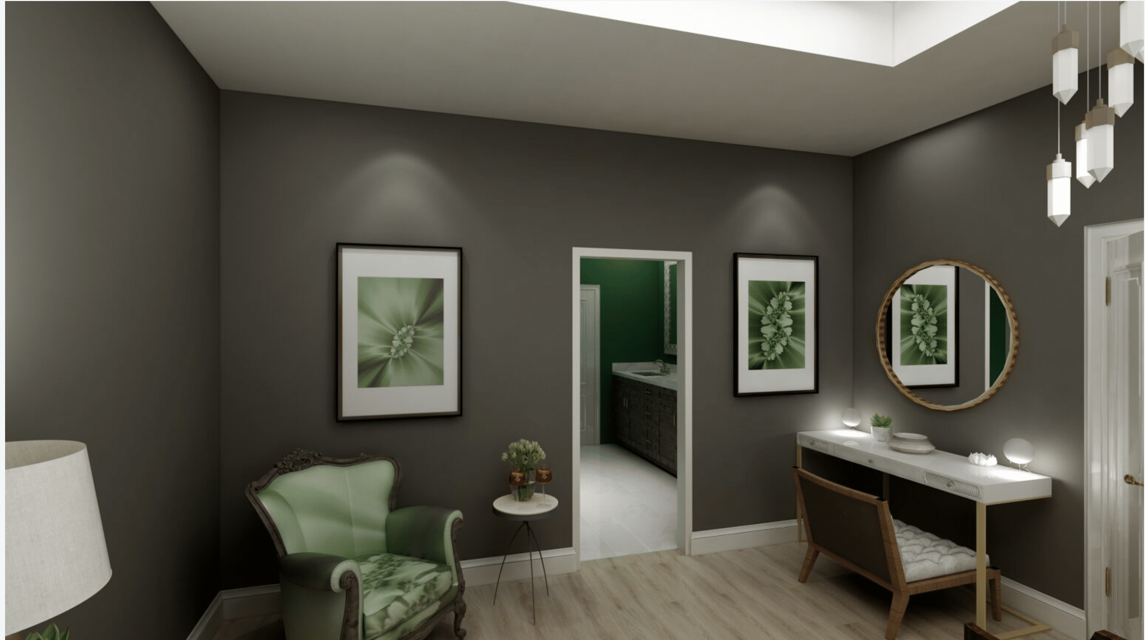
From my consulting experience with this color, let me share proven indoor applications based on real results.
1. Accent Walls: A single wall in Urbane Bronze can make your TV screen blend away rather than stand out. I’ve seen this work especially well in media rooms and family spaces. What makes this effective is the color’s LRV of 8 – it’s dark enough to make screens feel like part of the wall.
2. Cabinetry: This color can refresh kitchens and bathrooms without overwhelming. Based on successful client projects, I recommend:
- Use it on kitchen islands with light countertops above
- Painting bathroom vanities for a high-end look
- Keeping upper cabinets in white tones like Shoji White or Alabaster for balance
3. Interior Doors & Trim: While this shade is typically too dark for most interior trim work, it creates beautiful interior doors. One caution from experience: in rooms with low light, test thoroughly as it may appear almost black.
4. Small Spaces: For smaller rooms like offices or powder rooms, pair them with lots of light neutrals and plenty of lighting. In my practice, I’ve found flat or matte finishes work best on walls to minimize glare and showcase the color’s depth.
Using Urbane Bronze Outdoors
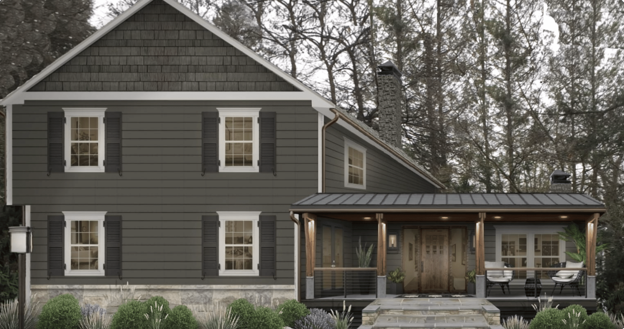
Let me share how this color performs on home exteriors.
Exterior Siding and Trim
In Colorado sunshine, Urbane Bronze appears lighter while maintaining its rich character. From my client projects, some successful combinations include:
- Siding with Wool Skein trim and fascia
- Window frames paired with Shoji White trim
- Gable shingles and downspouts
Front Doors and Garage Doors This color pairs beautifully with both light and dark exteriors. From real project experience:
- It matches bronze window frames perfectly
- Works well with red brick homes
- Creates smooth transitions when used on both garage doors and roofline trim
Complementing Colors for Exteriors When choosing exterior trim colors, I’ve found these successful pairings:
- Wool Skein for a softer contrast that doesn’t look stark outside
- Shoji White for stucco and columns
- Natural Choice for siding, especially with brick homes
Design Pairings And Inspirations
Based on successful client projects, let me share proven combinations:
Natural Elements – This color forms natural partnerships with:
- Warm, natural wood finishes
- Mixed metals, particularly brushed brass and chrome fixtures
- Herringbone backsplash tiles
- Green foliage that brings out its subtle undertones
Color Pairings – From my project portfolio, these combinations consistently work well:
- Soft whites: Alabaster, Wool Skein, Shoji White for contrast
- Light neutrals: Natural Choice for a gentle transition
- Deep accents: Tricorn Black for areas needing stronger contrast
- Warm tones: Especially effective with red brick exteriors
What to Avoid – From Actual Client Experiences:
- Clean, cool whites often look too stark
- Low-light spaces can make the color appear too dark
- Matching from different paint brands (results are unpredictable)
Remember: Light plays a crucial role in how this color performs. In north-facing rooms, it reads more gray, while south-facing spaces bring out its warmer side.
Practical Considerations
Having worked with hundreds of clients using this color, I’ll share what really matters for a successful application.
Testing is absolutely critical – something I’ve learned from both successes and missteps. I always recommend peel-and-stick paint samples because they show you exactly how the color performs in your unique lighting situation.
Testing Paint Colors: Unlike traditional paint swatches, these samples give you a true sense of the color’s depth and undertones throughout different times of day.
For application and finish selection, I’ve found that flat or matte finishes work best for walls, which is especially important since this is such a deep color.
Maintenance Tips: The LRV of 8 means it absorbs quite a bit of light, so sheen can make a significant difference in how the final result appears. From my real project experience, higher sheens can create distracting reflections that interfere with the color’s rich character.
Rooms to Avoid: Speaking of light, some spaces aren’t suited for this color. Rooms with minimal natural light might make the color appear darker than intended.
Based on client results, I’ve noted that the color reads most true in spaces with adequate natural or artificial lighting, where its subtle green undertones can properly emerge.
Comparison Table For Urbane Bronze And Similar Colors
| Color Comparison | Key Features of the Color | Key Features of Urbane Bronze | Notes |
|---|---|---|---|
| SW Iron Ore vs Urbane Bronze | Closer to black with less visible undertones. Warm undertones appear darker overall. |
Shows more warmth and brown notes. It appears lighter in sunlight. |
Both have warm undertones but offer different effects depending on lighting. |
| SW Black Fox vs Urbane Bronze | It is nearly identical to Urbane Bronze. Slightly darker with an LRV of 7. It appears browner overall. |
Slightly lighter than Black Fox. It shares similar green undertones. |
Both work well in similar applications, like trims and accents. |
| SW Peppercorn vs Urbane Bronze | Cooler with violet undertones. Appears more like gray (the color of elephants). |
Maintains warmth with green undertones. Provides a cozier, more natural look. |
Peppercorn is a better choice for sleek and modern styles, while Urbane Bronze adds warmth. |
| SW Tricorn Black vs Urbane Bronze | Darkest option with an LRV of 3. Strong, bold black with no brown undertones. |
Dark but lighter than Tricorn Black. Adds warmth and depth with green undertones. |
Use together to create strong accents with noticeable contrast. |
Expert Recommendations For Urbane Bronze Users
Do’s:
- Use in well-lit spaces where the color’s depth shines through
- Pair with creamy white colors like Alabaster or Shoji White for trim
- Test in your specific space using peel-and-stick samples
- Consider it for exterior applications – especially with brick homes
- Apply in a flat or matte finish for the best wall coverage
Don’ts:
- Skip testing the color in different lighting conditions
- Match using different paint brands
- Use on interior trim in most situations
- Apply in rooms with minimal natural light
- Pair with stark or cool whites
Application Tips
- For kitchen design:
- Works best on lower cabinets or islands
- Keep upper cabinets light for balance
- Consider light countertops for contrast
- For exterior use:
- Perfect for front doors and garage doors
- Excellent trim color with light siding
- Works beautifully with warm brick tones
Conclusion
From my extensive experience with color consulting, Urbane Bronze has proven its staying power beyond typical paint trends.
What makes this color special isn’t just its rich depth but its remarkable ability to adapt to different spaces and styles. Whether coating a stately front door, defining a cozy reading nook, or updating kitchen cabinets, it brings a refined touch without overwhelming.
This color succeeds where many dark shades fail – it manages to be bold yet livable, dramatic yet grounding. Through countless client projects, I’ve seen it transform ordinary spaces into sophisticated retreats.
If you’re considering this shade for your home, remember to test it thoroughly in your space, but trust that you’re choosing a color that will look as fresh years from now as it does today.