")
Choosing the right paint color can be challenging, as there are so many choices. If you get it wrong, fixing it takes time and money.
One color that might work well is Benjamin Moore’s Venetian Portico (LRV – 41.94). It’s a warm neutral that’s easy to use in many rooms.
This color gives off a soft and cozy feel. It’s not too bright and doesn’t look dull. It works in rooms with natural light or even in darker spots, making it a flexible choice.
I’ve tested many Benjamin Moore colors and seen how they look in different lights. Venetian Portico changes gently with the light, but not in a bad way. It stays calm and warm, which helps make a room feel peaceful.
In this blog, I’ll share what this color looks like, what it goes well with, and where it works best. By the end, you’ll have a clear idea of whether it’s right for your home.
Let’s break it all down, step by step.
Why Venetian Portico (AF-185) Is the Perfect Choice?

Venetian Portico (AF-185) is a soft, calm beige with a gentle, warm tone. It helps make a room feel cozy without looking too yellow.
This color adds warmth without being bold. It’s a nice choice if you want something simple and easy on the eyes. What’s great about it is how it changes with light. In sunlight, it looks like a clean beige.
In darker spots, it can look a bit more golden. That makes it work well any time of day. It’s part of the Affinity Collection by Benjamin Moore. These colors are made to go well together.
Venetian Portico has a soft, modern feel. It complements both new and classic styles and is a color that works in many homes and rooms.
Where Is Venetian Portico (AF-185) Best Used in an Interior?
Venetian Portico’s versatility makes it an excellent choice for nearly any room in your home. Its neutral warmth adapts well to different spaces and lighting conditions.
1. Living Room
Venetian Portico works really well in living rooms. It gives the space a warm and soft look without taking attention away from your furniture.
The gentle color makes the room feel calm and cozy, which is great for relaxing or spending time with others.
If your living room faces north and doesn’t get much sun, this paint helps balance out the cooler light. It looks great with wood furniture, soft white pillows, and earthy items like terracotta pots or green plants.
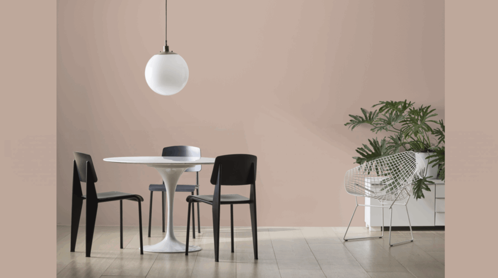
2. Dining Room
This color adds quiet warmth to dining rooms. It makes meals feel more relaxed and special at the same time. With soft lighting, the paint gives off a nice glow that looks good on people and food.
That makes dinners feel more enjoyable. Try adding dark blue chairs, gold-colored lights, or strong wood pieces to match.
The color doesn’t fight for attention, so your dishes and centerpieces really stand out.
3. Bathroom Walls
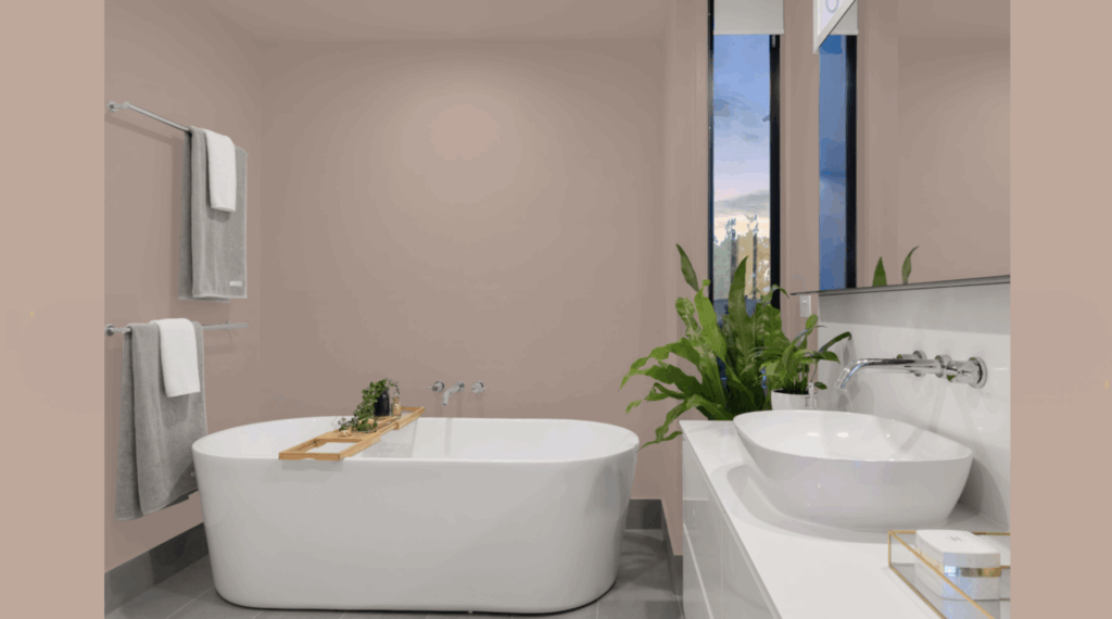
Venetian Portico is a great choice for bathrooms. It helps the space feel clean and calm, like a little home spa. It also works well with the cool look of tiles and metal sinks or tubs.
In small bathrooms, it makes the walls feel more open. But it still adds enough warmth so the space doesn’t feel cold.
It goes nicely with marble, bronze, or silver fixtures and even little plants or wooden shelves.
4. Bedroom
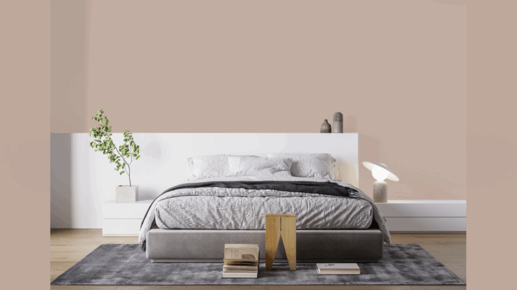
Bedrooms need calm colors, and this one is perfect for that. The Venetian Portico makes the room feel quiet and peaceful. It’s not too dark or too bright. That helps your eyes and mind rest.
It also works with many colors, so you can switch out your blankets or pillows whenever you like.
You don’t need to repaint each time you change your style. The color looks nice in rooms with both sunlight and indoor lights.
5. Entryway
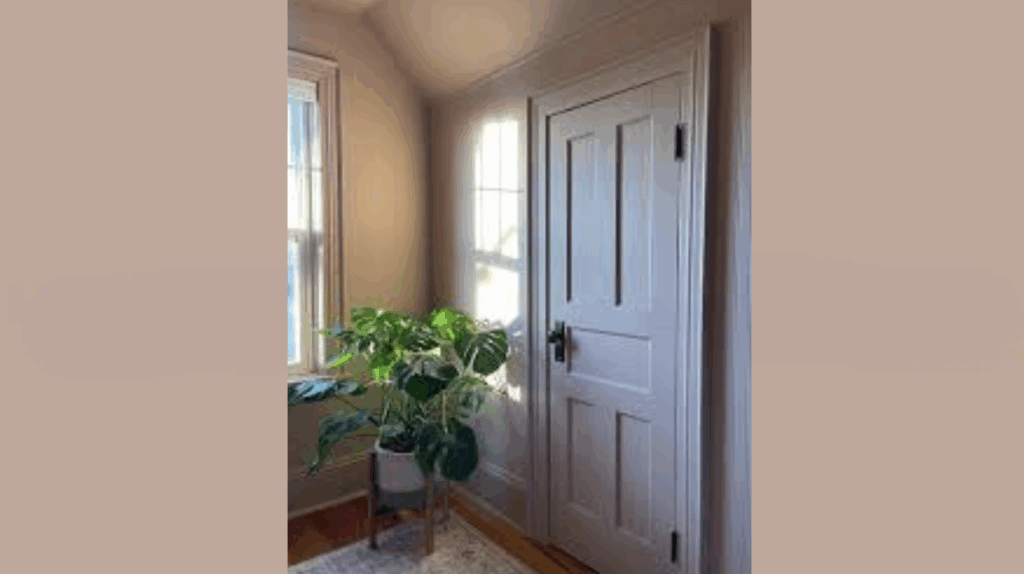
The entryway is the first thing people see when they walk in. The Venetian portico gives it a soft and welcoming feel. It’s light enough to make a small space seem bigger. But it also holds up well in spots where people walk through a lot.
The soft beige color doesn’t take over the space, so your decorations, like pictures or plants, stand out more. It also blends well with nearby rooms, making the whole home feel connected.
How to Incorporate Venetian Portico (AF-185) Into Your Home Decor?
Venetian Portico is a color that fits in with many styles. It’s soft, warm, and easy to match with other colors. For trim and nearby walls, you can use warm whites or light beige.
If you want more contrast, try navy blue or dark green for accents. These darker colors really pop against the soft beige.
Furniture made from natural wood also looks great with this paint. Light oak, deep brown, or weathered gray all work well.
Soft fabrics in cream, gray, or tan help keep couches and chairs calm. Bold colors like dark blue or green can also make things stand out.
Lighting is important too. In rooms with lots of sunlight, Venetian Portico looks bright and clean.
In darker rooms, it can look deeper and warmer. Using warm-toned lights, like table lamps or wall lights, can help the color feel cozy at night.
This paint also works well with textures. To add more detail, you can add thick blankets, soft rugs, or woven baskets.
Decorations like brass or copper lights, green plants, and earth-tone art will really shine. The simple color of the walls helps everything else in the room stand out more.
Conclusion
Benjamin Moore’s Venetian Portico is a soft beige that works in many different spaces. Its warm feel makes rooms cozy and welcoming.
The color changes gently in different lighting. In sunlight, it looks bright and clean. In darker spots, it feels warm and calm. That makes it easy to use in any room of the house.
This color fits well with many styles. It doesn’t matter if your home is more modern or more classic. The Venetian Portico blends in and still adds something special.
You can use it with many other colors, like whites, browns, blues, or greens. It also looks great with wood, metal, and soft fabrics.
If you’re redoing your whole home or just painting one room, this color is a safe choice. It’s calm and simple and works well with all kinds of furniture and decorations. You don’t have to worry about it going out of style.
I’ve seen this color in many homes. It always adds a warm, clean look that lasts. It helps make any space feel peaceful and put together.
If you want a color that works well and looks good, Venetian Portico might be the one you’ve been looking for.
Frequently Asked Questions
What Undertones Does Venetian Portico Have?
Venetian Portico has soft, warm undertones. It shows hints of yellow and beige, but not too much. It stays neutral in most lighting and doesn’t turn pink or overly yellow.
This makes it easy to use in different rooms without the color shifting too much throughout the day.
Does Venetian Portico Work With Gray Furniture?
Yes, it works really well with gray furniture. The warm tones in Venetian Portico help balance out cooler gray shades, creating a calm and cozy look. It’s a great way to soften up a room with gray sofas, chairs, or tables without needing bold color.
How Does Venetian Portico Compare To Benjamin Moore’s Edgecomb Gray?
Venetian Portico is warmer than Edgecomb Gray. Edgecomb Gray leans slightly green-gray, while Venetian Portico feels more beige. Both are neutral, but Venetian Portico brings more warmth.
If you’re looking for a softer, cozier color, Venetian Portico may be a better choice.
Is Venetian Portico Considered A Warm Or Cool Color?
Venetian Portico is a warm color. Its beige base has soft yellow undertones that make a space feel inviting.
It adds warmth without being too strong, making it perfect for living spaces, bedrooms, or any room where you want a relaxed and welcoming feel.
What Trim Color Works Best With Venetian Portico?
White Dove (OC-17) and Simply White (OC-117) are both great choices for trim. They are soft whites that don’t look too bright or too stark.
These whites help highlight the warmth of the Venetian Portico while keeping the space light and clean.