
Small entryways often feel off, even when they’re tidy. It’s not about clutter; it’s how your eye moves through the space that makes it feel cramped or open.
I’ve seen entries jammed with shoes, hooks, and baskets that look smaller than they actually are. The problem isn’t stuff; it’s where it lands visually. The middle gets crowded.
The fix is simple but subtle. Give the eye a first landing point, like a mirror or a tall piece. It guides attention and makes the space feel considered.
Why Small Entryways Feel Off and What’s Actually Causing It?
A small entryway often feels cramped, not because it lacks furniture or decoration, but because visual weight is concentrated in the wrong area.
Hooks, a short console, a stack of shoes, or a basket on the floor each make sense on their own, but together they form a dense horizontal band between knee and shoulder height. That band is where the eye lands first, making the ceiling feel lower and the walls feel closer.
I’ve seen spaces like this feel tight even when there’s room to move. The cluttered middle interrupts the natural flow, compressing the space instead of guiding it.
The problem isn’t quantity; it’s placement. When attention stops at that midline, nothing draws the eye elsewhere, and the entryway reads as smaller than it is.
The solution is simple but counterintuitive: give the eye a better landing point.
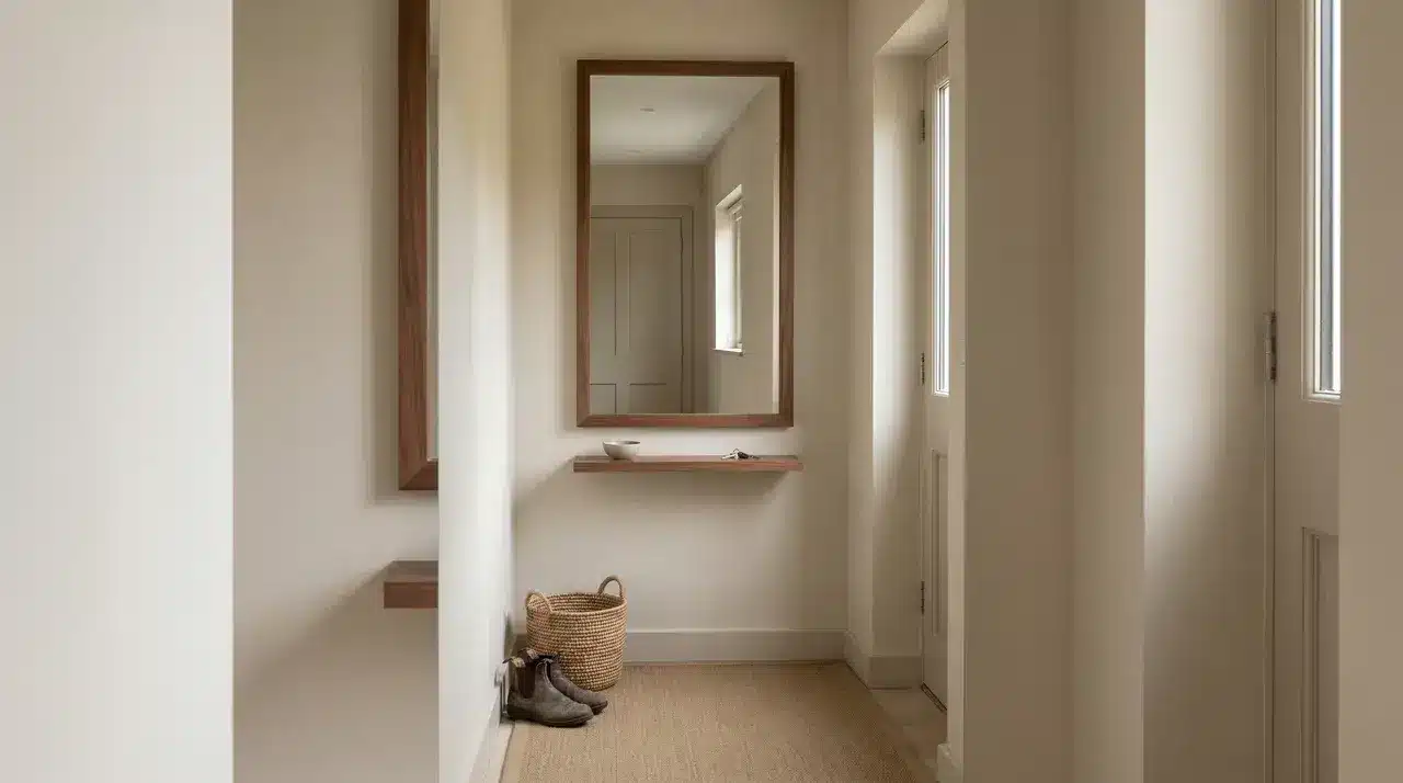
A mirror hung at the right height, a tall vertical element, or a single piece with enough presence can redirect attention.
Pulling the gaze up and across creates a moment of pause, signaling arrival, and makes the space feel considered instead of cluttered. Understanding this relationship makes every other design choice.
The One Anchor Piece that Does the Heavy Lifting
Start with one dominant piece to anchor the space, giving the eye a landing point and setting the scale before anything else.
Mirror vs. Console vs. Bench: Which Anchor Fits Your Layout
The right anchor depends on one thing above all: the width of the entry.
In an entryway under about four feet wide, keep the floor clear. A wall-mounted mirror or a pair of sconces flanking a small piece of art will do more for the space than any furniture. Placing anything on the floor in a narrow entry uses up the one resource it can’t afford to lose.
When the entry has enough width, a console table becomes the most versatile anchor. It provides surface space without blocking movement. A bench works best when storage for coats and shoes is the priority, but it reads as functional first and decorative second.
The Mistake Is Picking the Anchor Based Solely on Style
The right anchor depends mainly on the entry’s width. In spaces under about four feet, keep the floor clear. Wall-mounted mirrors or sconces flanking a small art piece work better than furniture. Furniture steals valuable floor space.
Wider entries can handle a console table. It offers surface space without blocking movement. A bench suits coat and shoe storage. It reads as functional before decorative.
Wall Treatments that Add Depth without Shrinking the Space
Focus on the walls to guide the eye and add depth without crowding the space.
- Largest surface impact: The walls dominate a small entryway. How you treat them can make the space feel open or cramped, so every decision matters.
- White paint ≠ bigger: A plain coat of white may seem safe, but in a small entry it often reads as unfinished rather than spacious.
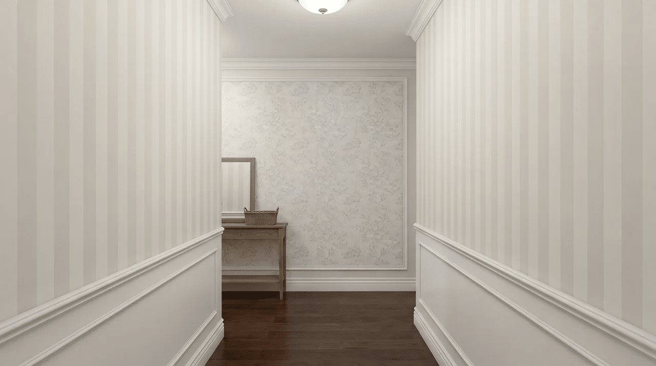
- Vertical pattern: Stripes, board and batten, or picture frame molding draw the eye upward. This vertical movement tricks the eye into perceiving taller ceilings, giving the space a lighter, more open feel.
- Horizontal pattern: Patterns running side to side emphasize width, which can make narrow entries feel squat and compressed, reducing the perception of height.
- Wallpaper placement: Bold wallpaper works best on an end wall in a narrow entry, visually pushing it back. On side walls, the same pattern can make the walls feel like they’re closing in. Placement is more important than the actual pattern.
- Molding vs. wallpaper: Unlike busy prints that visually advance the wall, molding adds shadow and dimension. It reads as architectural detail, giving the space intentional design without shrinking it.
- Texture without crowding: Molding or trim can create layered visual interest without adding clutter or heavy pattern, keeping the walls dynamic but spacious.
- Paint finish matters: Satin or eggshell finishes subtly reflect light, enhancing depth and making walls feel more dimensional. Flat paint absorbs light, visually flattening the space.
Lighting a Small Entryway so It Reads as A Real Room
The right lighting turns a narrow, overlooked entry into a space that feels intentional, layered, and taller than it actually is.
Choose Fixtures with Presence
Lighting a small entryway fails when the fixture is invisible. A flush mount keeps the lights on but does nothing for the room’s perceived height or dimension.
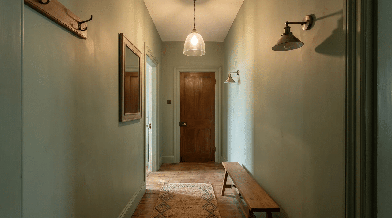
A pendant, chandelier, or wall sconce draws the eye upward. Visual weight makes the entry feel intentional, transforming it from a pass-through into a space with presence.
Layer Light for Depth
Low ceilings need careful choices. A pendant that hangs too low can feel oppressive. Sconces flanking a mirror provide vertical framing without crowding headspace.
Layered lighting adds depth. Overhead light alone flattens the space, while lamps or sconces at eye level create pockets of warmth, making the entry feel larger and more considered.
Storage that Doesn’t Make a Small Entryway Feel Like a Closet
A small entryway has to handle everything like coats, shoes, bags, and keys without feeling chaotic. The problem isn’t providing storage; it’s letting that storage dominate the first impression.
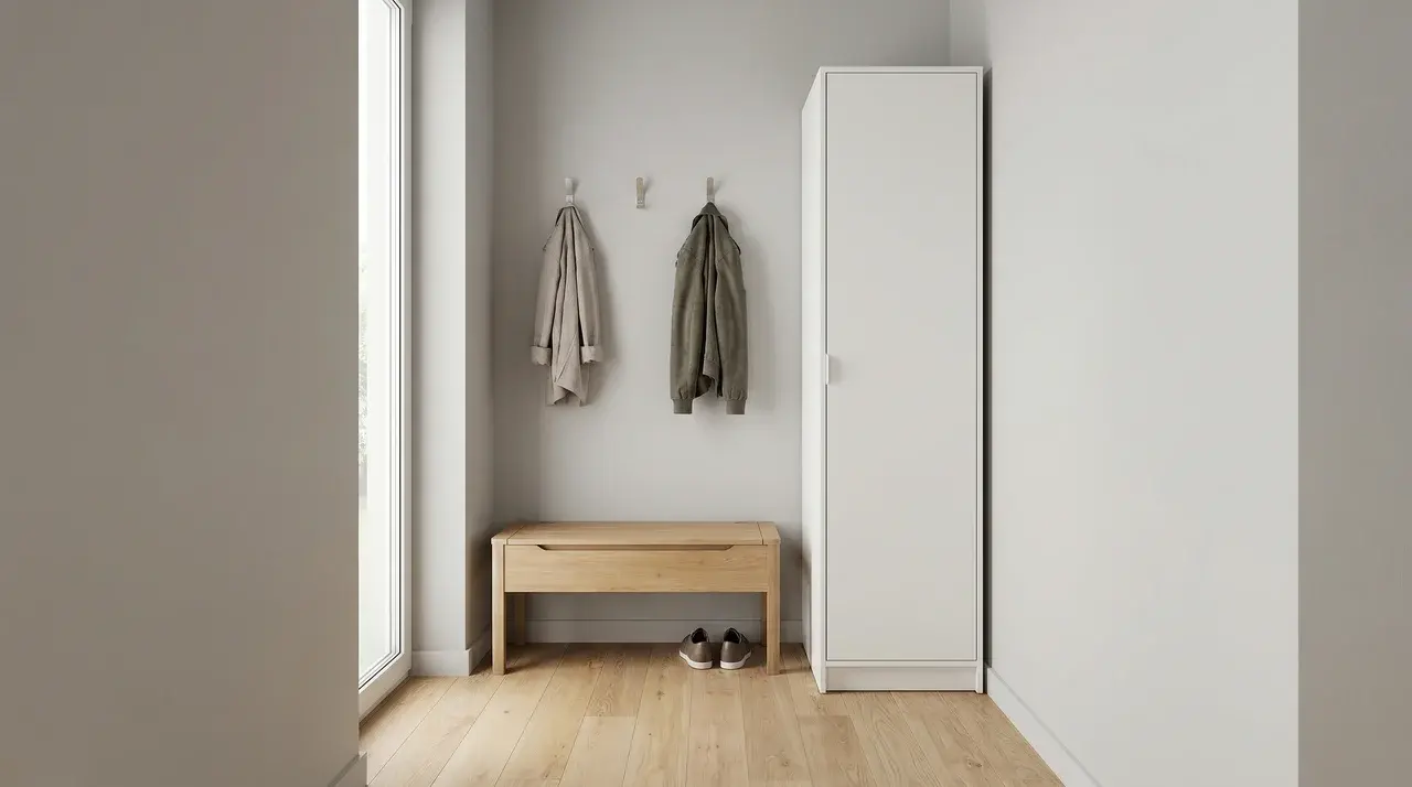
Visibility is key. Concealed or semi-concealed storage, such as a bench with a lid, hidden hooks, or a slim cabinet, keeps the visual load light and the space feeling calm.
Open storage can work if managed. Hooks deliberately grouped and edited—three holding one coat each—read as design. The challenge is maintaining discipline to prevent clutter from taking over.
Always leave one surface or wall completely clear. Even in a storage-heavy entry, that empty space prevents the room from feeling like it exists only to hold things.
Final Take
A small entryway works hardest when every choice guides the eye. Anchors, wall treatments, lighting, and storage shape how the space feels and functions every day.
Focus on balance. Keep one clear surface, use vertical lines, and layer light. Thoughtful placement makes a cramped entry feel open, intentional, and welcoming rather than chaotic.
Start with one deliberate change today. Add a mirror, adjust lighting, or clear a wall. See how a small tweak changes your entry instantly.
Frequently Asked Questions
What is the single most effective thing to do in a tiny entryway?
Install a mirror larger than instinct suggests — at minimum 24 inches wide. A properly scaled mirror reflects light, creates the illusion of depth, and functions as an anchor piece simultaneously. It is the one element that addresses visual weight, perceived scale, and brightness in a single decision, which is why it appears in nearly every well-designed small entryway.
How do you make a small entryway feel bigger without major renovations?
Keep the floor plane as clear as possible, use a vertical element (tall mirror, pendant light, wall-mounted hooks) to draw the eye upward, and limit surface decor to three items or fewer. The combination of open floor space and upward visual movement reliably makes a compact entry feel larger without structural changes.
Should a small entryway have a rug?
Yes, with one condition: the runner or rug should span at least two-thirds of the entryway’s length to anchor the zone rather than float in it. A rug that’s too small makes the floor feel more fragmented, not more finished. For very narrow entries, a 2×3 or 2×4 runner performs better than a square format.
Can you decorate an entryway that has no dedicated space — just a front door that opens into a room?
Yes. Use a rug to define the zone, position one piece of furniture (a narrow console, a small bench, or even a wall-mounted shelf) to signal arrival, and place a mirror above it. The boundary is visual, not architectural — three elements used with intention create the same psychological pause a dedicated entry room provides.