")
If you’re looking for a soft, warm white paint color, Benjamin Moore Steam might be just what you need. It’s not too bright, not too dull – just a nice clean white that feels calm and welcoming.
This color works well in so many rooms, from kitchens and bedrooms to bathrooms and hallways.
What I like about Steam is that it has just enough warmth to keep a space from feeling cold, but it’s still fresh and airy. It pairs nicely with wood tones, light grays, and soft colors, making it easy to decorate around.
In this blog, we’ll look at the undertones, lighting effects, and best places to use Steam in your home. Whether you’re painting one wall or a whole room, knowing how this color works will help you decide if it’s the right fit for your space.
The Rich Undertones of Steam by Benjamin Moore

Steam is a warm neutral that sits nicely in the off-white category. It’s not too yellow and maintains a gentle, creamy quality that feels welcoming in most spaces.
I’ve watched this color change throughout the day in my own home. Morning light brings out its softer side, while afternoon sun can highlight some of its warmer notes. In rooms with north-facing windows, Steam takes on a slightly cooler look.
What makes Steam special is its subtle mix. You’ll notice hints of beige that come through, giving it more depth than a plain white. It’s not quite greige, but it’s not a stark white either.
With an LRV (Light Reflective Value) of 84.2, Steam reflects a good amount of light. This means it’s light enough to make spaces feel open but has enough color to create warmth.
Have you ever noticed how some neutrals feel flat? Steam doesn’t have that problem.
When I painted my living room with Steam, it created a cozy feeling without being heavy. The walls became a refined backdrop that made my furniture stand out nicely.
In shadowy corners, you might spot a touch of taupe coming through. This gives Steam its character and stops it from feeling too plain.
The Psychology of Steam by Benjamin Moore
When you walk into a room painted with Steam, you’ll likely feel an immediate sense of calm washing over you. This color has a special way of making spaces feel warm and clean at the same time.
I’ve noticed that friends who visit my Steam-colored office often comment on how peaceful it feels. The soft warmth creates a feeling that’s both welcoming and tasteful without trying too hard.
The name “Steam” fits this color perfectly. Think about how you feel during a hot shower or bath – that sense of comfort and letting go of stress. This paint brings that same feeling to your walls.
What makes it different from other whites?
Unlike stark whites that can feel cold or clinical, Steam offers a spa-like feeling that still feels lived-in and cozy. It’s like the gentle mist from hot water rather than harsh white tile.
I find this color especially helpful for people who get anxious with bold colors. Steam creates a background that soothes the mind while still having more personality than plain white.
For anyone looking to create a timeless home, Steam delivers. It grounds a space without weighing it down, giving you a base that won’t feel dated in a few years.
Why Steam Is an Ideal Paint Color for Any Room?
Steam is a top choice for walls in any home setting. This soft, neutral shade offers many benefits that make it perfect for various spaces. Let’s look at why Steam works so well in different rooms and situations.
1. Works in Multiple Spaces
I’ve used Steam in nearly every type of room over the years. This color shines in bedrooms where it creates a restful mood without feeling boring. In kitchens, it offers a clean backdrop that makes cabinets and countertops stand out.
When I painted my bathroom with Steam, I was pleased with how it added warmth without fighting against the cool tones of the tiles and fixtures. It even works well in living rooms, where it can make the space feel bigger while keeping things cozy.
2. Fits Various Design Styles
One thing I truly value about Steam is how it plays well with different design choices. If you love farmhouse style, Steam gives you that soft, homey feeling without looking yellow. For modern homes, it provides just enough warmth to keep spaces from feeling cold.
Have you struggled to find a color that works with your existing furniture?
Steam blends with both warm wood tones and cooler metals. I’ve seen it look equally good in rooms with leather furniture and spaces filled with linen and cotton textiles.
3. The Perfect Middle Ground
What makes Steam special is its balance. It’s not so bold that it takes over a room, but it’s not so plain that it disappears. This middle-ground quality means you won’t tire of it quickly.
I find many whites can be too stark or too yellow, but Steam sits right in the sweet spot. You get color without commitment to a strong shade that might feel dated in a few years.
4. Easy to Style with Other Colors
When I work with clients, they often worry about how to add color to their homes. Steam makes this simple. Its neutral tone creates a perfect base for adding pops of color through art, pillows, or throws.
You can pair it with navy blue for a classic look or add green plants for a fresh feel. If you change your style often, Steam will adapt to new accent colors without needing to repaint the whole room.
Best Places to Use Benjamin Moore’s Steam in Your Home
Benjamin Moore’s Steam is a neutral shade that works well in many parts of your home. This light color brings a calm feeling to rooms while staying in the background, letting your furniture and decorations stand out. These are the best spots to use this paint color in your house:
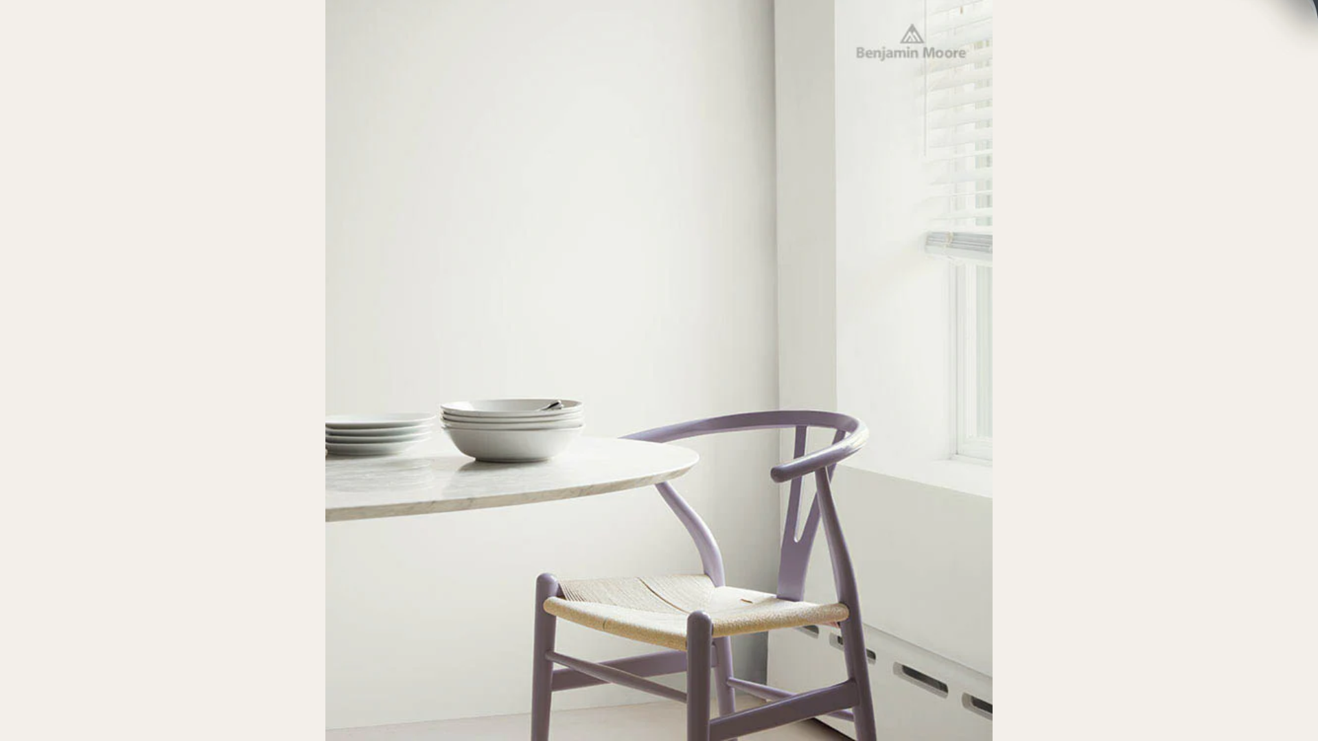
1. Living Room Walls
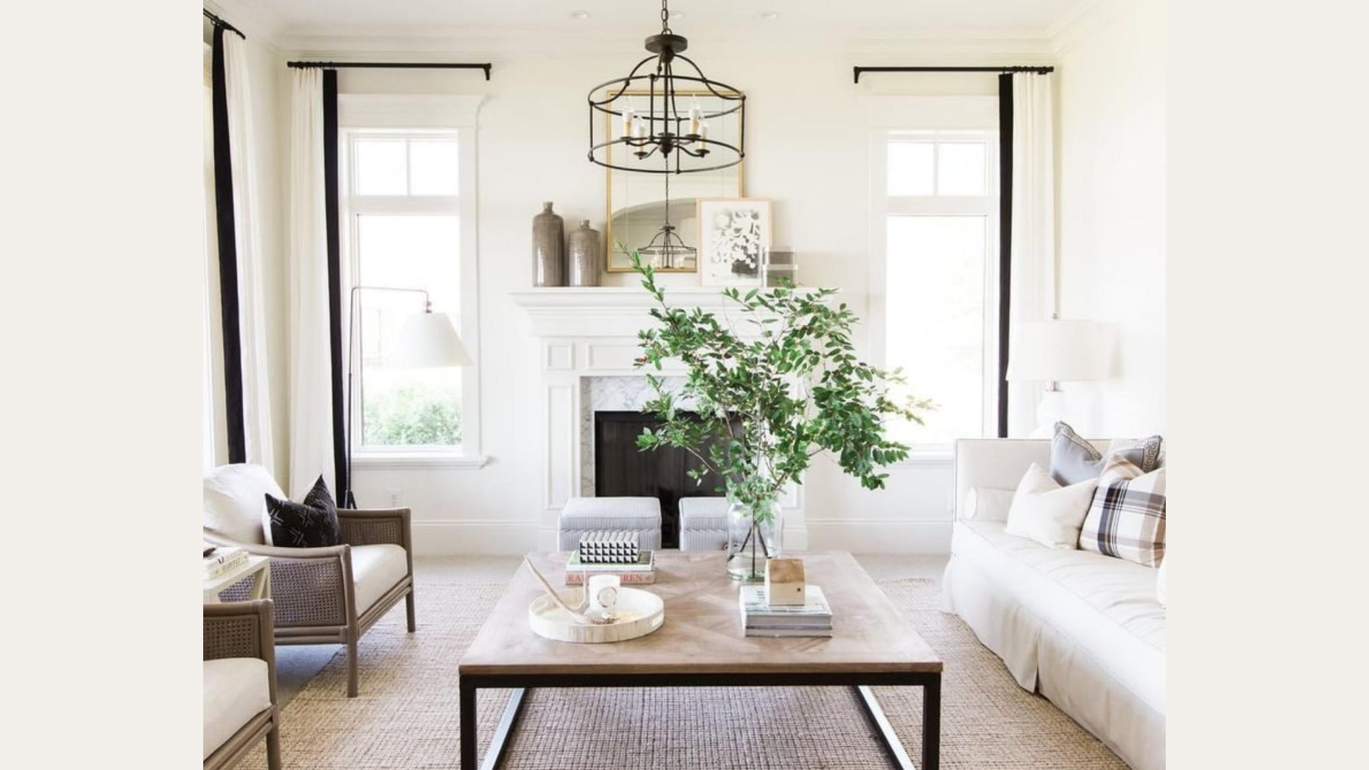
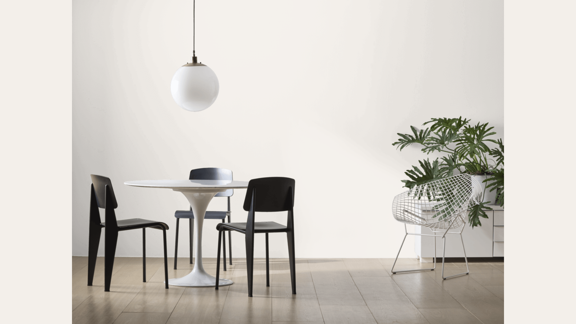
I’ve found that Steam creates a wonderful feeling in living rooms. Its soft tone makes the space feel open yet still cozy. When I painted my own living room with Steam, it helped the room feel bigger without seeming cold or empty.
If you have a small living room, this color will help it feel more open. In larger living rooms, it creates a sense of calm that brings the space together. Your furniture will stand out nicely against these walls, no matter what colors you have.
2. Kitchen Cabinets and Walls
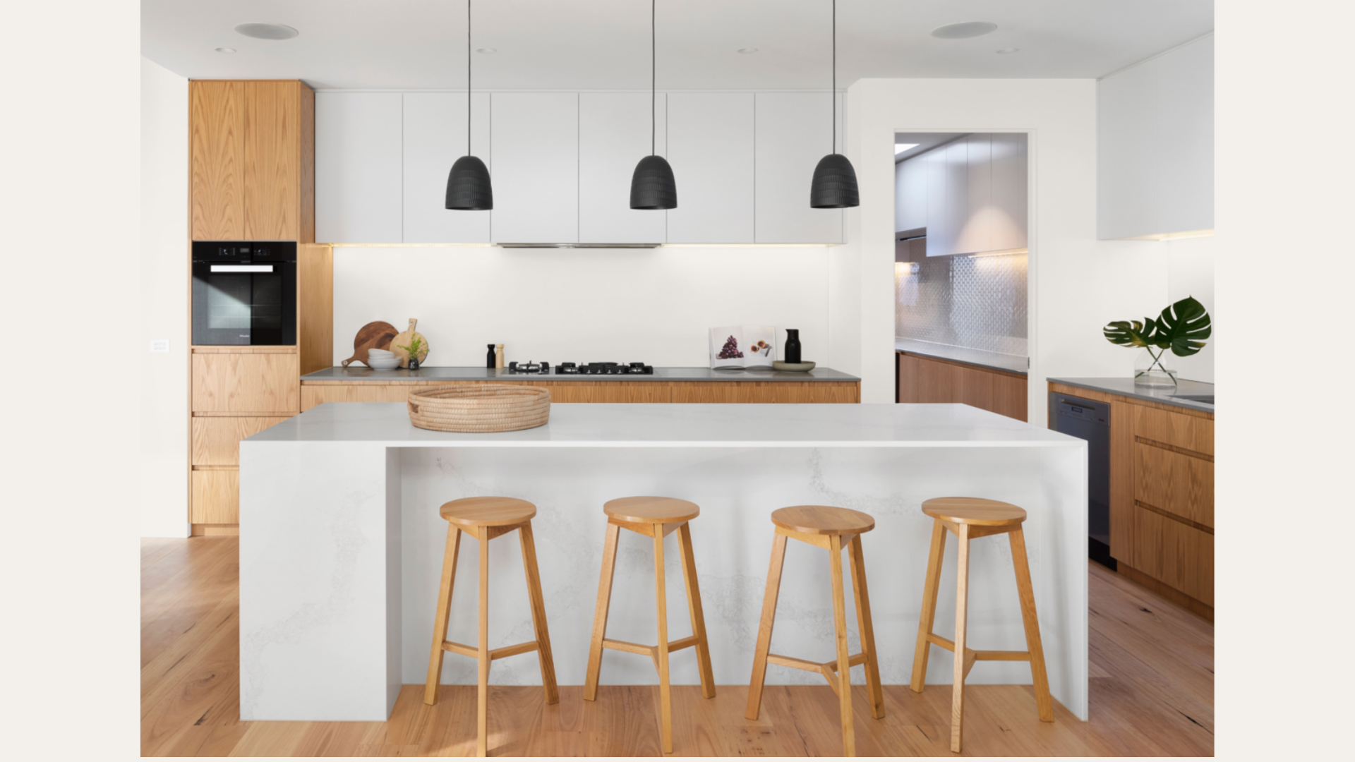
Kitchen cabinets painted in Steam look clean and fresh without the harshness of pure white. I helped a friend paint her kitchen cabinets with Steam last year, and the difference was amazing. The color added just enough warmth to make the space feel welcoming.
For walls, Steam pairs well with both white and colored cabinets. If you want a kitchen that feels bright but not stark, this is a great choice. Have you ever noticed how some whites can make a kitchen feel too clinical? Steam solves that problem.
3. Bedrooms and Nurseries
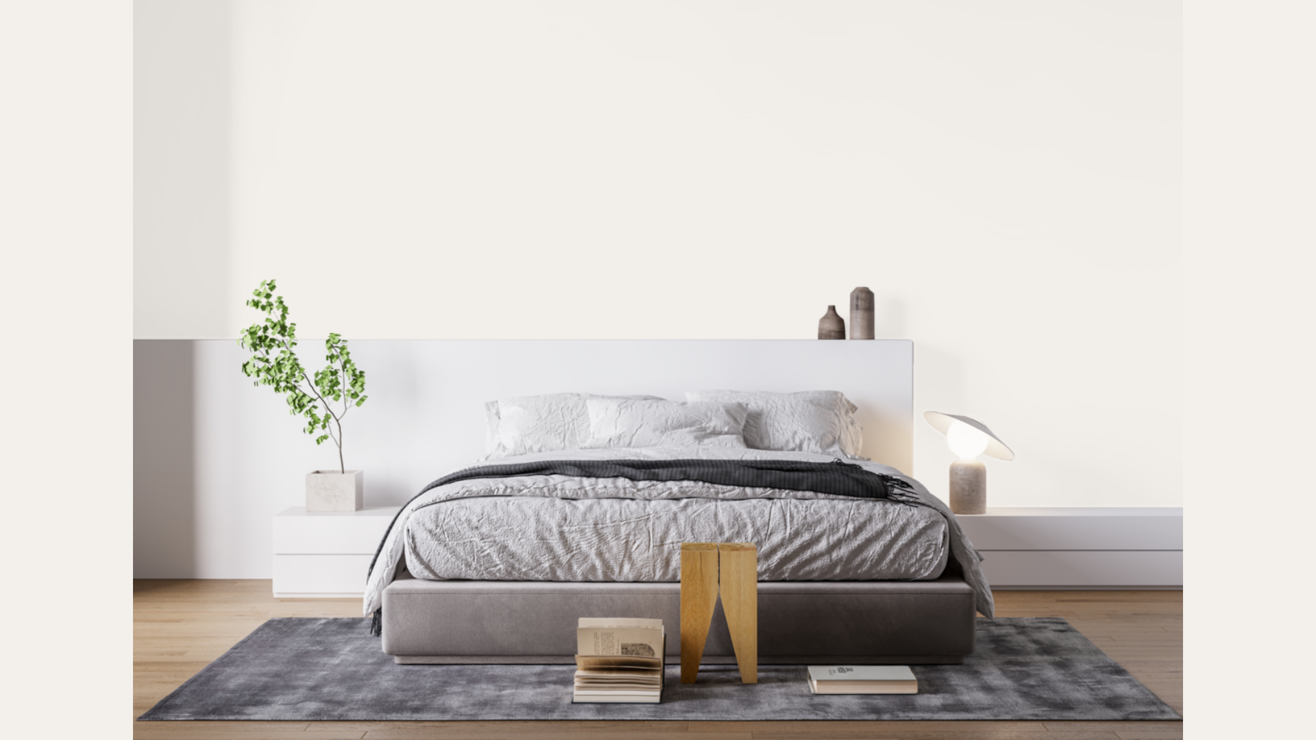
When it comes to rest and sleep, the walls around you matter. Steam creates a peaceful backdrop that helps calm the mind. I’ve used it in master bedrooms where it makes the space feel like a retreat.
For nurseries, Steam offers a gentle base that works with any accent colors you might add. It’s not too stimulating for a baby but has enough warmth to feel nurturing. You can easily add pops of color through art or bedding as your child grows.
4. Home Office Space
Working from home? The color of your walls can affect your focus. Steam provides enough color to feel cozy but is neutral enough not to distract. My home office is painted in Steam, and I find it helps me stay focused without feeling closed in.
The color also looks good on video calls, giving you a clean background that looks professional. Your work materials and computer will stand out nicely against these walls.
Flooring Options That Pair Beautifully with Steam
Benjamin Moore’s Steam creates a perfect neutral backdrop that works with many flooring materials. The right floor choice can pull together your entire room design when paired with this paint color.
1. Hardwood Floor Options
I’ve seen Steam look stunning with many types of wood floors. Medium-toned oak creates a balanced look that feels natural and timeless. The warmth in both the paint and wood complements each other without competing.
Darker walnut floors create a nice contrast with the Steam walls. This pairing makes both elements stand out in a good way. Your room will feel grounded yet still bright and open with this combo.
If you prefer a lighter look, whitewashed or bleached wood floors pair wonderfully with Steam. This creates a soft, airy feeling that works well in beach homes or modern spaces.
2. Tile and Stone Pairings
When it comes to bathrooms and kitchens, tile choice matters. Soft travertine tile creates a warm, natural feeling when paired with Steam walls. I redid my guest bathroom with this combination, and visitors always comment on how pleasant it feels.
Creamy ceramic tiles offer a clean look without being too clinical. The slight warmth in both Steam and these tiles creates a cohesive feel that’s easy to live with.
Have you considered stone flooring? Warm-toned limestone or buff-colored slate can work beautifully with Steam. The natural variations in the stone add interest while the soft wall color ties everything together.
3. Carpet Selections
For bedrooms or cozy spaces, carpet color can make a big difference. Soft beige or greige carpets blend seamlessly with Steam walls, creating a calm, unified look.
I also like the contrast of a slightly deeper carpet tone – think warm gray or taupe – with lighter Steam walls. This grounds the space while still keeping things light overall.
For basement spaces that might lack natural light, pairing Steam with a lighter carpet can help brighten the entire room without feeling too stark.
4. Rug Choices For Any Room
Rugs offer a great way to add texture and color. Natural jute or sisal rugs bring a wonderful texture that contrasts with the smooth painted walls. The neutral tones work together to create a layered look.
If you want more color, patterned wool rugs with soft blues or greens look beautiful against Steam walls. The neutral background helps more colorful rugs shine without clashing.
Light oriental rugs with faded patterns create a timeless look with Steam. I helped a friend select this combination for her dining room, and the result was both classic and fresh.
5. Why Texture Matters
The magic of Steam is how it lets textures stand out. Since the color is subtle, it creates a perfect backdrop for materials with character. Rough stone, knotty wood, or nubby fabrics all get noticed more against these walls.
I find this especially true with flooring. You’ll notice the grain in hardwood more and appreciate the natural variation in stone when paired with Steam’s gentle color.
When you combine a soft color like Steam with rich textures in your flooring, you create depth without needing bold colors. This gives your space interest while maintaining a calm feeling that’s easy to live with day after day.
Steam Compared to Other Warm-Neutral Paints of Benjamin Moore
I’ve worked with many Benjamin Moore neutrals over the years, and Steam has its own special place among them. Let’s see how it compares to other popular warm-neutral options:
| Paint Color | Undertones | Best For | How It Differs From Steam |
|---|---|---|---|
| Steam (AF-15) | Subtle beige with balanced warmth | All-purpose spaces, versatile rooms | Our baseline – soft, well-balanced, warm neutral |
| Ballet White (OC-9) | Greige with slight yellow | Modern farmhouse, transitional spaces | Slightly lighter than Steam with more yellow/green notes |
| Feather Down (OC-6) | Warm beige with pink hints | Cozy living rooms, bedrooms | A touch darker than Steam with more obvious pink undertones |
| White Dove (OC-17) | Soft white with slight yellow | Trim, cabinets, bright spaces | Much lighter than Steam, closer to a true white |
| Swiss Coffee (OC-45) | Creamy with yellow-green | Traditional homes, south-facing rooms | Lighter than Steam with more yellow warmth |
| Pale Oak (OC-20) | Greige with purple undertones | Sophisticated spaces, north-facing rooms | Similar depth to Steam but with cooler undertones |
If your room gets lots of natural light, Steam will show its true color well. For darker spaces, you might want to consider White Dove, which reflects more light.
I find that Steam works better in rooms where you want warmth without obvious yellow tones. If you need more yellow warmth, Ballet White might be a better choice.
Conclusion
Steam stands out as a versatile warm neutral that works in nearly any room. Its balanced undertones avoid looking too yellow or too gray, while its good LRV of 84.2 brightens spaces without feeling stark.
I’ve used Steam in my own home and client projects with great results. Would I use it again? Absolutely! It’s one of my go-to colors when I need something reliable that won’t let me down.
Before you commit, please grab a sample. Paint a large swatch on different walls and watch how it changes throughout the day. This small step saves both money and stress.
Have you used Steam in your home? I’d love to hear about your experience! Where did you use it, and what colors did you pair it with?
Share your thoughts in the comments below – your input helps other readers make good choices for their own homes.
1 Comment
What white trim colour would you use with Steam? I was looking at White Dove. Would a brighter white make the Steam look yellow? Thanks