")
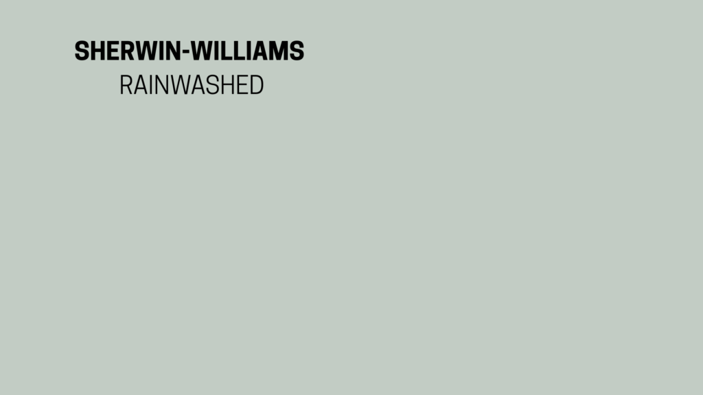
When I first came across Rainwashed by Sherwin-Williams, I didn’t expect it to be the color that kept popping into my mind. I had been testing out a lot of greens and blues, and nothing felt right until this one.
Rainwashed is a soft blue-green with a bit of gray mixed in. It feels calm without being dull, and that balance makes it stand out.
Sherwin-Williams Rain is the shade that keeps showing up when you want a spa-like green-blue.
If you’re here, you’re probably wondering if this is the right color for your walls, trim, or even outside of your home.
In this guide, I’ll go over what Sherwin-Williams says about Rainwashed, share its technical details, how it feels in different rooms, what it pairs well with, and how to buy it.
By the end, you’ll have all the specs and insight you need to make your decision.
Overview of Rainwashed by Sherwin-Williams
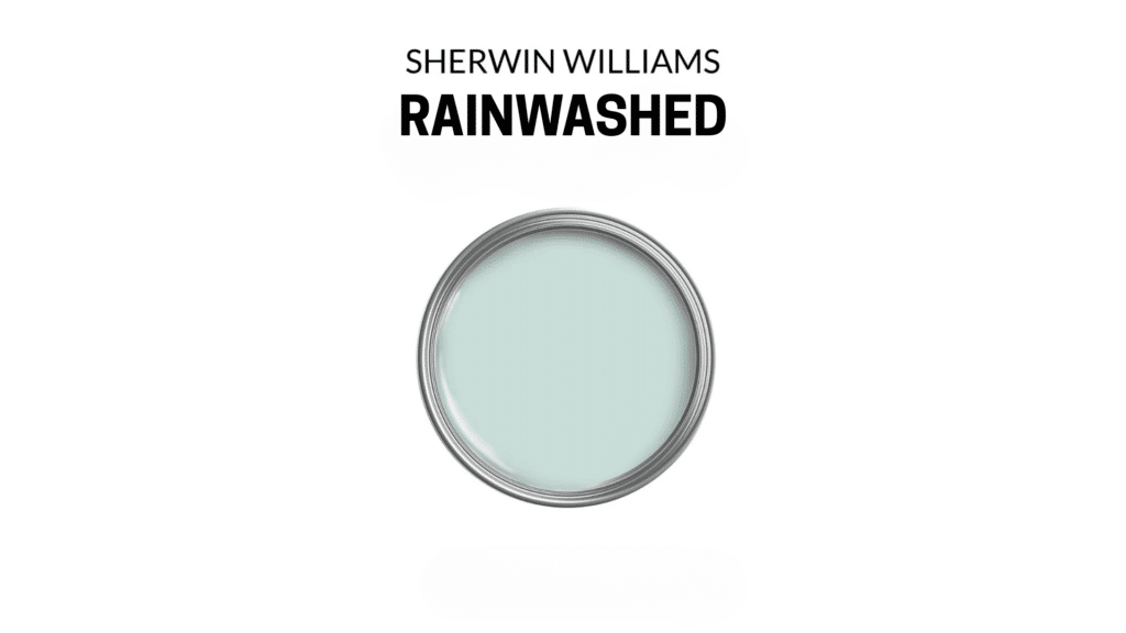
Sherwin-Williams places Rainwashed (SW 6211) in its green color family. It’s also part of their Living Well: Recharge collection, which focuses on calm, health-inspired shades designed to bring comfort into everyday spaces.
This color works well both inside and outside the home. I’ve seen it add brightness to bedrooms and bathrooms, and it can bring a soft coastal look to porch ceilings or front doors.
Sherwin-Williams Rain makes testing easy with orderable samples, a virtual room visualizer, and peel-and-stick swatches.
Professionals can also access full product data sheets with safety and environmental details.
Specifications of Rainwashed
| Feature | Value | What It Means |
|---|---|---|
| Light Reflectance Value | 59 | Reflects a medium amount of light. Balanced between light and dark. |
| RGB / Hex | 194, 205, 197 / #C2CDC5 | Exact digital mix for matching or comparison. |
| Undertones | Blue, Green, Gray | Soft, watery tones that stay calm without being too bright. |
| Temperature | Cool (softened) | Leaning cool, but the gray keeps it from feeling icy. |
Rainwashed brings a balance of calm and versatility that works in many settings. With these basics and specs in mind, you’ll have a clear starting point before deciding where it fits in your home.
How Sherwin-Williams Rain Shapes a Space?
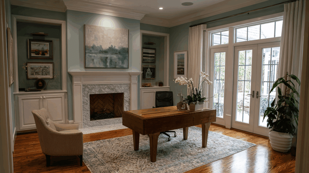
When I tried Rainwashed in my guest bathroom, the change was instant. The space felt calmer, almost like stepping into a spa.
The soft blue-green shade reminded me of sea glass after a storm, gentle and refreshing at the same time.
This color doesn’t push itself forward or fight for attention. Instead, it settles quietly into the room, shaping the mood without effort.
What I like most is how balanced it feels. It’s calm and airy, yet not so light that it fades into nothing.
If you want a fresh start in a space or a sense of quiet ease, Sherwin-Williams Rain is the kind of shade that can create that atmosphere naturally.
How to Use Sherwin-Williams Rainwashed at Home
Rainwashed works differently depending on where you use it. Each room brings out a slightly new side of the color, from relaxing and airy to soft and coastal.
- Bathrooms: Feels fresh and clean; creates a spa-like vibe that makes small spaces feel open.
- Bedrooms: Calm and cool; they work as a backdrop that makes it easy to rest and recharge.
- Nurseries: Gender-neutral and soft; warm enough to feel cozy, cool enough to stay fresh.
- Living Rooms: Works as a whole-home shade; quiet and easy-going, pairs well with warm accents.
- Exteriors: Softer outside; looks coastal and inviting on porch ceilings, doors, or shutters.
These examples show how flexible Rainwashed can be. No matter the space, it creates a gentle backdrop that feels easy to live with and style around.
Comparisons with Similar Colors
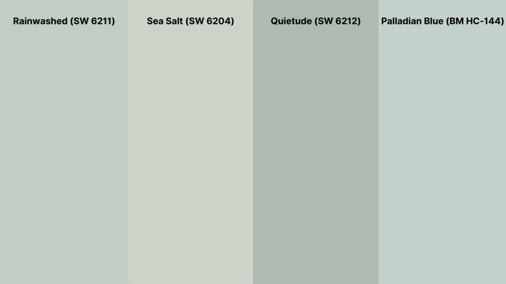
Rainwashed often gets compared to other soft blue-green shades in the Sherwin-Williams and Benjamin Moore collections.
On paper, the differences may seem subtle, but undertones and light reflectance can shift how each color feels once it’s on your walls.
| Paint Color | LRV | Undertone | How It Compares |
|---|---|---|---|
| Rainwashed (SW 6211) | 59 | Blue-green with gray | Balanced, soft, and calming. Works as a versatile whole-home or accent color. |
| Sea Salt (SW 6204) | 63 | Green-gray with blue | Lighter and more neutral; Rainwashed has a stronger blue-green presence. |
| Quietude (SW 6212) | 48 | Deeper blue-green | Darker and moodier, Rainwashed feels lighter and airier in most spaces. |
| Palladian Blue (BM HC-144) | 60 | Blue-green, less gray | Similar depth, but Palladian Blue leans brighter and more blue-toned. |
Rainwashed sits in the middle, being softer than Quietude, deeper than Sea Salt, and grayer than Palladian Blue. This balance makes it a favorite for bedrooms, bathrooms, and calm living areas.
How Rainwashed Looks Under Light
Light changes the way Sherwin-Williams Rainwashed appears, and that’s what makes it such an interesting color.
In north-facing or dim rooms, Rainwashed leans more green. The cooler light pulls out its softer, muted side, making it look a little earthy.
In south-facing or bright spaces, the blue tones come forward. The color feels fresher and lighter, almost like a soft coastal blue-green.
At night, under warm bulbs, Rainwashed shifts again. It can appear more gray and subdued, almost like a gentle neutral that blends into the background.
These shifts are why sampling is so important. The same can of paint looks different in every corner, depending on how the light falls.
Where to Buy Rainwashed?
Getting Sherwin-Williams Rainwashed is simple, but it helps to know your options before you commit. No matter if you want to test it out first or jump straight into gallons, there are several ways to buy.
- Sherwin-Williams Website: Order paint, chips, or samples directly online.
- Sherwin-Williams Stores: Find gallons or quarts at local Sherwin-Williams retail locations.
- Home Depot: Some locations and their website carry Sherwin-Williams paints, including Rainwashed.
- Lowe’s: Offers Sherwin-Williams color matching and samples in-store.
- Samplize: Buy 12×12 peel-and-stick swatches that can be moved around your walls.
Testing first is always smart. Light changes the way Rainwashed looks, and sampling in your own space makes sure you’ll love it before painting an entire room.
Tips and Practical Advice for SW Rainwashed
After using Rainwashed in a few different rooms, I picked up some helpful lessons. These small details can make the difference between liking the color and truly loving it.
- Test on multiple walls: Place samples on both shady and sunlit walls. The shift in tone can be surprising.
- Pick the right finish: Satin or eggshell works best in bathrooms since they handle moisture better.
- Watch low-light spaces: In darker hallways, Rainwashed can lean gray. Pairing it with lighter trim helps it pop.
- Apply enough coats: Two coats usually give the truest version of the color without streaks.
Taking the time to sample and adjust finishes pays off. With the right prep, Rainwashed shows its calm and balanced personality in any space.
Conclusion
If you’ve been searching for detailed information about Sherwin-Williams Rainwashed, this guide should give you everything you need in one place.
You now know the official specs, including its undertones, reflectiveness, and color values.
You’ve also seen how it shifts under different lighting and how it compares to similar shades like Sea Salt, Quietude, and Palladian Blue.
I’ve shared how it feels in real rooms, from bathrooms and bedrooms to exteriors, and why it works so well as a calm and balanced backdrop. You also know where to buy it and the best ways to test it first.
For me, Rainwashed has been one of the easiest colors to live with. If your intent was to see if it fits your home, you should now feel ready to decide with confidence.