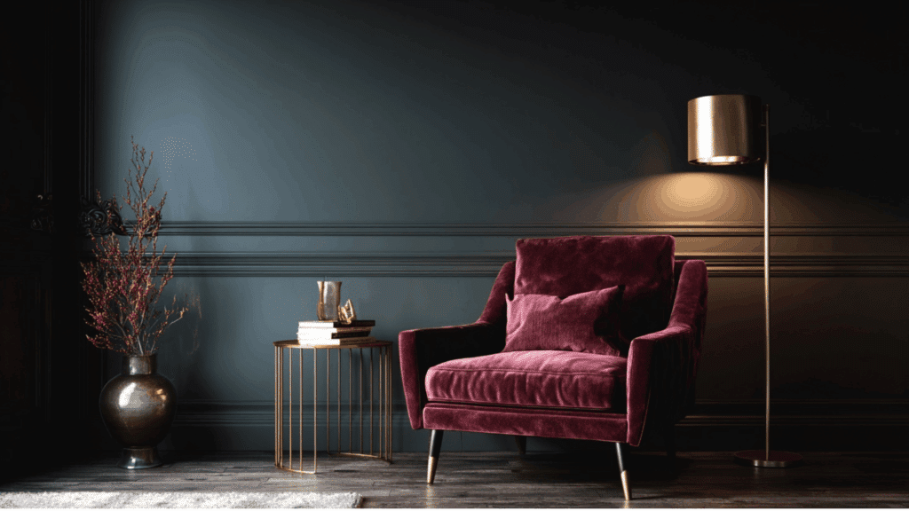
A whole house color palette helps create a sense of flow and connection throughout a home.
Instead of treating each room as a separate project, it ties all spaces together through thoughtful color choices. The right interior color scheme can make a home feel calm, cozy, bright, or balanced, depending on the shades used.
A cohesive design doesn’t mean painting every room the same color; it’s about finding hues that work well together.
By following a clear home color scheme, homeowners can achieve a beautiful, unified look that feels natural and welcoming from one room to the next.
What is a Whole House Color Palette?
A color palette is a thoughtfully planned mix of shades used throughout a home to create a visual and emotional connection.
Designers often combine interior color schemes and home color schemes to balance personal style with harmony. By choosing a unified palette, homeowners can create a cohesive color story that enhances comfort and beauty.
The following are some of the many benefits of choosing a whole house color palette:
- Improves flow between rooms, making transitions feel seamless and natural.
- Simplifies color and décor decisions for the entire home.
- Makes spaces appear visually larger and more open.
- Creates emotional balance and visual comfort in every room.
- Adds a professional, polished touch without expensive redesigns.
How to Build Your Whole House Color Palette

Creating a whole-house color palette starts with balance. It’s about choosing shades that connect rooms while reflecting your home’s unique personality.
1. Choose a Versatile Base Color: Start with a neutral foundation, such as white, beige, greige, or soft gray. These shades complement most décor styles and lighting conditions, providing balance and flexibility for layering other colors throughout your home.
2. Identify Undertones and Lighting Effects: Pay attention to undertones, warm (yellow, red) or cool (blue, green), as they affect how a color feels. Observe samples in natural and artificial light to ensure consistency across different rooms and times of day.
3. Add Complementary and Accent Colors: Select two to three coordinating hues to build depth and interest. Use accent shades on feature walls, furniture, or décor to express personality while keeping the overall look harmonious and connected.
4. Create a Smooth Flow Between Rooms: Ensure transitions feel natural by maintaining related tones or repeating certain colors. Flooring, trim, and textiles help visually link spaces, reinforcing a cohesive whole-house color palette from one area to the next.
5. Test Before You Commit: Always test paint samples on walls before finalizing choices. Evaluate them under varying light conditions and at different times of day. Digital paint visualizers or swatch boards also help preview how your palette works together.
Whole House Color Palette Ideas and Inspiration
Discover inspiring whole-house color palette ideas that bring harmony, personality, and seamless flow to every room in your home.
1. Neutral and Classic
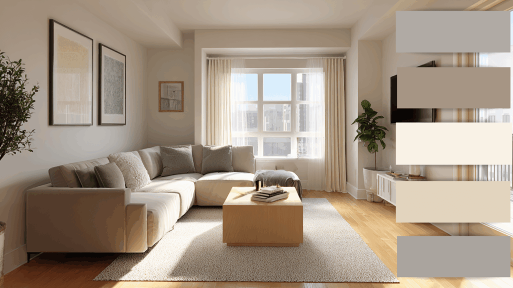
Soft whites, taupe, and muted grays create a calm and classic foundation that never goes out of style.
This palette works beautifully in both modern and traditional homes, offering flexibility for décor updates. It allows furniture, artwork, and lighting to stand out without competing for attention.
Perfect for homeowners who prefer understated modernity and want an easy-to-maintain look that feels bright, balanced, and effortlessly stylish throughout the entire home.
2. Warm and Cozy
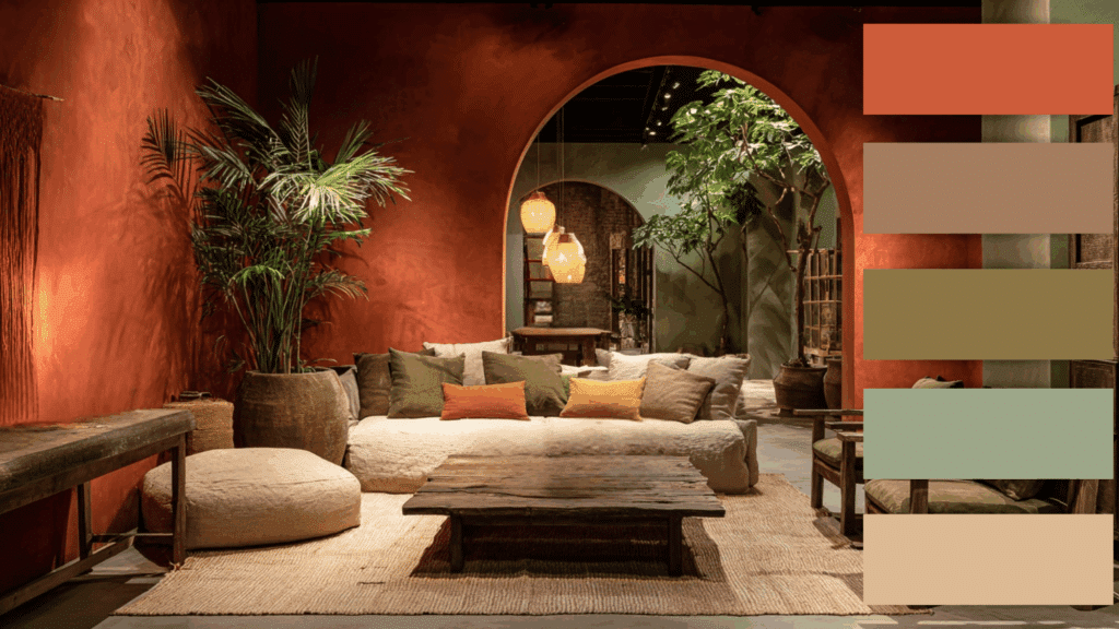
Earthy tones like terracotta, olive, and cream bring comfort and warmth to living spaces. These colors mimic natural elements, helping rooms feel grounded and welcoming.
The palette pairs well with wooden furniture, woven textures, and warm lighting. It’s ideal for families who love a homely, inviting atmosphere.
Using these shades throughout your home makes it feel connected and emotionally rich without overwhelming the senses.
3. Modern and Minimal

Black, white, and natural wood tones create a clean, balanced beauty. This whole house color palette offers a modern yet classic appeal.
The contrast between light and dark enhances structure and form while allowing textures to shine. Add warmth through beige accents or greenery.
It’s perfect for those who love simple design, uncluttered spaces, and a harmonious balance between style and functionality.
4. Coastal Calm
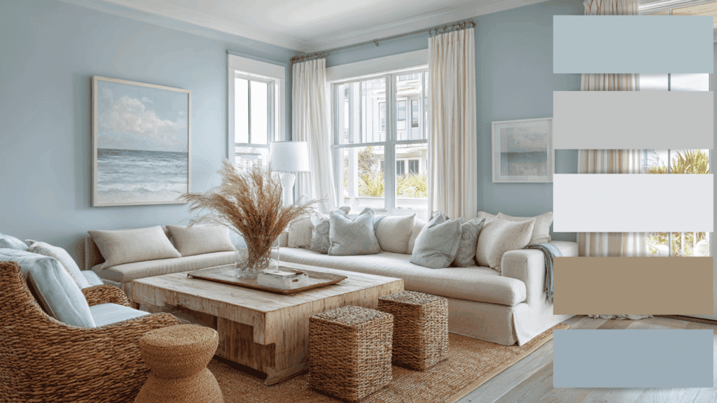
Soft blues, sandy neutrals, and crisp whites bring a breezy, seaside beauty to interiors. This palette evokes relaxation and openness, inspired by ocean and sky hues.
Natural materials like linen, jute, and rattan complement the look. It’s ideal for creating a peaceful retreat that feels refreshing year-round.
Use light wood flooring and airy fabrics to maintain the beachy, effortless flow across all rooms.
5. Bold and Artistic
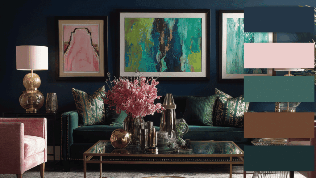
Deep navy, emerald green, and blush accents add personality and drama. This home color scheme suits homeowners who love creative, statement-making spaces.
The darker hues ground the design, while soft tones keep it inviting. Ideal for eclectic or modern interiors, this palette blends with fun.
Balance bold walls with neutral furniture and metallic details to create a cohesive, art-inspired appeal throughout your home.
6. Earthy Modern
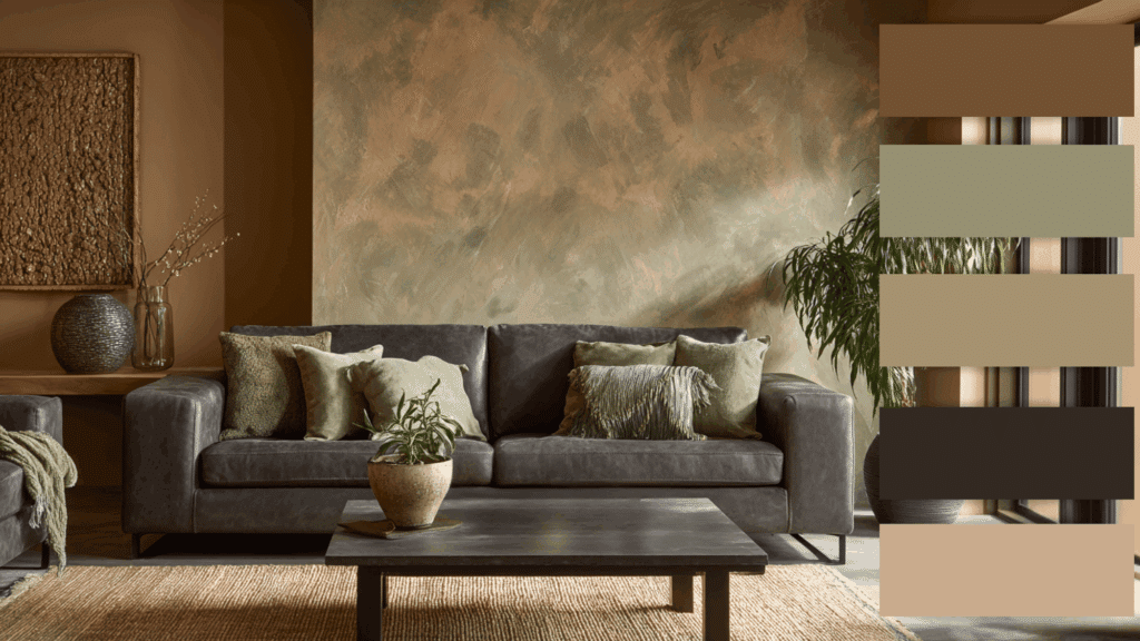
Warm clay, charcoal, and sage create a refined yet grounded palette. Inspired by natural landscapes, it combines organic comfort with contemporary style.
This mix works well with both rustic and sleek interiors, emphasizing texture and materiality.
Earthy tones make spaces feel inviting and calm, while dark accents add modern contrast. A perfect choice for those who appreciate minimalism rooted in nature.
7. Stylish Monochrome
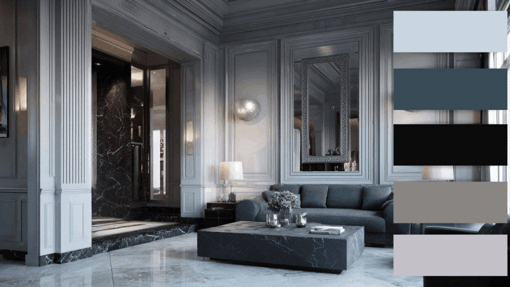
Different shades of gray, from soft dove to rich graphite, build depth and style. Layering tones rather than colors keeps rooms unified while remaining visually interesting.
Pair with marble finishes, silver accents, and subtle textures to maintain modernity.
This interior color scheme feels luxurious and balanced, making it ideal for open-concept layouts or modern homes aiming for a sleek, high-end atmosphere.
8. Nature-Inspired Greens
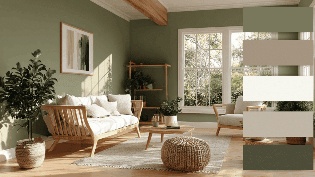
Olive, moss, and muted sage shades evoke freshness and renewal. These hues bring the calmness of the outdoors inside.
When paired with natural woods and off-white trims, they create a grounded, organic feel.
Perfect for living spaces, bedrooms, or kitchens that aim for a soothing, earthy vibe. This palette connects the entire home through nature’s most relaxing tones.
9. Warm Neutrals with Blue Accents
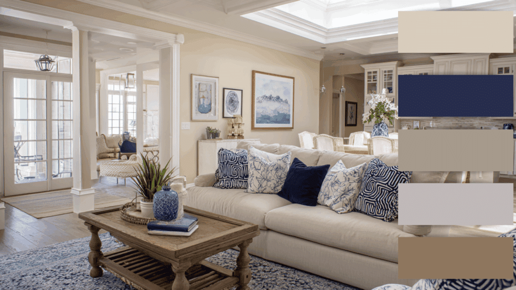
Cream, beige, and taupe form a cozy base, while navy or slate blue adds beauty. The contrast creates both warmth and structure.
This combination feels coastal yet stylish, making it versatile for traditional or modern homes.
It’s especially effective in open layouts, where blue accents in rugs or décor carry the eye from one room to another seamlessly.
10. Desert Sunset
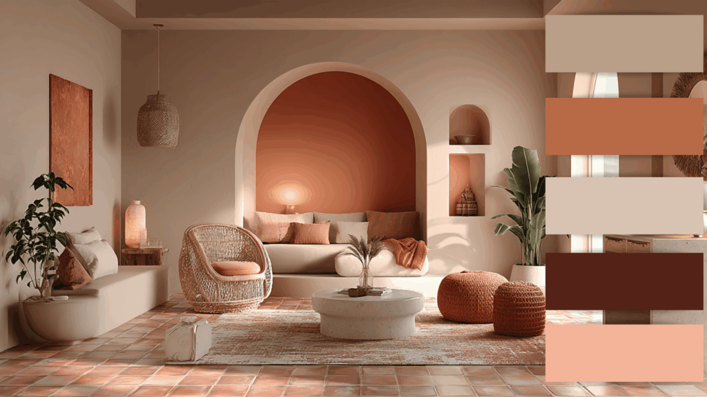
Soft peach, sandy beige, and muted coral reflect the glow of a sunset. These tones infuse spaces with warmth and tranquility.
Perfect for boho or Mediterranean-inspired interiors, this palette enhances natural light beautifully.
Incorporate terracotta tiles, woven baskets, and gold accents for a cohesive, sun-warmed home that feels serene and full of character.
11. Modern Farmhouse
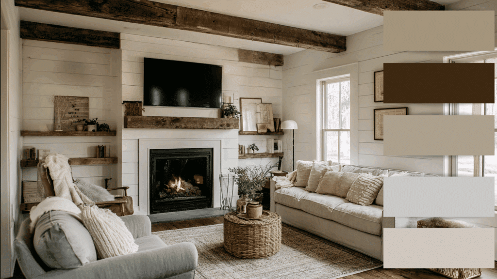
White, greige, and soft black define this welcoming palette. It blends rustic warmth with modern simplicity.
Shiplap walls, black fixtures, and natural woods enhance the beauty. This color story feels fresh and classic, perfect for open layouts or transitional homes.
The balance of light and contrast makes rooms feel airy yet grounded, offering comfort with a modern twist.
12. Moody Style

Charcoal, plum, and deep forest green create a dramatic, intimate vibe.
These rich tones add depth and beauty to spaces like dining rooms or libraries. Pair with gold or brass details and plush fabrics for a luxurious finish.
Despite its darker look, this whole house color palette feels warm and cocooning when balanced with lighter accents and good lighting.
13. Soft Pastel Harmony
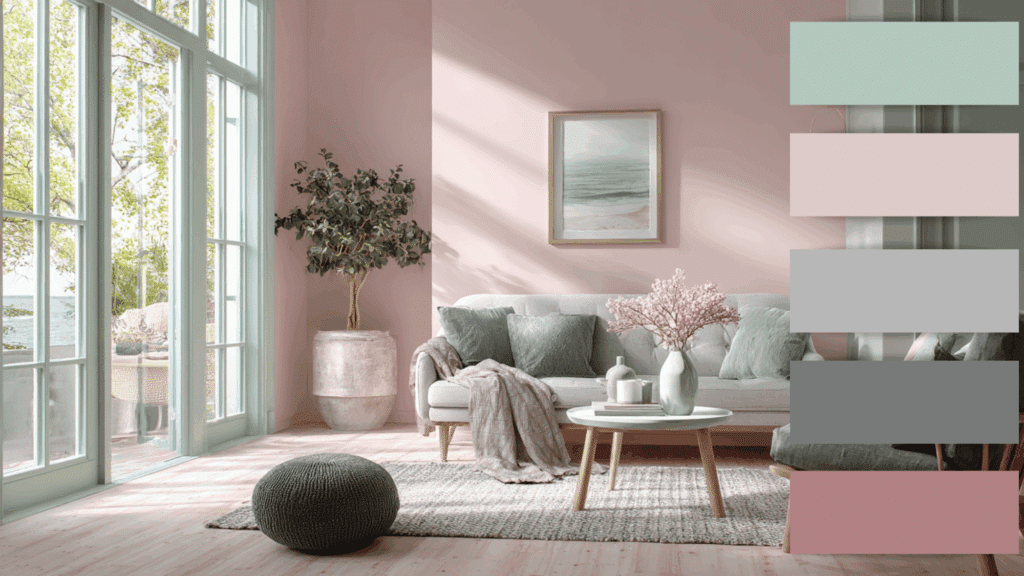
Dusty pink, pale mint, and soft gray create a gentle, uplifting color story. This palette works wonderfully in smaller homes or apartments, making rooms feel open and cheerful.
Ideal for Scandinavian-inspired or feminine interiors, it offers subtle color without overwhelming the senses.
These hues promote relaxation, creating a unified, light-filled atmosphere that feels welcoming and soothing across the home.
Professional Tips for Choosing Interior Color Schemes
Designers use color theory and texture to craft balanced, beautiful interiors. These professional tips help create cohesive, inviting home color schemes.
- Understand Color Temperature: Use warm tones for coziness and cool tones for calmness to create balance and emotional harmony.
- Use Contrast Wisely: Pair light and dark shades to add depth and visual interest without overwhelming the overall design.
- Layer Patterns and Textures: Mix subtle patterns and varied textures to enhance dimension while maintaining a consistent color connection.
- Draw Inspiration from Designer Collections: Explore curated paint palettes from professionals for reliable, pre-tested combinations that ensure cohesive results.
- Balance Consistency and Creativity: Keep a unifying base color but experiment with accents to add personality and freshness to each room.
Conclusion
A thoughtfully chosen whole house color palette brings balance, comfort, and personality to every corner of a home.
By blending well-planned shades and textures, homeowners can achieve a seamless connection between rooms that feels both stylish and natural.
The right mix of interior color schemes can make spaces appear larger, brighter, and more cohesive, while reflecting individual taste.
If inspired by classic neutrals, soft pastels, or bold contrasts, a curated home color scheme ensures harmony without monotony.

