")
I’ve been living with Benjamin Moore’s Raintree Green on my walls for about a year now, and I’m excited to share what I’ve learned about this rich, calming color. This green shade has changed my home in unexpected ways.
In this blog, you’ll learn:
- What Raintree Green actually looks like in real homes
- Which rooms work best with this color
- Colors that pair perfectly with it
- How to test it properly before buying
I’ve used this paint in several rooms with different light exposures and noticed how it shifts throughout the day. I’ve made the mistakes, so you don’t have to.
Let’s see if this rich, calming green is the perfect choice for your home.
What Kind of Color Is Raintree Green?
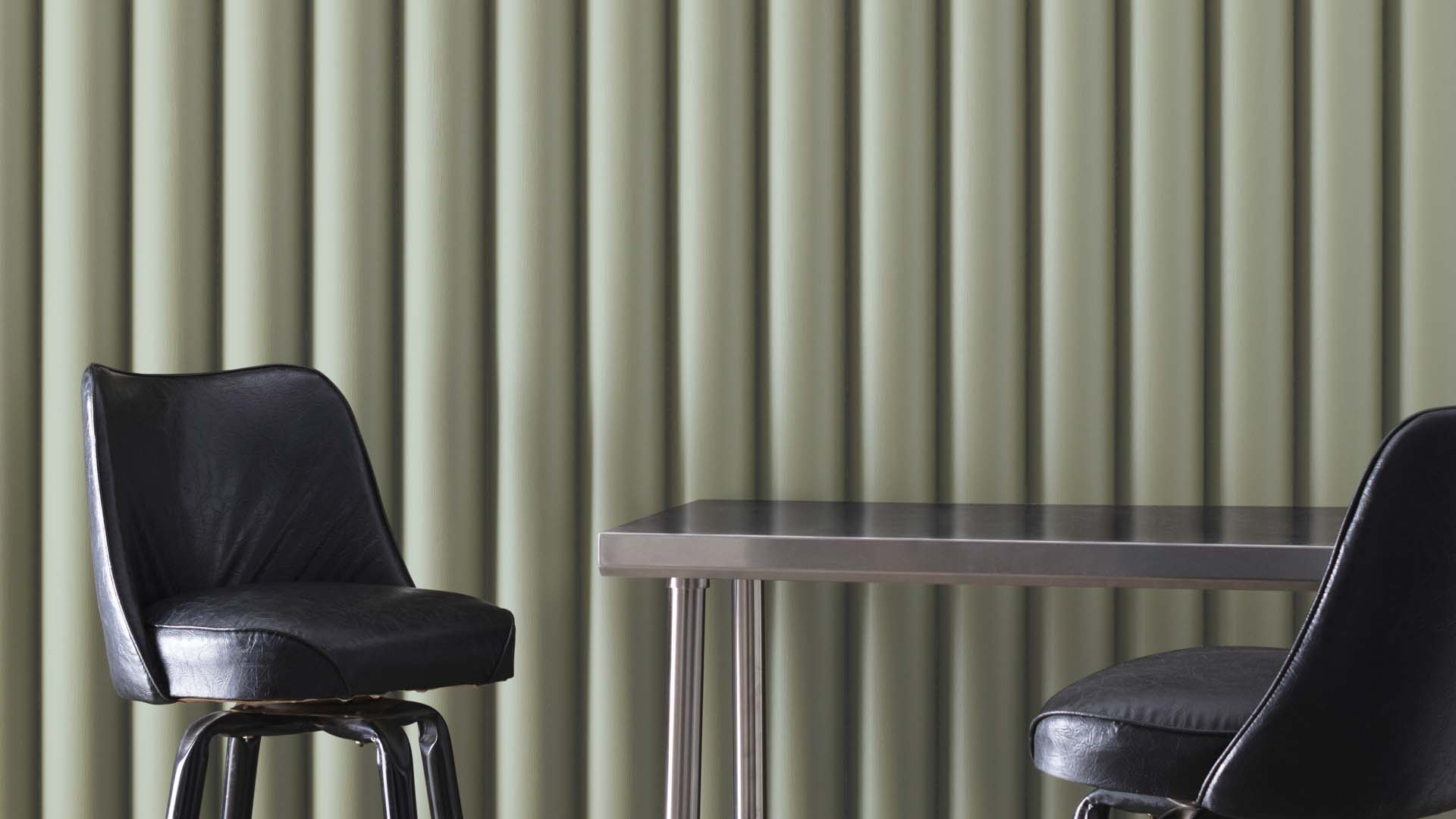
Raintree Green (Benjamin Moore 1496) is a rich, medium-depth green with subtle gray undertones. It creates a natural background and adds a fresh, calming feeling to any room. I see it as the color of mature forest foliage or moss after rain—natural, balanced, and full of depth.
I’ve watched it change throughout the day. In morning light, it shows more of its green character. By afternoon, the gray aspects become more noticeable, and in evening light, it takes on a deeper, more intimate quality.
The color has an LRV (Light Reflectance Value) of 32.38, placing it in the medium range. This means it absorbs and reflects light in a way that adds character to a room without making it too dark. The balanced nature of Raintree Green makes it perfect for creating spaces that feel both natural and cozy.
What sets Raintree Green apart is its ability to create a sense of calm and a connection to nature. In most spaces, it adds a feeling of stability and freshness with a depth that works in many settings and home styles.
What Rooms Work Best with Raintree Green?
I’ve found that Raintree Green works wonderfully in spaces where you want a natural, deep look that will last for years. Based on my experience, here are the spaces where Raintree Green performs best:
Living Rooms
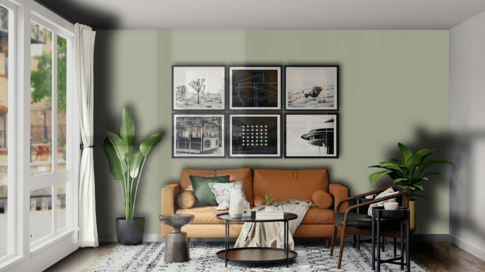
This color makes living spaces feel rich and welcoming. It creates a natural background that allows furniture and art to stand out nicely. In my living room, Raintree Green walls make the space feel complete while highlighting my cream sofa and wood accent pieces.
The color works especially well in spaces that need to feel cozy without being too dark. When paired with warm lighting, it creates a room that feels both fresh and comforting.
Dining Rooms
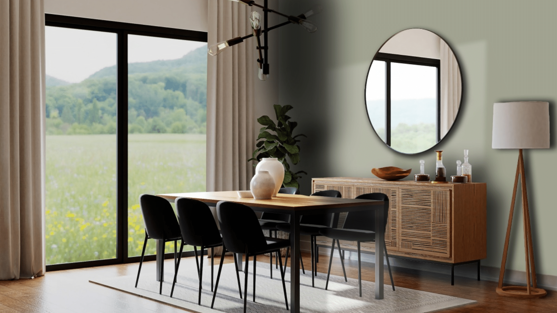
Raintree Green can transform dining spaces into warm, inviting areas perfect for gatherings. I used it in my dining room, where it created a cozy atmosphere for meals and conversations. The natural green tones help create a pleasant feeling while still being more interesting than plain neutrals.
What surprised me is how well it works with different wood tones. My oak dining table looks sharp against the Raintree Green walls, while brass light fixtures bring warmth that balances the coolness of the walls. The room feels special yet comfortable.
Home Offices
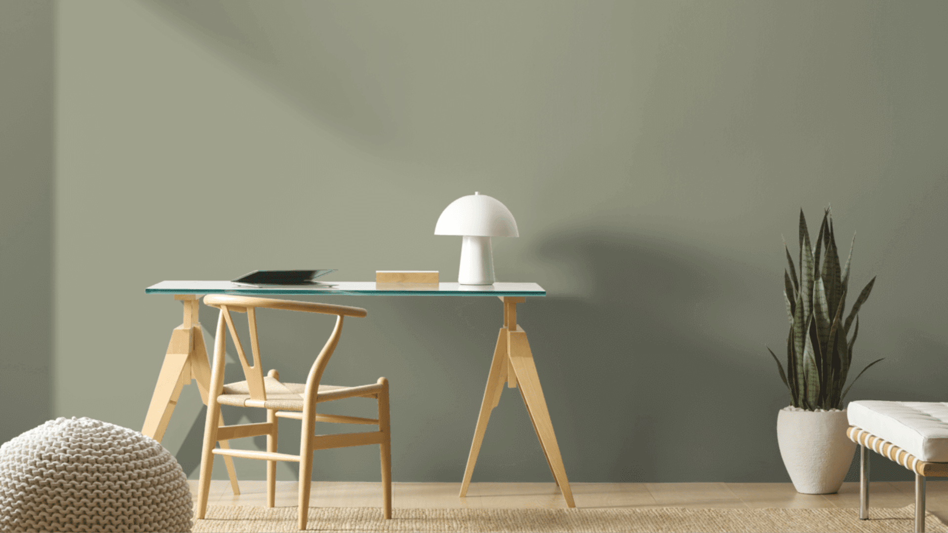
Raintree Green helps create a sense of focus and calm in work areas. The balanced green feels natural yet comfortable during long work hours. I painted my home office accent wall in this shade and find it creates the perfect background for video calls while keeping me relaxed and focused.
Raintree Green is particularly suitable for offices that require a professional yet comfortable atmosphere. The color appears to add depth while aiding concentration. I’ve noticed I feel more productive in my Raintree Green office compared to my previous, plain white workspace.
Bathrooms
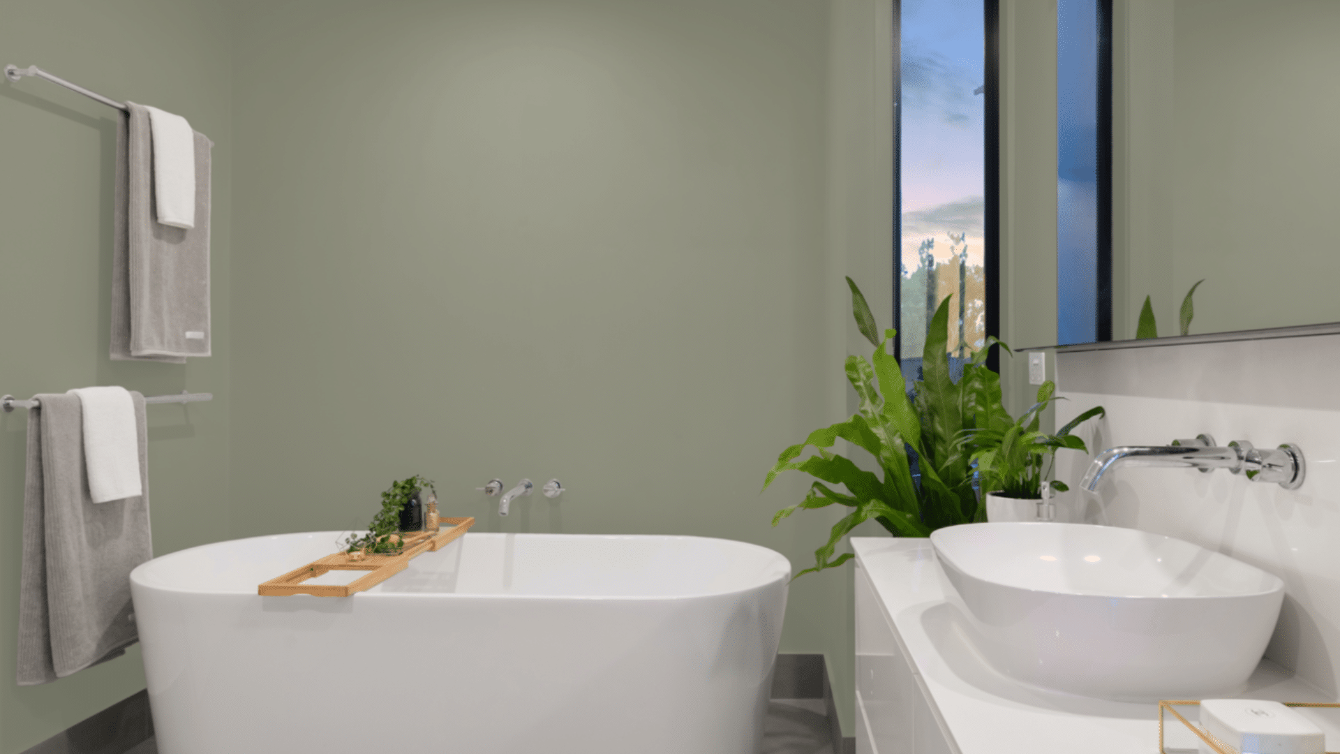
This balanced green can add a touch of spa-like serenity to these functional spaces. I painted my small powder room Raintree Green, and it feels both fresh and cozy. It works well for a space that needs to feel clean yet not stark.
The color pairs beautifully with white marble surfaces and chrome or brushed nickel fixtures. It adds just the right amount of color without being too overpowering, making it a smart choice for a room that needs to encourage relaxation and comfort.
Kitchens
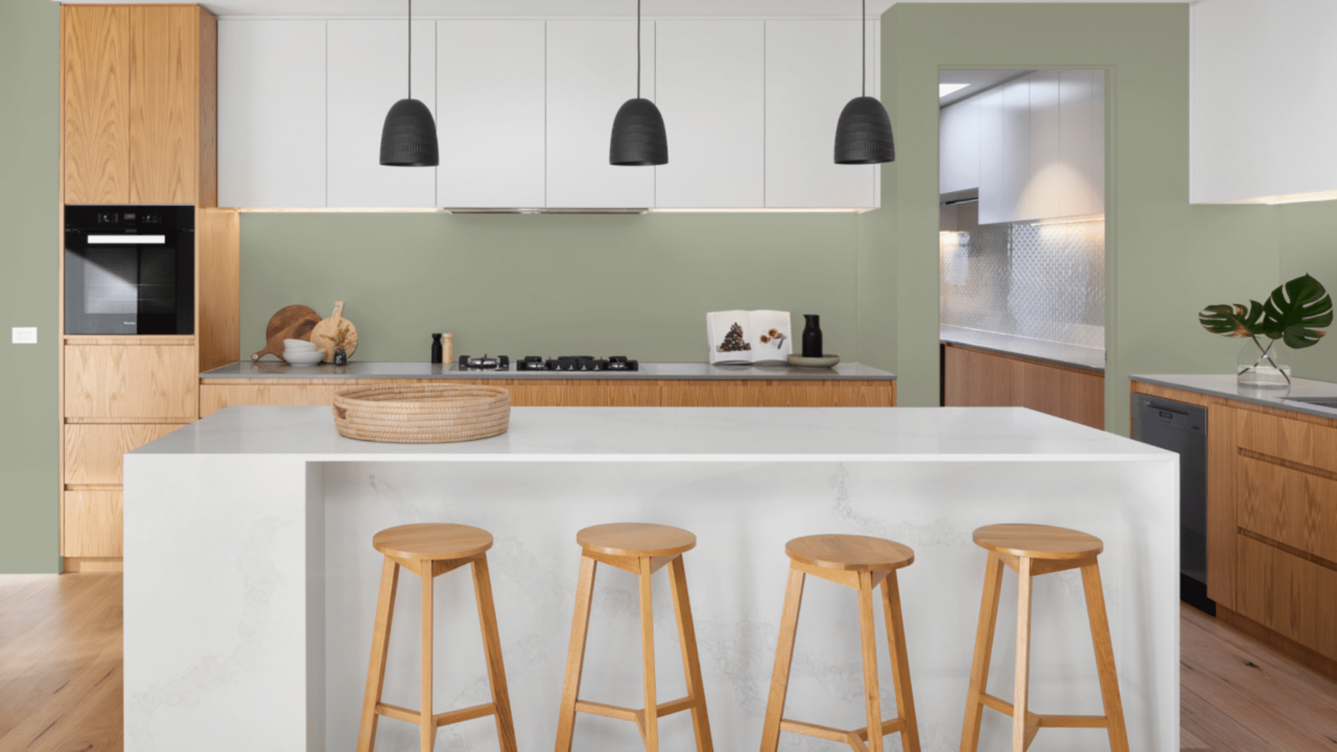
Raintree Green brings a refreshing yet classy feel to kitchen spaces. I used it on my kitchen island, creating a focal point that anchors the room without overwhelming it. The green tone feels natural and clean, perfect for a food preparation area.
What works especially well is how Raintree Green complements both light and dark countertops. With my white quartz counters, the green creates a crisp, fresh contrast.
What Colors Complement Raintree Green?
- Crisp whites: They create a fresh contrast that feels clean and timeless
- Soft creams: Offer a subtle contrast that feels cohesive and calming
- Medium to light wood tones: Add organic texture and complementary warmth
- Black accents: Create a sharp definition that makes the color shine
- Gold and brass accents: Add a touch of warmth that balances the green undertones
For my living room, I combined Raintree Green walls with white trim and brass lighting fixtures. The combination feels both fresh and balanced.
What Style Works Well with This Color?
Raintree Green accommodates various design styles. In modern homes, it brings a natural element that feels clean without being stark. For traditional spaces, it creates the perfect background for antiques and classic pieces. In farmhouse settings, it offers a rich quality that feels appropriate and grounded.
Most impressively, Raintree Green complements homes that mix different styles by adding a natural presence to spaces that combine various elements.
My own home mixes contemporary items with more traditional ones, and this color creates the perfect background for both. This flexibility makes it a smart choice if you like to change your decor or mix elements from different styles.
Is It a Warm or Cool Color?

Raintree Green is a balanced color with complex undertones. The green base lends it a natural, fresh feel, while the gray elements add sophistication.
I’d describe it as “softly balanced” – the kind that makes a room feel grounded rather than overly cool or warm. The neutral aspects keep it from feeling too vibrant. This balance makes it work well year-round in most homes.
When used well, it doesn’t feel too gray despite its balanced base. The depth keeps it livable for everyday spaces. In rooms with ample natural light, the balance helps it reveal its true character throughout the day.
If you’re worried that a space feels too cool, I’ve found that adding warmer elements, such as wood tones, fabric textures, or brass fixtures, creates the perfect balance. In my dining room, the Raintree Green walls look beautiful with my wood table and brass candlesticks.
Color Characteristics Table
| Characteristic | Raintree Green | What This Means For Your Space |
|---|---|---|
| Temperature | Balanced | Creates a calm, grounded atmosphere |
| Undertones | Green with subtle gray notes | Adds depth and sophistication |
| Light Reflectance Value | 32.38 | Adds depth while still providing clear color |
| Seasonal Feel | Year-round | Works well in both summer and winter settings |
| North vs. South Rooms | Adaptable | Appears richer in south-facing rooms, deeper in north-facing rooms |
How to Test This Color in Your Space?
- Buy a sample: Get a small container of Raintree Green
- Paint a board: Use a 2×2-foot piece of white poster board
- Move it around: See how it looks in different locations at different times of day
- Live with it for 3 days: Your first impression might change
When I tested Raintree Green, I was surprised by the significant changes it underwent from morning to evening. In my north-facing bedroom, it appeared deeper and more moody.
And in my south-facing living room, it showed more of its clear, green aspects throughout the day.
What Paint Finish Should You Choose?
- Flat: Good for ceilings and walls with texture issues
- Matte: My top choice for most walls – the deep color looks rich without glare
- Eggshell: This works in kitchens and bathrooms, where you need to clean walls
- Satin: Adds a slight sheen, could make the color look slightly brighter
- Semi-gloss: Too shiny for Raintree Green walls, but works for trim and doors
I used a matte finish in my bedroom and an eggshell finish in my bathroom. The eggshell finish makes cleaning easier without adding too much shine that would alter the color’s appearance.
Real Home Ideas Using Raintree Green
- Accent wall: Raintree Green on one wall creates a focal point that grounds the room
- With white trim: Used with white trim colors for a crisp contrast
- Cabinets: Kitchen island or bathroom vanity in this shade creates a custom look
- Furniture: A bookcase or dresser painted this shade adds a natural touch
- Exterior: Works beautifully as an accent color for doors or shutters
My friend painted just one wall in her dining room, Raintree Green with white trim, creating a balanced look that feels both fresh and grounded. It looks amazing and has inspired me to think about using it in more areas of my home.
Common Mistakes to Avoid
- Using it in rooms with very yellow lighting – This can cause Raintree Green to look too muddy. Stick with balanced white bulbs (3000-4000K) to show their true beauty.
- Not testing in your actual space – This color can look very different in various lighting conditions. I was surprised how it appeared in my north-facing bedroom versus my south-facing living room. Always test a large sample in your own space.
- Using too many cool accessories – This can make the room feel too cold. Add a touch of warm woods, soft textiles, or brass accents for balance.
- Expecting it to look exactly like online photos – Every screen shows colors differently, and professional images are often edited. The only way to know how it will look in your home is to test it yourself.
- Pairing with the wrong whites – Some whites can make Raintree Green look too gray. Test white trim colors alongside your Raintree Green sample to find the best match.
Why Do People Like Raintree Green?
Raintree Green has become popular among many homeowners, and I understand why. Its balanced quality creates spaces with depth while still feeling very livable.
People like it because it’s not a basic green—it has personality without being hard to use. The color creates natural spaces that still feel cozy and inviting.
It works with many decorating styles and doesn’t date quickly, unlike more trendy colors. Whether in natural or artificial light, it shifts throughout the day, keeping spaces interesting.
Is Raintree Green Right for Your Home?
Raintree Green creates spaces that feel both natural and cozy simultaneously. After using this color in multiple rooms over several months, I remain satisfied with my choice.
What makes it stand out is how it adds natural character while remaining very flexible with different furniture and decor styles. It’s not a color for those who want light, airy walls.
Instead, it creates a foundation that supports your furniture and accessories while making a subtle statement of its own. This balanced presence explains why it remains a favorite choice year after year.
In a world of stark whites and plain grays, Raintree Green is the ideal choice for those seeking to incorporate natural color with purpose. It works with modern, traditional, farmhouse, and many other styles.
It’s a truly versatile color that creates beautiful, livable spaces that feel fresh and personal, and that’s what truly matters in a home.
Frequently Asked Questions
Does Raintree Green Work with A White Trim?
Yes, it pairs beautifully with a white trim. The natural green creates a pleasing contrast with the pure white that feels fresh and intentional.
Is Raintree Green Too Dark for Small Rooms?
Not necessarily. With a medium Light Reflectance Value, it can work well in small spaces if balanced with light furnishings and good lighting.
In small rooms, it can actually make the space feel more intimate and cozy while still feeling finished. Its balanced color provides just enough depth to make spaces feel intentional rather than cramped.
How Does It Compare to Other Green Paints?
Raintree Green is more balanced and complex than many greens, with subtle gray undertones that add sophistication. It changes more throughout the day than many similar colors, showing different aspects as the light changes.
Will This Color Show Dirt Easily?
Unlike very light colors, Raintree Green’s medium depth helps hide minor marks and smudges. The natural green tone actually conceals more than lighter colors would, though high-touch areas may still need occasional cleaning.
Can I Use Raintree Green in An Open Floor Plan?
Yes, though with care. Its deeper nature means it might work best as an accent wall or in one defined area rather than throughout an entire open space. It pairs well with lighter neutrals to add variety within connected rooms.
1 Comment
What about using it on kitchen cabinets?