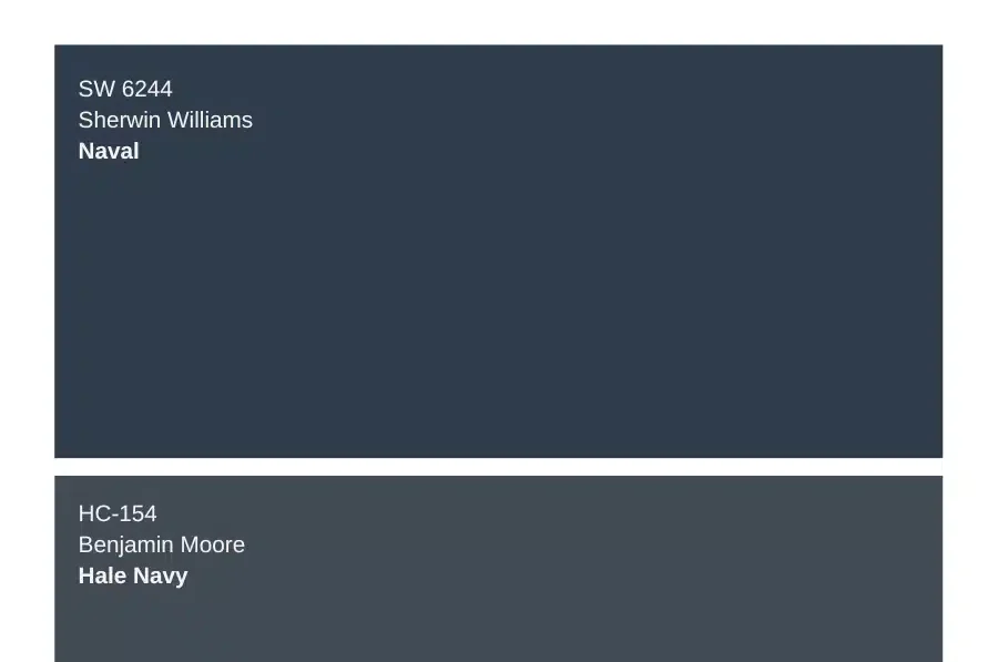
Sherwin-Williams Naval and Benjamin Moore Hale Navy are leading navy blue paint colors that offer distinct differences in undertones, lighting adaptability, and versatility.
Naval shows subtle green-grey undertones and performs best in east, west, and north-facing rooms, while Hale Navy maintains its deep blue shade even in bright spaces.
Though both paints work well for walls, cabinets, and exteriors, their specific traits make each better suited for different conditions.
As a color consultant who has used these paints extensively, I will compare their key features to help you make the right choice for your space.
This guide breaks down everything from undertones to real-world applications so you can feel confident in your decision.
Navy Through Years
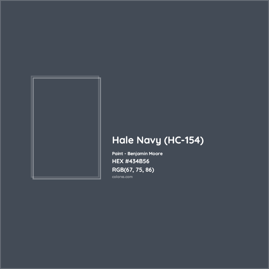
Navy blue isn’t just another passing trend in home design. Both Hale Navy and Sherwin Williams Naval have been around for years, and they’re still going strong.
If you’ve been on the fence about using these colors, you’ll be glad to know they’ve already proven themselves in countless homes.
But just like your favorite pair of jeans, these blues have their own way of settling in over time.
How Navy Ages
I see the Navy hold its depth well indoors. After five years, most walls still look rich and clean. But there are some things to keep an eye on,
- South-facing rooms show more fading
- Direct sun spots may lighten faster
- Wall edges can fade differently
- Touch-ups might look slightly off
Fading Patterns in Sun Exposure
- The morning sun brings out purple hints
- Afternoon light shows more blue
- Evening light deepens the color
- Artificial light keeps it true
Cleaning Methods that Work
- Clean walls every 6 months
- Use soft cloths only
- Avoid harsh cleaners
- Touch up yearly
- Keep extra paint stored properly
Long-Term Colour Stability
- Use quality primer first
- Apply two full coats
- Maintain good ventilation
- Control room humidity
- Keep temperatures steady
Comparison Between Hale Navy and Sherwin Williams Naval
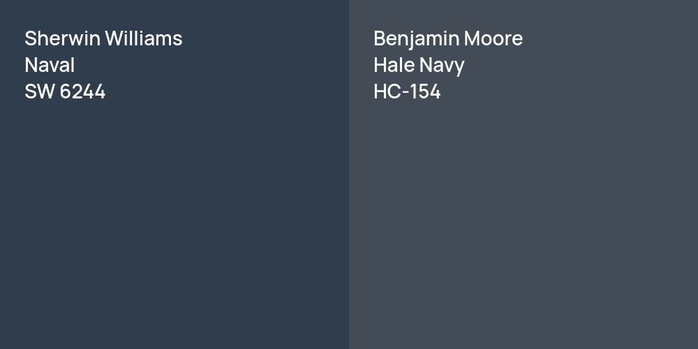
At first glance, these two navy paints might look like twins. But spend some time with them, and you’ll see each has its own character.
Let me break it down clearly for you without any paint-expert jargon or fussy language.
Here’s what you really need to know about each one…
What is LRV?
LRV means Light Reflectance Value – it tells us how much light a color bounces back into a room.
Think of it like a mirror – higher numbers mean more light bounces back, and lower numbers mean the color absorbs more light.
I’m going to add a little table to show you the key differences between the Hale Navy and Sherwin Williams Naval,
| Feature | Hale Navy | SW Naval |
|---|---|---|
| Light Reflectance Value (LRV) | 8 – Reflects more light; slightly lighter in rooms | 4 – Absorbs more light; appears darker in rooms |
| Color Characteristics | True blue all-day Classic navy Neutral-like Minimal light changes Works with wood tones |
Hints of purple Deeper and richer Dramatic Changes in different lights Modern with white |
| Pros | Easy to match Stays consistent Good for bright rooms Hides dirt Great for furniture |
Fancy feel Rich and deep Perfect for accent walls Modern Versatile for most rooms |
| Cons | It might feel too safe Can feel traditional Needs good lighting Shows dust Touch-ups vary |
It can be too dark Shows purple Hard to touch up Not ideal for small spaces Needs ample light |
Environmental and Health Considerations
Both Sherwin-Williams Naval and Benjamin Moore Hale Navy offer environmentally conscious options.
Hale Navy’s Advance paint line and Naval’s GreenGuard-certified formulas both feature low VOC (Volatile Organic Compounds) content, making them safer for indoor use.
While both meet environmental standards, proper application matters –
- Ensure good ventilation,
- Allow full drying time,
- And select appropriate finishes for different spaces.
Practical Combinations: I Always Prefer
Let me share the best combinations I’ve seen work with both of these navy colors.
I will go one by one and pair the colors with different interior furnishings, then give equal examples first for the Naval and then for the Navy.
Floor Colour Pairings
Let’s start from the ground up. I’ve tested these navies with all sorts of flooring, and trust me, some pairings just work better than others.
Here’s what I’ve learned.
1. Sherwin Williams Naval Works Best With
Now, let’s talk about the Naval’s best friends in the color world. After seeing it in countless homes, I can tell you which colors make this blue feel right at home.
Light Oak Hardwood
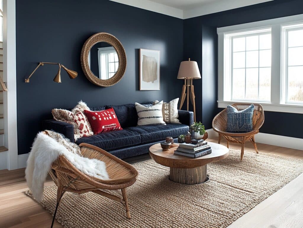
Naval really comes alive against light oak hardwood floors. The warm wood tones balance out the deep blue, making any room feel cozy but not heavy. It’s like they were made for each other.
White Marble Tiles
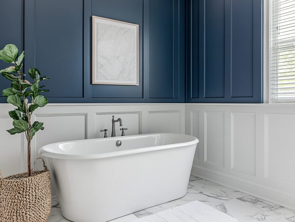
This pair creates pure magic in bathrooms and kitchens. White marble lets Sherwin Williams Naval be the star while adding a bit of sparkle to the mix. The contrast feels right.
Warm Gray Carpet
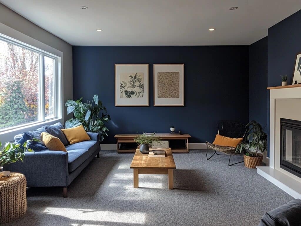
When Naval meets a warm grey carpet, the room feels super put-together. The subtle grey tones help smooth out the blue, creating a soft, welcoming space.
2. Hale Navy Loves
It’s time to look at Hale Navy’s perfect matches. After years of seeing this color in action, I’ve got a solid list of partners that bring out its best side.
Here’s what goes well with Hale Navy.
Dark Walnut Floors
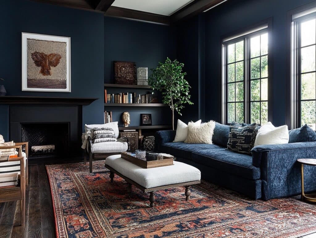
Hale Navy and dark walnut make quite the pair. The rich brown floors give this navy a chance to show off its softer side, creating spaces that feel warm and grounded.
Natural Stone
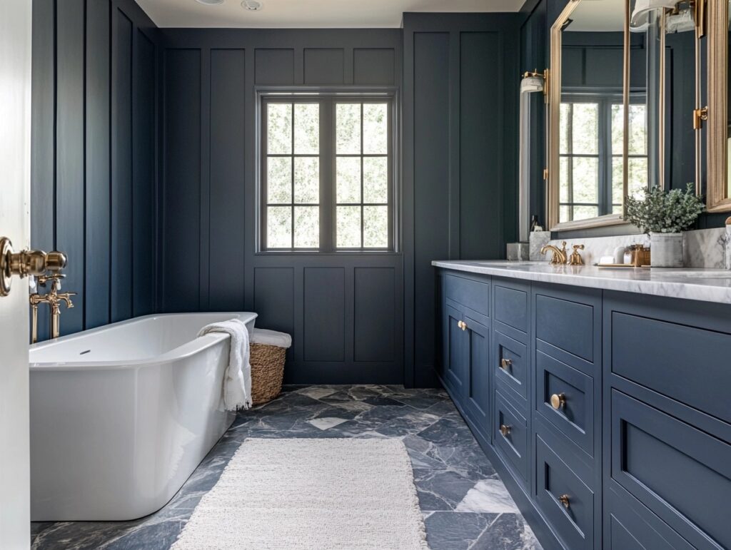
The earthy tones in natural stone bring out Hale Navy’s subtle green hints. I’ve seen this combo in so many bathrooms and kitchens – it gives a very earthy feel to any space.
Beige Carpet
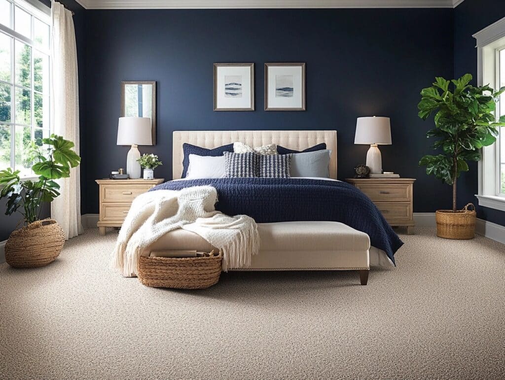
Hale Navy takes on a whole new life with the beige carpet below. The neutral base lets the blue shine without competing, making rooms feel open and bright.
Ceiling Colour Options
The ceiling’s not just a blank slate – it’s your room’s top layer. And when it comes to navy walls, what you put up there can make a huge difference.
3. Naval Pairs With
Let’s peek at how Sherwin Williams play with different ceiling shades. I’ve tried quite a few combinations, and some of these matches might surprise you.
Pure White Ceilings
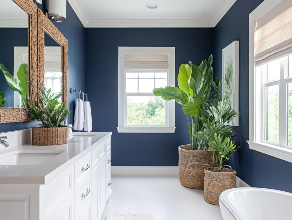
Nothing beats a clean white ceiling with Naval walls. The white keeps your room feeling open and bright, while letting those navy walls do their thing.
Soft Grey for Drama
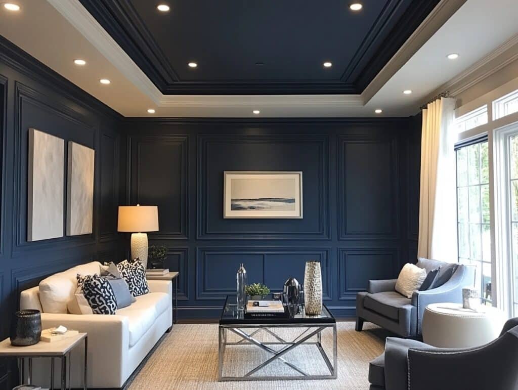
Want to know a little secret? Paint your ceiling soft grey with Naval walls, and suddenly, your space feels like a high-end hotel. The combo just works.
Same Colour for Cozy Feel
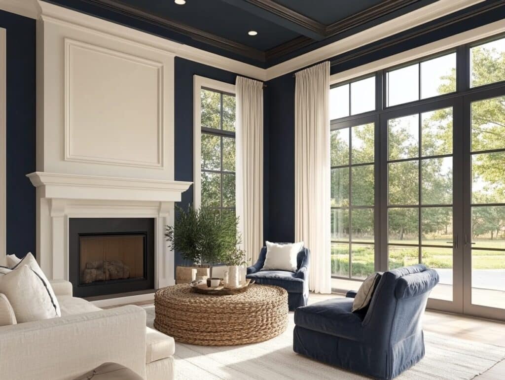
Here’s a bold move – taking Naval right up onto the ceiling. I’ve seen this in living rooms and studies, where it wraps the room in a cozy blanket of blue.
3. Hale Navy Matches
The magic of Hale Navy lies in how it works with other colors. Each combo creates a different vibe for your room. Let’s see which pairs make Hale Navy shine more.
Crisp White Ceilings
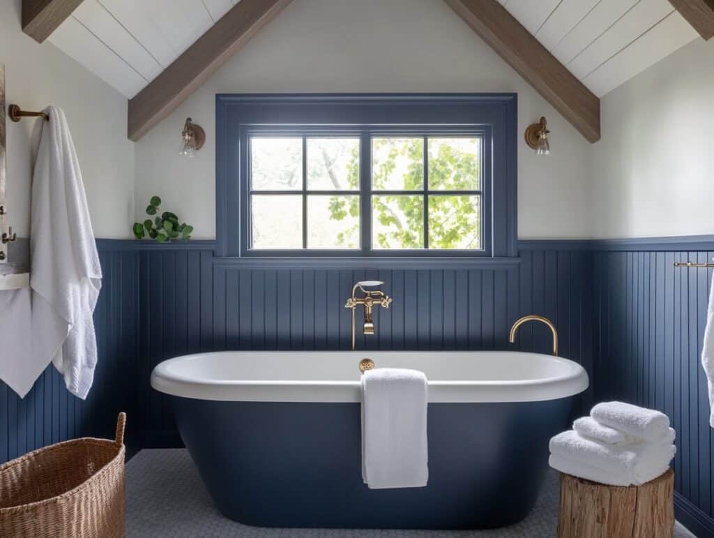
Nothing beats a clean white ceiling with Hale Navy walls. The contrast pops right away. Benjamin Moore’s White Dove OC-17 will also give you that bright, clean look overhead.
Light Cream Tones
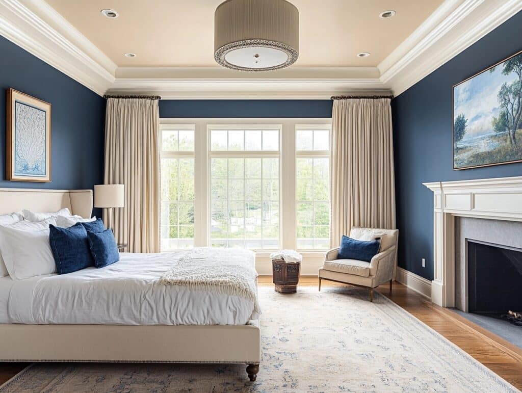
Some rooms need a softer touch-up top. That’s when light cream ceilings come in handy. Simply White OC-117 adds warmth without going too yellow against those navy walls.
Pale Blue for Depth
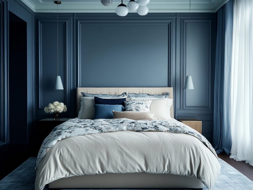
Looking for a way to make your room feel taller? A gentle hint of softness on the ceiling creates this effect naturally while keeping everything tied together with your walls.
Hardware Finishes
Now that we’ve sorted out the top of your room let’s look at those smaller details that make a big impact. Your hardware choices can make these navy shades stand out.
4. Naval Looks Great With
In real homes, I’ve seen Naval absolutely glow with brass pulls and copper knobs. The warmth of these metals makes the blue notes in Naval stand right out.
Brushed Gold
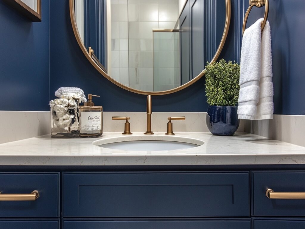
The soft sheen of brushed gold against SW’s Naval creates a luxurious look. You’ll spot this winning combo in many designers’ kitchens and bathrooms.
Polished Nickel
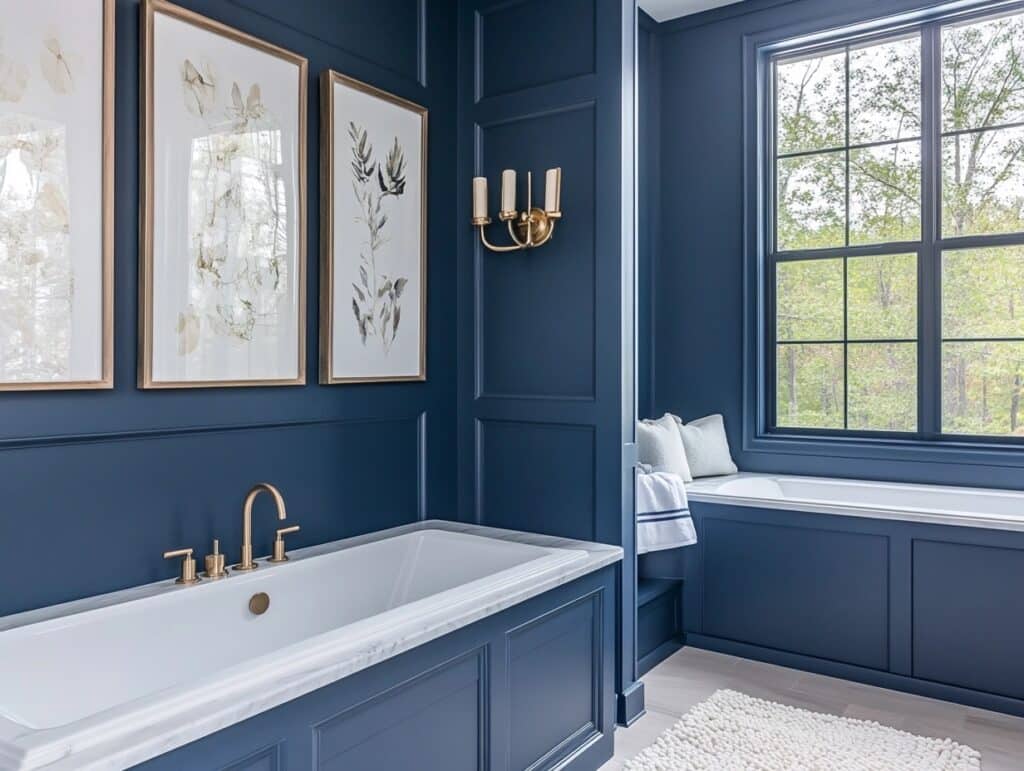
Want something that works anywhere? Polished nickel with Sherwin Williams gives you that timeless feel. It’s clean and bright and works especially well in bathrooms.
Matte Black
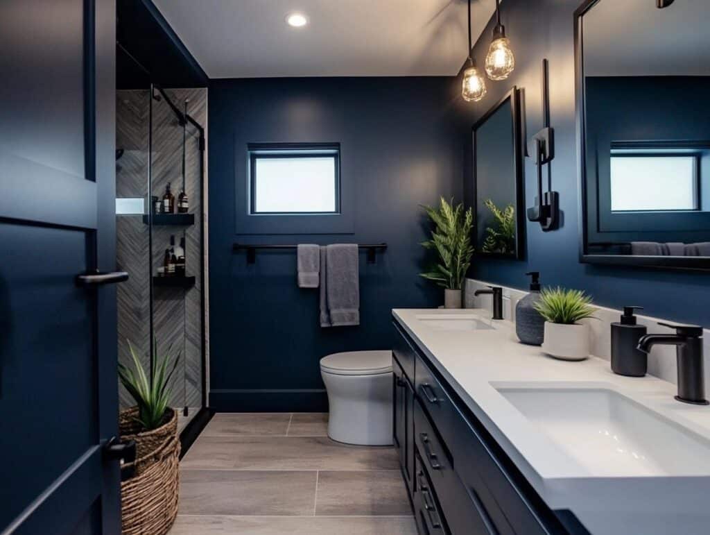
Going for a bold statement? Matte black hardware on Naval cabinets or doors creates strong lines and a confident modern style.
5. Hale Navy Shines With
Silver hardware gives Hale Navy a modern edge, while brass adds a traditional touch. Want something different? Bronze pulls create a rich, warm contrast against these navy tones.
Antique Brass
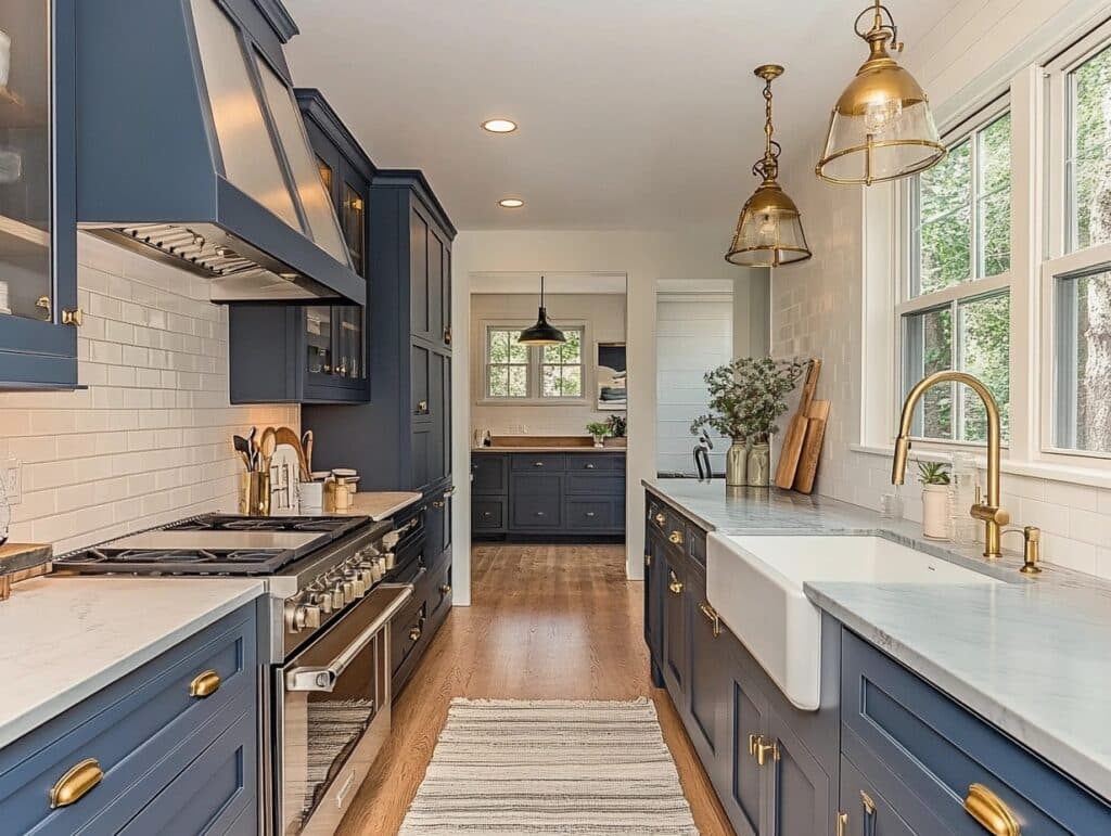
Old-world meets new style when you pair antique brass with Hale Navy. This combo works wonders in kitchens, especially on cabinets and drawer pulls.
Chrome
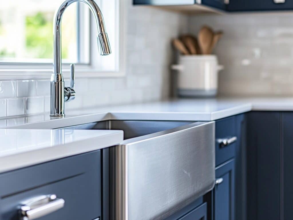
Chrome fixtures against Hale Navy offer a bright, clean contrast. This pairing shows up beautifully in bathrooms and on kitchen appliances.
Oil-Rubbed Bronze
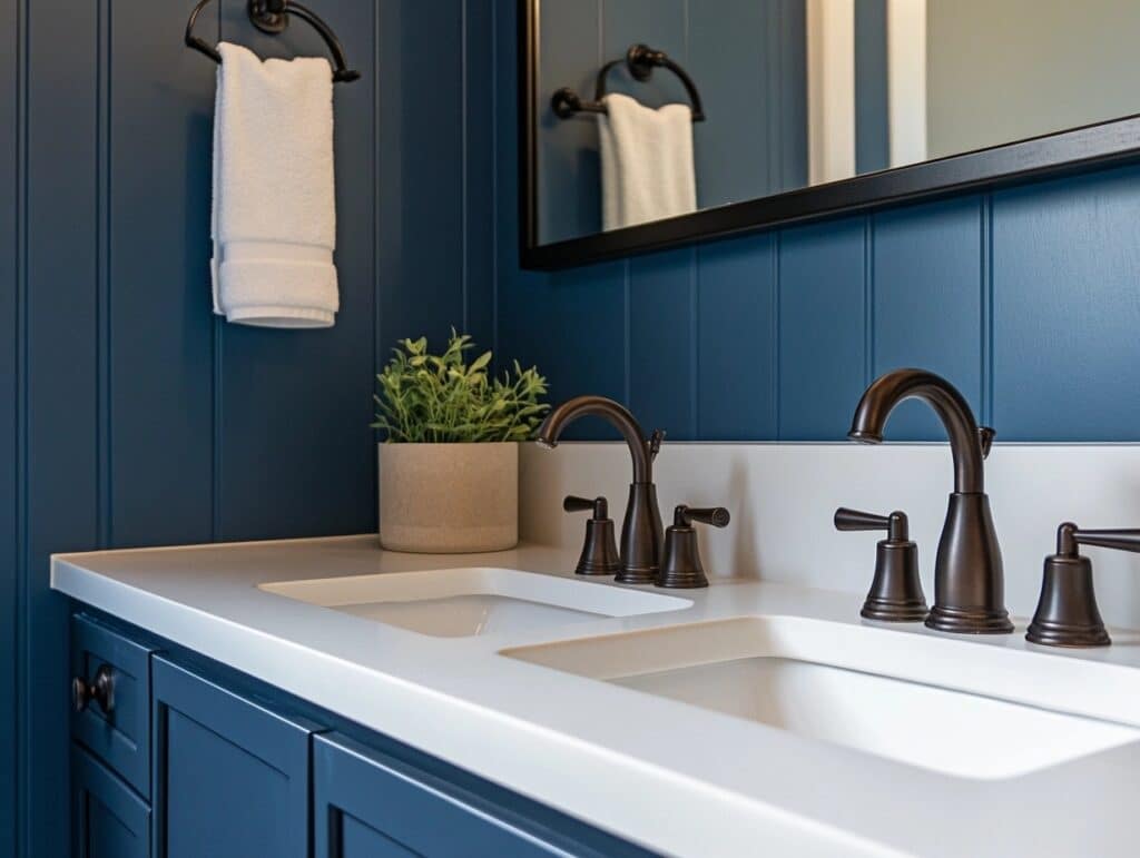
The deep, rich tones of oil-rubbed bronze complement Hale Navy’s natural depth. It’s a subtle match that adds character to any cabinet or door.
Window Treatments
Now that we’ve settled the ceilings and hardware finishings discussion let me walk you through the best window options for both of these navy colors.
6. Naval Matches Well With
Use as many natural linens as you can. It gives Naval a fresh, classic feel. You’ll notice the rooms will start to look more balanced with simple patterns.
Crisp White Curtains
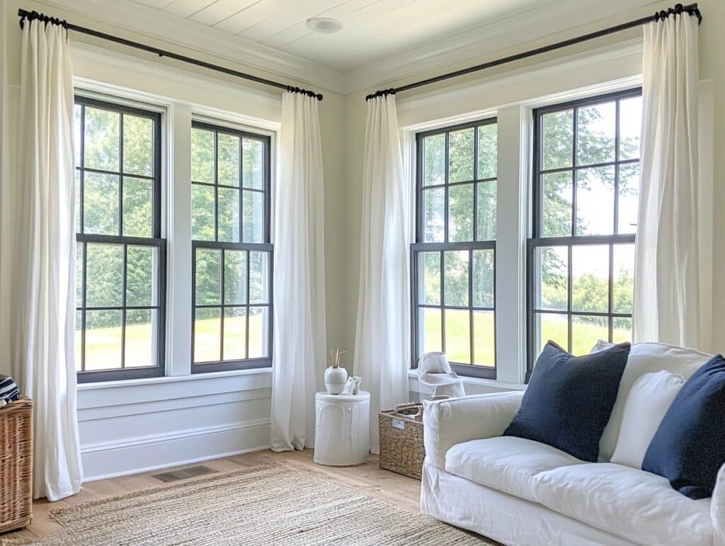
Bright white fabrics against Naval trims on windows create a clean, fresh look. I often use these in living rooms to lighten the whole space.
Natural Linen
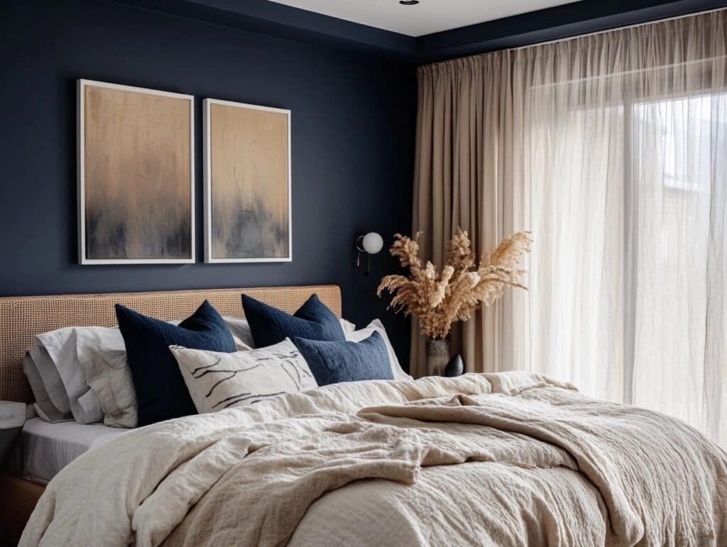
When I want to soften the Naval’s presence, I reach for natural linen. The subtle texture adds warmth without competing with the walls, making it perfect for bedrooms.
Textured Neutrals

I often pair neutral curtains with Naval trim on the windows. The mix of textures and tones makes every window a standout feature.
7. Hale Navy Loves
Natural textures and soft white fabrics make Benjamin Moore’s Hale Navy stand out. The walls gain depth with light, flowing materials.
Off-White Sheers

The soft white sheers let light filter through beautifully with Hale Navy. Put these in your bedroom to feel fresh morning sunlight in your room.
Tan Woven Shades
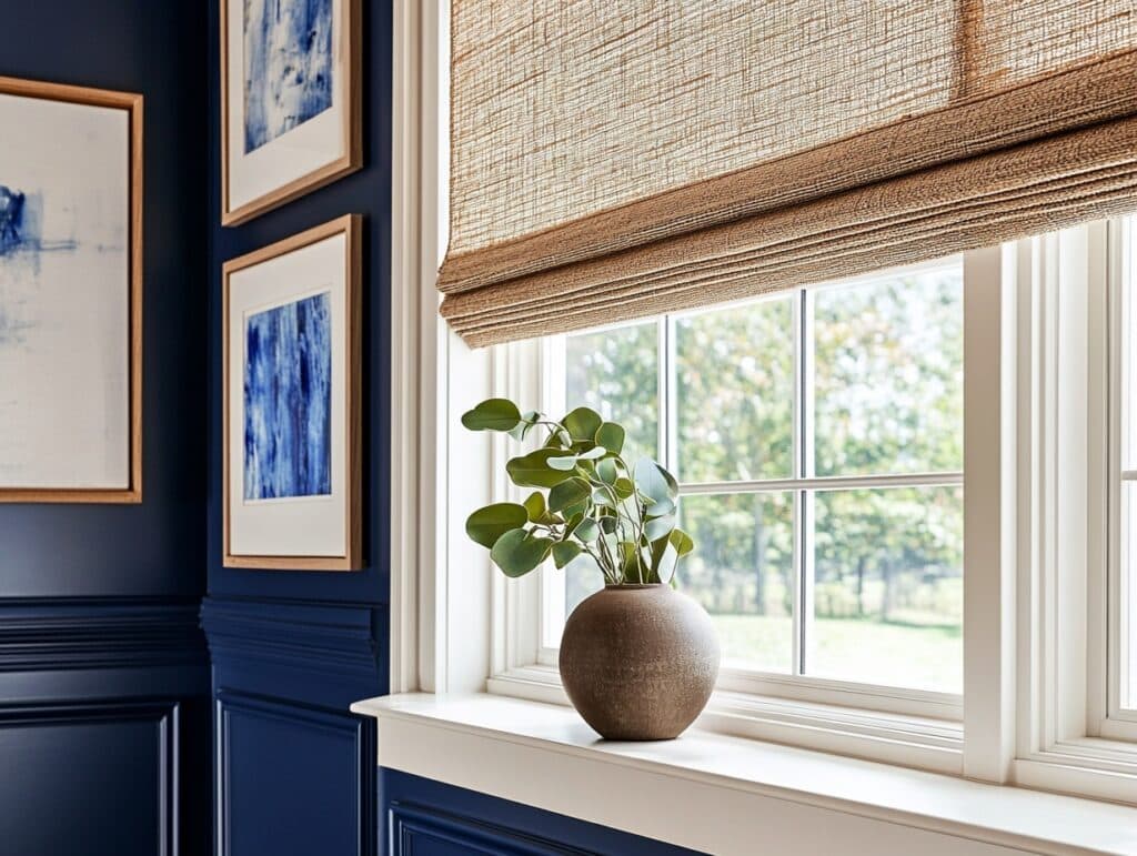
These natural shades bring such warmth to Hale Navy walls. You can use these in hallways to bring out a more cozy and comfortable feel.
Cream Drapes
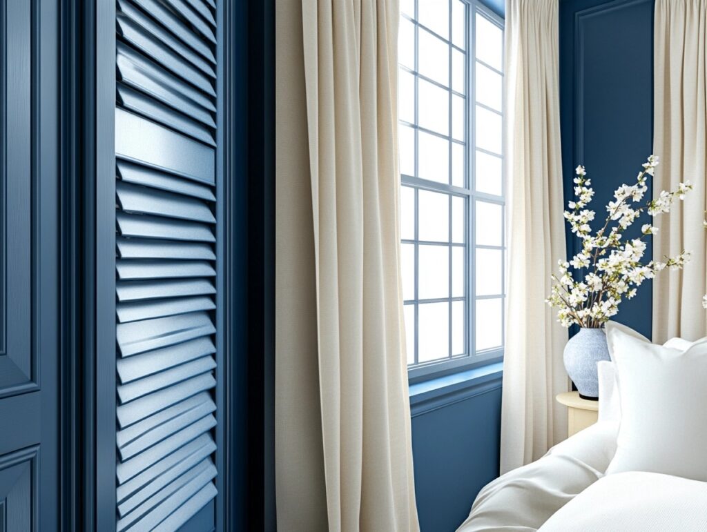
When clients ask for something classic with Hale Navy, I suggest cream drapes. The subtle contrast makes both colors look their best.
Art and Decor
Speaking of what makes these navies shine, let’s talk about art and decor. I’ve found some combinations that truly make each color sing.
8. Naval Supports
I truly believe that Naval walls with certain art pieces stand out perfectly. Let me share the combinations that my clients absolutely adore.
Gold Framed Art
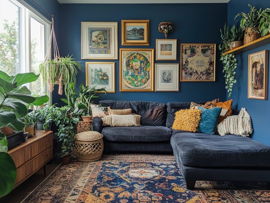
The way gold frames pop against Sherwin Williams’s wall is simply perfect. I recommend using this with more natural elements if you want to stand out.
White Matted Prints
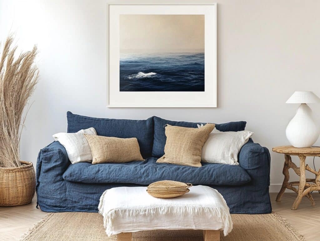
Using white prints works as a highlight, be it cushions, wall prints, or furniture. It creates a clean contrast between the Naval interiors.
Natural Wood Pieces
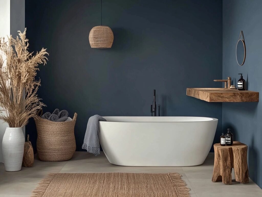
Wooden art pieces bring such warmth to Naval walls. I recently used some craved pieces such as bathroom cabinets and tables, and it looks fantastic.
9. Hale Navy Enhances
When it comes to Hale Navy, I’ve noticed it makes art pieces look even better. Here’s what I’ve seen work time and time again.
Black and White Photos

I love creating photo galleries on Hale Navy walls. Last week, I put together some family photos in matching frames – you can see the results here are simply stunning.
Vintage Brass Pieces
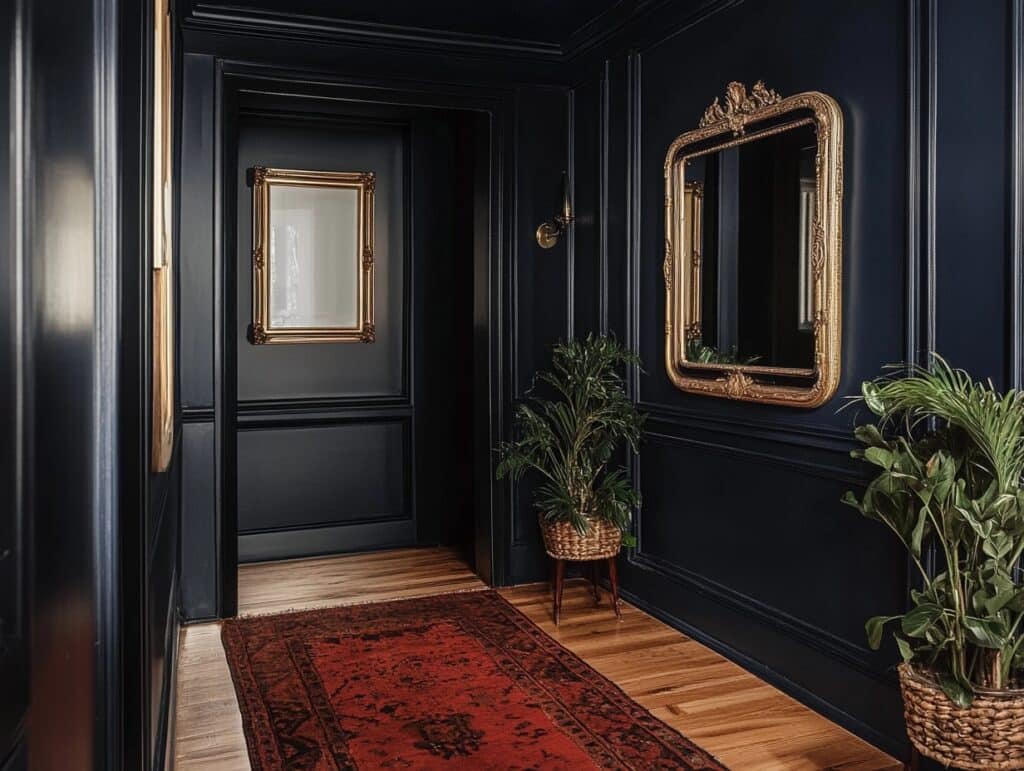
Old brass items look wonderful against Hale Navy. I placed a collection of antique mirrors in my client’s hallway – they catch light beautifully.
Cream Textiles
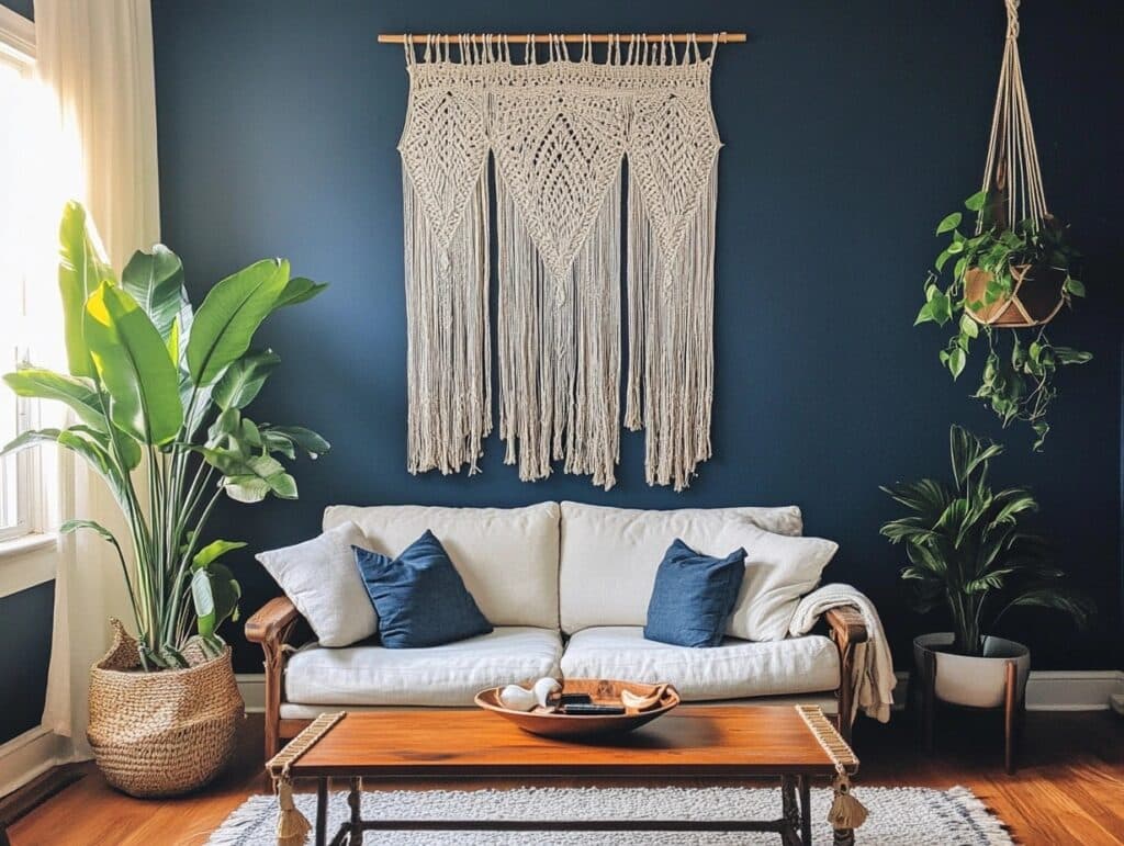
Soft cream fabrics make Hale Navy feel so cozy. I often add woven wall hangings to bring texture to these deep blue walls.
Both of these colors work like a neutral background. They make other colors pop while staying elegant.
Professional vs. DIY Application – Which is the Best Option
Whether you paint naval or hale navy yourself or hire a professional, both colors work well for your home project.
In my previous blog, I already talked about the application process and tools required, mistakes, common problems & solutions.
You can visit the page to find important points.
1. Cost Comparison
From my experience, hiring pros to paint a room costs somewhere around $600-800. but they bring their own tools and finish in one day.
When i do it myself, i spend about $200 On paint and tools, but it takes much, much longer.
Remember, pros include prep work and cleanup in their price.
2. Skill Level Needed
Beginners can handle these paints, as dark shades like naval hide minor mistakes.
However, achieving smooth coverage requires patience and basic painting skills, such as cutting edges and rolling evenly.
The trickiest part?
Getting smooth coverage with dark paint takes practice.
Resale Value Impact
- Modern buyers Love seeing navy in homes today. I find they’re drawn to its blend of classic and current style. Young buyers especially like naval’s drama, while older buyers appreciate hale navy’s traditional feel.
- These navy colours stand the Test of time Because they work like neutrals but add more character.
- They don’t date like Trendy colours Do. i’ve watched both naval and hale navy stay popular for over a decade.
- Real estate agents Tell me homes with navy features catch more attention online and during showings. They say navy paint, when used well, can help justify higher listing prices, especially in kitchen and bath updates.
- The market trend Is clear – navy is replacing grey as the new favourite neutral. I see it used more in kitchens, built-ins, and accent walls. Both colours give homes that “designer touch” buyers want.
Quick tip, when using navy for resale, focus on fixed features like cabinets or built-ins rather than full walls.
Purchase Links
You can find the direct links here to buy benjamin moore’s hale navy and sherwin williams naval colour.
Tips before you buy any paint,
- Join local store events for discounts
- Watch out for seasonal paint sales
- Get samples first ($10-15 Each)
- Ask for contractor pricing for bigger projects
Find sherwin william Naval paint Here. And, find benjamin moore’s Hale navy paint Here.
Conclusion
After working with both colours extensively, i find they’re strong choices but equally versatile to match with.
Your choice comes down to your style – sherwin williams for modern drama, hale navy for timeless elegance.
Remember to test samples in your space, as lighting changes everything with navy colours. (read My previous blog To find steps for A sample test)
Need help deciding?
I offer a free 15-minute call To help you with your problems.
You can send me pictures of your home spaces and i will recommend the better suited colour according to it.

