
Looking to refresh a living space this fall? The soft autumn color palette brings warmth without overwhelming the senses. It’s all about those muted, cozy tones that make a room feel lived-in and inviting.
Think caramel, sage, and dusty rose. These aren’t the bold, brassy colors of peak autumn. They’re gentler. Softer. The kind of hues that work year-round but shine brightest when the leaves start to turn.
Decorating with a soft autumn palette doesn’t require a complete overhaul. Sometimes it’s just about swapping a throw pillow or adding a new wall color. Small changes can shift the entire mood of a home.
Ready to see how these colors can work? Let’s get into it.
What is the Soft Autumn Color Palette?
The soft autumn color palette sits right between warm and neutral. It draws on nature’s quieter moments: overcast skies, dried grasses, and fading sunlight.
These colors are muted, never too bright or too saturated.
Unlike the fiery oranges and deep burgundies of traditional autumn palettes, soft autumn leans toward dusty pinks, warm grays, and gentle golds.
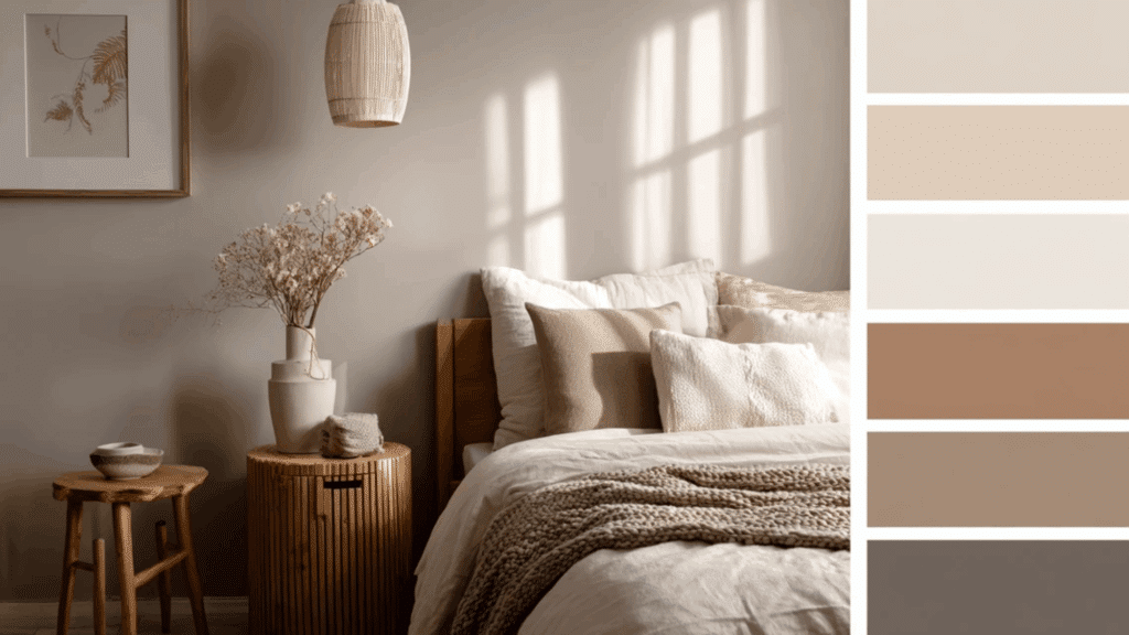
There’s a lot of brown in the mix, but it’s soft brown. Taupe, not chocolate. Beige with a hint of warmth. This palette works because it’s forgiving and easy to live with.
Soft Autumn Color Palette Characteristics
Soft autumn colors share a few key traits that make them instantly recognizable and surprisingly easy to work with in home decor.
- Muted and subdued: These colors avoid harsh brightness and lean into softness.
- Warm undertones: There’s always a gentle warmth, never cool or icy.
- Low contrast: Colors blend smoothly, with no sharp differences between shades.
- Earthy and natural: Inspired by nature, especially late summer and early fall.
- Dusty finish: Colors look like they’ve been lightly veiled or softened with gray.
- Neutral-friendly: Pairs effortlessly with beiges, taupes, and warm grays.
Soft Autumn Color Palette Colors
Here’s a breakdown of the best soft autumn colors, split between neutrals that anchor a room and accents that add personality.
Best Soft Autumn Neutral Colors
These are the foundation shades that create balance and calm, working as backdrops for bolder accent pieces throughout the home.
1. Warm beige: A go-to base that adds warmth without feeling too yellow or flat, perfect for walls and larger furniture pieces.
2. Camel: Rich but soft, this color brings depth and works beautifully in upholstery, rugs, and curtains for a cozy feel.
3. Taupe: The ultimate neutral, blending gray and brown with warmth, ideal for creating calm, grounded spaces that feel timeless.
4. Soft ivory: Not stark white, but a creamy off-white with subtle warmth that brightens rooms without feeling cold or clinical.
5. Mushroom gray: A warm-toned gray with a hint of beige, offering a modern neutral that still feels soft and approachable.
Best Soft Autumn Accent Colors
These colors bring personality and visual interest without overwhelming the space, adding just enough contrast to keep things feeling alive and layered.
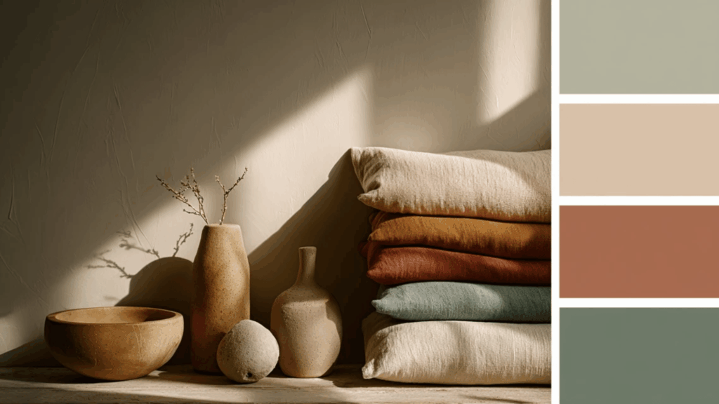
6. Muted terracotta: Earthy and warm, this softened rust tone adds character to pillows, throws, and pottery without overpowering a space.
7. Dusty coral: A gentle peachy-pink that brings warmth and a touch of color, perfect for textiles and decorative accents throughout the home.
8. Sage green: Soft, muted green with gray undertones that feels fresh yet calming, great for linens, plants, and painted furniture.
9. Soft teal: A dusty blue-green that adds a cool contrast while staying warm enough to blend seamlessly with autumn palettes.
10. Warm mustard: A golden yellow that’s muted and earthy, adding a pop of warmth in small doses like cushions or artwork.
Best Soft Autumn Color Combinations
These color pairings bring out the best in soft autumn tones, creating balanced, inviting spaces that feel cohesive and thoughtfully designed.
1. Warm Beige and Sage Green
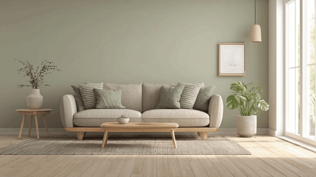
This combination feels fresh yet grounded. The warm beige provides a soft, neutral backdrop while sage green adds a touch of nature without feeling too bold.
It works beautifully in living rooms and bedrooms where calm is key.
Layer in natural textures like linen and wood to enhance the organic feel. This pairing never fights for attention, just flows.
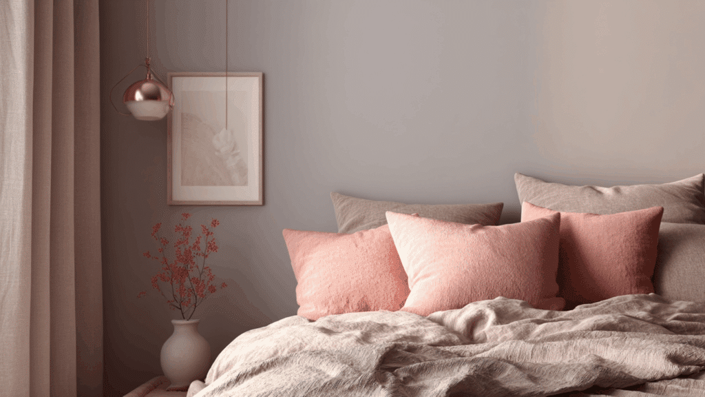
2. Camel and Dusty Coral
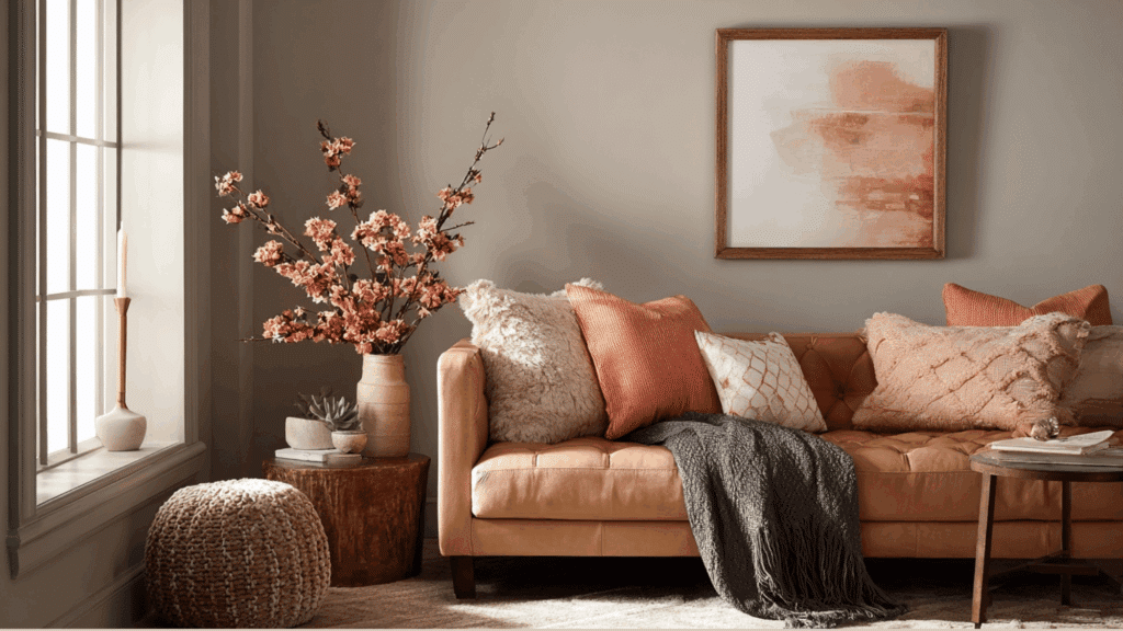
Rich camel tones get a gentle lift from dusty coral, creating warmth with subtle contrast. This combo feels lived-in and welcoming, perfect for spaces meant for gathering.
Use camel on larger pieces like sofas or rugs, then bring in coral through pillows, throws, or artwork. The result is cozy without being heavy.
3. Taupe and Soft Teal
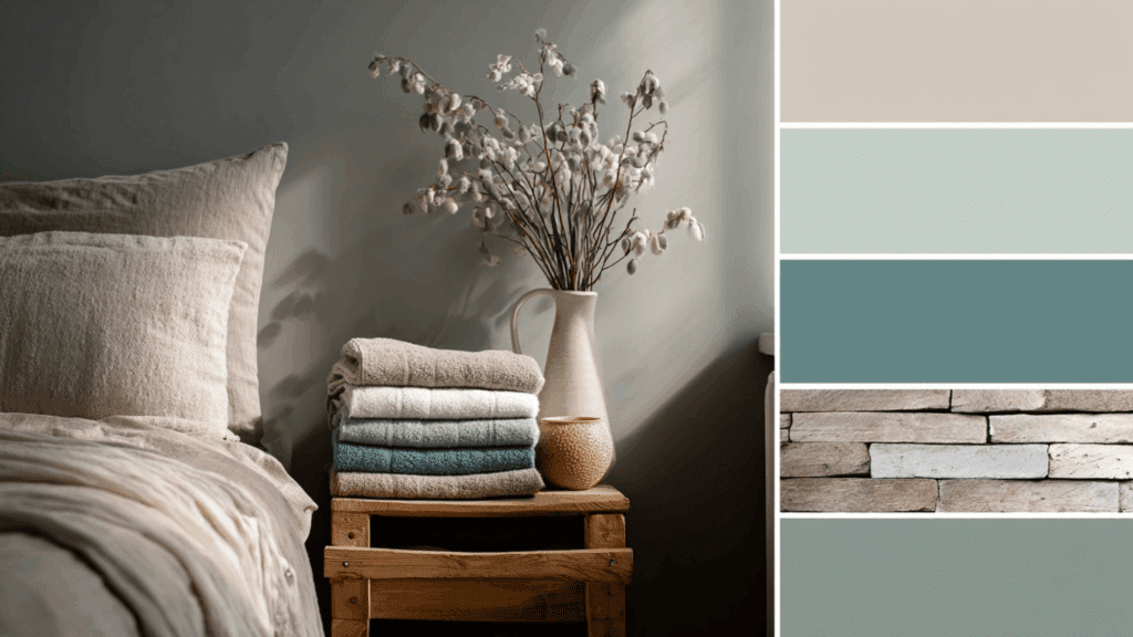
Taupe keeps things neutral and calm, while soft teal introduces just enough color to keep a room interesting. This pairing works especially well in bathrooms and bedrooms where relaxation is the goal.
The teal adds a hint of cool contrast without clashing with the warm base. It’s balanced and soothing.
4. Mushroom Gray and Warm Mustard
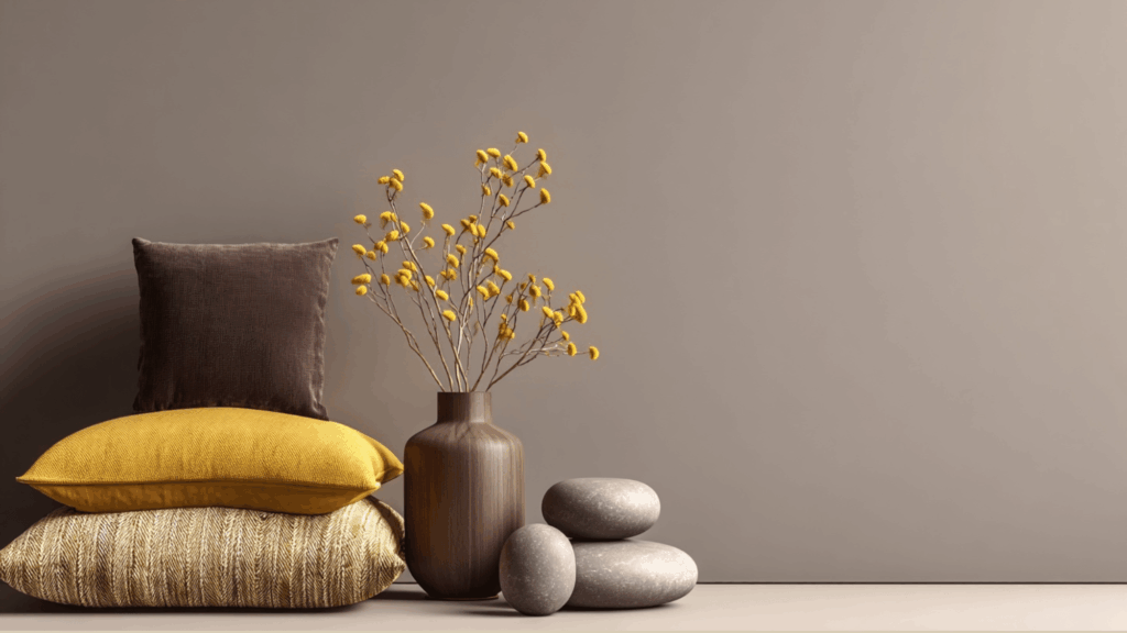
Mushroom gray offers a modern, muted backdrop that lets warm mustard shine without overwhelming the space. This combination brings energy while staying soft and approachable.
Use mustard sparingly in accent pillows, vases, or small furniture pieces. The gray grounds everything, making the mustard feel intentional rather than random.
5. Soft Ivory and Muted Terracotta
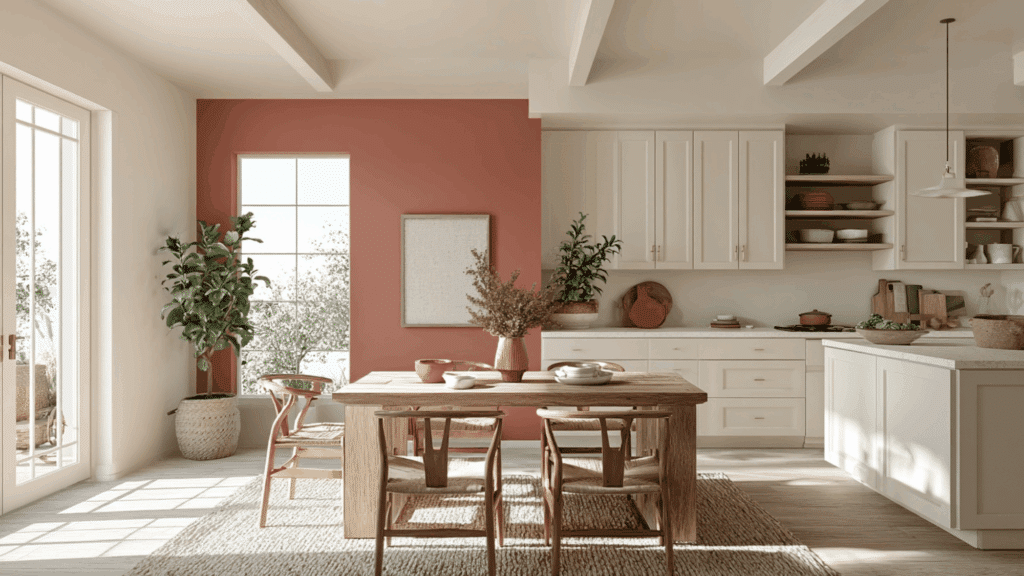
Soft ivory brightens a room while muted terracotta adds earthy warmth and depth.
This pairing feels airy yet cozy, perfect for kitchens and dining areas. The ivory keeps things light, while terracotta brings in that soft autumn character.
Add natural wood elements and greenery to complete the look. It’s warm without being dark.
6. Camel and Sage Green
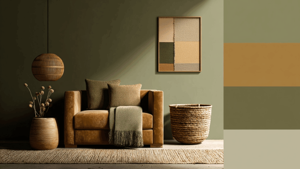
Two of the most versatile soft autumn colors come together beautifully here. Camel adds richness, sage green brings freshness, and together they create a balanced, natural vibe.
This combination works in nearly any room and pairs well with brass accents and woven textures. It’s ageless and easy to build around.
7. Taupe and Dusty Coral
Taupe provides a subtle, neutral base that allows dusty coral to add warmth and personality.
This pairing feels soft and romantic without being overly sweet. It works well in bedrooms and sitting areas where comfort is important.
Layer in soft fabrics and matte finishes to keep the look cohesive and inviting.
How to Know If You Are a Soft Autumn
Understanding your own color season can help guide decorating choices that feel natural and reflect personal style in meaningful ways.
- Warm undertones feel right: Clothing and makeup in warm tones look better than cool, icy shades on the skin.
- Gold jewelry is more flattering: Gold, brass, and copper look harmonious, while silver feels harsh or out of place.
- Muted colors are preferred: Soft, dusty shades feel more comfortable than bright, saturated, or neon colors.
- Earth tones dominate the wardrobe: Closets naturally fill with beiges, olives, rusts, and warm browns over time.
- High contrast feels jarring: Black and white combinations or stark color pairings don’t feel as natural or appealing.
- Autumn landscapes resonate deeply: Soft autumn scenery, faded grasses, and golden hour light feel visually comforting and inspiring.
The Bottom Line
The soft autumn palette isn’t about following strict rules. It’s about finding colors that feel good together and make a space comfortable to be in.
Not every room needs a full makeover, and not every color has to match perfectly.
Start small. Swap out a few pillows. Try a new throw blanket. Paint an accent wall. See what feels right and build from there. Soft autumn colors are forgiving, so experimenting doesn’t come with much risk.
For those who naturally gravitate toward warm, muted tones, this palette already feels like home. And for everyone else, it’s worth trying out.